About Convert
Convert is a powerful Business theme with a unique design and vast customisation options.
Image Sizes
The minimum recommended image sizes for Convert are:
- Post thumbnail: 885×498
- Item thumbnail: 615x346px
- Media Item tall: 615px unlimited in height
- Large Item image: 1260x709px
- Article Image: 510x510px
- Hero image: 1920x956px
Notice, the original demo images are not redistributed (unless noted). Instead blurred equivalents will be imported while installing the sample content.
Fonts Used
We are using Open Sans and Montserrat. These are Google Fonts that you can find and test here
Getting Started
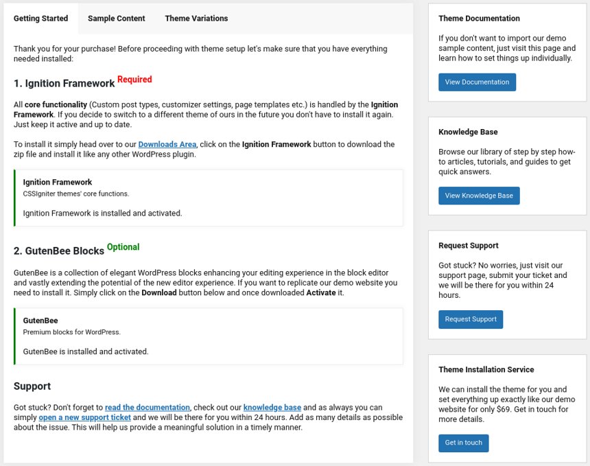
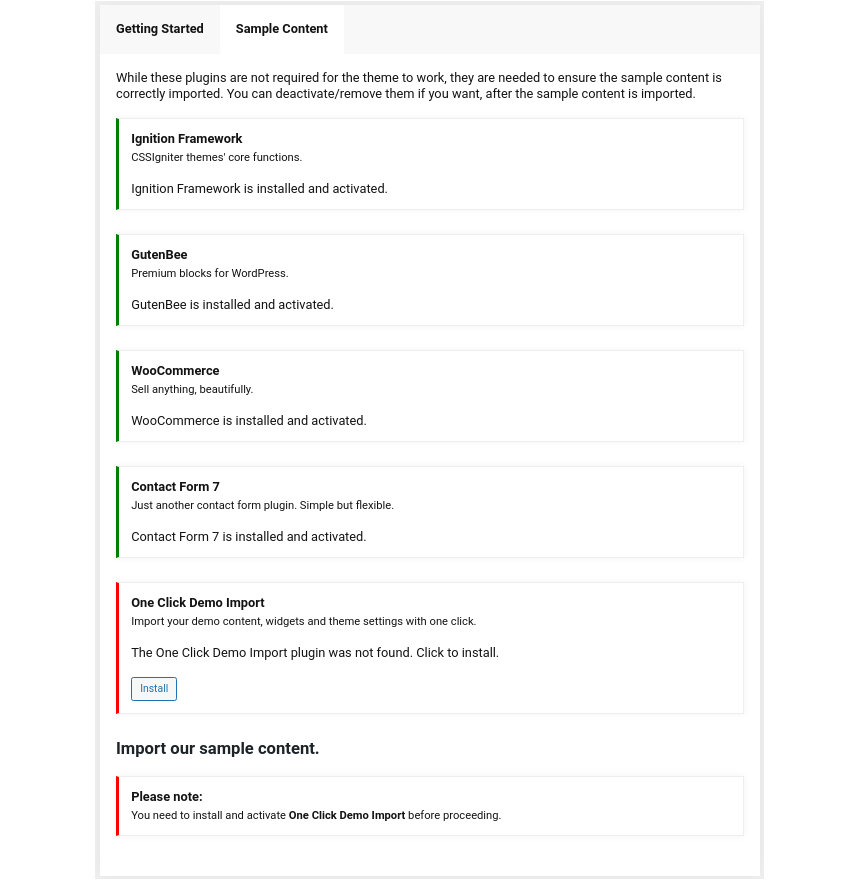
After installing the theme you will be redirected to this welcome screen. Here you can install both required and recommended plugins. While recommended plugins are optional for the theme to function, consider installing them if you want the full sample content to be imported.
Required Plugins
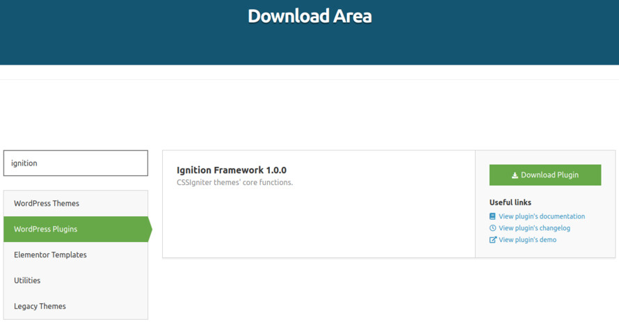
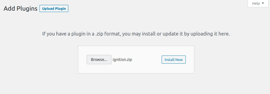
Here you will need to install and activate the theme specific plugin required by the theme. This will create Custom Post Types as well as various Widgets and Shortcodes. Some hosting providers block automatic installation of plugins. This means you will need to install the plugin manually as you would normally do. This plugin is located inside the /plugins/ folder in your theme archive.
Must have plugins
Under the Recommended Plugins tab you will find a list of supported plugins that are needed for the theme’s functionality. It is recommended to install and activate them before importing your sample content.
- WooCommerce: To enable eCommerce functionality for your website
- Elementor: A free page builder that delivers high-end page designs and advanced capabilities.
- MaxSlider : Use this plugin to help you create custom sliders and use them anywhere you wish shortcodes.
- One Click Import : Use this plugin to help you import your content with just one click.
All the above are mandatory while these:
- WPForms use this plugin to create a contact form, then copy the shortcode it gives you and paste it in an empty page.
- WP Instagram Widget: Use the latest version of this plugin to help you display your Instagram feed in any of the theme’s sidebars.
plugins are complementary.
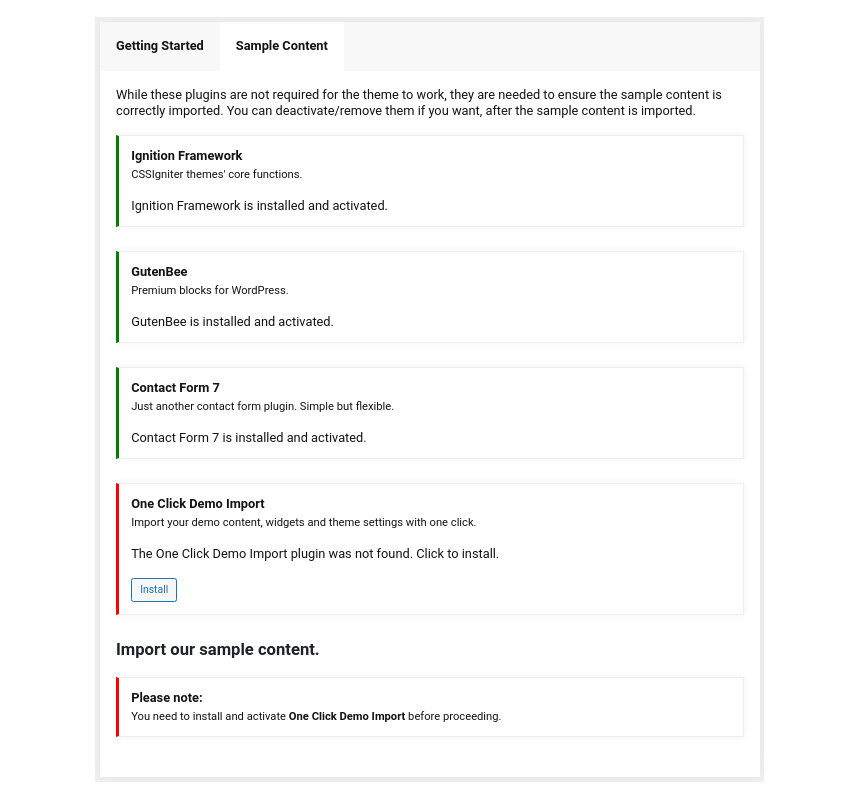
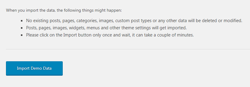
Installing Sample Content
To automate the process of importing and for a better experience we have included native support for One Click Import Plugin. From the Sample Content tab, you can click the Get Started button to navigate to the sample content import screen.
You can always find the import page under Appearance → Import Demo Data.
You can install it in the Recommended Plugins tab (2) or manually from From your WordPress dashboard
-
-
- Visit Plugins → Add New,
- Search for ‘One Click Demo Import’ and install the plugin,
- Activate ‘One Click Demo Import’ from your Plugins page.

Click on the Import Demo Data button and you are done!
Notice: If you are using WooCommerce you will need to make these extra actions
WooCommerce > Status > Tools > WooCommerce transients > Clear transients
WooCommerce > Status > Tools > Product lookup tables > Regenerate
Sometimes altering and editing sample content may go wrong. If you need a fresh start you can reset your WordPress installation using any popular reset Plugin. Beware: this will erase all data you have and not just the sample content.
This plugin requires a PHP version of at least 5.3.x, but we recommend version 5.6.x or better yet 7.x. Please contact your hosting company and ask them to update the PHP version for your site.
Customizing Your Theme
All theme’s customizations and settings can be done via WordPress’s built-in Customizer. If you haven’t used it or want to learn more about it, please read this article.
Go to Appearance → Customize and you will see this:

TIP 1: Any changes you make in the tabs below will be previewed live on the site which appears in right side of the screen, however to save these changes you need to click the Save & Publish button on the top of the bar, if you have made a change but see the button grayed out (for example changed the font size of a heading), move the cursor outside the input box, for example, to the next input box, then the button should be clickable again.
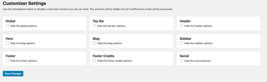
TIP 2: You can hide any customization section your don’t need to appear in the customizer under Appearance→Customizer Settings.
Let’s take a look at the options each tab gives you.
Global
Global section will allow you to control the layout, colors and typography that will apply everywhere in the theme:

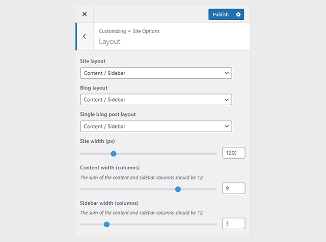
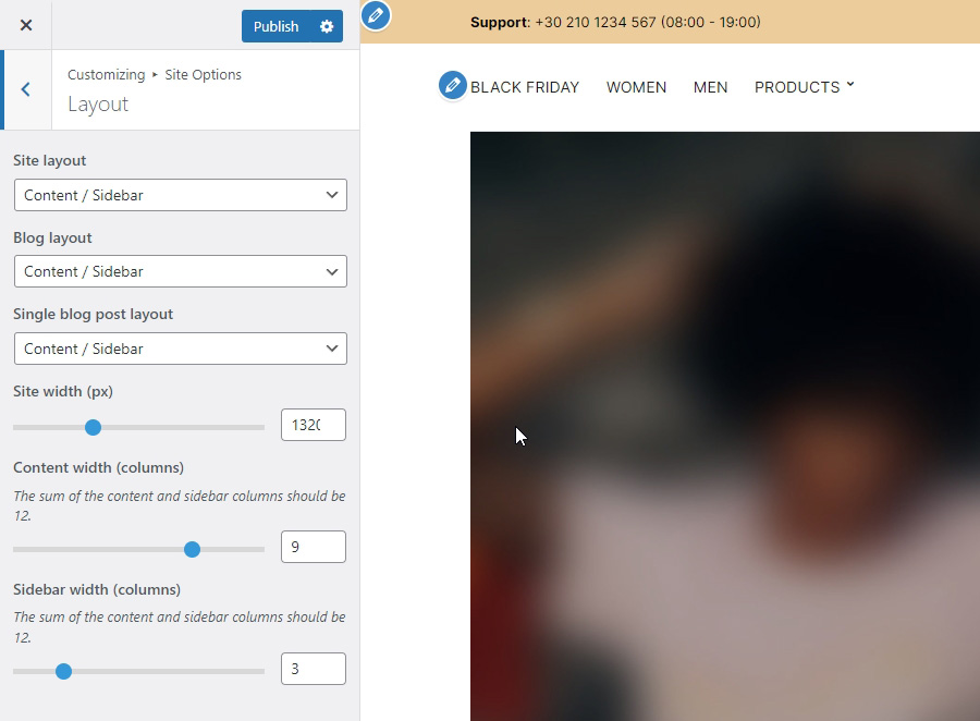
Global→Layout
Let’s have a look at each option this section provides:
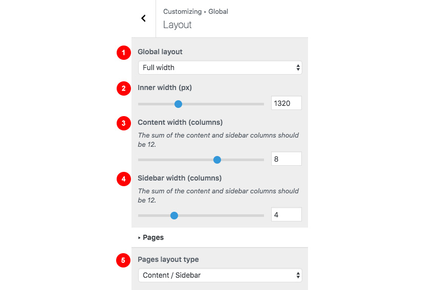
- Apply a full width or boxed container for all content.
- Control the inner full content width.
- Control the content width from (1 to 12).For example 8 means that your content width will have the 8/12 of your Inner Site Width while the other will be reserved for the sidebar.
- The sidebar width.For example 5 means that your content width will have the 5/12 of your Inner Site Width while the other will be reserved for the main content.
When selecting a Boxed layout you will get this screen:

- You can switch layouts anytime you wish.
- Control the outer width of your main content.
- Control the inner width of your main content.
Global → Colors
This section will allow you to change the background color / image as well as all your basic theme elements, like your links, forms, headings, buttons colors:
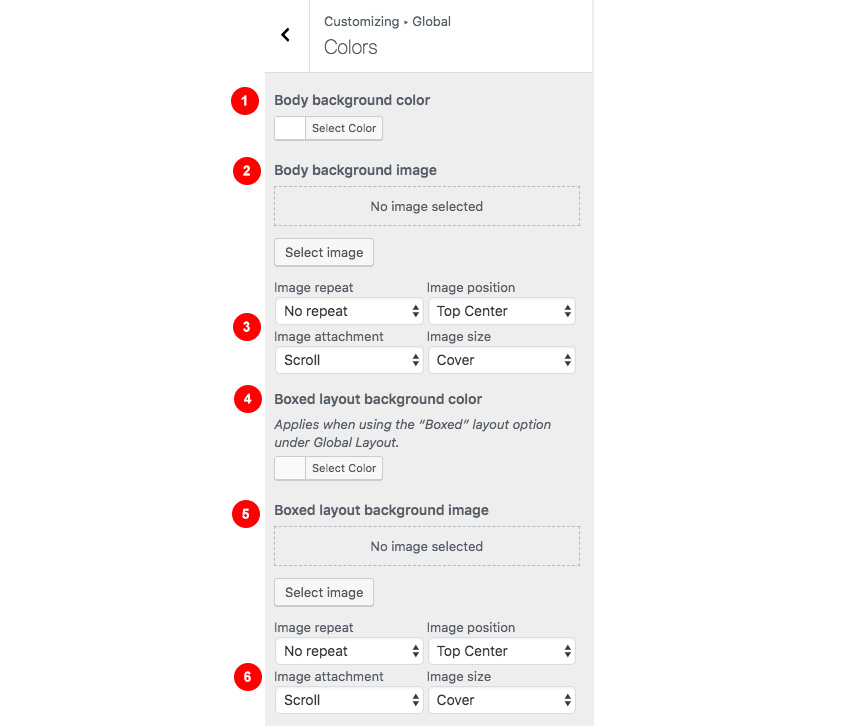
- Change the body background color.
- Add or remove background image.
- Control the background location and size.
- When using a boxed layout you can select the inner background color.
- Select the boxed layout background image.
- Also you can control the boxed background image location and size.
Typography
Customizing your fonts is included natively in Convert:
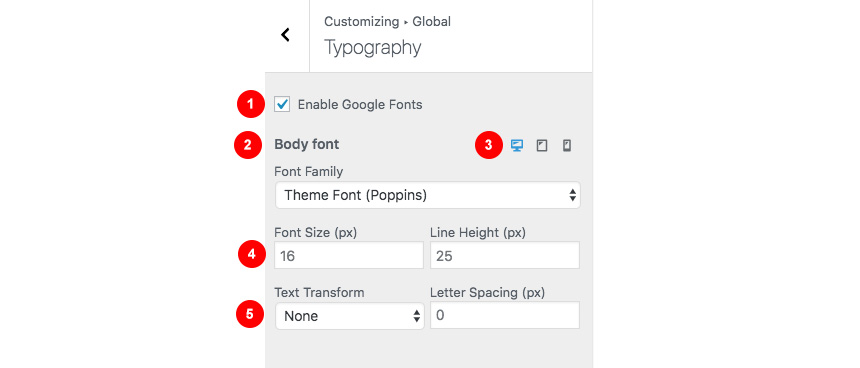
- Enable the use of Google Fonts. Not checking this option will give you web safe font controls for your main body text.
- Change the main font family you need to use.
- Change your settings depending on the visitor viewport. This gives you the advantage of having different font sizes for Desktop, Tablet and mobile devices.
- Change the font size and Line height.
- Change the text type and your letter spacing.
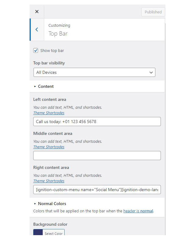
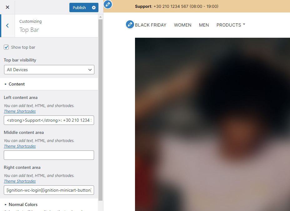
Top Bar
Top Bar section will allow you to control the area before your main header. This area contains various elements, like search, social icons and placeholders via shortcodes as well as informatory text.
You can control its layout, content, colors and typography directly via the customizer.

Top Bar → Layout
In this section you can:
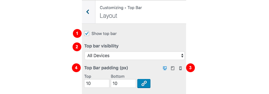
- Show / hide the top bar.
- Change the top bar visibility in mobile devices.
- Change the padding of the top bar in desktop, tablet, mobile.
- Arrange the top and bottom distance of the top bar. The chain button will allow you to change these values equally.
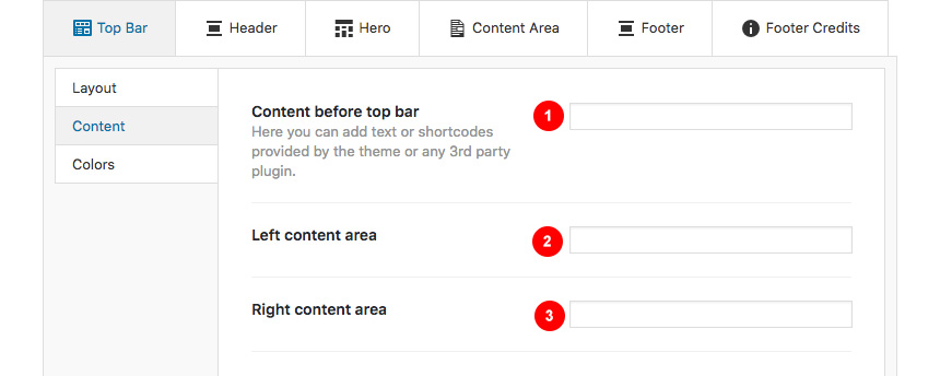
Top Bar → Content
Here you can control what the top bar will actually have as content:
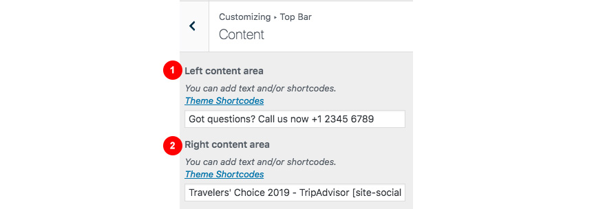
- Control the Left Content area, using various shortcodes or text.
- Control the Right Content area again using shortcodes or text.
You can find all theme’s shortcodes here.
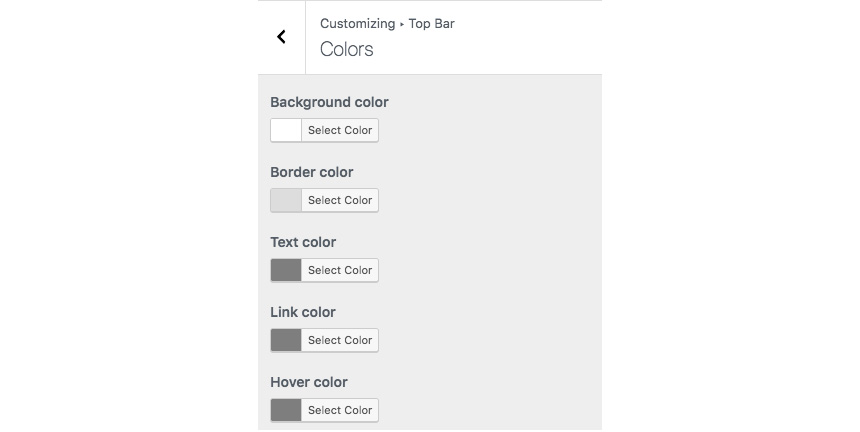
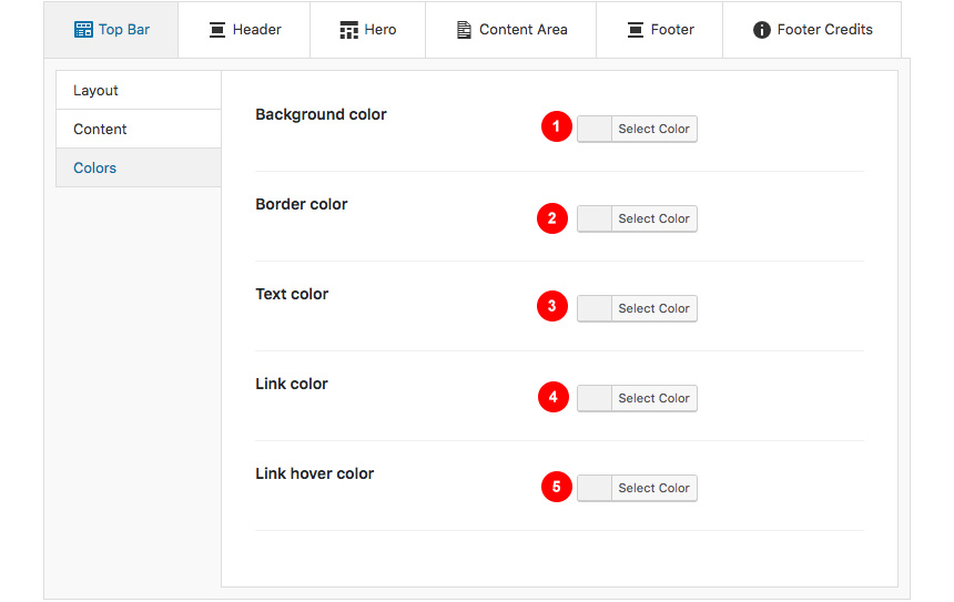
Top Bar → Colors
Here you can control all related colors of each element that renders in the top bar.
Top Bar → Typography
Controlling typography is quite simple as well. In this section you can:
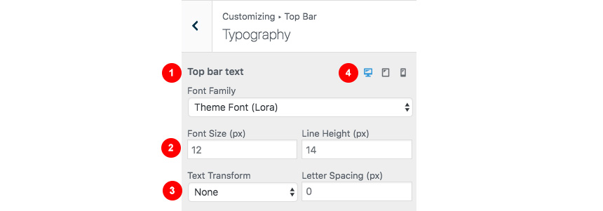
- Change the main font family you need to use.
- Change the font size and Line height.
- Change the text type (uppercase, lowercase) and your letter spacing.
- Change your settings depending on the visitor viewport. This gives you the advantage of having different font sizes for Desktop, Tablet and mobile devices.
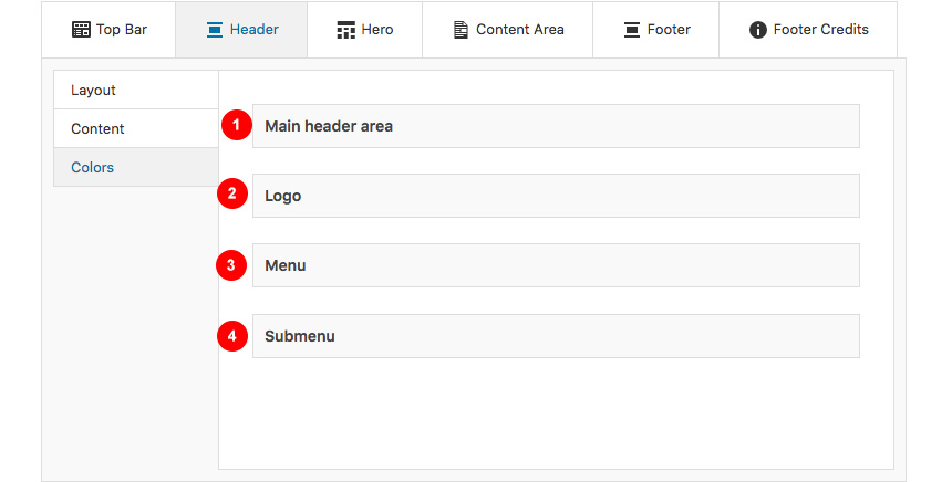
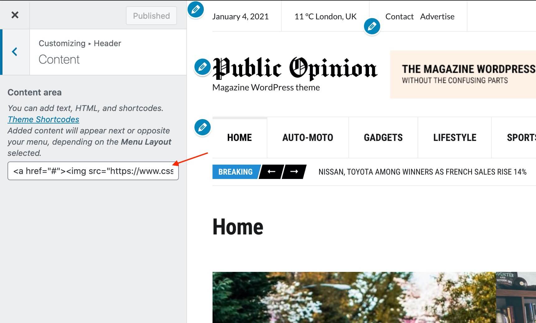
Here you can control the basic Layout, Content, Colors and Typography of your header. You can also control if you need your header to stick to the top when scrolling.

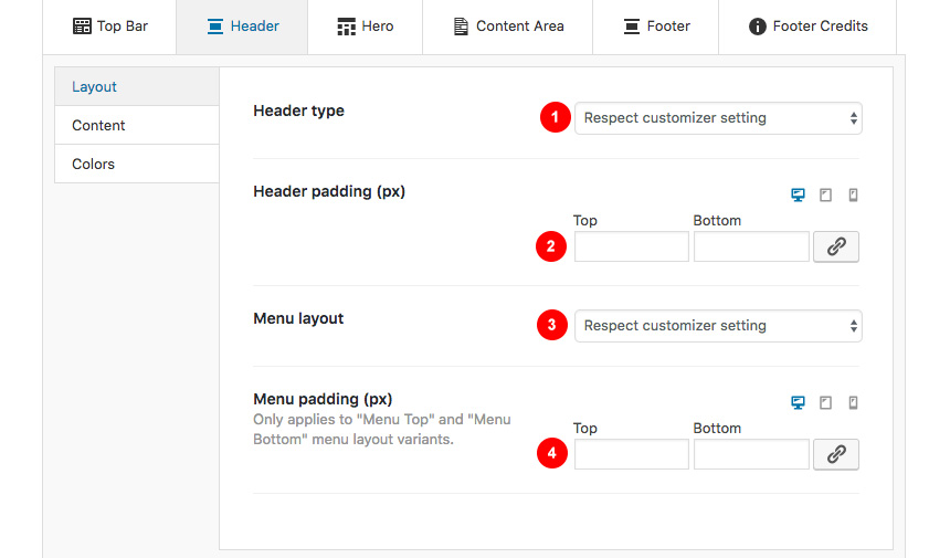
Header → Layout
Here you can control the basic structure of your header area.
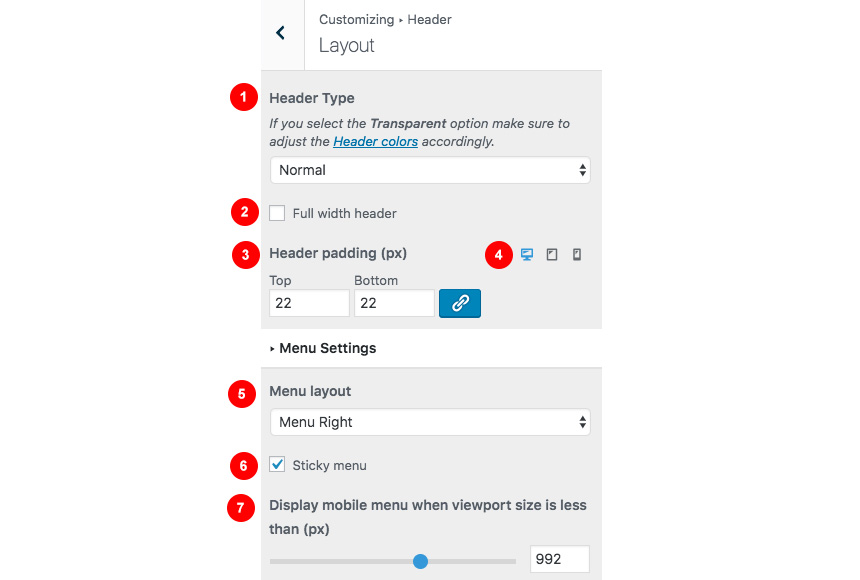
In detail you can:
- Control the header type. Normal means the header will not cover the hero, while being transparent will do! (Even if you don’t have transparency setup from your Header Colors section)
- Make the header cover the full width of the screen.
- Change the Header top and bottom padding and lock these values to behave the same.
- Change the padding section in any device type.
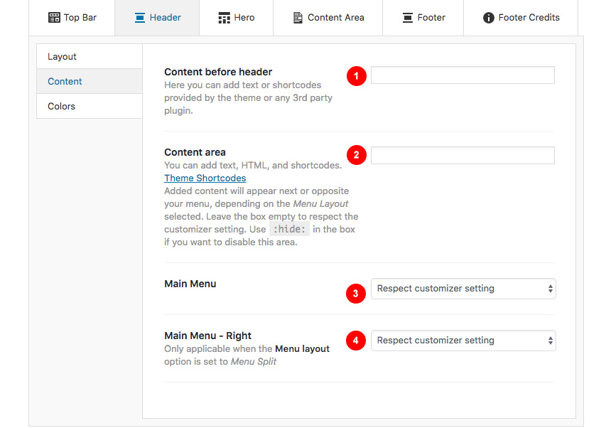
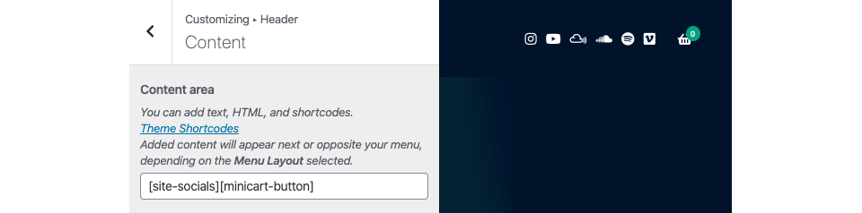
Header → Content
While your header actually has the main menu attached you can add any text/shortcode you wish before or after the main menu. Add a social icon shortcode for example.
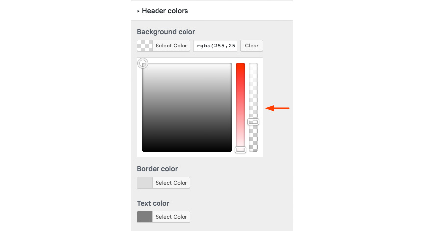
Header → Colors
Here you can control all header colors. Pay special attention to the transparency control when using the Transparent header type.
Header→Sticky Colors
Here you can control the colors for your sticky header.
Header→Typography
Here you can control the Main Menu Font style.

- Change the main menu font family and settings
- Change the submenu font family and settings
Also in the same section you can change (if you are using a text logo):
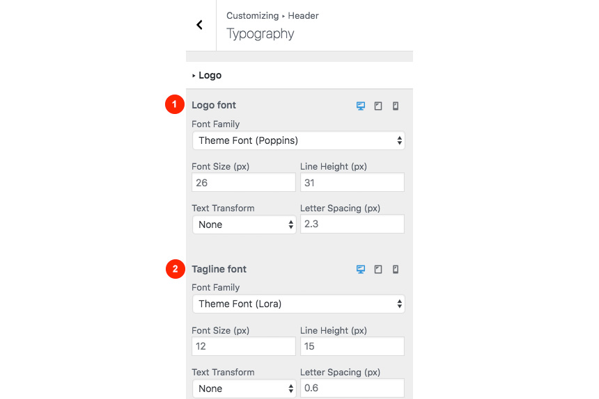
- The text Logo font family and style.
- The tagline font family and style.
Site Identity
Here you can change the logo and favicon as well as the title and description. Use the appropriate fields to add your information, show or hide your site title and subtitle and upload your logo and site icon images.
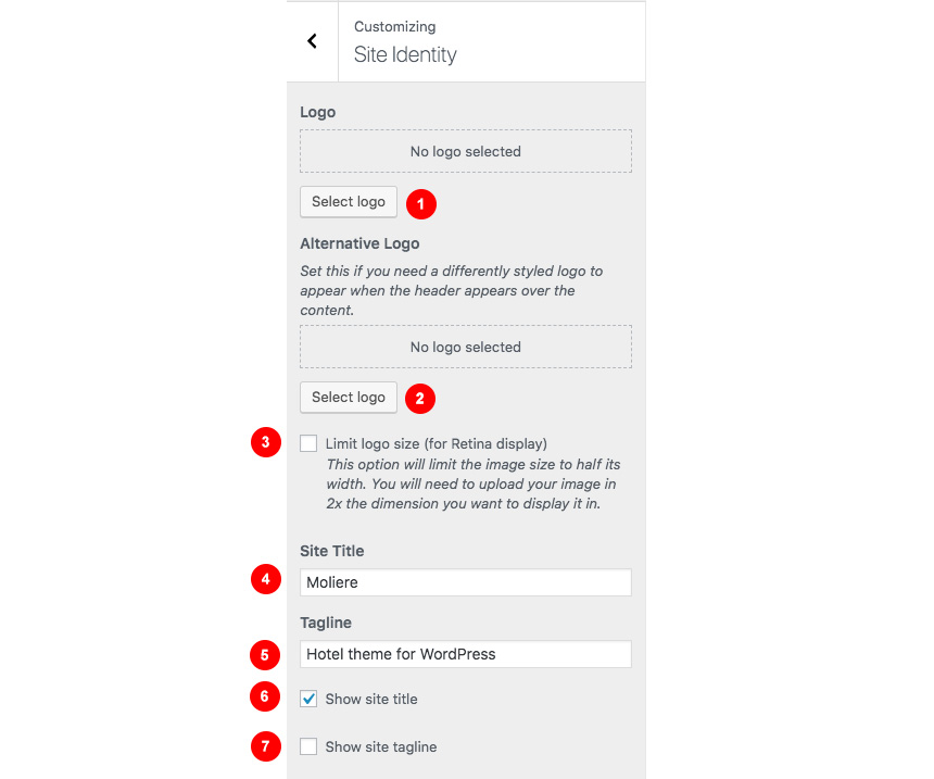
- Select an image Logo.
- Select an alternate logo that will appear either when your header is sticky with different background color, or when your header has the transparent type selected. This extra field will ensure maximum contrast in any case.
- Limit the size logo in half (you will need to use a 2x image) for retina devices.
- Add you site title.
- Add you site tagline.
- Show/hide your site title.
- Show/hide your tagline.
For your main site icon you can select any image you want as long as it’s 512x512px in width and height and it’s square.

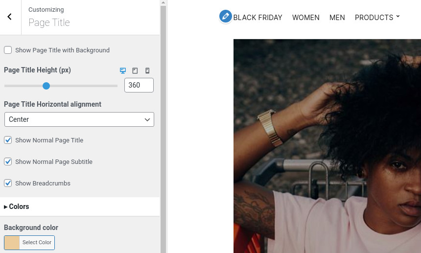
Hero
This is the basic section before the contents of your page and you can control the Layout, Content colors and typography of this particular section.

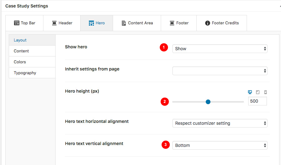
Hero→Layout
Here you can:
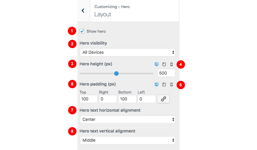
- Show or hide the hero section
- Change the section visibility depending on the device viewport size.
- Change the hero height,
- Control the hero height in desktop/mobile/tablet
- Change the hero padding and lock the proportions in order to change them in tandem.
- Control the hero padding in desktop/mobile/tablet
- Control the horizontal alignment of your hero content.
- Control the vertical alignment of your hero content.
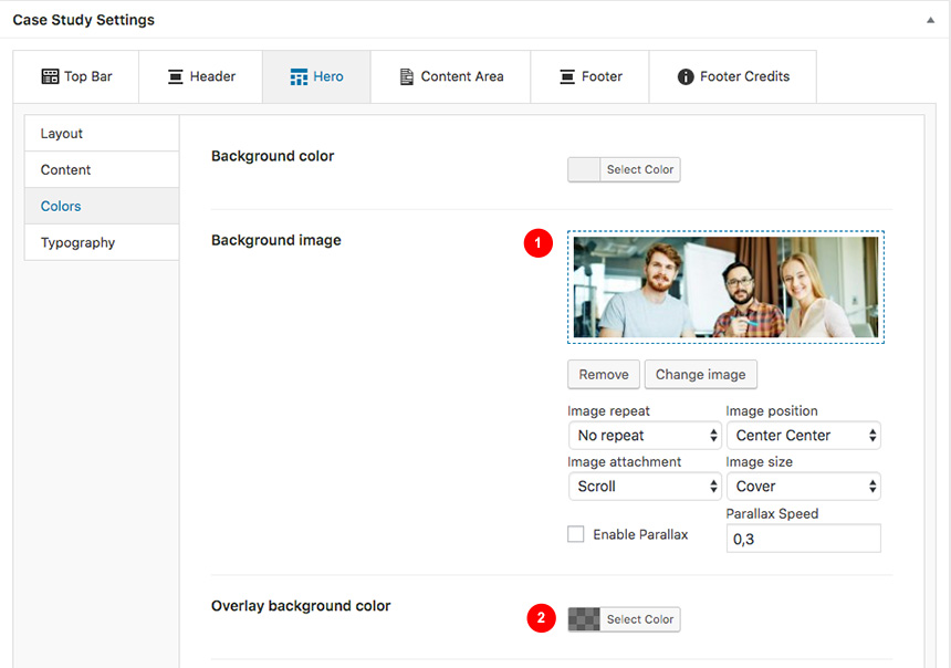
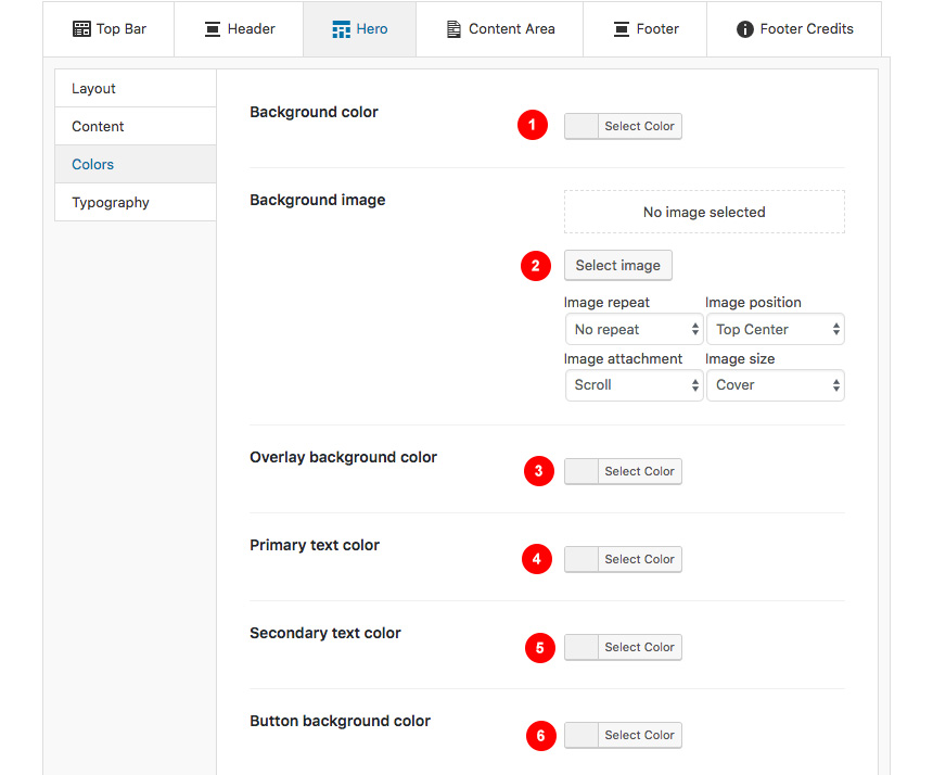
Hero→Colors
Here you can:
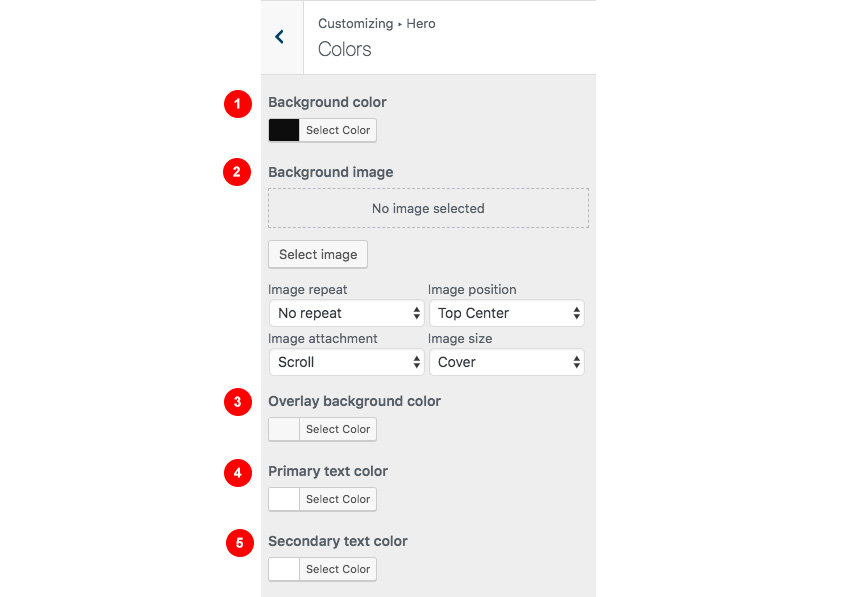
- Add a background color.
- Add a background image and control your image settings and position.
- Use an overlay background color for your image to increase the contrast for your content.
- Change the primary text color.
- Change the secondary text color.
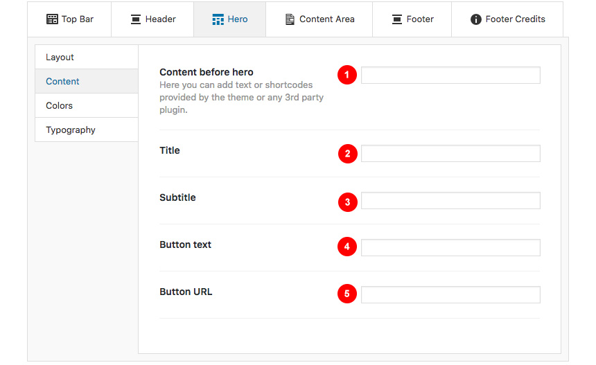
Hero→Content
This is the basic Hero content section:
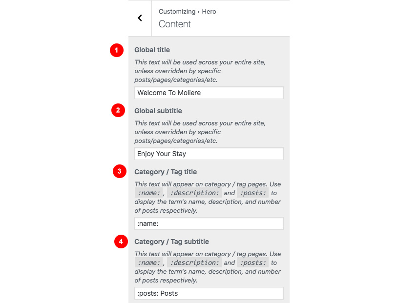
- Have a global title for the entire site
- Have a global subtitle for the entire site
- Change the title in category/tag archives
- Change the subtitle in category/tag archives
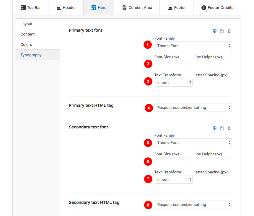
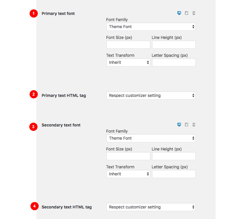
Hero→Typography
Here you can control:
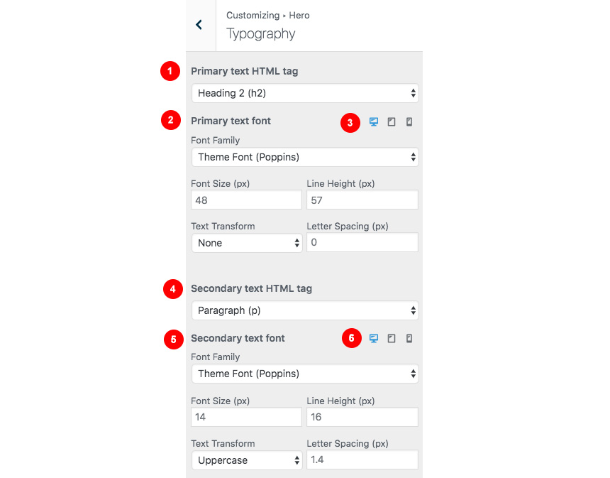
- Your primary title heading type. This can be any suggested HTML tag
- Change the primary text font family and settings
- Change the primary text settings in mobile, desktop, tablet viewport
- Your subtitle HTML tag
- Change the secondary text font family and settings
- Change the secondary text settings in mobile, desktop, tablet viewport
Blog
This tab allows you to customize your blog and post options.

Blog→Layout
Here you can change your single post and archive (category and tags) looks.
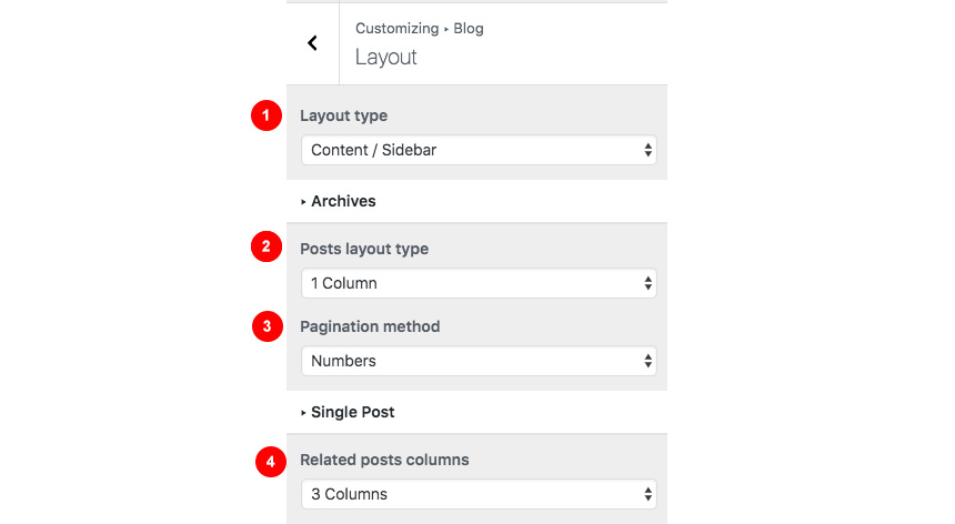
- Change the main blog page Layout.
- Change your archive layout type.
- Change the pagination method.
- Change the Related post columns.
Blog→Content
Here you can control which elements you want to show/hide in your Single Post pages and Archives:

For Archives:
- Change the excerpt length in words
- Show or hide the featured image
- Show or hide the post title
- Show or hide the post meta
- Show of hide the content
- Show or hide the Read more button
While in Single Posts you can:
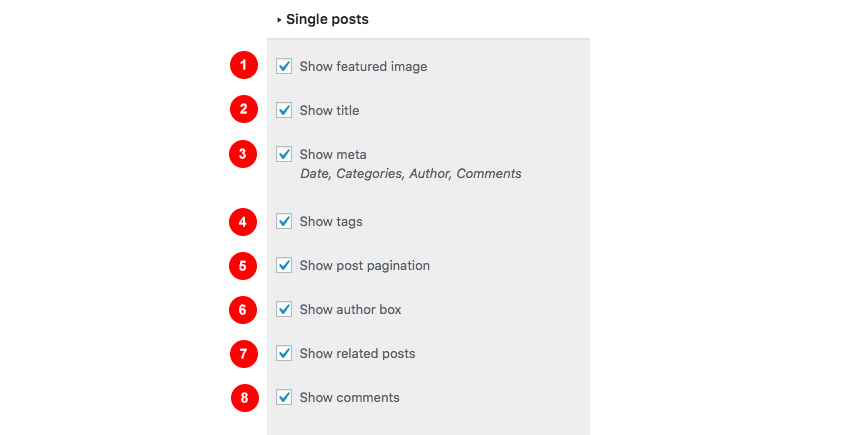
- Show or hide featured images.
- Show or hide the title.
- Show or hide meta information.
- Show tags.
- show post pagination.
- Show the author box.
- Show related posts.
- Show comments.
Blog→Typography
Here you can change your Archive typography:
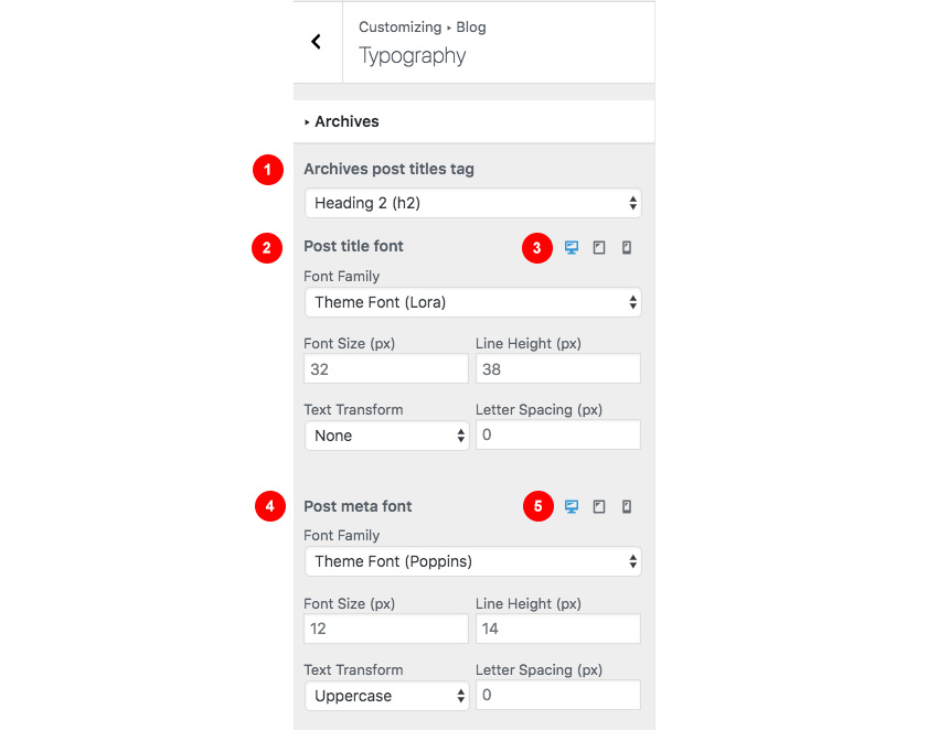
- Change the archive heading HTML tag.
- Change the post title font family
- Change the font size and other settings in different viewports
- Change the post meta font family and settings
- Change the font size and other settings in different viewports
Same applies in single post typography:
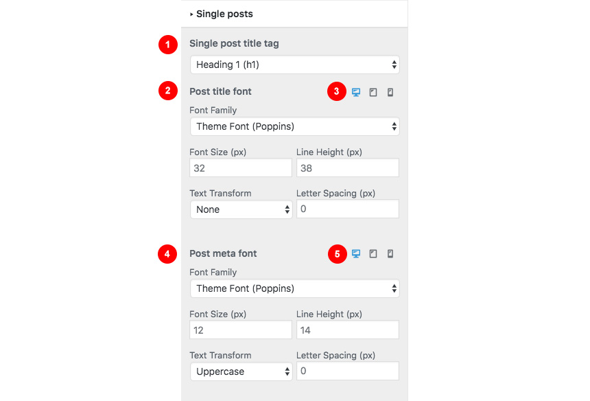
Here you can:
- Change the post heading HTML tag
- Change the Font family and settings of the post title
- Change the post meta font family and settings
- Change the font size in various viewports
Here you can change your sidebar options.

Sidebar→Layout
Under the Layout section you can:
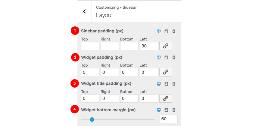
- Change the Sidebar padding in any possible viewport
- Change the widget padding in both mobile/desktop/tablet.
- Change the widget title padding
- Change the widget bottom margin.
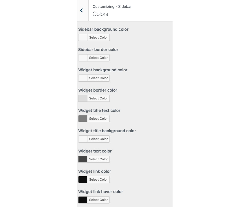
Sidebar→Colors
Here you can customize all sidebar and widget colors.
Sidebar→Typography
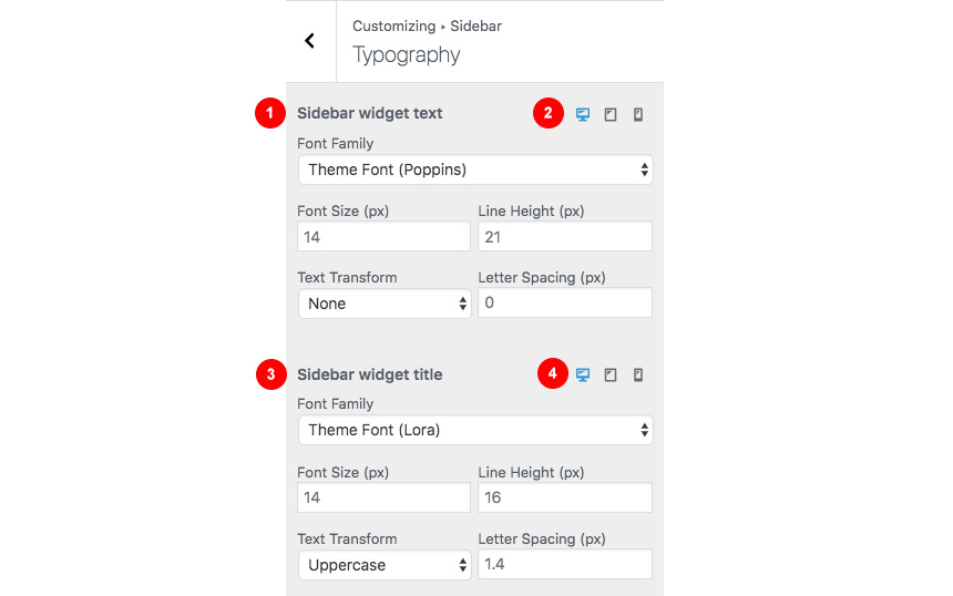
- Change the sidebar widget text family and settings.
- Change the sidebar widget text size in Desktop/Mobile/Tablet.
- Change the sidebar widget title font family and settings.
- Change the sidebar widget title font size in Desktop/Mobile/Tablet
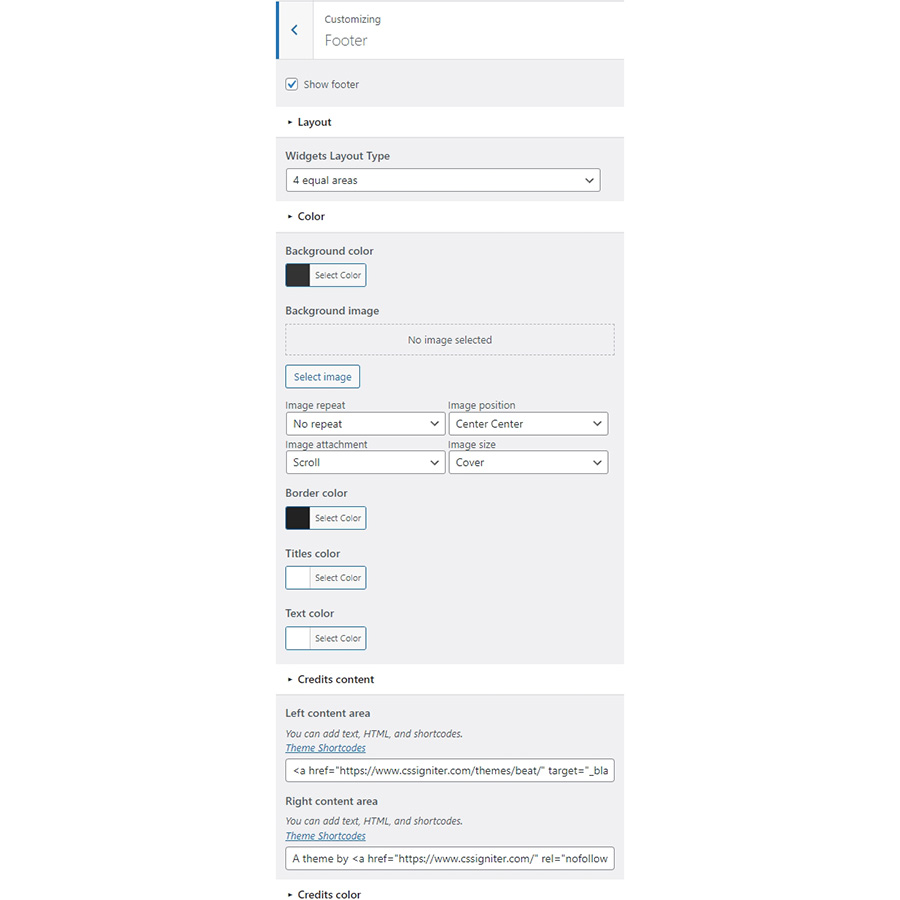
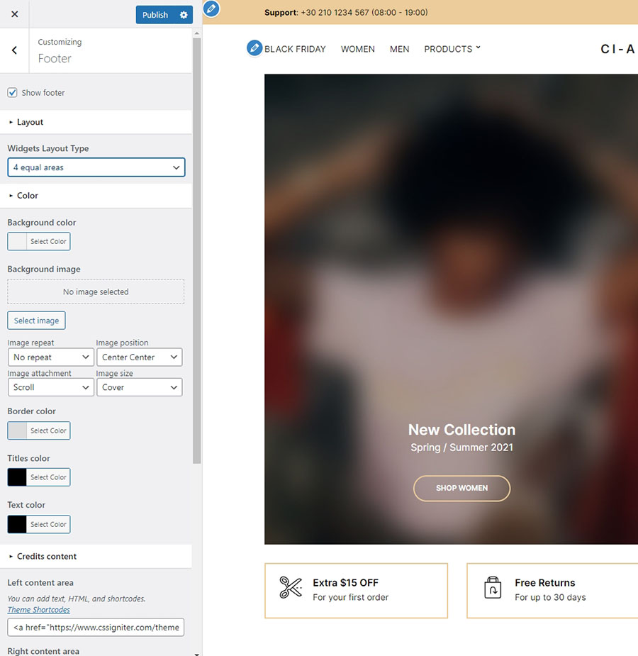
Footer section also has a full customizable layout, color and typography section:

Footer→Layout
Here you can:
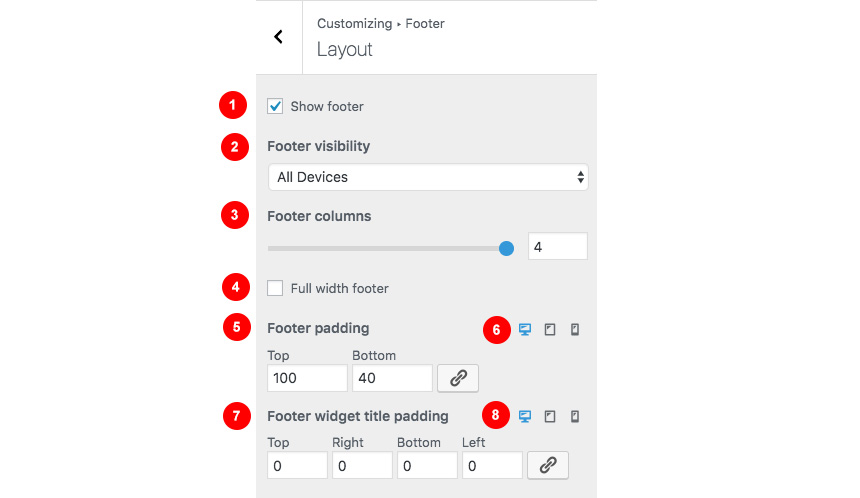
- Show or hide the footer area
- Select the footer visibility in Mobile devices
- Select the footer columns you need
- Make the footer full width
- Change the Footer padding
- Change the Footer padding in all possible viewports
- Change the Footer widget titles padding and
- Change the Footer widget titles padding in Mobile devices.
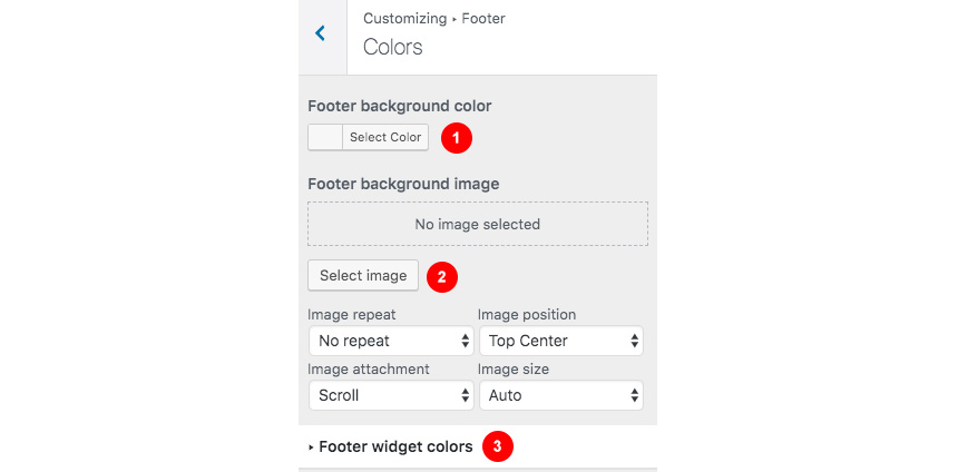
Footer→Colors
Here you can change most of the footer and footer contents colors. While in general you can:
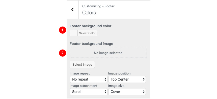
- Add a background color.
- Set a background image and customize its appearance.
Footer → Typography
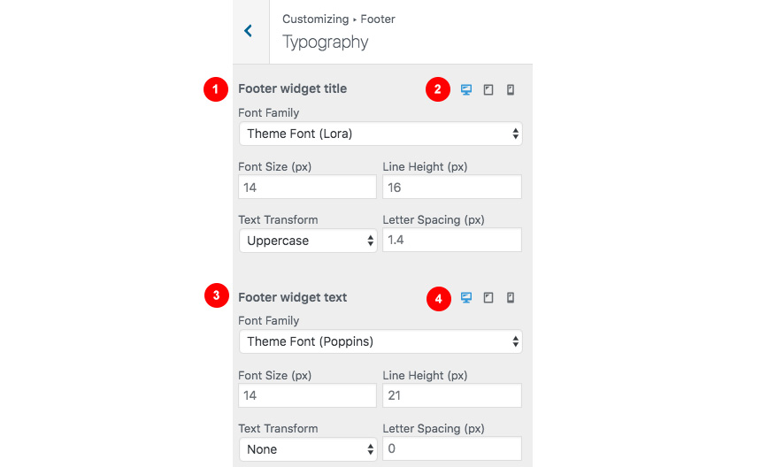
- Change the title font
- Change text options for the type of device
- Change the main text font
- change text options for for the type of device
After the main footer area we have reserved a Footer Credits section you can add you copyright text or any content you wish via shortcodes.

Footer Credits→Layout
Here you can

- Show or hide the footer credits
- Change the credit visibility in mobile devices
Footer Credits→Content
Currently there are two areas you can use to add your content. Both these support some HTML elements.

- Add your text/shortcode in the Left content area.
- Add your text/shortcode in the Right content area.
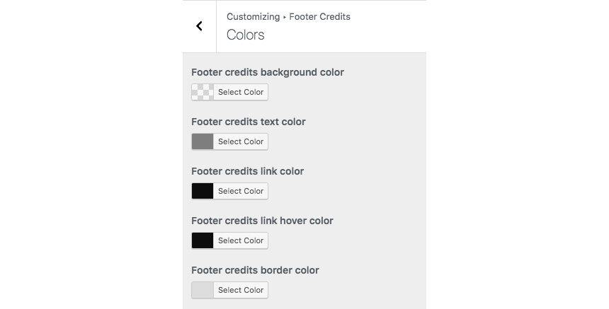
Footer Credits→Colors
Here you can control all Footer Credits colors.
Footer Credits→Typography
This section gives you the option to change the credits text style.
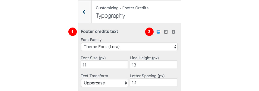
- Change the Font family and font settings of the Footer credits section
- Control all font settings in any possible viewport.
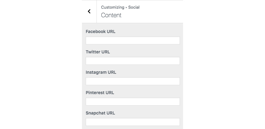
Social
In this section You can add your Social Network URLs. These icons will be displayed in the Theme-Social Icons Widget automatically and wherever the Social Icon shortcode appears
Here you can add your social network URL and change your icon colors
Social→Layout
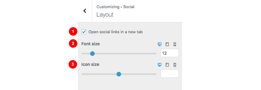
- Select if you wish to open your links in new tabs
- Change the font size
- Change the icon size
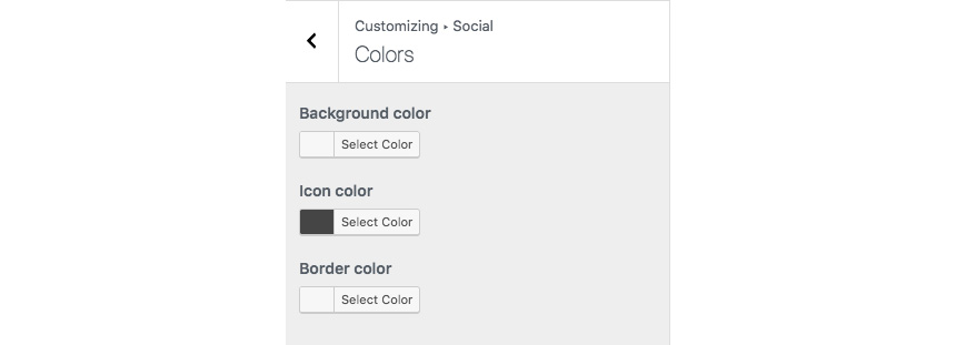
Social→Colors
Change the Social icon and background colors
Social→Content
Add you social networks in the content area.
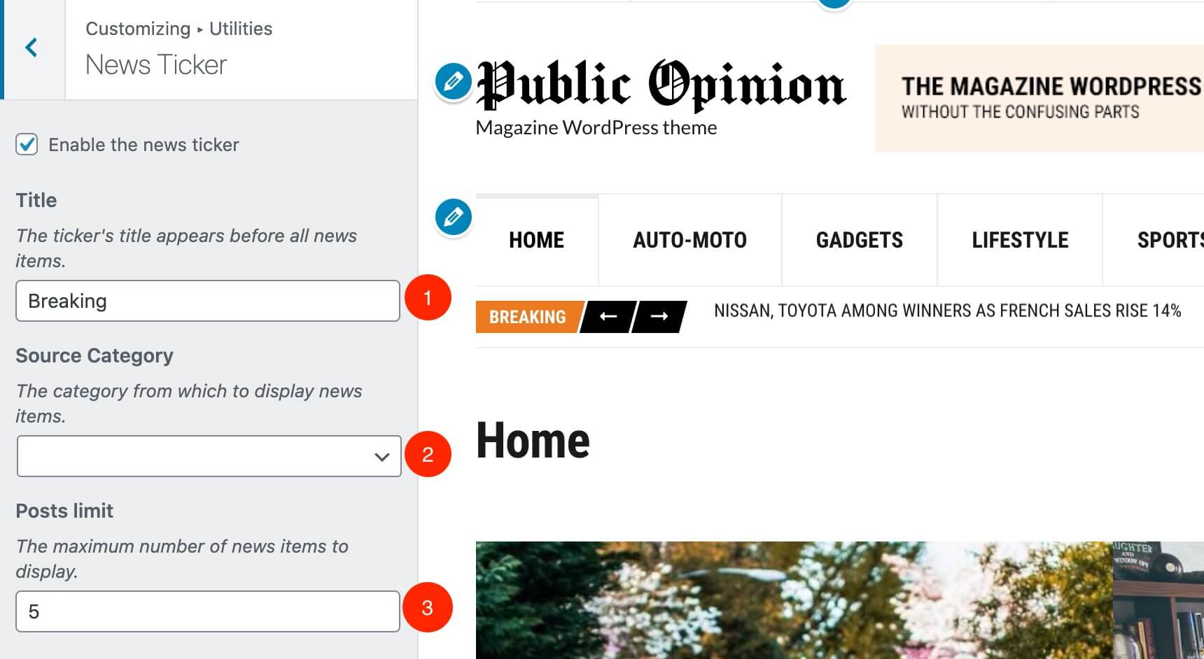
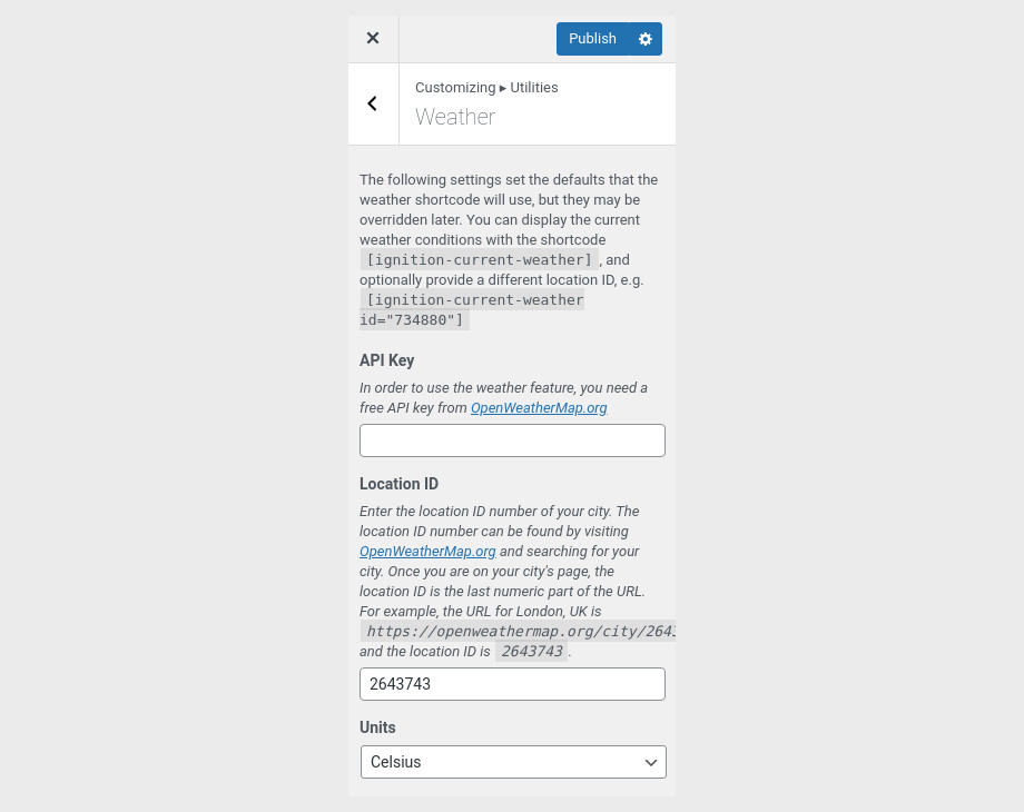
Utilities
This section provides control over the Lightbox (gallery popup) and the Back to top button.

Utilities→Lightbox
Here you can switch the theme Lightbox off, if you need to use a third party one, or simply nothing.
Utilities→Back to top button
This section will help you
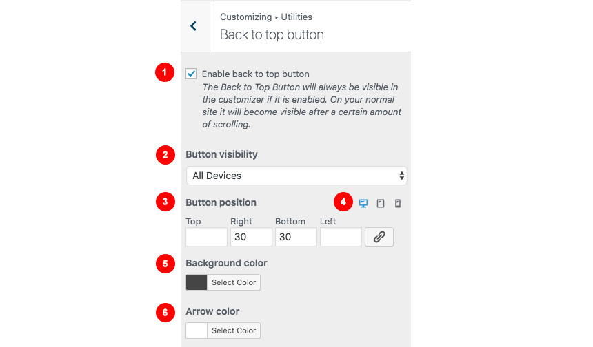
- Enable the back to top button
- Change the button visibility
- Change the button position and
- Change the button position in various viewports
- Select its background color
- Change its icon color
Here you can create and assign menus to the theme. To learn more about menu creation check out the Codex’s menu user guide here.
WooCommerce
In this tab you can change the number of products on shop listing page and control your WooCommerce Settings.
Under the Product Catalog section you can:
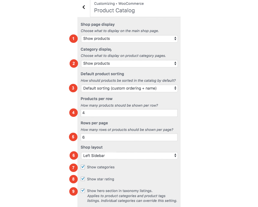
- Choose what you want to render in the main shop page.
- Choose what you want to display in the category pages
- Change the default product sorting
- Change products per row
- Select how many rows of products you need per page
- Change the sidebar location
- Show or hide, categories
- Show or hide star ratings
- Show or hide hero sections in category/tag listings.
You can also change your Single Product layout from the Single Product Section. Here you can control if you need to have a sidebar or not in your products.

Through this tab you can add widgets to the theme’s sidebars. The theme features eight widgetized areas to provide you maximum flexibility when displaying your content.
Homepage Settings
Use this tab to make the Home page your static front page so you can take advantage of the homepage template we have created for you. Here you can also set the Blog page to be your default posts page.
Additional CSS
In this tab we host the custom CSS panel which you can use to insert styles for elements not covered in the rest of the tabs.
Creating a Widgetized Front Page
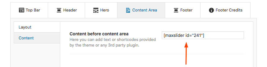
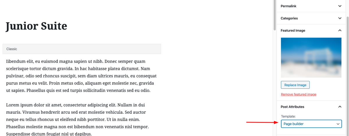
Navigate to Content Area→Layout and under the Layout dropdown select the Page Builder-Full width.

Then open in the Content Area the Content tab and set a MaxSlider Shortcode.
Then select this page as a static frontpage from Settings→Reading.
Replicating the frontpage with Elementor
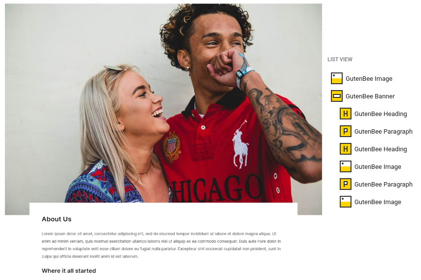
You can download the template here and install it via Elementor as Described here. Besides the hero / slider section all other elements of the frontpage are Elementor widgets. Lets have a look on them one by one:
Simple Callout Element
This is a simple Element with two columns and a button that serves as a basic callout button. Notice: To achieve this overlap effect on the slider we are using a negative margin.
Convert Group element
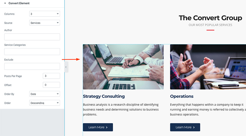
This is a basic Convert Element widget with the Services custom post type as main source included in Convert.
Case Studies

This is a basic Convert Element widget with the Case Studies custom post type as main source included in Convert.
Simple Hero
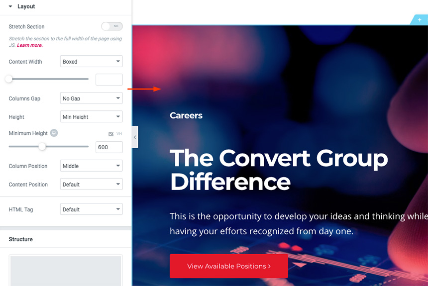
This is a simple hero section with a button linking to the Job Listing page.
Meet the Team

This is a basic Convert Element widget with the Meet the Team custom post type as main source included in Convert.
Insights
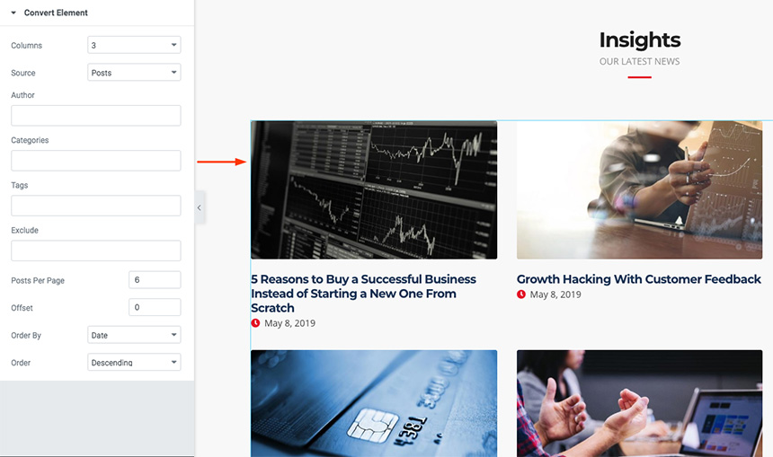
This is a basic Convert Element widget with simple Posts as the main source.
Creating a Page Builder Landing Page
Create a new page as described here and navigate to Content Area→Layout and under the Layout dropdown select the Full Width Page builder option.
If this is your homepage select it as a static frontpage from Settings→Reading.
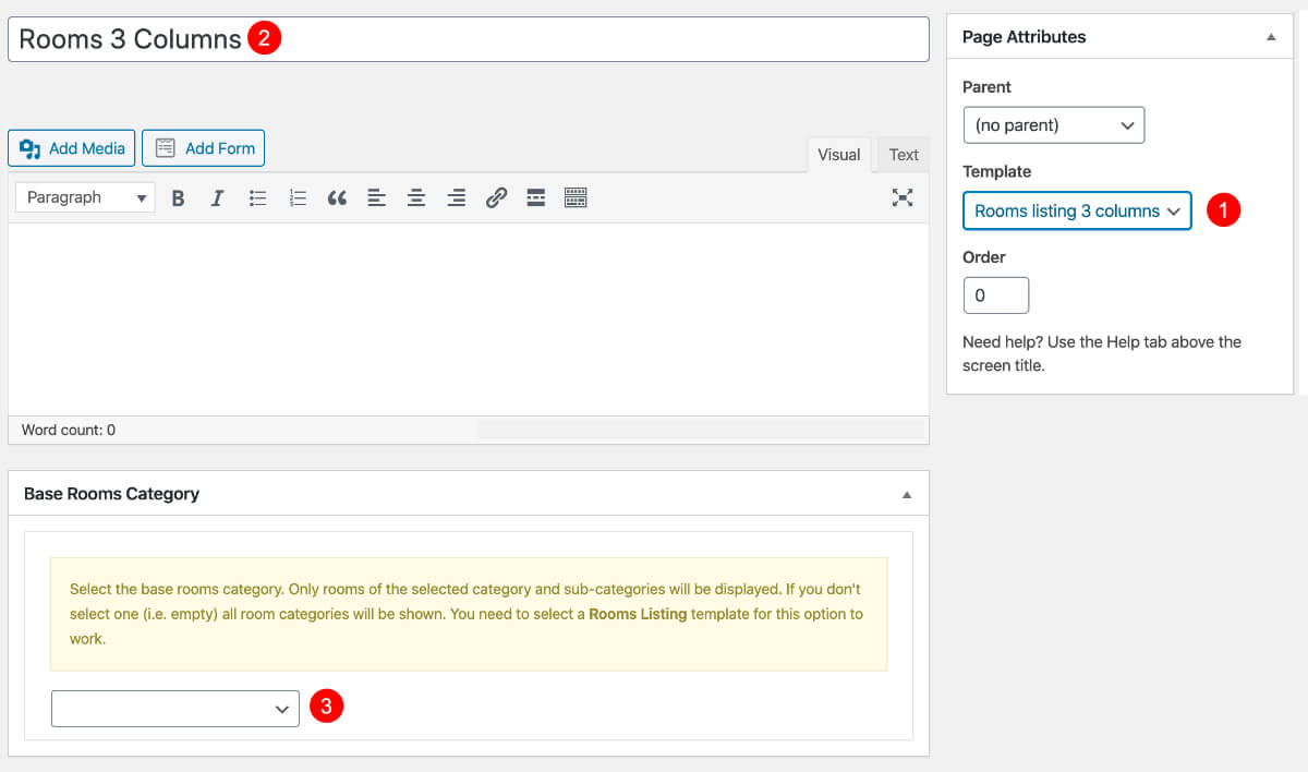
Creating a Services Listing Page
Create a new page like described here and then navigate to Content Area→Layout and under the Layout dropdown select the Services Listing option.
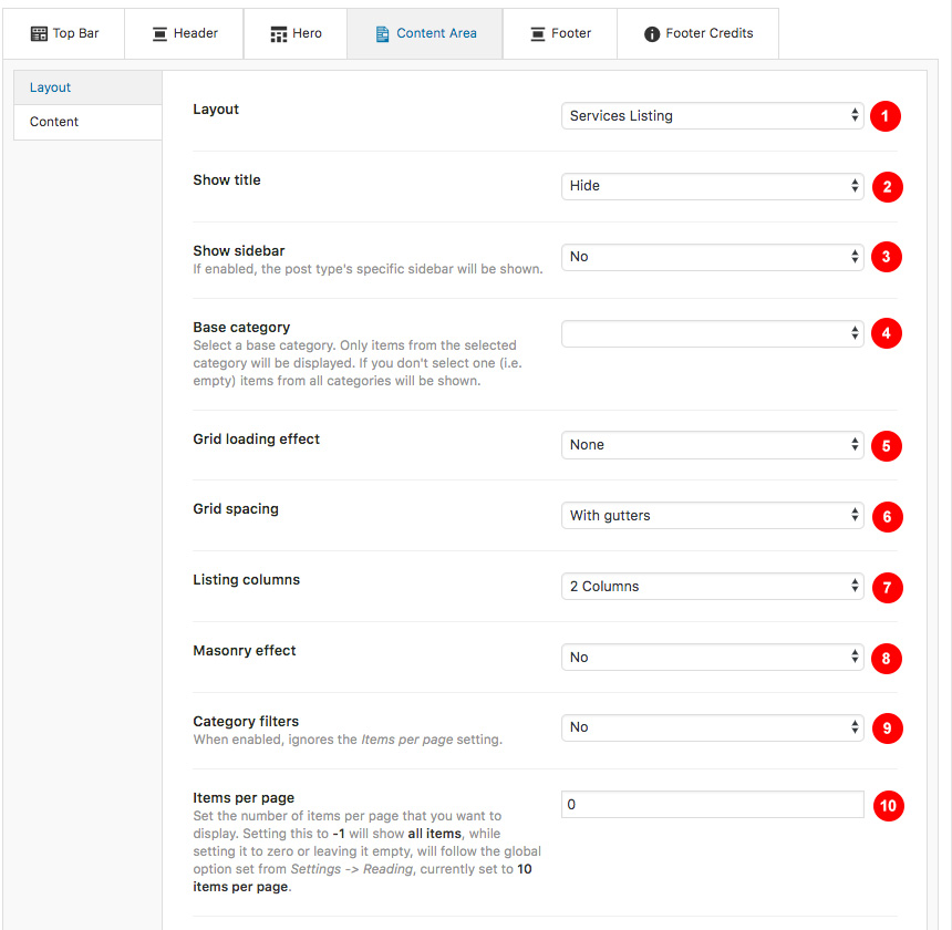
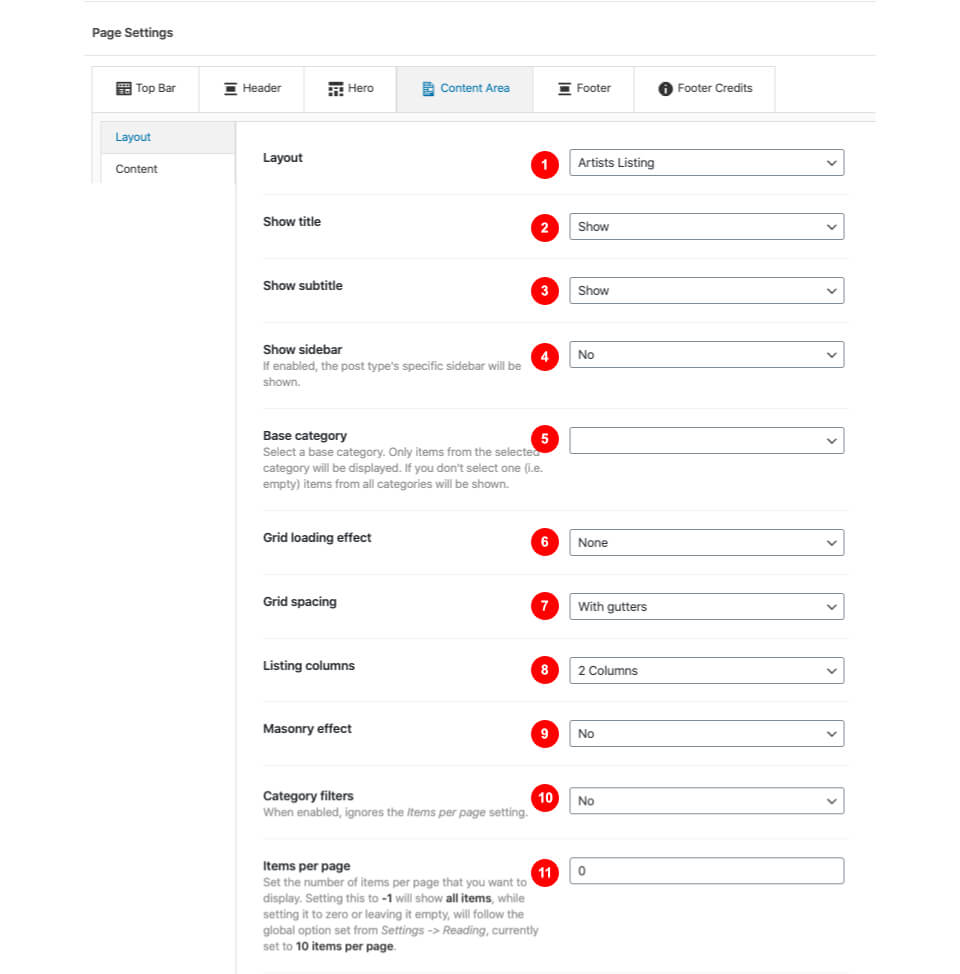
Here you can
- Select the page Layout
- Show or hide the page title
- Select a category that will be the base for your items. Leaving this blank will fetch all of them.
- Show or not the sidebar
- Change the grid loading effect
- Change the grid spacing
- Change the number of columns for your list
- Use a masonry effect for different image sizes.
- Use category filtering. This will display all categories as filter options and will also show all your listings
- Change the items per page,-1 will show them all, while not having anything here will default to the Settings→Reading Post to show option.
Adding a new Service
Adding a new Service is relatively easy. Navigate to Services→Add New and here you can
- Add a Service name
- Add some content or edit the service using Elementor
- Change your Service settings.
- Organize your Services via Categories (You can add a new category directly from this section or Categories→Add New). These categories will work as filter items for the Services – Filters page.
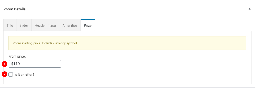
- Set a basic Featured image that will be used in your Services listings and Service taxonomy listings
While most of them are straight forward, we will have a look a the Service details which will help you customize each Service separately, altering the main Customizer settings to your needs.
Service settings consists of 6 main customization tabs. These are exactly the same options as Pages but with certain functionality to match the Services post type.
While most of these section are inherited from your Customizer settings we will focus on the Content Area. Here you can change the basic looks of your service(sidebar location, fullwidth content area etc).
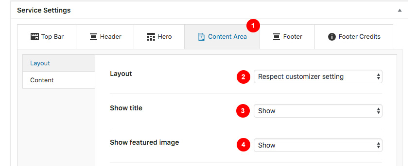
- Edit the settings of your main content area.
- Change the Layout of your service. Here you can change the sidebar location, or remove it.
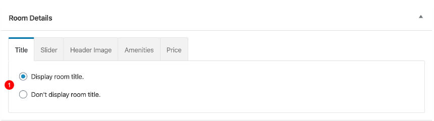
- Show / hide the featured image.
Single Service Style #1
This is a simple Service, created with Elementor, having no sidebars.
Single Service Style #2 and Single Service Style #3
This is a simple Service using the sidebar on the right and left, with content from the WordPress Editor
Creating a Case Studies Listing Page
First Create a new page as described here then navigate to Content Area→Layout and under the Layout dropdown select the Case Studies Listing option.
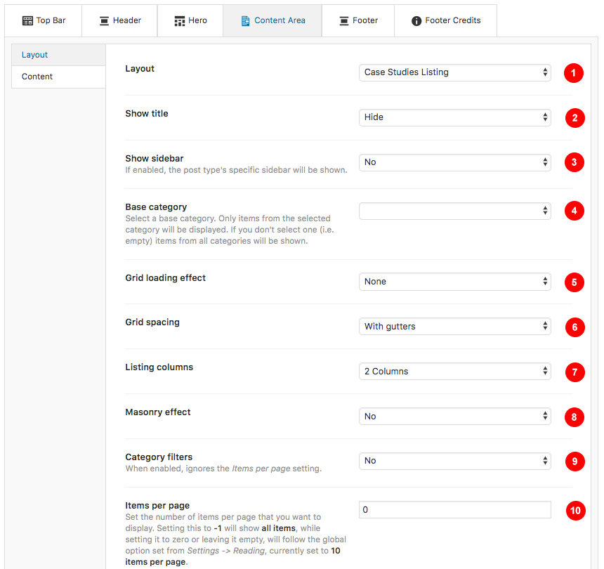
- Select the page Layout
- Show or hide the page title
- Select a category that will be the base for your items. Leaving this blank will fetch all of them.
- Show or not the sidebar
- Change the grid loading effect
- Change the grid spacing
- Change the number of columns for your list
- Use a masonry effect for different image sizes.
- Use category filtering. This will display all categories as filter options and will also show all your listings
- Change the items per page,-1 will show them all, while not having anything here will default to the Settings→Reading Post to show option.
Adding a new Case Study
Case Study
Case Study items are Custom post types you can add from Case Study→Add New. These items don’t have any taxonomy option though.
- Add your Case Study name
- Add some content / galleries / etc
- Change your Case Study settings.
- Set a basic Featured image
- Publish your Case Study.
Case Study settings consists of 6 main customization tabs. These are exactly the same options as Pages but with certain functionality to match the post type. These tabs have the same behaviour as the Page settings.
Replicating Case Study Style #2
While the Case Study Style #1 Demo can be replicated by adding some content from the WordPress editor, the style #2 features a Hero section. You can replicate the same section
So you will need to navigate to the Hero tab under the Case Study Settings and
- Select to show a Custom hero section
- Change its hero height
- Change the hero text alignment
Next you will need to set the hero content from the Content tab

- Add a Hero Title
- Add a Hero Subtitle
Finally, set in the Colors tab
- Your background image
- Overlay color (make sure you have a transparency set or else the background image will not appear).
Creating a Team Members Page
Create a new page as described here then navigate to Content Area→Layout and under the Layout dropdown select the Team Members Listing option.
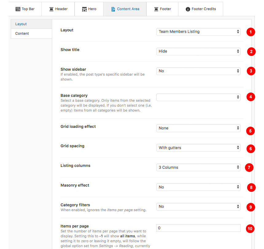
- Select the page Layout
- Show or hide the page title
- Select a category that will be the base for your items. Leaving this blank will fetch all of them.
- Show or not the sidebar
- Change the grid loading effect
- Change the grid spacing
- Change the number of columns for your list
- Use a masonry effect for different image sizes.
- Use category filtering. This will display all categories as filter options and will also show all your listings
- Change the items per page,-1 will show them all, while not having anything here will default to the Settings→Reading Post to show option.
Adding a new Team Member
Adding a new Team member is relatively easy. Navigate to Team Members→Add New and here you can
- Add a Team Member name
- Add some content or edit the service using Elementor
- Change your Team settings.
- Organize your Team via Categories (You can add a new category directly from this section or Categories→Add New). These categories will work as filter items for the Team – Filters page.
- Set a basic Featured image that will be used in your Services listings and Service taxonomy listings
While most of them are straight forward, we will have a look a the Team Member details which will help you customize each Team Member separately, altering the main Customizer settings to your needs.
Team Member settings consists of 6 main customization tabs. These are exactly the same options as Pages but with certain functionality to match the Team Members post type.
Creating a Careers Page
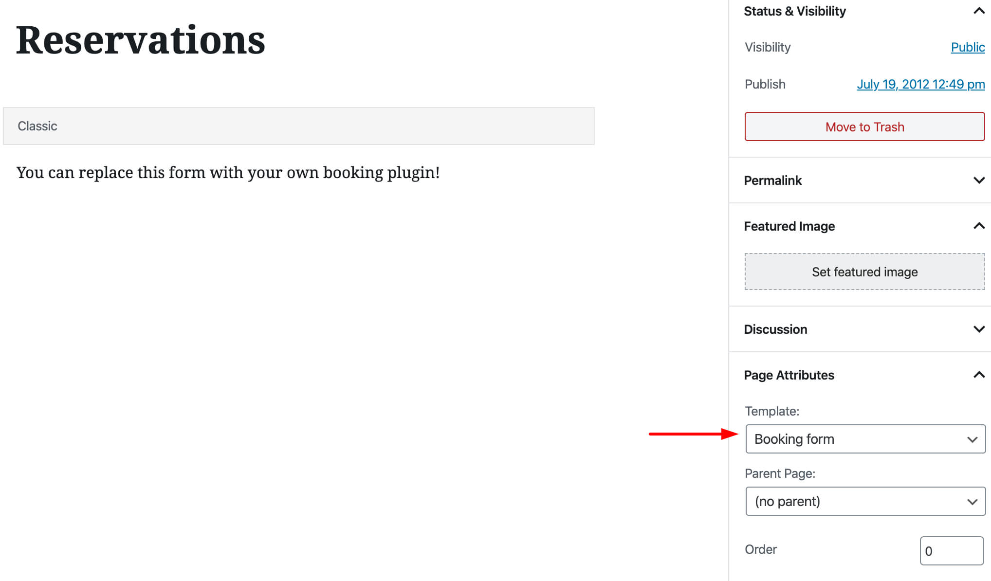
Create a new page as described here then navigate to Content Area→Layout and under the Layout dropdown select the Carrers Listing option. The page will by default display a table with all available listing while you can edit/add your content before it using Elementor or plain WordPress editor.
Adding a new Job Item
Adding a new Job is relatively easy. Navigate to Jobs→Add New and here you can
- Add a Job name
- Add some content or edit the Job using Elementor
- Change your Job settings.
- Organize your Jobs via Categories (You can add a new category directly from this section or Categories→Add New).
From the Job Tab under the Job Settings you can

- Add a Job Location
- Add a job Department
- Add a starting date
- Add a Salary
Creating an Event Listing Page
First Create a new page as described here then navigate to Content Area→Layout and under the Layout dropdown select the Event Listing option.

- Select the page Layout
- Show or hide the page title
- Select a category that will be the base for your items. Leaving this blank will fetch all of them.
- Show or not the sidebar
- Change the grid loading effect
- Change the grid spacing
- Change the number of columns for your list
- Use a masonry effect for different image sizes.
- Use category filtering. This will display all categories as filter options and will also show all your listings
- Change the items per page,-1 will show them all, while not having anything here will default to the Settings→Reading Post to show option.
Adding a new Event
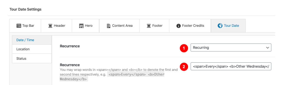
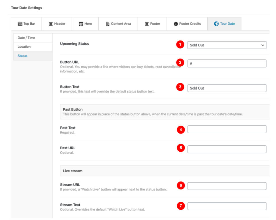
Creating single Events

- Select the event Date
- Add the event time
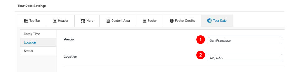
- Select the Location of your event
Creating a Full width page
To add new posts to your blog, go to Pages → Add new and navigate to Content Area→Layout and under the Layout dropdown select the Fullwidth or Fullwidth Narrow option.
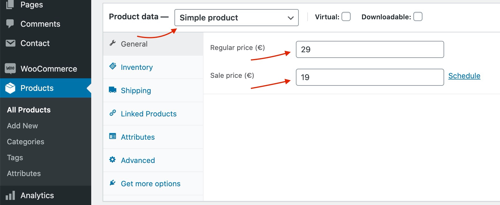
Adding Products
Earlier we saw how we can install WooCommerce. Let’s take a brief look at creating products. Start by going to Products > Add Product.

- First we need to fill in the product title,
- Add the product’s description,
- In the Product Data metabox you will fill all the required product info, such as price, inventory, tax and shipping information and more,
- Fill in a short product description
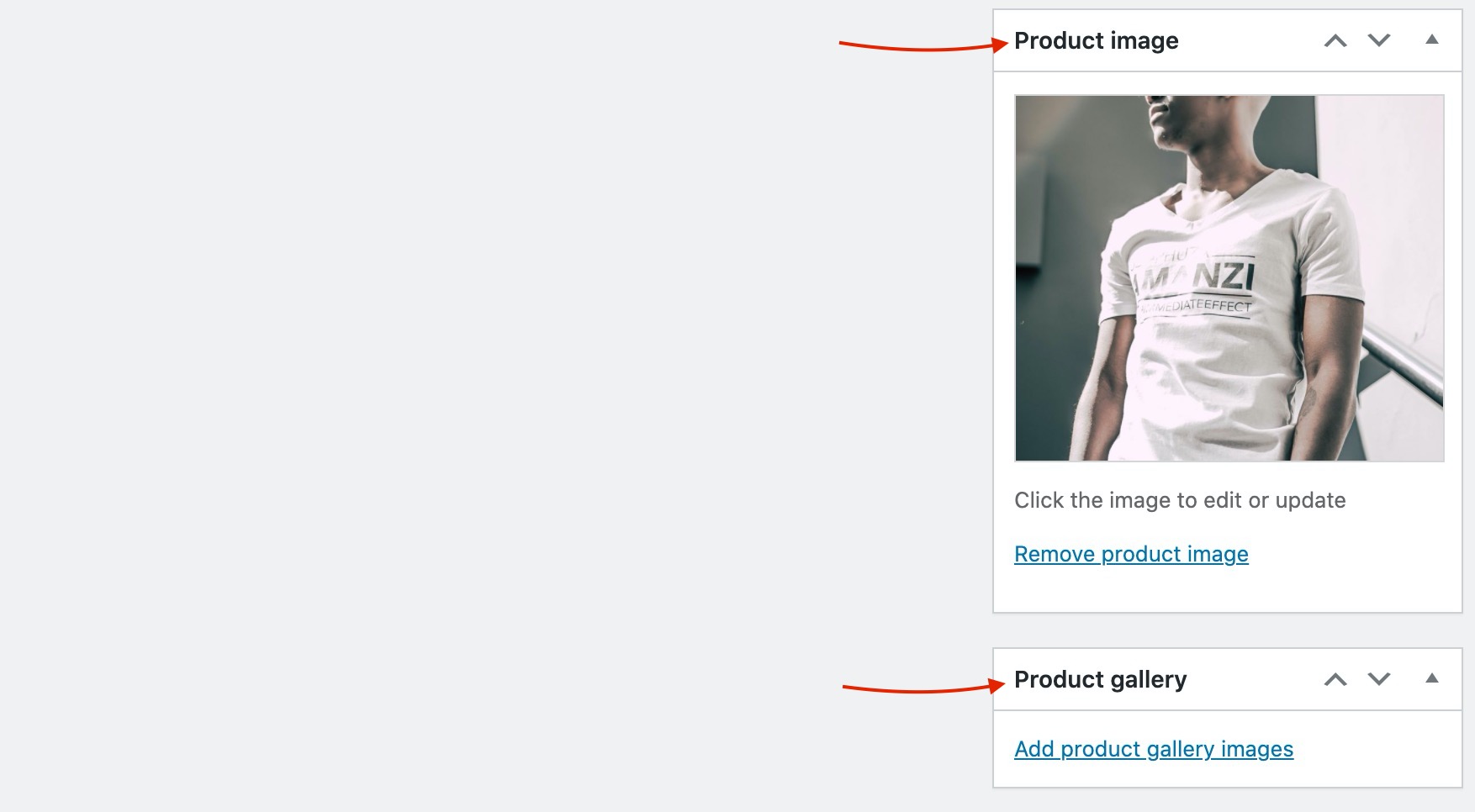
- Add product gallery images to upload additional photos for the product,
- Click Set Product Image to add the product’s featured image
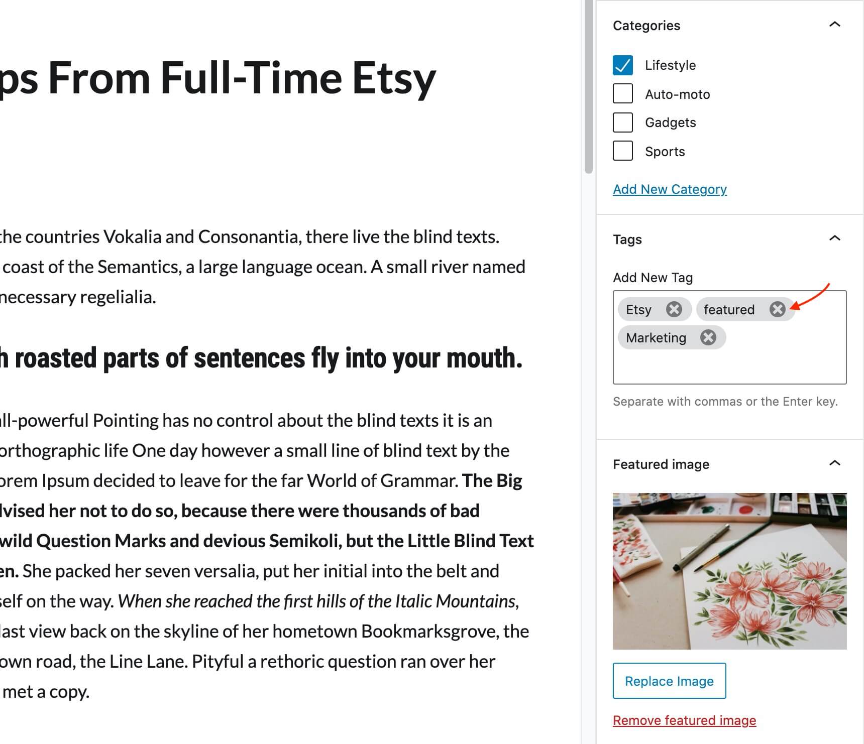
- Add Tags to your product to make filtering easier
- Add categories for your product
This is a brief overview of adding products to your site, the product post type is a complex one, if you haven’t worked with it before please consider reading the official documentation on how to add and manage products here.
Setup the shop page
Once you install and activate WooCommerce all the default pages will be created, including the shop listing page. To make sure this was properly configured go to WooCommerce > Settings > Products > Display and check if the Shop page is selected in the Shop Page drop down.
If the drop-down is empty, locate the Shop page and select it. If you can’t find a page named Shop, just go to Pages > Add New create one and then set it as your shop page. Add this page to your menu to give your visitors access to the product listing.
Creating Global Sections
Global Sections are small layout sections. Lets replicate the sections found in our demo.
Basic Global Layout: Call to action
Create a new Global Section from Global Section→Add New. Then create an Elementor section with any content of your preference. Then head over to Global Section Settings and
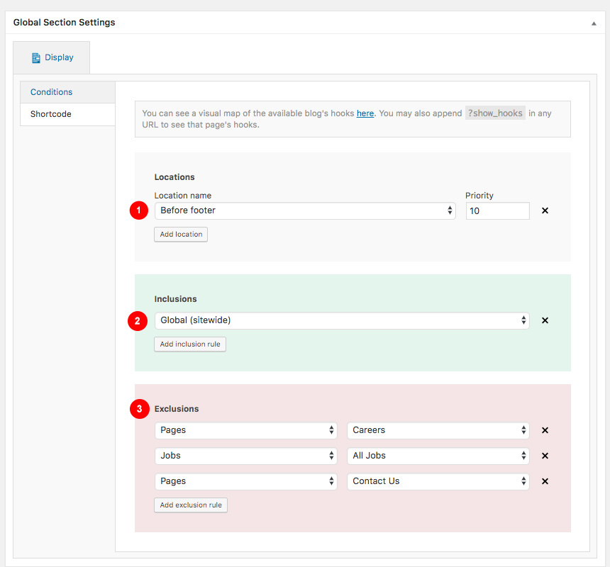
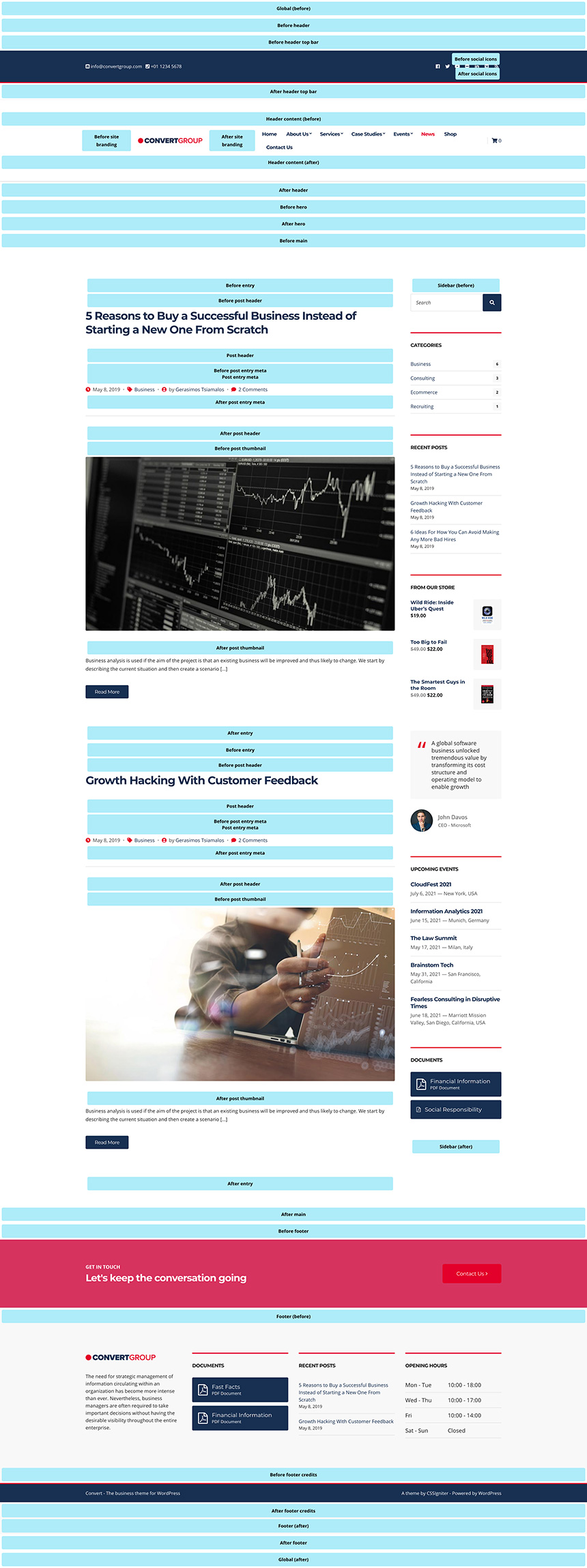
- Select the exact position your content will appear. We offer various places you can render your content. For a visual guide have a look here or add this ?show_hooks on your site URL when logged in.
- Select where you want (pages) this section to appear
- Select some pages you need to exclude it from rendering
You can get a shortcode of this section
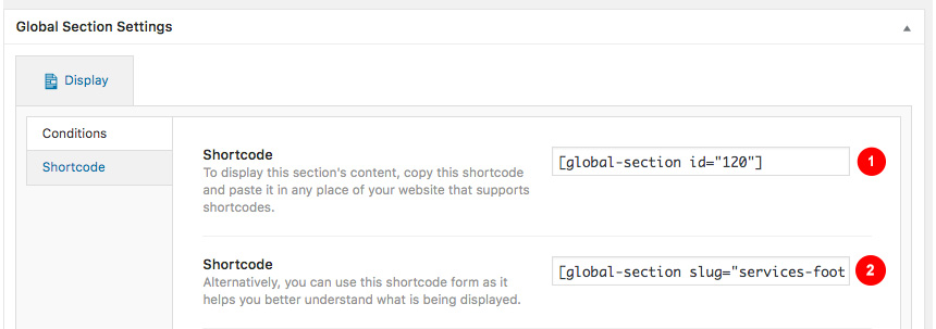
- Using the ID
- Using the slug
These shortcodes can placed wherever you want. Even inside a HTML simple widget.
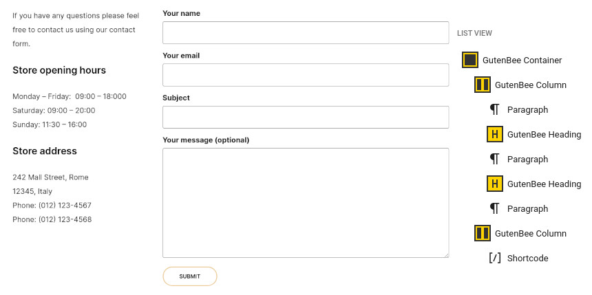
For this example we will use WPForms and create a simple layout with a shortcode from our form like shown below
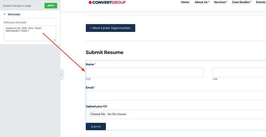
Then we can create a simple inclusion/exclusion scenario in order for this section to appear.
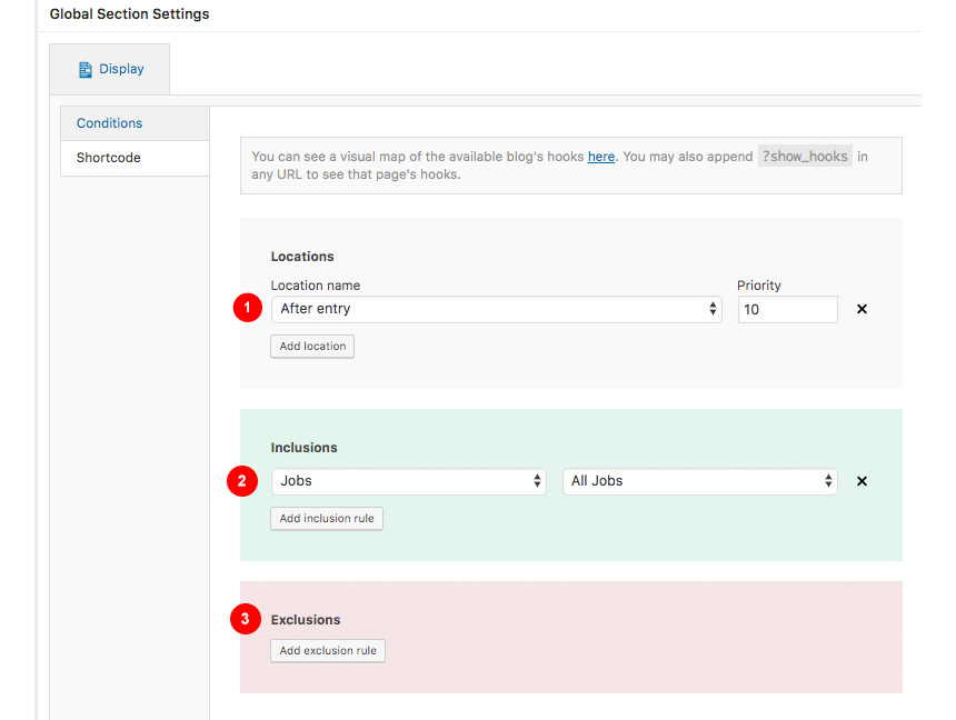
- Select After Entry to make your section render after each post type
- Select where you want it to appear. Here we need it to appear after every job
- No need to add an exclusions list
Adding a new page
To add new posts to your blog, go to Pages > Add new and proceed to:
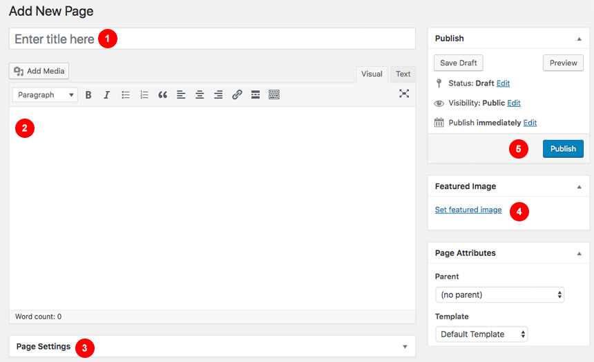
- Add a title to your page
- Enter the content in the editor
- Change the page settings
- Upload a featured image by clicking “Set featured image” on the Featured Image panel
- once finished clicking the Publish button to publish the post
Page Settings
This is the main settings panel which you can use to alter your page functionality and looks. Here you can alter your page to behave as a listing page for all custom post types or a listing page for children pages when the one editing is a parent to them. Lets check all Tabs one by one to identify their functionality.
- Here you can bypass all Top Bar Customizers settings
- Differentiate a page header from the default one you created in Customizer
- Change the Hero content and styling for specific page
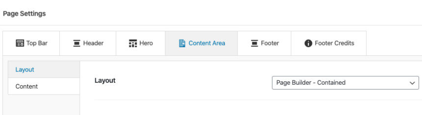
- Change the Page type and enchant its layout functionality from Content Area
- Change the Footer section properties for a certain page
- Change the Footer Credits section properties for a certain page
While All tabs are mimicking the Customizer behaviour but for the page you are creating, under the Content Area tabs we have a set of special options for each page.
Page→Top Bar
This will Control the top bar layour of that particular page. If settings stay intact, customizer ones will be imported
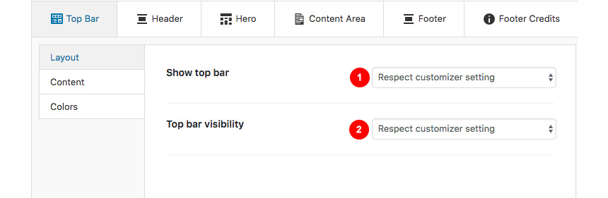
- Show or not the Top Bar for that page
- Change the Top bar visibility
In the same section you can control the top bar content, again for this particular page.
- Add content (shortcodes or HTML).
- Add content on the left top bar area.
- Add content on the right top bar area.
In the next tab you can change the Top bar colors for that page
- Change the background color.
- Change the border color.
- Change the text color.
- change the link color.
- change the hover color of the link.
Page→Header
Here you can control the Header Layout
- Change the Header type of the page
- Change the Header padding of the page
- Change the menu layout for that page
- Change the menu padding
While, you can also add content before or next to the main menu, for that page only.
Also you can
- Add Content like text or shortcodes before the header
- Add Shortcodes or HTML in the main header area
- Add a main menu
- Add a Main menu that will appear on the right side when a Menu split is selected.
Finally, you can change all header Colors like
- All Header area colors
- All Logo colors
- All Menu colors
- All Sub menu colors
Page→Hero
Here you can control the Hero layout of the page. Leaving these settings untouched will automatically inherit all your Customizer settings under Customize→Hero

- Choose to show the hero or not
- Change the Hero height
- Change the horizontal alignment of your text
- change the vertical alignment of your text
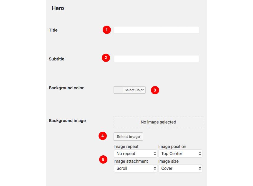
Next, you can change the Hero Content, like:
- Add a shortcode before the hero section
- Add a title
- Add a subtitle
- Add a callout button text
- Add a URL for your button
Along, you can change the colors or the background of the Hero section.
- Add a background color
- Select an image and change its position settings
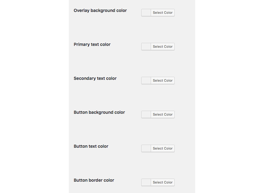
- Add an overlay color for your background image
- Select the title text color
- Select the subtitle text color
- Select the button background color
Finally you can set the Hero typography settings
- Change the title text font and font style.
- Select the HTML tag for this element.
- Select a secondary text font.
- Select a secondary text HTML tag.
Page→Content Area
Here you can control the main content area Layout
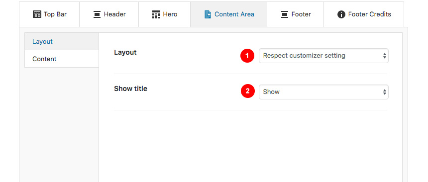
- Change the Page default layout
- Show its title or not
Also you can
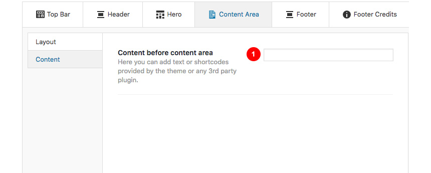
- Set a shortcode to show before your main page content
Page→Footer
This is the main layout section for the page footer
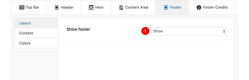
You can select whether you can
- Show or hide the footer
While you can also add some content before the main page footer area

- Add some text or shortcode before the footer.

Also you can change all page footer colors, for that specific page
- Change the Footer background
- Add a Footer image and select its settings
- Change the Footer Widgets colors
Page→Footer Credits
You can change the Layout of the page Footer credits
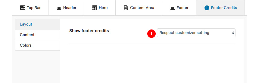
- Showing or not the credits area
Also you can control the content before the page Footer Credits section
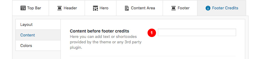
- Add a shortcode or text there
Finally you can change the Footer Credits Color for this page
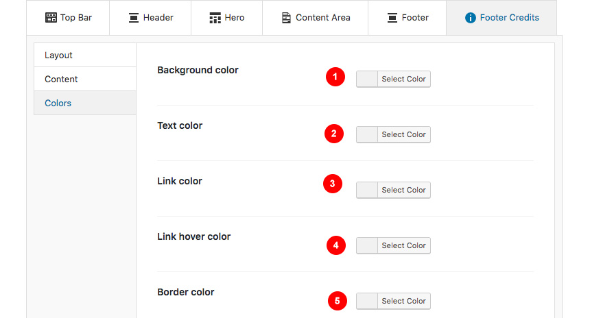
- Change the background color of your Credits footer section for a specific page
- Change the text color for the Credits footer section for a specific page
- Change the like color for the Credits footer section for a specific page
- Change the link hover color for the Credits footer section for a specific page
- Change the border color for the Credits footer section for a specific page
Creating a page for your posts
To setup your blog page you can go to Pages → Add New and create a page named Blog. Then navigate to Settings → Reading and set that page as your posts page.
Now you can add that page to your menu to give your visitors easy access to all your posts.
In this page you can control via its Page Settings section how the hero behaves in the blog page but it will also affect the hero section of the following pages: Categories, tags, author archives & date archives. If you don’t change anything in this page, Customizer settings will be respected.
You can change in each category your Hero background image and title to your preference, from Posts→Categories and Posts→Tags under the Hero section. If no Hero image is selected, the category/tag will default to the Blog page values, and if no blog page settings exist then it will inherit the Customizer→Hero values.
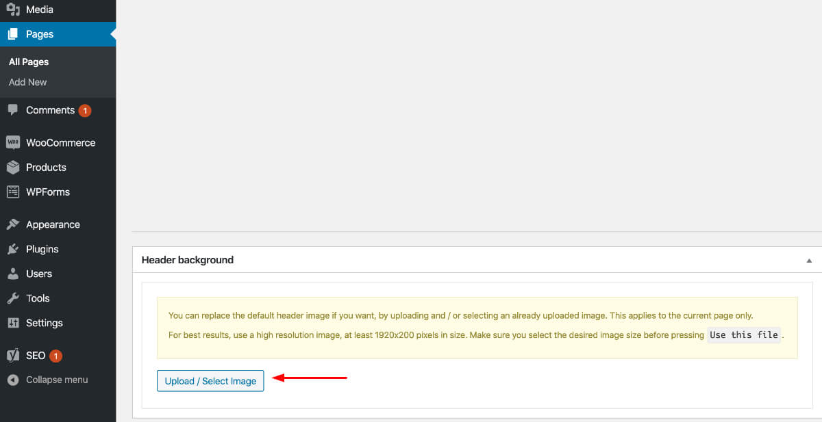
Lets have a quick look at how to change the Hero background for every category. First navigate to Posts→Categories and add a new or edit the category you need to change. Then scroll down to this screen:
- You can set your taxonomy title
- Change your taxonomy subtitle
- Select a background color
- Upload a background image for your hero
- Change the background image settings
Following this section there is a color selection for every aspect of the taxonomy hero
while scrolling more you will get this
- You can change the primary text font (title)
- The primary font HTML tag
- The secondary text font
- The secondary font HTML tag
These settings are the same for Tag archives also.
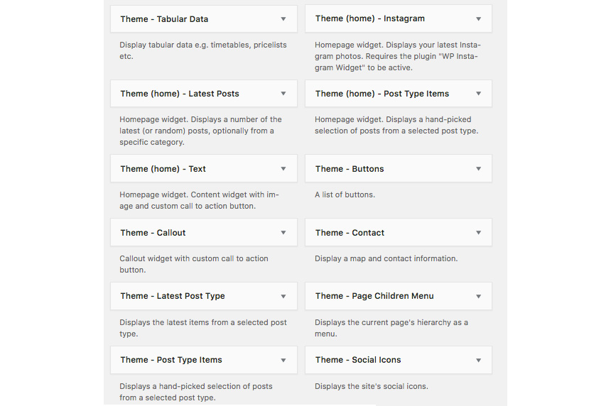
We have handcrafted some custom widgets to help you better display your content. You will find them under Appearance→Customize →Widgets or Appearance→Widgets
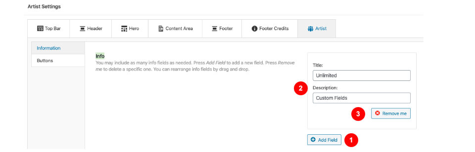
Using this widget you can create a contact box including a title a map and various complementary elements with icons that will help you add more information like telephone etc about your business.

- Add a title for your Contact widget.
- Add a map code (iframe).
- Add a contact title
- Create new complementary elements.
- Add an icon code (from fontawesome.io) and some text along.
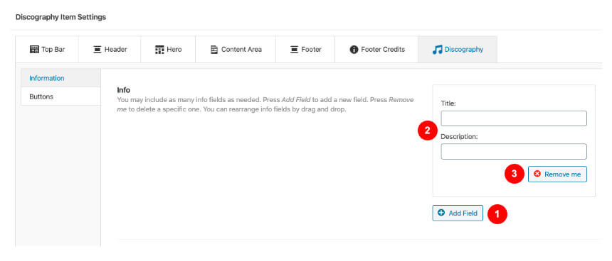
This widget allows you to create a small Schedule table with extra contextual information.
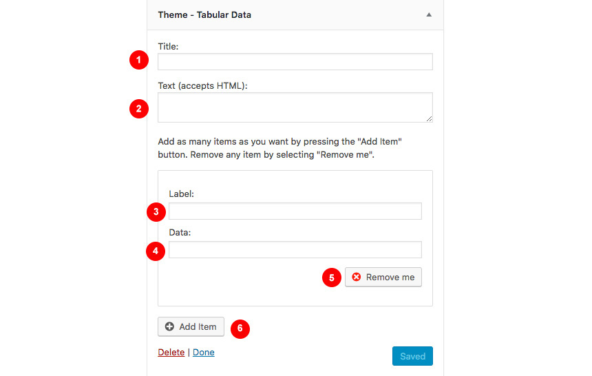
- Add a title for your widget
- Add some complementary text. You can use HTML tags also if you wish.
- Add a new item
- Add your item Label.
- Add the item value
- Remove the item
Theme(home)-Instagram
This will allow you to display your Instagram Account in your Front Page or Pre-Footer sidebar. The WP Instagram Widget must be installed and activated in order this Widget to appear
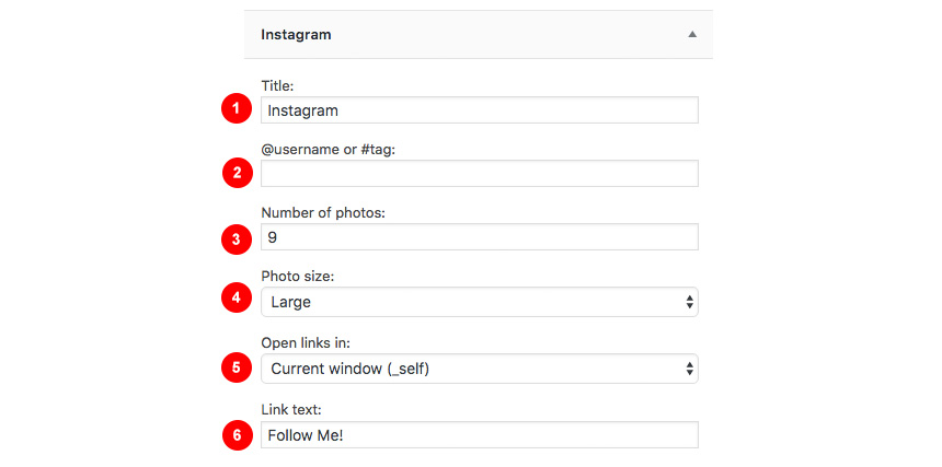
- Add a title for your Instagram Widget.
- Add your Instagram Account.
- Add a number of photos you wish to display.
- Select the Instagram Photo size.
- Select whether you need your images to open in the current window or open in a new tab.
- Change the link text.
Theme (home)-Latest Posts
This widget is built to help you display your latest posts in your home widget area.

- Add a title.
- Add a subtitle.
- Select the category your need to display the latests posts from.
- Show random posts instead.
- Change the post number.
- Adjust the number of columns for your content.
- Show carousel like widget with your posts.
Theme-Callout
This is a simple Callout widget, that will allow you to add a text with a button in any sidebar you want.
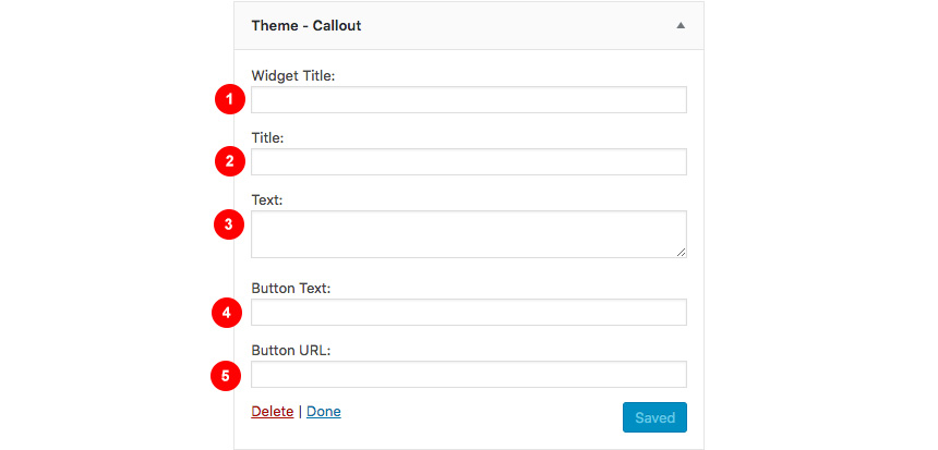
- Add a widget title
- Add a Title for your Callout widget.
- Add a Subtitle for your Callout widget.
- Select a Button text
- Select a button URL.
This widget will help you render a list of buttons.

- Select the Widget Title.
- Add a new button.
- Add the button title.
- Add a button subtitle.
- Add a button icon.
- Add a button link.
- Remove the button.
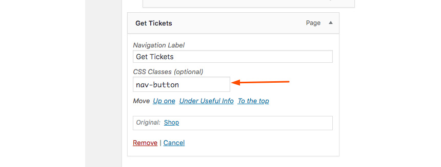
When you have a parent page, in any of its children that this widget is present it will create a menu linking to other children of the same parent page.
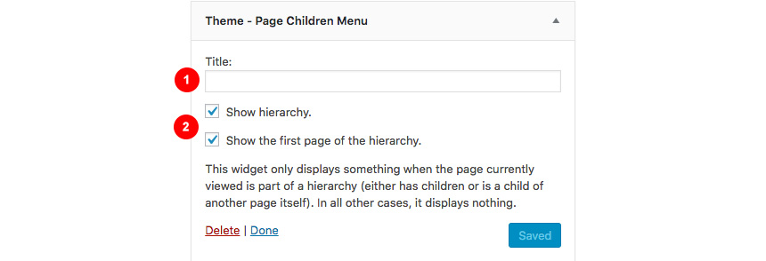
- Widget Title
- Hierarchy settings.
Theme-Social Icons
This widget displays your site’s social icons. In order to set them up, you need to visit Appearance→ Customize → Social → Content and provide the appropriate URLs where desired.
Theme(home)-Post Type Items
This widget is built to help you display any post you wish in your Homepage Widget area.
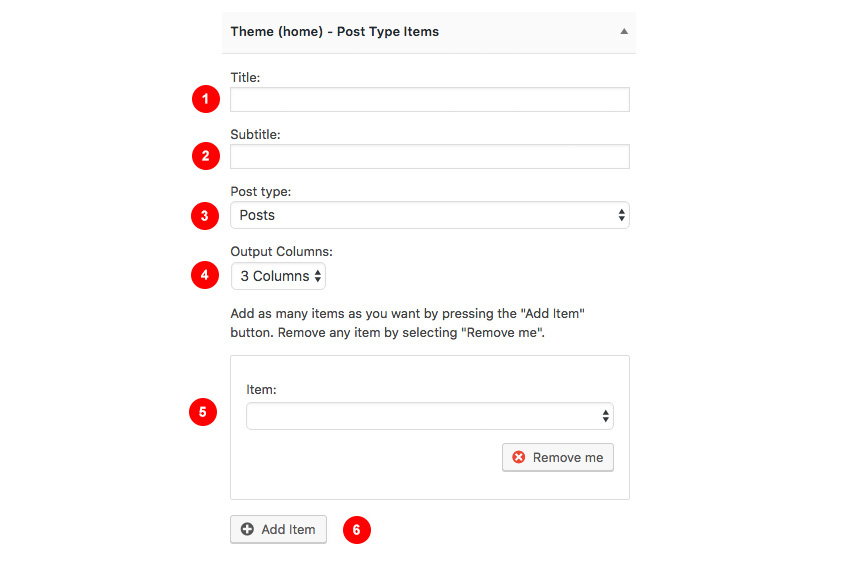
- Add a title.
- Add a subtitle
- Select the post type.
- Select the output columns.
- Add the Item you wish to output.
- Select the Item from the drop-down menu.
Theme-Callout
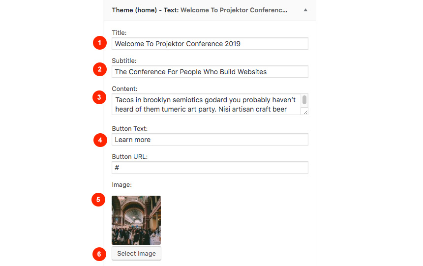
This will allow you to display a Hero Callout specially designed for your frontpage sidebar.

- Add a title for your widget.
- Add the main title.
- Add some text
- Select your button text
- Select a URL for you button
Shortcodes
You can use these shortcodes in any HTML/shortcode reserved area:
[site-socials]
This shortcode will display the site’s social icons. You can edit these icons from Customize→Socials→Content
[site-search]
Displays a search icon which, when clicked, drops down a searchform from the top of the page.
[site-title]
Displays the site title.
[site-tagline]
Displays the site tagline.
[custom-menu name="Menu name"]
Displays the *top level items* of a menu. Inside the name=”” parameter there should be the *name* of a user-created menu, not its slug. e.g. [custom-menu name=”Main Menu”]
[minicart-button]
Displays a cart button which, when clicked, expands into a minicart. Please note, this shortcode is only available when the WooCommerce plugin is activated.
[menu-items]
Displays menu items. Without any parameters prints all menu items (including subcategories etc).
Convert comes with custom Elementor widgets which have the same functionality as its widgets, making landing pages easier to create.
Convert Element
This is your Swiss knife when using Elementor plugin. With Convert Element you can render all your content from all custom post types and their taxonomies(if any) as well as manually get any part of your content using a search keyword. Let’s have a quick look
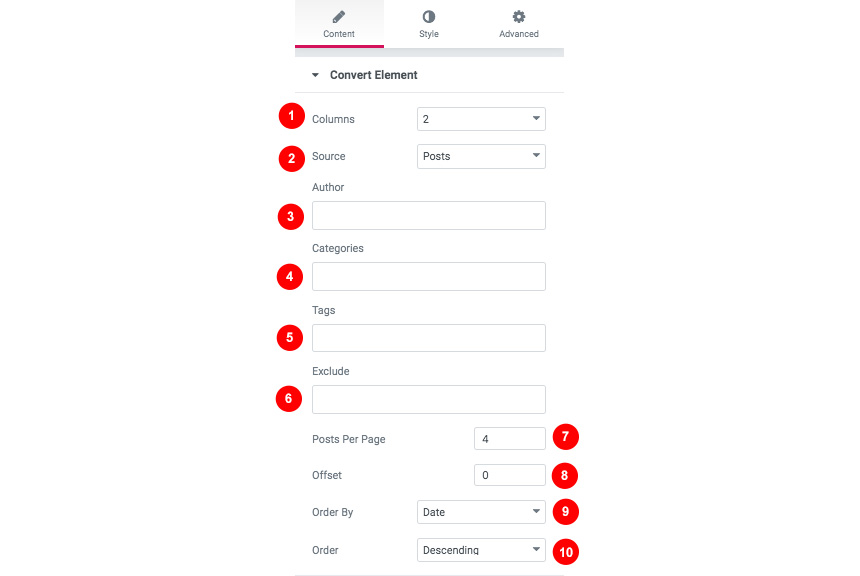
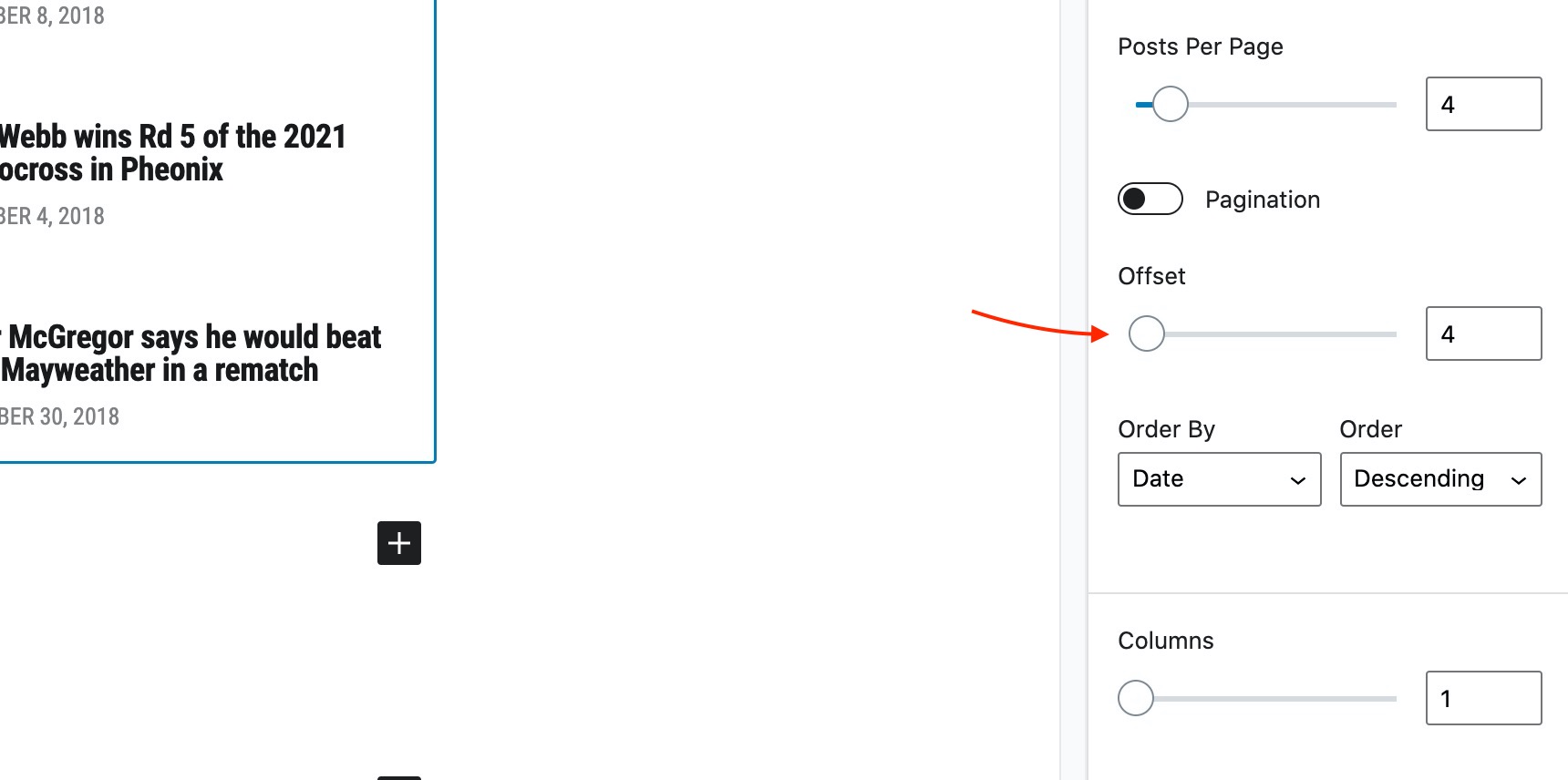
- Select in how many columns your content will render
- Select the main source type for your content. Notice, you can select a manual mode, where you will get the source based on you search criteria
- Filter your source content by author.
- Select a category. If blank all categories will be shown.
- Filter by tags.
- Exclude posts you dont want to show
- Select how many posts you want to show
- Select the offset of the rendered posts (2 for example, will leave the first two).
- Select the order by a value (Date, etc)
- Select the order of your results (descending etc)
Hooks
Hooks will allow you to add extra functionality at various areas inside the theme. For example, you might need to add a simple ad banner or text after each post, or after your header! Hooks will help you achieve this.
Check this WordPress Hooks API guide to make yourself familiar with Hooks (actions/filters etc).
Here are all theme hooks
Examples if you dont want to use Global Layout post type
The Convert_head_mast_before hook is executed right before the Site Header.
add_action( 'Convert_head_mast_before', 'Convert_custom_script_before_header' );

function Convert_custom_script_before_header() {
 // Your PHP goes here
}
or use Convert_after_header add some HTML after your header and before the hero/slider area
add_action( 'Convert_after_header', 'Convert_custom_html_after_header' );
function Convert_custom_html_after_header() { ?>
<!-- Your HTML goes here -->
<?php }
You can either add these snippets in your child theme functions.php file or using a third party plugin
Next Steps
Still have questions or problems setting up your CSSIgniter Theme? We will be happy to help you out! Please visit our support Hub


