Documentation for GutenBee
- Installation
- Enabling your Blocks
- Blocks one by one
- Accordion Block
- Banner Block
- Buttons Block
- Container Block
- Countdown Block
- Countup Block
- Divider Block
- Food Menu Block
- Google Maps Block
- Heading Block
- Icon Block
- Icon Box Block
- Icon List Block
- Image Block
- Image Box Block
- Image Comparison Block
- Image Gallery Block
- Paragraph Block
- Post Types Block
- Progress Bar Block
- Reviews Block
- Slideshow Block
- Spacer Block
- Tabs Block
- Testimonial Block
- Video Block
- Video Embed Block
- Common Options
- Additional Help
GutenBee is a collection of elegant WordPress blocks enhancing your editing experience in the Gutenberg editor and vastly extending the potential of the new editor experience.
Installation
To install the plugin simply navigate to Plugins → Add New in your WordPress dashboard and search for Gutenbee!
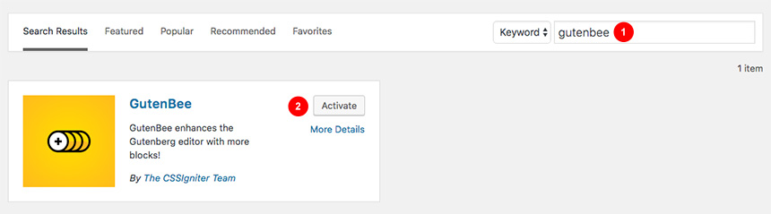
Next, click the Install Now button and wait for the plugin to be installed. Once the plugin is installed you can click the Activate button.
That’s it. The plugin is installed and activated.
Enabling your Blocks
Navigate to Settings→GutenBee Settings and enable or disable your new custom blocks. By default, all blocks are enabled and work as expected except for the Google Maps Block, which will need first a valid API key. You learn how to obtain an API key by following the guide here.
Blocks one by one
After Installing the plugin, you will notice a new tab that appeared in your block collection that includes all active GutenBee blocks.
These new tools will help you shape your content and generate complex scenarios using the new WordPress Editor. Let’s have a look at each block.
Accordion Block
With this block you can create easily an Accordion structure, by directly adding your content editing the Title, Content and change several settings from the block’s options. Let’s take a look at the settings.
Accordion Settings

Under the Accordion Settings tab you can set up how the Accordion will work. There are three available options:
- From the number of tabs slider you can select how many tabs the accordion will have.
- If the collapse others on click switch is on clicking to open one tab will close/collapse the currently open one.
- You can have one tab be open on page load by selecting it and toggling the start current tab open switch. This is a per tab option and you can have more than one tabs set to be open by default.
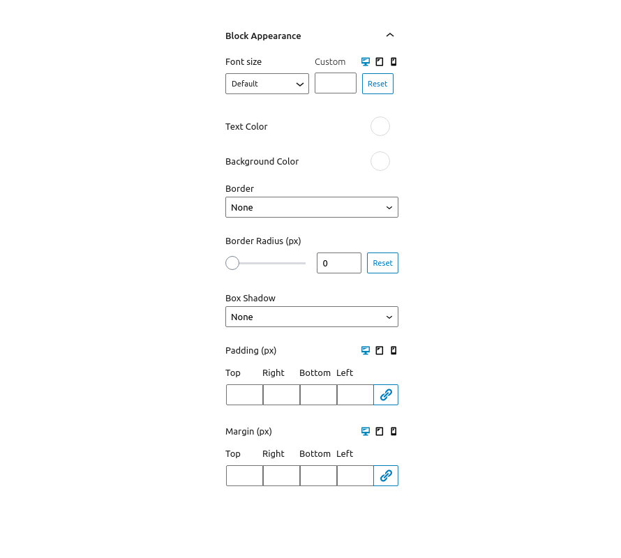
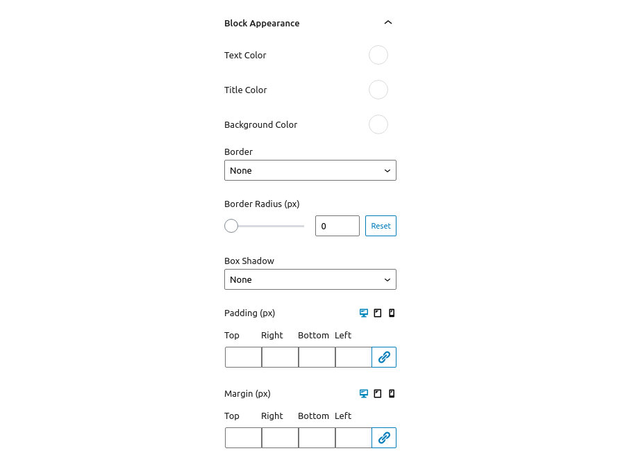
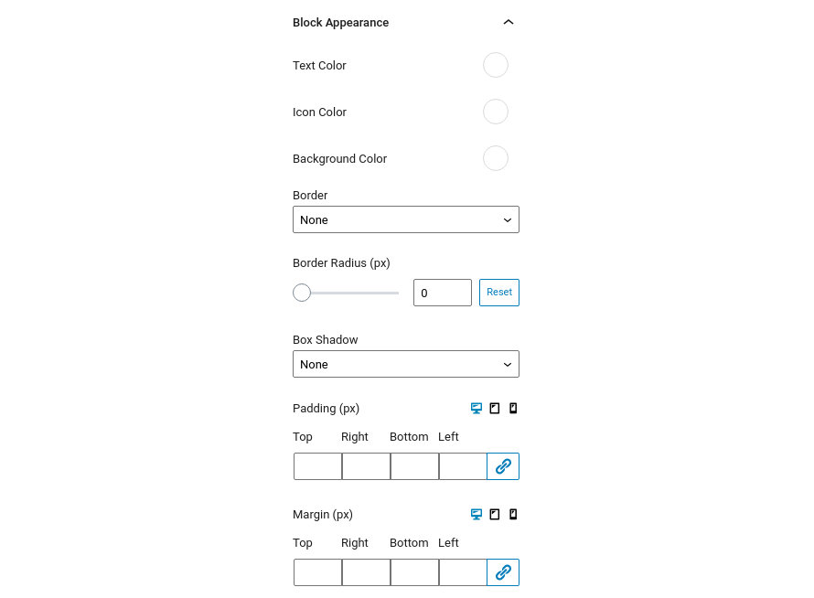
Block Appearance
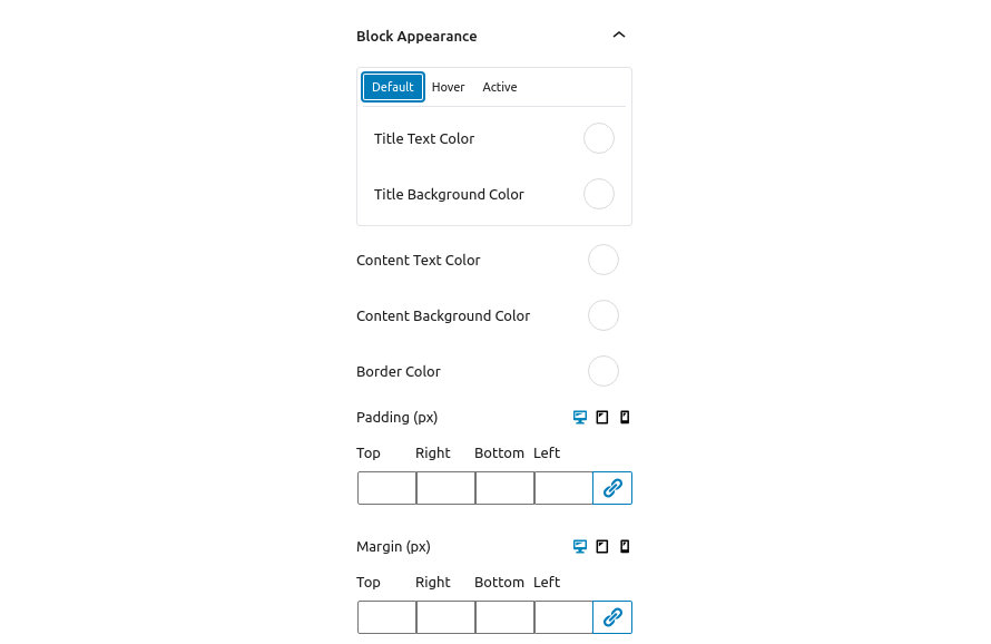
Under Block Appearance you can customize the look of the block. The available options are:
- Title Text Color: This option controls the color of the tab title’s text, for Default, Hover and Active State.
- Title Background Color: This option controls the color of the tab title’s background, for Default, Hover and Active State.
- Content Text Color: This option controls the color of the content text.
- Content Background Color: This option controls the background color of the content area.
- Border Color: This option modifies the color of the block’s borders.
- Padding: With this option you can control the padding on each side of the block individually or all at once.
- Margin: With this option you can control the margin on each side of the block individually or all at once.
Notice that the Padding and Margin options have three icons next to their label. These are the Desktop, Tablet and Mobile icons. By clicking each icon you can separately modify the values of padding/margin for each device.
Banner Block
Buttons Block
The Buttons block consists of the Button Group block which groups multiple buttons and offers options for the general appearance of the group and the Button block which controls the functionality and appearance of the individual button.
Let’s take a look at the Button Group first.
Button Group Settings

Here you can control the alignment of the entire button group and choose to display your buttons aligned to the left, right or center.
Notice that the Button Alignment has three icons next to its label. These are the Desktop, Tablet and Mobile icons. By clicking each icon you can separately modify the button group alignment for each device.
Block Appearance
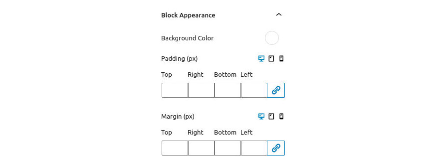
Under Block Appearance you can customize the look of the block. The available options are:
- Background Color: This option controls the background color of the button group.
- Padding: With this option you can control the padding on each side of the block
- Background Color: This option controls the background color of the button group.
- Padding: With this option you can individually control the padding on each side of the block.
- Margin: With this option you can control the margin on each side of the block individually or all at once..
Notice that the Padding and Margin options have three icons next to their label. These are the Desktop, Tablet and Mobile icons. By clicking each icon you can separately modify the values of padding/margin for each device.
Button Settings
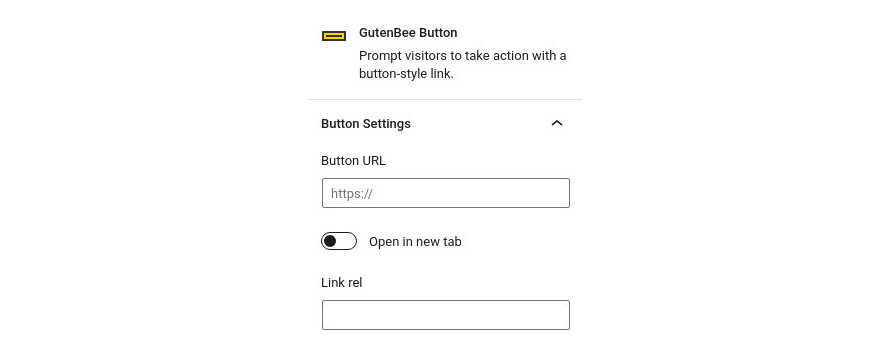
Here you can set the button’s URL, select if you wish for it to open in a new tab and set the relation between the current and the linked document via the rel attribute. If you wish to add more than one attributes separate them with a space.
Block Appearance
Under the block appearance tab you can control how each button looks. Let’s take a look at the options.
- Font Size: This option allows you to set the font size either via a drop down of preset values or by setting an exact pixel value in the input.
- Text Color: This option allows you to set the color for the button’s text.
- Background Color: This option controls the button’s background color.
- Border: This option allows you to select the border style via the drop down and then select the border color and width.
- Border Radius: This option allows you to round the button’s corners.
- Box Shadow: This option allows you to apply an inset/outset box shadow, its color, spread, blur radius and offset.
- Padding: With this option you can control the padding on each side of the block individually or all at once.
- Margin: With this option you can control the margin on each side of the block individually or all at once.
Notice that the Font Size, Padding and Margin options have three icons next to their label. These are the Desktop, Tablet and Mobile icons. By clicking each icon you can separately modify the control’s values for each device.
Predefined Templates

Under the Predefined Templates tab you can choose from pre-built button sizes and button styles for easier button creation. Available button sizes are extra small, small, medium and large. Available button styles are normal and outline.
Container Block
Countdown Block
This block will allow you to create an advanced countdown element using the date and time you want as an ending point.
- Here you can change the ending date and time.
- Change which elements you want to display or not.
- Select the font style and size as well as the padding and margin of the block.
- Change the text color.
- Change the background color.
- Add a custom CSS class to style your block.
Date & Time Tab
In detail in this tab you will find:
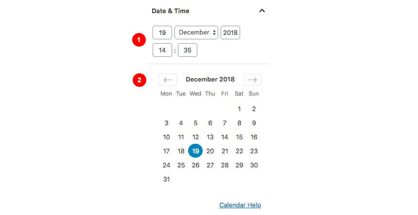
- Select the date and time the counter will finish.
- Advanced Calendar to easily find your date.
Settings Tab
Also, you can change which parts you need to hide or show each time.

- Show/Hide Days.
- Show/Hide Hours.
- Show/Hide Minutes.
- Show/Hide Seconds.
- Show/Hide Labels.
Block Appearance
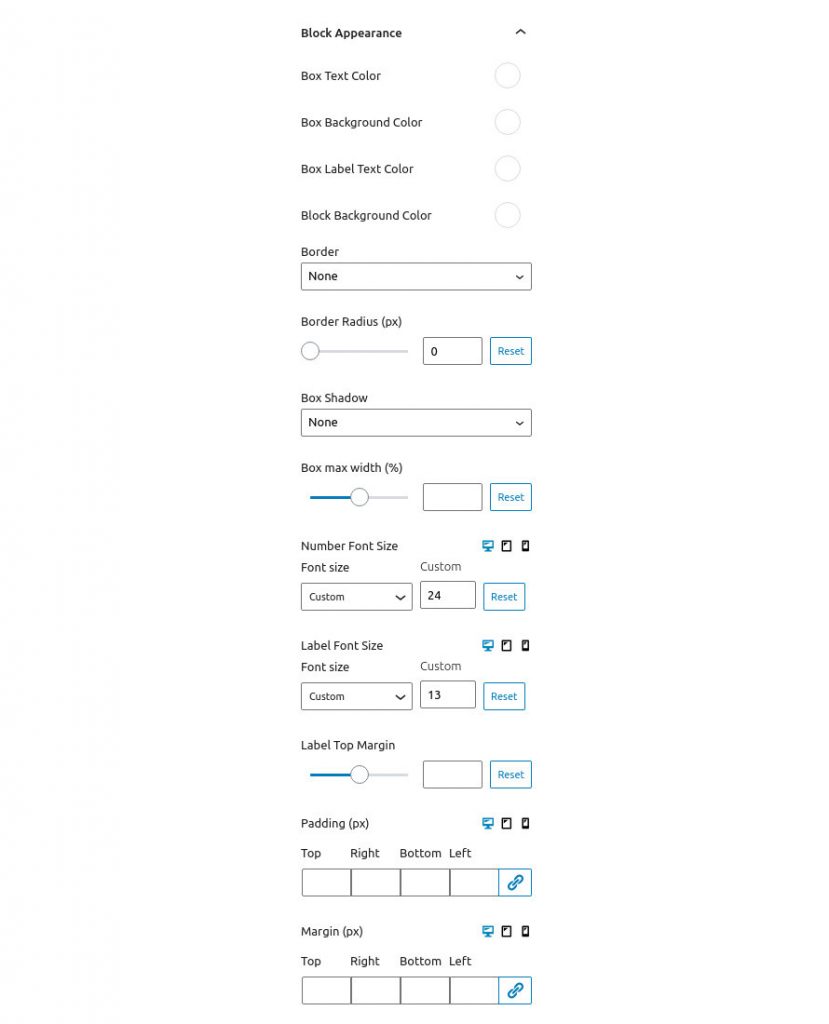
Under the block appearance tab you can control how the block looks. Let’s take a look a the options.
- Box Text Color: This option allows you to set the color of the count down text.
- Box Background Color: Controls the color of the box’s background.
- Box Label Text Color: Changes the color of the labels.
- Block Background Color: Controls the background of the entire block.
- Border: This option allows you to select the border style via the drop down and then select the border color and width.
- Border Radius: This option allows you to round the box’s corners.
- Box Shadow: This option allows you to apply an inset/outset box shadow, its color, spread, blur radius and offset.
- Box Max Width: Allows you to set a maximum width for the boxes (relative to their container).
- Number Font Size: Set the font size for the numbers either via a drop down of preset values or by setting an exact pixel value in the input.
- Label Font Size: Set the font size for the labels either via a drop down of preset values or by setting an exact pixel value in the input.
- Label Top Margin: Control the spacing between the numbers and the text below.
- Padding: With this option you can control the padding on each side of the block individually or all at once.
- Margin: With this option you can control the margin on each side of the block individually or all at once.
Notice that the Font Sizes, Padding and Margin options have three icons next to their label. These are the Desktop, Tablet and Mobile icons. By clicking each icon you can separately modify the control’s values for each device.
Countup Block
This block will allow to you create a count up element from a number to an ending one. You can have extra labels (prefix and suffix) before and after the counter.
Block Settings
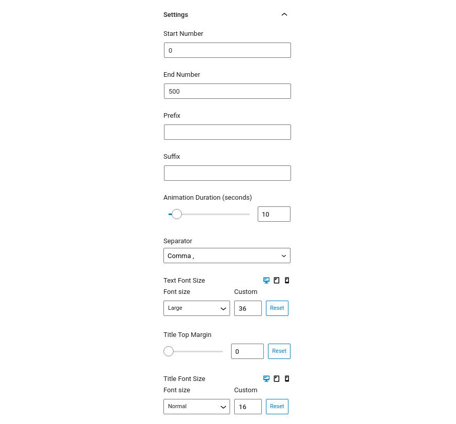
- Start Number: Input the number from which you want to start your count up from.
- End Number: When this number is reached the count up ends.
- Prefix: Any input here will appear to the left of the number in the count up.
- Suffix: Any input here will appear to the right of the number in the count up.
- Animation Duration: The time it takes for the count up to reach the end number.
- Separator: This is the thousands separator, can be comma, dot, or space.
- Text Font Size: Set the font size for the count up either via a drop down of preset values or by setting an exact pixel value in the input.
- Title Top Margin: Control the spacing between the numbers and the text below.
- Title Font Size: Set the font size for the title text either via a drop down of preset values or by setting an exact pixel value in the input.
Notice that the Font Size options have three icons next to their label. These are the Desktop, Tablet and Mobile icons. By clicking each icon you can separately modify the control’s values for each device.
Block Appearance
Under the block appearance tab you can control how the block looks. Let’s take a look a the options.
- Text Color: This option allows you to set the color of count up text.
- Title Color: This option allows you to set the color of the title text below the numbers.
- Background Color: This option controls the block’s background color.
- Border: This option allows you to select the border style via the drop down and then select the border color and width.
- Border Radius: This option allows you to round the box’s corners.
- Box Shadow: This option allows you to apply an inset/outset box shadow, its color, spread, blur radius and offset.
- Padding: With this option you can control the padding on each side of the block individually or all at once.
- Margin: With this option you can individually control the margin on each side of the block individually or all at once.
Notice that the Padding and Margin options have three icons next to their label. These are the Desktop, Tablet and Mobile icons. By clicking each icon you can separately modify the values of padding/margin for each device.
Divider Block
This is a simple divider block which will allow you to create distance between elements or add a border with various styles between them.
Block Settings
This section is used to control the look of the divider. Let’s take a look at the available options.
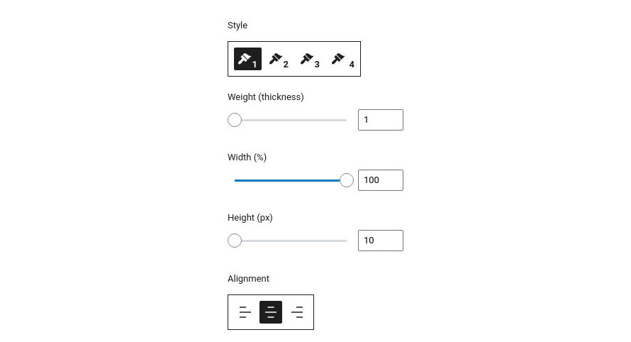
- Style: There are four available styles to choose from, solid, dotted, dashed and double.
- Weight: Controls the thickness of the divider.
- Width: Controls whether the divider will span the entire width of its container or be narrower.
- Height: Sets the height of the divider’s container.
- Alignment: Changes the alignment of the divider, useful when the width is less than 100%. Available options are left, center and right.
Block Appearance
Under the block appearance tab you can control how the block looks. Let’s take a look a the options.
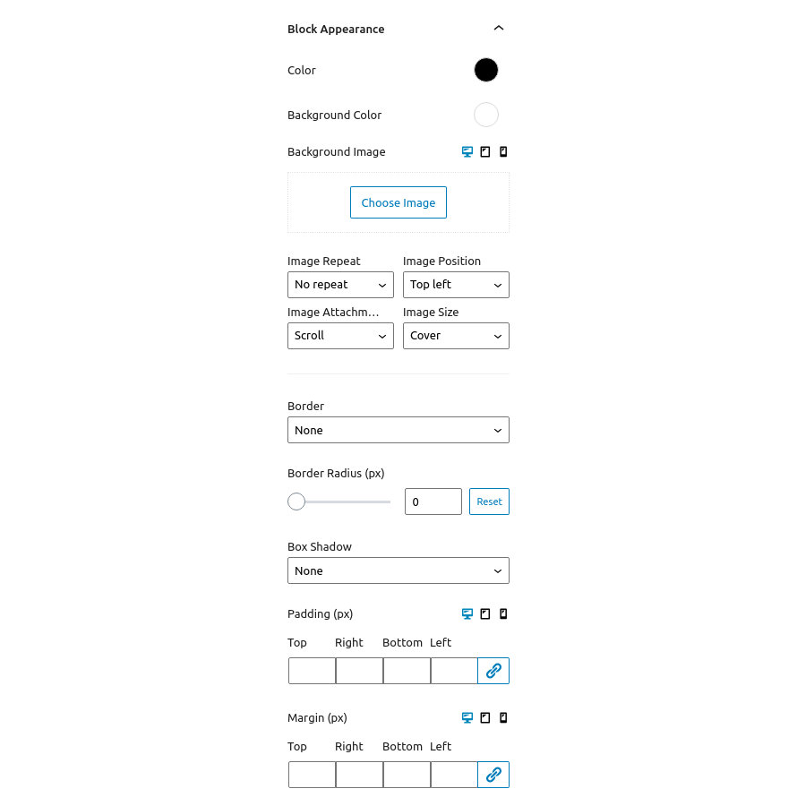
- Color: This option allows you to set the color of the divider.
- Background Color: Controls the color of the divider container’s background.
- Background Image: Applies a background image to the divider’s container and allows you to configure its appearance.
- Border: This option allows you to select the border style via the drop down and then select the border color and width.
- Border Radius: This option allows you to round the divider container’s corners.
- Box Shadow: This option allows you to apply an inset/outset box shadow, its color, spread, blur radius and offset.
- Padding: With this option you can control the padding on each side of the block individually or all at once.
- Margin: With this option you can individually control the margin on each side of the block individually or all at once.
Notice that the Background Image, Padding and Margin options have three icons next to their label. These are the Desktop, Tablet and Mobile icons. By clicking each icon you can separately modify the control’s values for each device.
Food Menu Block
Google Maps Block
This tab will allow you to create a Google Map Element as a block. In order this to work you will need to set up an API key and add it under Settings→GuttenBee Settings
Block Settings

Here you can
- Change the Latitude/Longitude for your icon to appear.
- Change the Zoom Level of the map.
- Change the height of the map.
- Disable Map Zoom while scrolling.
- Change the map style.
- Upload your own marker.
- Add a complimentary popup with the text you want.
Map Appearance
You can use the textarea in this section to paste in a custom map style, like the ones provided by SnazzyMaps if you don’t wish to use any of the preinstalled styles.
Block Appearance
Under the block appearance tab you can control how the block looks. Let’s take a look a the options.

- Background Color: Controls the color of the map’s background.
- Border: This option allows you to select the border style via the drop down and then select the border color and width.
- Border Radius: This option allows you to round the map’s corners.
- Box Shadow: This option allows you to apply an inset/outset box shadow, its color, spread, blur radius and offset.
- Padding: With this option you can control the padding on each side of the block individually or all at once.
- Margin: With this option you can control the margin on each side of the block individually or all at once.
Notice that the Padding and Margin options have three icons next to their label. These are the Desktop, Tablet and Mobile icons. By clicking each icon you can separately modify the values of padding/margin for each device.
Heading Block
Create flexible headings for your content with the Heading Block.
Block Settings
This section will help you configure the heading. Let’s check out the available options.
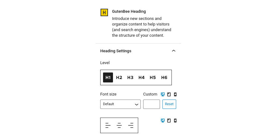
- Level: Set the level of the heading.
- Font Size: Set the font size for the heading either via a drop down of preset values or by setting an exact pixel value in the input.
- Alignment: Select the text alignment for the heading.
Notice that the Font Size and Alignment options have three icons next to their label. These are the Desktop, Tablet and Mobile icons. By clicking each icon you can separately modify the control’s values for each device.
Block Appearance
Under the block appearance tab you can control how the block looks. Let’s check out the options.
- Text Color: This option allows you to set the color for the heading’s text.
- Background Color: This option controls the heading’s background color.
- Border: This option allows you to select the border style via the drop down and then select the border color and width.
- Border Radius: This option allows you to round the heading container’s corners.
- Box Shadow: This option allows you to apply an inset/outset box shadow, its color, spread, blur radius and offset.
- Padding: With this option you can control the padding on each side of the block individually or all at once.
- Margin: With this option you can individually control the margin on each side of the block individually or all at once.
Notice that the Padding and Margin options have three icons next to their label. These are the Desktop, Tablet and Mobile icons. By clicking each icon you can separately modify the values of padding/margin for each device.
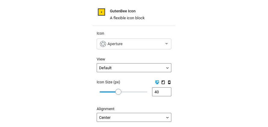
Icon Block
This block will allow you to add specific icons from our handmade listing. You can style them as you need changing their size, color and type.
Block Settings
This section will help you configure the block. Let’s check out the available options.
- Icon: Use the dropdown to find and select your desired icon.
- View: Choose between default, stacked (rounded container with solid background) or framed (square container with border).
- Icon Size: Set the size of the icon.
- Alignment: Choose the alignment of the icon, available options are left, center and right.
The Shape and Padding options are made available when a view is selected to control the shape of the icon’s background and its padding. Furthermore when the Framed view is selected a Border Size option is available to control the width of the border.
Notice that the Icon Size option has three icons next to the label. These are the Desktop, Tablet and Mobile icons. By clicking each icon you can separately modify the control’s values for each device.
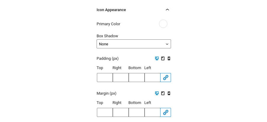
Icon Appearance
Under the icon appearance tab you can control how the block looks. Let’s check out the options.
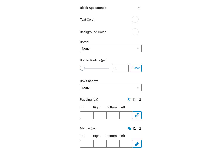
- Primary Color: This option allows you to set the primary icon color.
- Secondary Color: This option controls the icon’s secondary color (visible only when a View is selected).
- Box Shadow: This option allows you to apply an inset/outset box shadow, its color, spread, blur radius and offset.
- Padding: With this option you can control the padding on each side of the block individually or all at once.
- Margin: With this option you can individually control the margin on each side of the block individually or all at once.
Notice that the Padding and Margin options have three icons next to their label. These are the Desktop, Tablet and Mobile icons. By clicking each icon you can separately modify the values of padding/margin for each device.
Icon Box Block
Icon List Block
Create lists with custom icons instead of bullets.
List Settings
This section will help you configure the list. Let’s check out the available options.
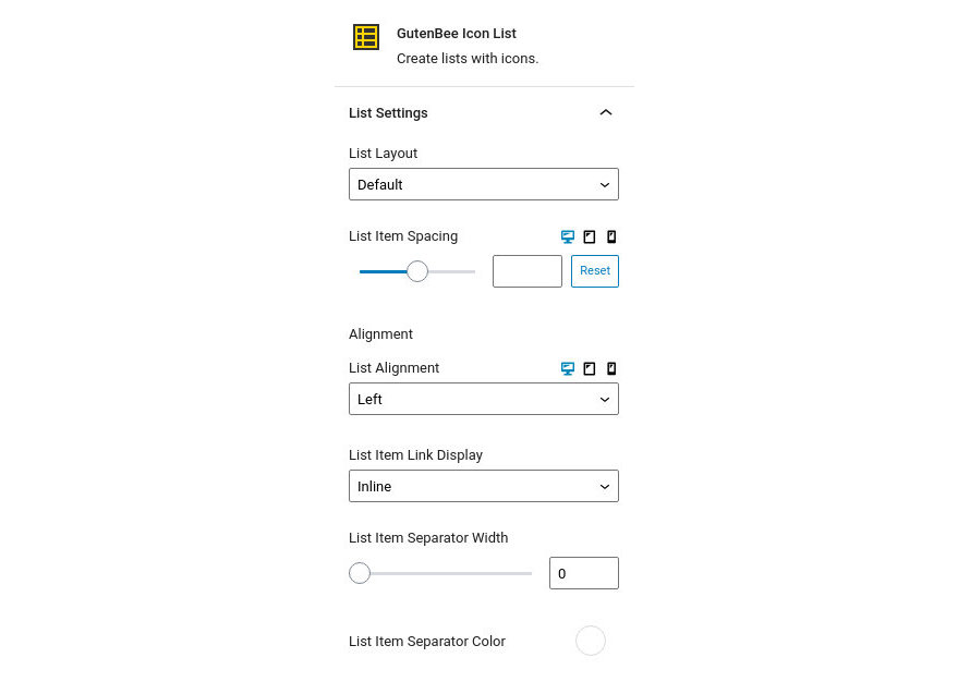
- List Layout: Choose between a normal or an inline list.
- List Item Spacing: Set the default spacing between list items.
- List Alignment: Choose the alignment of the list, available options are left, center and right.
- List Item Link Display: Choose if you want to display the list items as inline or block level elements.
- List Item Separator Width: Set the desired width of the list item separator.
- List Item Separator Color: Set the color of the separator.
Notice that the List Item Spacing option has three icons next to the label. These are the Desktop, Tablet and Mobile icons. By clicking each icon you can separately modify the control’s values for each device.
Font Settings
This section controls the font sizes for the list icons and text. You can set the font size either via a drop down of preset values or by setting an exact pixel value in the input.
Block Appearance
- Text Color: This option allows you to set the color for the list’s text.
- Icon Color: This option controls the color of the list icons.
- Background Color: This option controls the list’s background color.
- Border: This option allows you to select the border style via the drop down and then select the border color and width.
- Border Radius: This option allows you to round the heading block’s corners.
- Box Shadow: This option allows you to apply an inset/outset box shadow, its color, spread, blur radius and offset.
- Padding: With this option you can control the padding on each side of the block individually or all at once.
- Margin: With this option you can control the margin on each side of the block individually or all at once.
Notice that the Padding and Margin options have three icons next to their label. These are the Desktop, Tablet and Mobile icons. By clicking each icon you can separately modify the values of padding/margin for each device.
Icon List Item Settings
By selecting each Icon List Item you can configure its icon via a handy drop down, add a URL where the list item will link to when clicked and choose if you want it to open the link in a new tab.
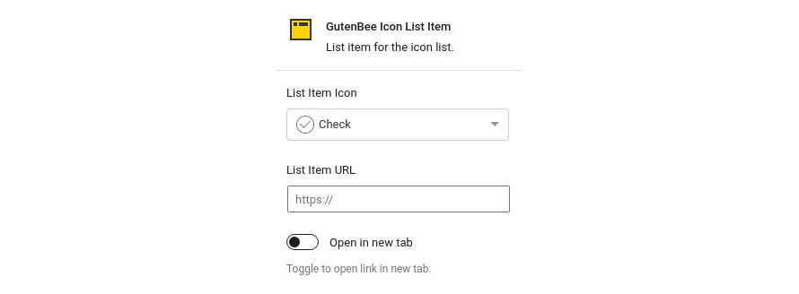
Image Block
Embed images in your content with the Image block.
Block Settings
This section will help you configure the image. Let’s check out the available options.
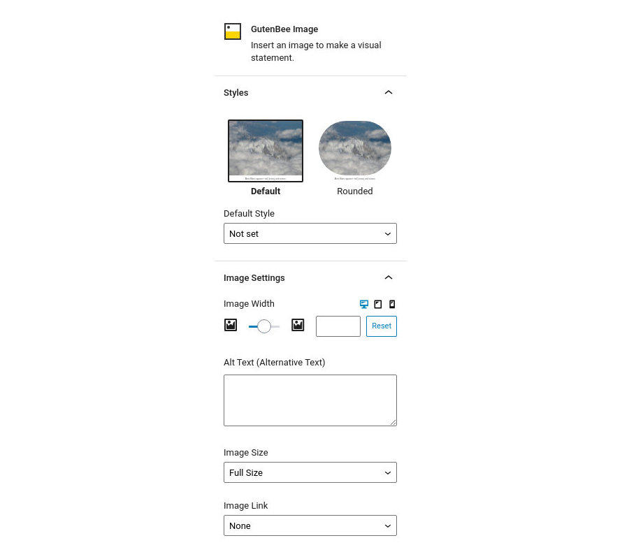
Firstly in the Styles section you can choose between the default or a rounded layout for the image.
Under the Image Settings tab you have the following options:
- Image Width: Set a fixed width for the image.
- Alt Text: Fill in an alternative text for the image, especially useful to screen reader users.
- Image Size: Choose the image’s size among the available image sizes of your WordPress installation.
- Image Link: Select where the image will link to when clicked..
Notice that the Image Width option has three icons next to the label. These are the Desktop, Tablet and Mobile icons. By clicking each icon you can separately modify the image’s width for each device.
Block Appearance
Under the block appearance tab you can control how the block looks. Let’s take a look a the options.
- Background Color: Controls the color of the block’s background.
- Border: This option allows you to select the border style via the drop down and then select the border color and width.
- Border Radius: This option allows you to round the image’s corners.
- Box Shadow: This option allows you to apply an inset/outset box shadow, its color, spread, blur radius and offset.
- Padding: With this option you can control the padding on each side of the block individually or all at once.
- Margin: With this option you can control the margin on each side of the block individually or all at once.
Notice that the Padding and Margin options have three icons next to their label. These are the Desktop, Tablet and Mobile icons. By clicking each icon you can separately modify the values of padding/margin for each device.
Image Box Block
This block will allow you to create an Image element next to a title and a subtitle. You can use any image you wish from your media library.
Image Settings
This section will help you set up the block’s image. Let’s check out the available options.
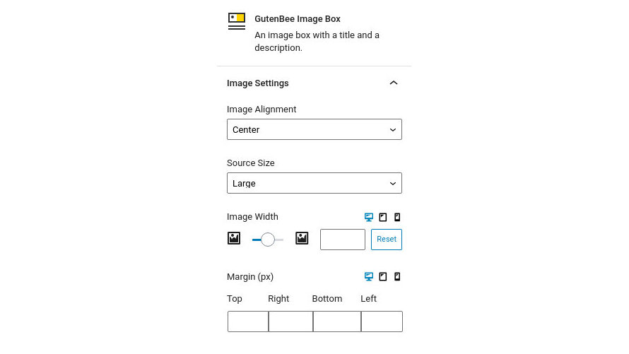
- Image Alignment: Pick the alignment of the image, allows you to position the image to the left, right or over the text.
- Source Size: Set the size of the source image among the available image sizes of your WordPress Installation.
- Image Width: Set a fixed width for the image.
- Margin: Set the margin for just the image.
Notice that the Image Width and Margin options have three icons next to the label. These are the Desktop, Tablet and Mobile icons. By clicking each icon you can separately modify the control’s values for each device.
Content Settings
This section will help you set up the block’s content. Let’s check out the available options.
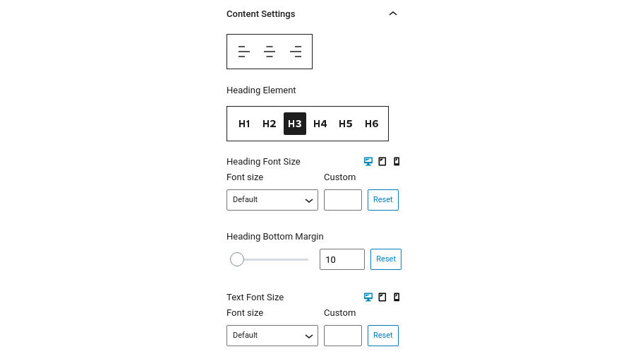
- Alignment: Set the text alignment.
- Heading Element: Set the level of the content’s heading.
- Heading Font Size: Control the font size of the heading either via a drop down of preset values or by setting an exact pixel value in the input.
- Heading Bottom Margin: Controls the spacing between the heading and the text below it.
- Text Font Size: Control the font size of the text either via a drop down of preset values or by setting an exact pixel value in the input.
Notice that the Font Size options have three icons next to the label. These are the Desktop, Tablet and Mobile icons. By clicking each icon you can separately modify the control’s values for each device.
Block Appearance
Under the block appearance tab you can control how the block looks. Let’s check out the options.
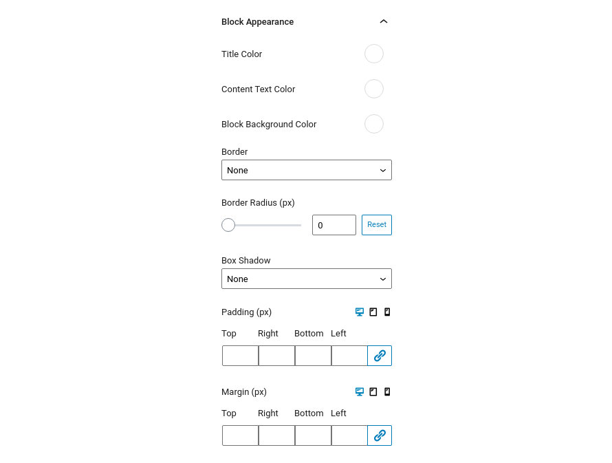
- Title Color: This option allows you to set the color of the content heading.
- Content Text Color: This option controls the color of the content text.
- Block Background Color: This option controls the block’s background color.
- Border: This option allows you to select the border style via the drop down and then select the border color and width.
- Border Radius: This option allows you to round the block’s corners.
- Box Shadow: This option allows you to apply an inset/outset box shadow, its color, spread, blur radius and offset.
- Padding: With this option you can control the padding on each side of the block individually or all at once.
- Margin: With this option you can individually control the margin on each side of the block individually or all at once.
Notice that the Padding and Margin options have three icons next to their label. These are the Desktop, Tablet and Mobile icons. By clicking each icon you can separately modify the values of padding/margin for each device.
Image Comparison Block
This block will allow you to create a side by side comparison for two images of your selection
Block Settings
This section will help you set up the block. Let’s check out the available options.

- Default Offset: Sets the initial position of the draggable comparison slider, by default it is in the middle of the image.
- Source Image Size: Set the size of the source image among the available image sizes of your WordPress Installation.
Block Appearance
Under the block appearance tab you can control how the block looks. Let’s take a look a the options.
- Background Color: Controls the color of the block’s background.
- Border: This option allows you to select the border style via the drop down and then select the border color and width.
- Border Radius: This option allows you to round the image’s corners.
- Box Shadow: This option allows you to apply an inset/outset box shadow, its color, spread, blur radius and offset.
- Padding: With this option you can control the padding on each side of the block individually or all at once.
- Margin: With this option you can control the margin on each side of the block individually or all at once.
Notice that the Padding and Margin options have three icons next to their label. These are the Desktop, Tablet and Mobile icons. By clicking each icon you can separately modify the values of padding/margin for each device.
Image Gallery Block
This block will allow you to create beautiful galleries using a hand picked set of images.
Block Settings
This section will help you set up the block. Let’s check out the available options.
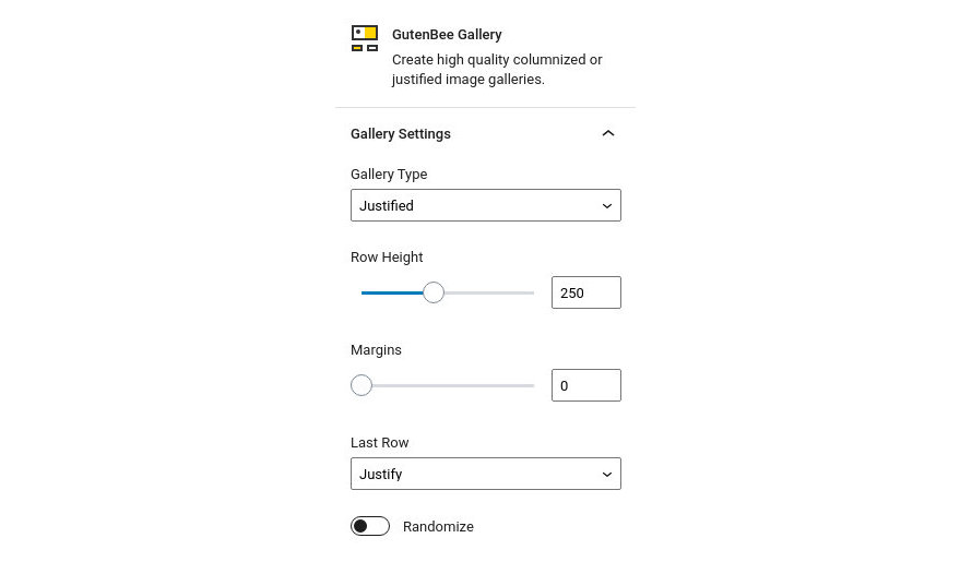
- Gallery Type: Choose between a Justified or a regular columned gallery type (with customizable column numbers).
- Row Height: This is used as a lower bound for the height of each row in justified galleries.
- Margins: Controls the spacing between gallery images.
- Last Row: Controls how the last row is treated in justified galleries. The row can be justified, aligned left, right or center, or hidden entirely.
- Randomize: Randomizes the image order on each page refresh.
Block Appearance
Under the block appearance tab you can control how the block looks. Let’s take a look a the options.
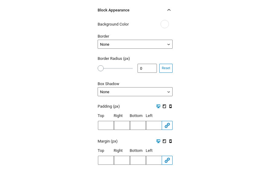
- Background Color: Controls the color of the block’s background.
- Border: This option allows you to select the border style via the drop down and then select the border color and width.
- Border Radius: This option allows you to round the image’s corners.
- Box Shadow: This option allows you to apply an inset/outset box shadow, its color, spread, blur radius and offset.
- Padding: With this option you can individually (or collectively) control the padding on each side of the block.
- Margin: With this option you can individually (or collectively) control the margin on each side of the block.
Notice that the Padding and Margin options have three icons next to their label. These are the Desktop, Tablet and Mobile icons. By clicking each icon you can separately modify the values of padding/margin for each device.
Paragraph Block
Create flexible paragraphs with this block.
Block Settings
This section will help you set up the block. Let’s check out the available options.
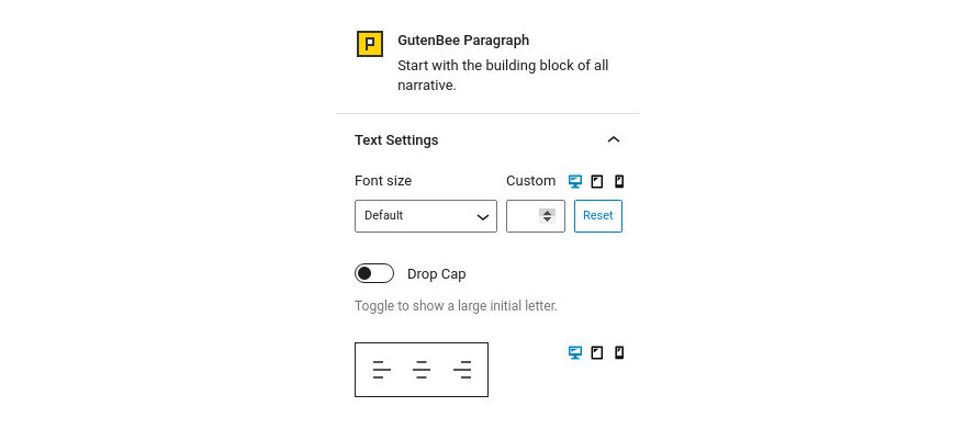
- Font Size: Control the font size of the paragraph text either via a drop down of preset values or by setting an exact pixel value in the input.
- Drop Cap: Makes the first letter of the paragraph larger.
- Alignment: Controls the alignment of the paragraph text.
Notice that the Font Size and Alignment options have three icons next to the label. These are the Desktop, Tablet and Mobile icons. By clicking each icon you can separately modify the control’s values for each device.
Block Appearance
Under the block appearance tab you can control how the block looks. Let’s check out the options.
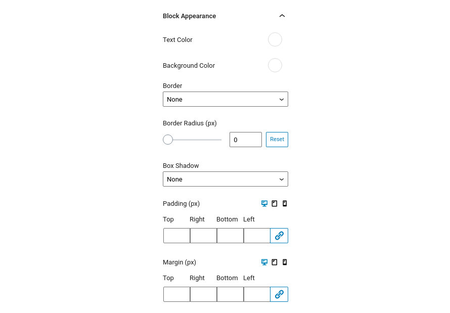
- Text Color: This option allows you to set the color for the paragraph’s text.
- Background Color: This option controls the paragraph’s background color.
- Border: This option allows you to select the border style via the drop down and then select the border color and width.
- Border Radius: This option allows you to round the paragraph container’s corners.
- Box Shadow: This option allows you to apply an inset/outset box shadow, its color, spread, blur radius and offset.
- Padding: With this option you can individually (or collectively) control the padding on each side of the block.
- Margin: With this option you can individually (or collectively) control the margin on each side of the block.
Notice that the Padding and Margin options have three icons next to their label. These are the Desktop, Tablet and Mobile icons. By clicking each icon you can separately modify the values of padding/margin for each device.
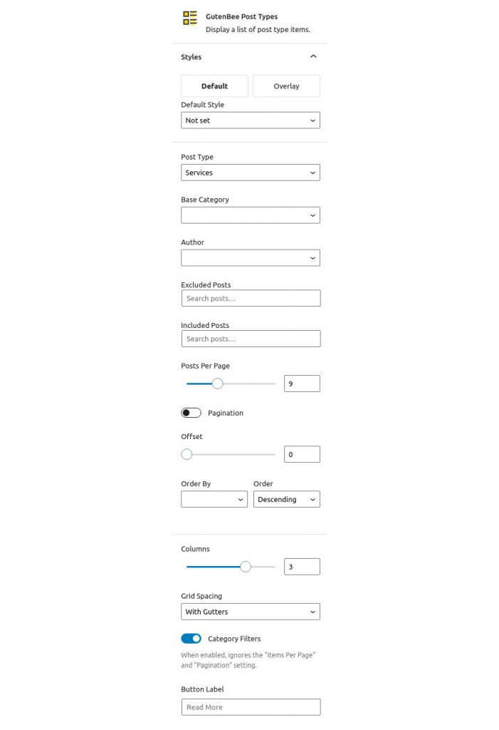
Post Types Block
With this block you can select a custom post type, page, or a post and display a portion of it inside your content. This is specifically useful for landing pages, as you can select more than one items!
Block Settings
The block’s options can be split into three distinct sections. The styles, the query and the layout.
Style
This section allows you to select between predefined block styles (if available) which will change the appearance of the displayed post grid.
Query setup
This section will create the query which will return the post types we want in our grid.
- Post Type: Select a post type to pull the posts from.
- Base Category: Select a category/taxonomy term to further narrow down the results.
- Author: Return only posts from a specific author.
- Excluded Posts: Exclude certain posts from the results.
- Included Posts: Include certain posts to the results (can be used to create a grid of hand-picked posts).
- Posts Per Page: Set the number of posts you want to see per page on the grid.
- Pagination: Enable or disable the pagination.
- Offset: Skip one or more posts from the start of the query.
- Order By: Select by which attribute your posts will be ordered from (i.e. date, title, id etc).
- Order: Display the posts in an ascending or descending order.
Layout
Here you can select how many columns your grid will have, choose to enable or disable grid gutters, toggle the category filtering buttons and set a label for the button on each post type item.
Post Type Templates
The post types block offers templates which allow you to change the structure of the grid items. To do that you will first need to create a child theme, or if using the one of our themes grab it from our downloads section.
Once you have the child theme installed create a folder inside it called template-parts and inside that create another folder called gutenbee.
Next navigate to the /wp-content/plugins/gutenbee/src/blocks/post-types-templates/ folder of the GutenBee plugin and copy the article-default.php and article-media.php files in the /template-parts/gutenbee/ folder you have created in the previous step.
Now you can edit these two files with your preferred code editor and modify the markup according to your needs. The article-media.php takes care of the appearance of grid items when the grid has only one column, and the article-default.php works for 2-4 columned layouts.
Progress Bar Block
You can easily create a static progress bar with several features.
Block Settings
This section will help you set up the block. Let’s check out the available options.
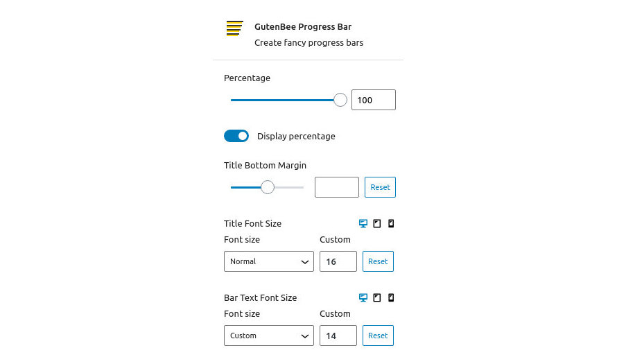
- Percentage: Set the “completed” percentage on the bar.
- Display percentage: Show a numeric representation of the percentage value on the bar.
- Title Bottom Margin: Control the spacing between the bar and its title.
- Title Font Size: Control the font size of the title text either via a drop down of preset values or by setting an exact pixel value in the input.
- Bar Text Font Size: Control the font size of the bar’s text either via a drop down of preset values or by setting an exact pixel value in the input.
Notice that the Font Size and Alignment options have three icons next to the label. These are the Desktop, Tablet and Mobile icons. By clicking each icon you can separately modify the control’s values for each device.
Block Appearance
Under the block appearance tab you can control how the block looks. Let’s check out the options.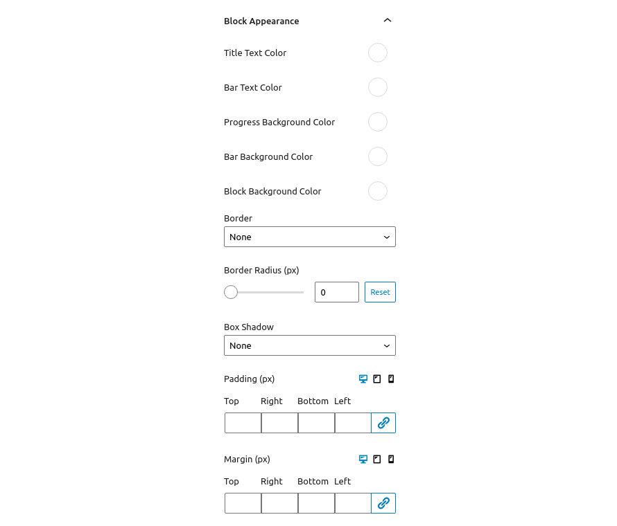
- Title Text Color: This option allows you to set the color for the title text.
- Bar Text Color: This option controls the color of the text on the bar.
- Progress Background Color: This option controls the background color of the “completed” section of the bar.
- Bar Background Color: This option controls the background color of the rest of the bar.
- Block Background Color: This option controls the background color of the entire block.
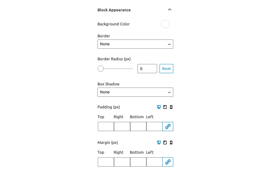
- Border: This option allows you to select the border style via the drop down and then select the border color and width.
- Border Radius: This option allows you to round the block’s corners.
- Box Shadow: This option allows you to apply an inset/outset box shadow, its color, spread, blur radius and offset.
- Padding: With this option you can individually (or collectively) control the padding on each side of the block.
- Margin: With this option you can individually (or collectively) control the margin on each side of the block.
Notice that the Padding and Margin options have three icons next to their label. These are the Desktop, Tablet and Mobile icons. By clicking each icon you can separately modify the values of padding/margin for each device.
Reviews Block
Create summary reviews with individual ratings and an automatic average score.
Block Settings
This section will help you set up the block. Let’s check out the available options.
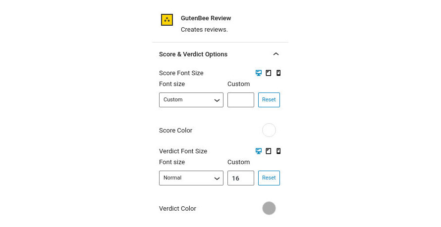
- Score Font Size: Control the font size of the score text either via a drop down of preset values or by setting an exact pixel value in the input.
- Score Color: Choose the desired color for the score text.
- Verdict Font Size: Control the font size of the verdict text either via a drop down of preset values or by setting an exact pixel value in the input.
- Verdict Color: Choose the desired color for the verdict text.
Notice that the Font Size options have three icons next to the label. These are the Desktop, Tablet and Mobile icons. By clicking each icon you can separately modify the control’s values for each device.
Review Item Settings
This section will help you configure global review item options. Let’s check out the available options.
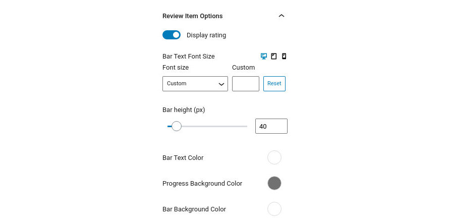
- Display Rating: Toggle the appearance of the rating number on each rating bar.
- Bar Text Font Size: Control the font size of the bar text either via a drop down of preset values or by setting an exact pixel value in the input.
- Bar Height: Set the rating bar height.
- Bar Text Color: Control the color of the bar’s text.
- Progress Background Color: Choose the desired color for the filled portion of the bar.
- Bar Background Color: Change the overall background color of the bar.
Notice that the Font Size option has three icons next to the label. These are the Desktop, Tablet and Mobile icons. By clicking each icon you can separately modify the control’s values for each device.
Block Appearance
Under the block appearance tab you can control how the block looks. Let’s take a look a the options.

- Background Color: Controls the color of the block’s background.
- Border: This option allows you to select the border style via the drop down and then select the border color and width.
- Border Radius: This option allows you to round the block’s corners.
- Box Shadow: This option allows you to apply an inset/outset box shadow, its color, spread, blur radius and offset.
- Padding: With this option you can individually (or collectively) control the padding on each side of the block.
- Margin: With this option you can individually (or collectively) control the margin on each side of the block.
Notice that the Padding and Margin options have three icons next to their label. These are the Desktop, Tablet and Mobile icons. By clicking each icon you can separately modify the values of padding/margin for each device.
Review Item

Selecting each review bar presents you with another option. This one allows you to set the rating number via the slider or the available input.
Slideshow Block
Create a simple Slideshow with various parameters and images.
Block Settings
This section will help you set up the block. Let’s check out the available options.
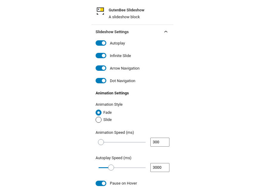
- Autoplay: If enabled the slides will advance without user input.
- Infinite Slide: If enabled the slider will loop around to the first slide when it reaches the end.
- Arrow Navigation: Toggles the navigation arrows.
- Dot Navigation: Toggles the navigation dots.
- Animation Style: Choose between fade and slide animations for your slideshow.
- Animation Speed: Set the animation speed for the slide/fade effect.
- Autoplay Speed: Set the speed between slides.
- Pause on Hover: Choose if you’d like the slideshow to pause when hovered.
Navigation Appearance
This section will help you configure the appearance of the slideshow’s navigation. Let’s check out the available options.

- Arrow Navigation Color: Controls the color of the navigation arrow.
- Arrow Background Color: Controls the background color of the navigation arrow.
- Dot Navigation Color: Controls the color of the navigation dots.
- Dot Background Color: Controls the background color of the navigation dots.
Block Appearance
Under the block appearance tab you can control how the block looks. Let’s take a look a the options.
- Background Color: Controls the color of the block’s background.
- Border: This option allows you to select the border style via the drop down and then select the border color and width.
- Border Radius: This option allows you to round the block’s corners.
- Box Shadow: This option allows you to apply an inset/outset box shadow, its color, spread, blur radius and offset.
- Padding: With this option you can individually (or collectively) control the padding on each side of the block.
- Margin: With this option you can individually (or collectively) control the margin on each side of the block.
Notice that the Padding and Margin options have three icons next to their label. These are the Desktop, Tablet and Mobile icons. By clicking each icon you can separately modify the values of padding/margin for each device.
Spacer Block
Add spacing between elements.
Block Settings
This section will help you set up the spacer’s height via the slider or the input.
Block Appearance
Under the block appearance tab you can control how the block looks. Let’s check out the options.
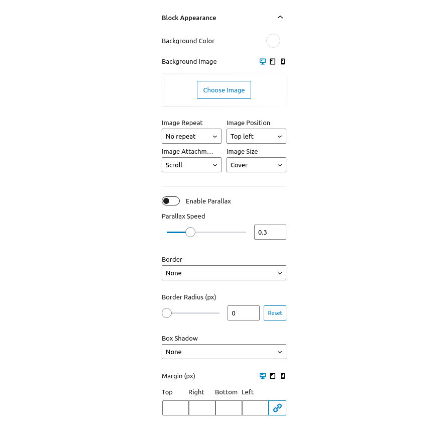
- Background Color: Controls the color of the spacer’s background.
- Background Image: Applies a background image to the divider’s container and allows you to configure its appearance.
- Enable Parallax: Toggles the parallax effect. Needs a background image set.
- Parallax Speed: Controls the speed of the parallax effect.
- Border: This option allows you to select the border style via the drop down and then select the border color and width.
- Border Radius: This option allows you to round the divider container’s corners.
- Box Shadow: This option allows you to apply an inset/outset box shadow, its color, spread, blur radius and offset.
- Margin: With this option you can individually (or collectively) control the margin on each side of the block.
Notice that the Background Image and Margin options have three icons next to their label. These are the Desktop, Tablet and Mobile icons. By clicking each icon you can separately modify the control’s values for each device.
Tabs Block
This block will allow you to create easily a tab element with your content inside.
Block Settings
This section will help you set up the number of tabs by dragging the slider.

Block Appearance
Under Block Appearance you can customize the look of the block. The available options are:
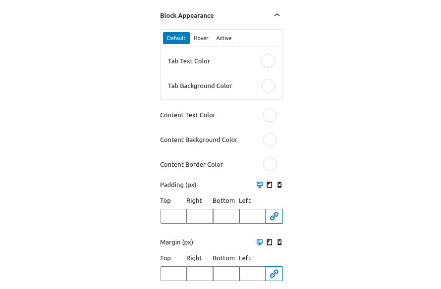
- Tab Text Color: This option controls the color of the tab’s text, for the default, hover & active states.
- Tab Background Color: This option controls the color of the tab’s background, for the default, hover & active states.
- Content Text Color: Control the color of the content.
- Content Background Color: Change the background color of the content.
- Content Border Color: This option modifies the color of the content’s borders.
- Padding: With this option you can individually (or collectively) control the padding on each side of the block.
- Margin: With this option you can individually (or collectively) control the margin on each side of the block.
Notice that the Padding and Margin options have three icons next to their label. These are the Desktop, Tablet and Mobile icons. By clicking each icon you can separately modify the values of padding/margin for each device.
Testimonial Block
Create testimonials for your site.
Style & Image Settings
This section will help you set up the block. Let’s take a look at the available options.
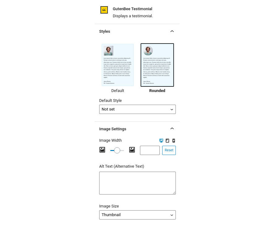
- Styles: Choose if you want to display a default square shaped avatar or a rounded one.
- Image Width: Set a fixed width for the image.
- Alt Text: Set the alternative text of the image, useful for screen reader users.
- Image Size: Set the source size of the image by picking among the available ones in your installation.
Notice that the Image Width option has three icons next to the label. These are the Desktop, Tablet and Mobile icons. By clicking each icon you can separately modify the control’s values for each device.
Layout & Text Settings
This section will help you configure the block’s layout and text. Let’s take a look at the available options.
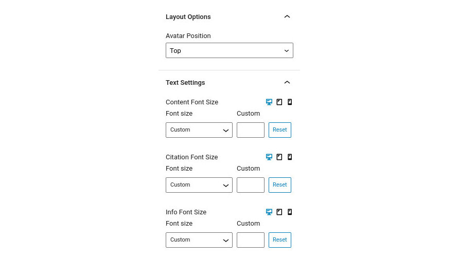
- Avatar Position: Select the location of the avatar relative to the text.
- Content Font Size: Control the font size of the content either via a drop down of preset values or by setting an exact pixel value in the input.
- Citation Font Size: Control the font size of the citation either via a drop down of preset values or by setting an exact pixel value in the input.
- Info Font Size: Control the font size of the info text either via a drop down of preset values or by setting an exact pixel value in the input.
Notice that the Font Size options have three icons next to the label. These are the Desktop, Tablet and Mobile icons. By clicking each icon you can separately modify the control’s values for each device.
Block Appearance
Under the block appearance tab you can control how the block looks. Let’s check out the options.
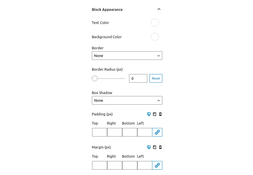
- Text Color: This option allows you to set the color of the block’s text.
- Background Color: This option controls the testimonial’s background color.
- Border: This option allows you to select the border style via the drop down and then select the border color and width.
- Border Radius: This option allows you to round the block’s corners.
- Box Shadow: This option allows you to apply an inset/outset box shadow, its color, spread, blur radius and offset.
- Padding: With this option you can individually (or collectively) control the padding on each side of the block.
- Margin: With this option you can individually (or collectively) control the margin on each side of the block.
Notice that the Padding and Margin options have three icons next to their label. These are the Desktop, Tablet and Mobile icons. By clicking each icon you can separately modify the values of padding/margin for each device.
Video Block
Easily embed videos from your media library.
Block Settings
This section will help you set up the video block. Let’s take a look at the available options.
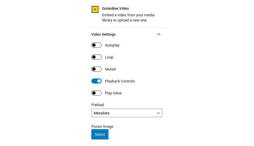
- Autoplay: If enabled the video will begin playing automatically when the page loads. (does not work on mobile devices).
- Loop: If enabled the playback will restart when the video reaches its end.
- Muted: If enabled the video will be muted by default.
- Playback Controls: If enabled will display interactive playback controls.
- Play Inline: If enabled, mobile browsers will play the video in-place instead of fullscreen by default.
- Preload: Choose what sort of data will be preloaded ( before the user clicks to play the video).
- Poster Image: Choose an image which will be displayed as a placeholder before the playback starts.
Block Appearance
Under the block appearance tab you can control how the block looks. Let’s check out the options.
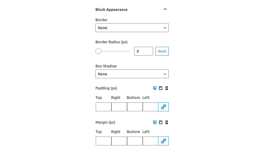
- Border: This option allows you to select the border style via the drop down and then select the border color and width.
- Border Radius: This option allows you to round the block’s corners.
- Box Shadow: This option allows you to apply an inset/outset box shadow, its color, spread, blur radius and offset.
- Padding: With this option you can individually (or collectively) control the padding on each side of the block.
- Margin: With this option you can individually (or collectively) control the margin on each side of the block.
Notice that the Padding and Margin options have three icons next to their label. These are the Desktop, Tablet and Mobile icons. By clicking each icon you can separately modify the values of padding/margin for each device.
Video Embed Block
Embed videos from YouTube or Vimeo
Block Settings
This section will help you set up the video embed block. Let’s take a look at the available options.
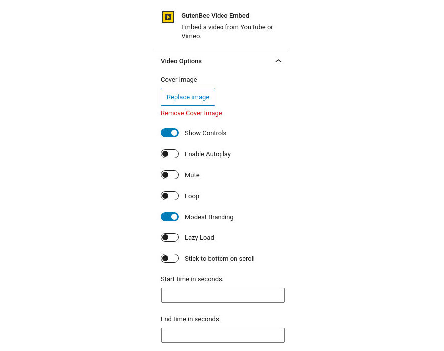
- Cover Image: Choose a cover image which will be displayed before the playback starts.
- Show Controls: Show or hide the video playback controls.
- Enable Autoplay: If enabled the video will begin playing automatically when the page loads. (does not work on mobile devices).
- Mute: If enabled the video will be muted by default.
- Loop: If enabled the playback will restart when the video reaches its end.
- Modest Branding: If enabled makes YouTube branding more discreet.
- Lazy Load: If enabled video assets will only be loaded once playback is initiated and not on page load.
- Stick to bottom on scroll: If enabled, the video will stick to the bottom corner of the view port and keep playing once the user scrolls past it.
- Start time in seconds: Set a custom timestamp to start the video playback from.
- End time in seconds: Set a custom timestamp as the video’s end.
Block Appearance
Under the block appearance tab you can control how the block looks. Let’s take a look a the options.
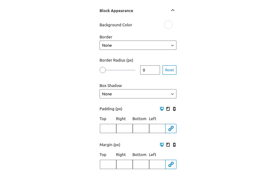
- Background Color: Controls the color of the block’s background.
- Border: This option allows you to select the border style via the drop down and then select the border color and width.
- Border Radius: This option allows you to round the block’s corners.
- Box Shadow: This option allows you to apply an inset/outset box shadow, its color, spread, blur radius and offset.
- Padding: With this option you can individually (or collectively) control the padding on each side of the block.
- Margin: With this option you can individually (or collectively) control the margin on each side of the block.
Notice that the Padding and Margin options have three icons next to their label. These are the Desktop, Tablet and Mobile icons. By clicking each icon you can separately modify the values of padding/margin for each device.
Common Options
Visibility Settings
Via the Visibility Settings you can hide the block for certain type of device or user. It is available on all blocks.
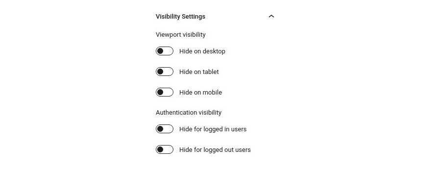
The Viewport visibility toggles allow you to hide the block on desktops, tablets and mobiles. You can choose to hide it on more than one device type.
The Authentication visibility toggles allow you to display the block only to logged in or logged out users.
Additional Help
Still, have questions or problems setting up GutenBee? We will be happy to help you out in GutenBee’s support forums.