If you are a new blogger or new to the world of WordPress you might not know the differences between WordPress.org and WordPress.com, or even that there are differences at all.
In this guide we will try to briefly describe how each platform works, compare them and try to reach a conclusion on which one to use depending on the type of user you are.
ATTENTION: This documentation is about the new version of Convert. If you are using the legacy version visit its documentation page here.
Server Requirements
If you already have WordPress installed, it means that you meet the minimum server requirements and you can perfectly install this theme without any issues. To get the most out of your website though, you should get in touch with your web host and ask them if they meet the following criteria:
PHP version 7.4 or greater.
MySQL version 5.6 or greater OR MariaDB version 10.1 or greater.
HTTPS support.
Prerequisites
Ignition Framework
This theme requires our free Ignition framework plugin to be installed. Simply visit the Downloads area, download the Ignition Framework plugin, upload it through your Dashboard > Plugins > Add new and Activate it.
It really doesn’t matter if you install the theme or the plugin first. Just make sure to install both in order to get the whole functionality.
For more information about the installation procedure along with some small videos check out this article.
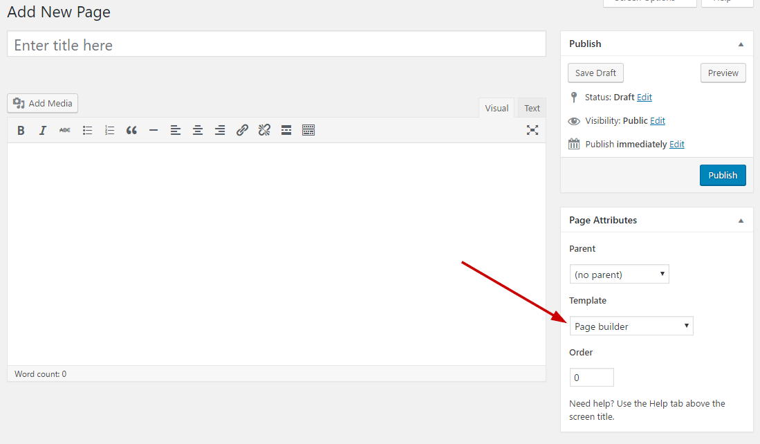
Theme installation
Here is a quick video guide to install Convert and the Ignition Framework:
Installing the theme is a very simple process. Go to your dashboard under Appearance > Themes > Add new, click Upload Theme and upload the zip file. Once uploaded click Install Now and then the Activate Theme link.
Once the theme is installed and activated you will be forwarded to the theme’s onboarding page.
Here you will be prompted to install and activate the Ignition Framework plugin if you haven’t done so already. Here you can also install our free custom blocks plugin, GutenBee. Through the onboarding page you have access to many useful links, such as the theme’s documentation, our knowledge base articles and direct links to our support hub.
In the Sample Content tab of the onboarding page you can install and activate all the plugins required to import the sample content and proceed with its installation. More info on that on the next section.
NOTE: The only plugin required for the theme to work properly is the Ignition Framework plugin, all other plugins are entirely optional if you don’t need their functionality or are not planning on importing the sample content. You can safely skip installing and activating them if you are sure you don’t need them.
How to import the sample content
If you like what you see in our demo website you can simply import the sample content. This means that a close approximation of our demo website will be imported in your WordPress installation. Now all you have to do is simply replace the content of these pages with your content. Importing the sample content can help serve as a basis on which you can continue to build and expand your site, however keep in mind that this procedure is entirely optional.
Here is a helpful video guide:
In your WordPress dashboard visit Appearance > Theme Options > Sample Content.
Click Install and then Activate for each of the required plugins.
Click the Get Started button and in the next screen, move over the screenshot of the builder/variation of your preference and click the Import Demo button.
NOTE: Due to the nature of the import mechanism some links may link back to our demo website. If you are not sure how to update / change these links simply get in touch and we’ll help you out.
Image sizes
Web page loading times are greatly affected by the size of your images. For best results make sure to use images with the recommended dimensions as described below:
Main post thumbnail: 870x580px
Item: 615x410px
Large Item: 1170x780px
Article Media 510x510px
Mini-cart items 160x160px
NOTE: If for any reason you want to change the dimensions of any of the predefined image sizes you have to use a plugin. This guide describes this process.
NOTE: All image sizes are the minimum recommended, adding larger image sizes will result in cropping them to fit these sizes
Setting up site-wide sections
It’s considered a good practice to set up the areas of your website that you won’t be editing a lot in the future, like the general site layout, the header, footer and some secondary functionality.
General Site Options
You can change your general site options under Appearance > Customize > Site Options. Under the Layout section you can control your site’s, blog’s and single blog post’s layout, as well as the site width and content/sidebar column ratio. The layout can then be overridden in each post/page individually. Under the Colors tab you can select the basic color palette for your installation and add a background image. Finally under Typography you can select the ideal font pairing from a full list of Google Fonts and customize font properties for key elements on desktop and mobile devices alike. You also have the option to disable Google Fonts altogether.
Header
The header on the theme consists of three key elements:
1. Top Bar
2. Logo
3. Main Menu
The layout of the header can be set globally under Customize > Header > Layout.
Top Bar
To edit the top bar go to Customize > Top Bar. Here you can toggle the top bar entirely and fill the 3 content areas with simple text, plain HTML, or shortcodes. Refer to the shortcodes section below for information regarding the shortcodes.
Logo
Alternative logo will appear when the header you selected is transparent. You can set your site icon here also
The recommended maximum width of your logo is 200px while you can use any height you want. To upload your logo go to Customize > Site Identity. You can upload two logos. The normal and the alternative one. The alternative logo can be used if you want a different logo to appear when the header layout is set to Transparent under Customize > Header > Layout.
This article offers more information regarding the header and its options.
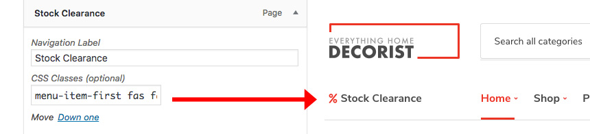
Navigate to Customize > Menus. Enter a menu name (It can be anything you like) and click on the Create Menu button. In the next page click the Add Items button and start adding items to the menu. Now all you have to do is assign this menu to a location through the Menu Locations section, check the Main menu location and you are done. Your navigation menu should be now visible on your website.
Create a menu button
You can create a special button-like menu item by setting a certain class for to it. The class name is nav-button and you can set it under Appearance > Menus for the item you want. First enable this section from Screen Options.
This is a predefined class you can use for your menu items
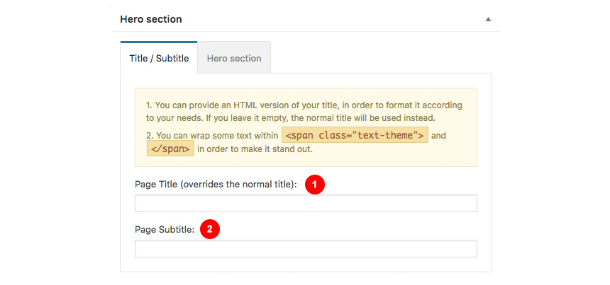
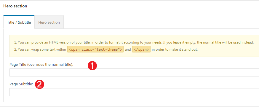
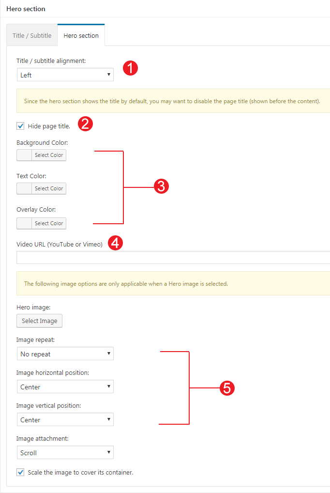
The page title section
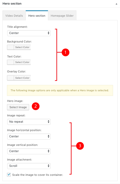
Here you can select the main hero section global image and settings
The page title section can be modified under Customize > Page title. You can choose to disable the page title section’s background image entirely, change its height, alignment, content and toggle the site’s breadcrumbs. Under the Colors section you can set a background color, a background image, an overlay color and also set the primary and the secondary text colors.
In some cases, like in our demo website, you might want to have different background images on different posts, pages and custom post types.
To achieve that create or edit a page. Under Page Settings > Page Title > Colors locate the Background Image field. Upload a new image and preview this page. As you can see we have successfully overridden the image set in the Customizer settings.
NOTE: The purpose of the Transparent header option is to have your main header components (Top bar, Logo & Main Menu) on top of a background image or background color which means that you have to set on in the Customize > Page title > Color section.
The footer area is a widgetized area that can be populated with widgets through Customize > Widgets. You can also remove the credits at the very bottom of this area by visiting Customize > Footer > Credits content section. You can also adjust the colors by setting a background color & image and modify the border, title and text colors.
In the Credits content section you can add your copyright information and use any of the shortcodes included in the Ignition Framework.
Utilities
Lightbox
The theme offers a lightbox for your images which is by default disabled to avoid conflicts with third party plugins which offer lightboxes. If you want to use it you can enable it under Customize > Utilities > Lightbox.
Weather
You will need to setup an API key in order weather to work
You can choose to show the weather for a chosen location using the weather shortcode anywhere inside your installation. First you will need to set it up by providing an API key and location under Customize >Utilities > Weather.
Block editor Dark Mode
Some themes might have a dark color scheme which is reflected in the block editor, this can make working with certain blocks a bit harder. Enabling the editor dark mode using the provided checkbox will apply certain styles to the editor in order to improve the content creation experience.
Custom post types
Create a new Service
Navigate to Services > Add New. Then under the Service tab start adding the basic item attributes. These are:
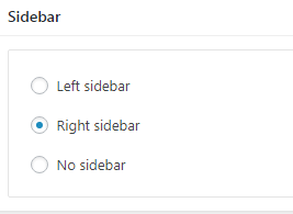
Summary: Control the location and appearance of the sidebar. More info about these options can be found here.
Categories: Set a category for the item which will also serve as a filter on the post type’s listing pages.
Featured image: Will appear on all related listings and on the item’s single page.
Excerpt: Add a manual excerpt that will appear on post listings and on the page title section as a subtitle (if applicable).
Page Title image: Set a custom post title background image/video for the item. Leave blank if you want to keep the default settings configured earlier.
Page Settings: Here you can fine tune the item’s appearance. E.g. toggle the featured image, change header type, hide the page title/subtitle, breadcrumbs etc. All our demo services have Remove top/bottom content padding and Show Page Title with Background options selected while the rest are fetched from the global Customizer options. More info about these options can be found here.
Create a Service sidebar navigation
Create a new menu under Customize > Menus, don’t set any location to it and add your service posts as menu items. If custom post types don’t appear when trying to add them to the menu you can enable them under Screen Options.
Under the Widgets panel in the Customizer add a Navigation menu widget in the Services sidebar and select the services menu you have just created for it.
Navigation menu widget will detect the current post type and highlight it
Create a new Portfolio
Navigate to Portfolio > Add New. Then under the Portfolio tab start adding the basic item attributes. These are:
Summary: Control the location and appearance of the sidebar. More info about these options can be found here.
Categories: Set a category for the item which will also serve as a filter on the post type’s listing pages.
Featured image: Will appear on all related listings and on the item’s single page.
Excerpt: Add a manual excerpt that will appear on post listings and on the page title section as a subtitle (if applicable).
Page Title image: Set a custom post title background image/video for the item. Leave blank if you want to keep the default settings configured earlier.
Page Settings: Here you can fine tune the item’s appearance. E.g. toggle the featured image, change header type, hide the page title/subtitle, breadcrumbs etc. Demo items inherit options from the Customizer. More info about these options can be found here.
Create a new Event
Navigate to Events > Add New. Then under the Event tab start adding the basic item attributes. These are:
Summary: Control the location and appearance of the sidebar. More info about these options can be found here.
Categories: Set a category for the item which will also serve as a filter on the post type’s listing pages.
Featured image: Will appear on all related listings and on the item’s single page.
Excerpt: Add a manual excerpt that will appear on post listings and on the page title section as a subtitle (if applicable).
Page Title image: Set a custom post title background image/video for the item. Leave blank if you want to keep the default settings configured earlier.
Page Settings: Here you can fine tune the item’s appearance. E.g. toggle the featured image, change header type, hide the page title/subtitle, breadcrumbs etc. Demo items inherit options from the Customizer. More info about these options can be found here.
Event Settings: Select your Event Date, time and Location.
Create a new Team Member
Navigate to Team > Add New. Then under the Team Member tab start adding the basic item attributes. These are:
Summary: Control the location and appearance of the sidebar. More info about these options can be found here.
Categories: Set a category for the item which will also serve as a filter on the post type’s listing pages.
Featured image: Will appear on all related listings and on the item’s single page.
Excerpt: Add a manual excerpt that will appear on post listings and on the page title section as a subtitle (if applicable).
Page Title image: Set a custom post title background image/video for the item. Leave blank if you want to keep the default settings configured earlier.
Page Settings: Here you can fine tune the item’s appearance. E.g. toggle the featured image, change header type, hide the page title/subtitle, breadcrumbs etc. Demo items inherit options from the Customizer. More info about these options can be found here.
Setting up the pages
NOTE: All blocks used in the construction of the pages below are provided by the GutenBee plugin unless mentioned otherwise.
Homepage
Create a new page from Pages > Add New, then select from the right side under Summary the Full width template. Then from Page Settings > Content Area check the Remove top/bottom content padding, from Page Settings > Header set the Header Type to Normal and from Page Settings > Page Title set all options to hide. Now we are ready to start adding GutenBee blocks in order to re-create the demo’s homepage layout.
The homepage’s hero section consists of a GutenBee container block with the Theme Grid option enabled. It contains two columns. The left column contains a heading and a paragraph block. The right column is intentionally left empty.
The callout section below the homepage hero consists of a container block with a single column and the Theme Grid option enabled. Inside it we find another container block with two columns. The left column contains a paragraph and a heading block and the right one contains a single button block.
Next up is the services presentation section. This consists of a container block with a single column and the Theme Grid option enabled, inside we find a single column, with a heading, a paragraph, a divider and a post types block with the service post type selected displaying 3 items in 3 columns.
The Case Studies section following the services has the exact same layout. Its two differences are, the outer container block has a background color set under Block Appearance and the inner post types block displays 4 portfolio items in a 2 column layout.
The next call to action section consists of a container block with the Theme Grid option enabled and a background image set under Block Appearance. Inside we find two columns. The left one houses a paragraph, a heading, another paragraph and a button. The right column is intentionally left blank.
The Latest News section has the same layout as the Services & Portfolio sections above. The post types block displays 6 posts in a 3 column layout.
Same goes for the team section following the news. The post types block displays 6 team members in a 3 column layout.
The partner section again starts with a container block with the Theme Grid option enabled. Inside we find 5 columns. Each column contains an image block with the partner’s logo.
Finally the last call to action section consists of a container block with the Theme Grid option enabled and a background image set under Block Appearance and is very similar with the previous one. Inside we find two columns. The left one houses a paragraph and a heading. The right column contains the section’s button.
Creating Event, Portfolio, Team Member and Service listing pages
Create a new page under Pages > Add New. Set the page template under Summary section to Full width boxed. Then select a background image from Page Title > Colors section, and select to show the page title over it from Page Title > Layout section by selecting Show Page Title with Background.
The grids are created using the GutenBee Post Types block. Start by adding the block in the editor, select one of the available Styles (default and overlay are available on Convert) and proceed to set up your post query. From the post type dropdown pick the post type you want to display, the number of post items, columns, pagination, toggle category filters (post items need to be in categories, if enabled ignores pagination) and more. Once done you can add more blocks to the page if you want, or publish the page.
Careers page
Create a new page under Pages > Add New, add a new GutenBee Container block with two columns. The left column contains two sets of Core Heading/Core Paragraph blocks. The right one hosts a Youtube embeded video.
Next add a Core Table block and set its style to Convert. Fill in the table contents and set the header section to appear under Table Settings
Contact us page
This will serve as your contact page, with a contact form, map and some details for your business. We are using Contact Form 7 plugin to display a contact form, but you can use any plugin you wish.
Create a new page from Pages > Add New. Under Summary set the template to Full width.
Start with a Google Maps block and set your location and info.
Next we have a Container block with two columns. On the left column we have 4 icon boxers with all the relevant contact info and icons. In the right column we have a Core Shortcode block with the Contact Form 7 shortcode. Alternatively you can use Contact Form 7’s block or any other contact plugin you prefer.
Common features
This section offers information on features common on all Ignition Framework based themes.
Shortcodes
The Ignition Framework offers a multitude of custom shortcodes these are:
Custom menu: [ignition-custom-menu name="your menu name"]

Site search: [ignition-site-search]

Date: [ignition-date]

Weather: [ignition-current-weather id="your-location-id(optional)"]

Minicart button: [ignition-minicart-button]

Language switcher: [ignition-language-switcher]

Icon link: [ignition-icon-link]

Instagram Feed: [ignition-instagram-feed]

WooCommerce search: [ignition-wc-search]
For more information about the shortcodes and their usage have a look at this Knowledge base article.
Page options
All themes offer six different templates which modify the location and appearance of the sidebar and the main content’s width.
Additionally pages have a common set of options which allow you to customize the appearance of the page title section, toggle breadcrumbs and more.
All settings are inherited from Customizer. So you can actually set some global settings and if you wish change certain pages to have different behavior.
For a detailed explanation of the available templates and their options you can read this article.
WooCommerce
Ignition Framework based themes are compatible with WooCommerce giving you the ability to create awesome online stores which perfectly match the appearance of the rest of your site.
WooCommerce is an optional plugin. You don’t need to install it if you are not looking to build an online store.
After activating WooCommerce it will create and set some default pages. These will serve as your Shop, Cart, Checkout and My Account pages.
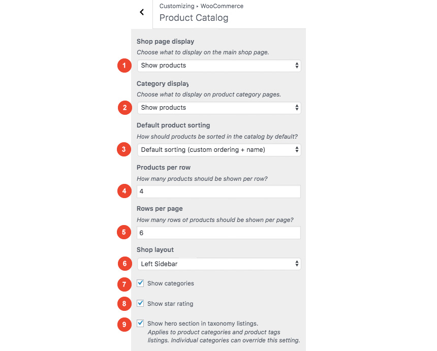
The framework offers various customization options both for the main product listing page under Customize > WooCommerce > Product Catalog and for single products under Customize > WooCommerce > Single Products.
Learn more about the WooCommerce integration and the options offered here.
Blog page
This is you main blog page. You can create a new page and set it as your posts page under Customize > Homepage Settings. You can customize it under Customize > Blog from the Archives section.
Widget areas
The theme provides special widget areas for your posts listings, pages and shop. You can use a plugin/module like Jetpack’s widget visibility to hide or show widgets for certain pages, posts or products.
Page builder support
Ignition Framework based themes work seamlessly with popular page builders like Elementor, Divi, Beaver builder and more to cater to the needs of those who like to build things visually.
Support
If you need help during the initial installation and setup of this theme feel free to get in touch and we will get back to you within 24 hours to help.
In case you missed it, last month we released Moliere, a hospitality theme, based on our brand new framework. Meanwhile, we’ve been hard at work building more goodies for you and improving upon what we’ve already built. Now, Moliere v1.1 adds some more features to sweeten the deal!
Moliere is a powerful Hotel theme with a unique design and vast customization options.
Image Sizes
The minimum recommended image sizes for Moliere are:
Post thumbnail: 850x478px
Item thumbnail: 615x346px
Media Item tall: 615px unlimited in height
Large Item image: 1260x709px
Article Image: 510x510px
Hero image: 1700x956px
Notice, the original demo images are not redistributed (unless noted). Instead blurred equivalents will be imported while installing the sample content.
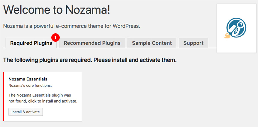
Getting Started
After installing the theme you will be redirected to this welcome screen. Here you can install both required and recommended plugins. While recommended plugins are optional for the theme to function, consider installing them if you want the full sample content to be imported.
Required Plugins
Here you will need to install and activate the theme specific plugin required by the theme. This will create Custom Post Types as well as various Widgets and Shortcodes. Some hosting providers block automatic installation of plugins. This means you will need to install the plugin manually as you would normally do. This plugin is located inside the /plugins/ folder in your theme archive.
Recommended plugins
Under the Recommended Plugins tab you will find a list of supported plugins that will enhance the theme’s functionality. It is recommended to install and activate them before importing your sample content.
WooCommerce: To enable eCommerce functionality for your website
Elementor: A free page builder that delivers high-end page designs and advanced capabilities.
MaxSlider : Use this plugin to help you create custom sliders and use them anywhere you wish shortcodes.
One Click Import : Use this plugin to help you import your content with just one click.
Contact Form 7: Use the plugin in order to get booking and contact forms on sample content import
All the above are mandatory while these:
WPForms use this plugin to create a contact form, then copy the shortcode it gives you and paste it in an empty page.
plugins are complementary.
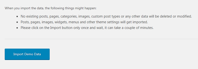
Installing Sample Content
To automate the process of importing and for a better experience we have included native support for One Click Import Plugin. From the Sample Content tab, you can click the Get Started button to navigate to the sample content import screen.
You can always find the import page under Appearance → Import Demo Data.
You can install it in the Recommended Plugins tab (2) or manually from From your WordPress dashboard
Visit Plugins → Add New,
Search for ‘One Click Demo Import’ and install the plugin,
Activate ‘One Click Demo Import’ from your Plugins page.
Click on the Import Demo Data button and you are done!
Sometimes altering and editing sample content may go wrong. If you need a fresh start you can reset your WordPress installation using any popular resetPlugin. Beware: this will erase all data you have and not just the sample content.
This plugin requires a PHP version of at least 5.3.x, but we recommend version 5.6.x or better yet 7.x. Please contact your hosting company and ask them to update the PHP version for your site.
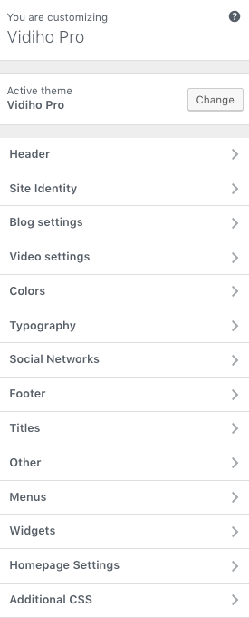
Customizing Your Theme
All theme’s customizations and settings can be done via WordPress’s built-in Customizer. If you haven’t used it or want to learn more about it, please read this article.
Go to Appearance > Customize and you will see this:
TIP 1: Any changes you make in the tabs below will be previewed live on the site which appears in right side of the screen, however to save these changes you need to click the Save & Publish button on the top of the bar, if you have made a change but see the button grayed out (for example changed the font size of a heading), move the cursor outside the input box, for example, to the next input box, then the button should be clickable again.
TIP 2: You can hide any customization section your don’t need to appear in the customizer under Appearance→Customizer Settings.
Let’s take a look at the options each tab gives you.
Global
Global section will allow you to control the layout, colors and typography that will apply everywhere in the theme:
Global→Layout
Let’s have a look at each option this section provides:
Apply a full width or boxed container for all content.
Control the inner full content width.
Control the content width from (from 1 to 12).For example 8 means that your content width will have the 8/12 of your Inner Site Width while the other will be reserved for the sidebar.
The sidebar width.For example 5 means that your content width will have the 5/12 of your Inner Site Width while the other will be reserved for the main content.
When selecting a Boxed layout you will get this screen:
You can switch layouts anytime you wish.
Control the outer width of your main content.
Control the inner width of your main content.
Global→Colors
This section will allow you to change the background color / image as well as all your basic theme elements, like your links, forms, headings, buttons colors:
Change the body background color.
Add of remove background image.
Control the background location and size.
When using a boxed layout you can select the inner background color.
Select the boxed layout background image.
Also you can control the boxed background image location and size.
Typography
Customizing your fonts is included natively in Moliere:
Enable the use of Google Fonts. Not checking this option will give you web safe font controls for your main body text.
Change the main font family you need to use.
Change your settings depending on the visitor viewport. This gives you the advantage of having different font sizes for Desktop, Tablet and mobile devices.
Change the font size and Line height.
Change the text type and your letter spacing.
Top Bar
Top Bar section will allow you to control the area before your main header. This area contains various elements, like search, social icons and placeholders via shortcodes as well as informatory text.
You can control its layout, content, colors and typography directly via the customizer.
Top Bar→Layout
In this section you can:
Show / hide the top bar.
Change the top bar visibility in mobile devices.
Change the padding of the top bar in desktop, tablet, mobile.
Arrange the top and bottom distance of the top bar. The chain button will allow you to change these values equally.
Top Bar→Content
Here you can control what the top bar will actually have as content:
Control the Left Content area, using various shortcodes or text.
Control the Right Content area again using shortcodes or text.
Here you can control all related colors of each element that renders in the top bar.
Top Bar→Typography
Controlling typography is quite simple as well. In this section you can:
Change the main font family you need to use.
Change the font size and Line height.
Change the text type (uppercase,lowercase) and your letter spacing.
Change your settings depending on the visitor viewport. This gives you the advantage of having different font sizes for Desktop, Tablet and mobile devices.
Header
Here you can control the basic Layout, Content, Colors and Typography of your header. You can also control if you need your header to stick to the top when scrolling.
Header→Layout
Here you can control the basic structure of your header area.
In detail you can:
Control the header type. Normal means the header will not cover the hero, while being transparent will do! (Even if you don’t have transparency setup from your Header Colors section)
Make the header cover the full width of the screen.
Change the Header top and bottom padding and lock these values to behave the same.
Change the padding section in any device type.
Header→Content
While your header actually has the main menu attached you can add any text/shortcode you wish before or after the main menu. Add a social icon shortcode for example.
Header→Colors
Here you can control all header colors. Pay special attention to the transparency control when using the Transparent header type.
Header→Sticky Colors
Here you can control the colors for your sticky header.
Header→Typography
Here you can control the Main Menu Font style.
Change the main menu font family and settings
Change the submenu font family and settings
Also in the same section you can change (if you are using a text logo):
The text Logo font family and style.
The tagline font family and style.
Site Identity
Here you can change the logo and favicon as well as the title and description. Use the appropriate fields to add your information, show or hide your site title and subtitle and upload your logo and site icon images.
Select an image Logo.
Select an alternate logo that will appear either when your header is sticky with different background color, or when your header has the transparent type selected. This extra field will ensure maximum contrast in any case scenario.
Limit the size logo in half (you will need to use a 2x image) for retina devices.
Add you site title.
Add you site tagline.
Show/hide your site title.
Show/hide your tagline.
For you main site icon you can select any image you want as long as its 512x512px in width and height and its square.
Hero
This is the basic section before the contents of your page and you can control the Layout, Content colors and typography of this particular section.
Hero→Layout
Here you can:
Show or hide the hero section
Change the section visibility depending on the device viewport size.
Change the hero height,
Control the hero height in desktop/mobile/tablet
Change the hero padding and lock the proportions in order to change dynamically.
Control the hero padding in desktop/mobile/tablet
Control the horizontal alignment of your hero content.
Control the vertical alignment of your hero content.
Hero→Colors
Here you can:
Add a background color.
Add a background image and control your image settings and position.
Use an overlay background color for your image to increase the contrast for your content.
Change the primary text color.
Change the secondary text color.
Hero→Content
This is the basic Hero content section:
Have a global title for the entire site
Have a global subtitle for the entire site
Change the title in category/tag archives
Change the subtitle in category/tag archives
Hero→Typography
Here you can control:
Your primary title heading type. This can be any suggested HTML tag
Change the primary text font family and settings
Change the primary text settings in mobile, desktop, tablet viewport
Your subtitle HTML tag
Change the secondary text font family and settings
Change the secondary text settings in mobile, desktop, tablet viewport
Blog
This tab allows you to customize your blog and post options.
Blog→Layout
Here you can change your single post and archive (category and tags) looks.
Change the main blog page Layout.
Change your archive layout type.
Change the pagication method.
Change the Related post columns.
Blog→Content
Here you can control which elements you want to show/hide in your Single Post pages and Archives:
For Archives:
Change the excerpt length in words
Show or hide the featured image
Show or hide the post title
Show or hide the post meta
Show of hide the content
Show or hide the Read more button
While in Single Posts you can:
Show or hide featured images.
Show or hide the title.
Show or hide meta information.
Show tags.
show post pagination.
Show the author box.
Show related posts.
Show comments.
Blog→Typography
Here you can change your Archive typography:
Change the archive heading HTML tag.
Change the post title font family
Change the font size and other settings in different viewports
Change the post meta font family and settings
Change the post size and other settings in different viewports
Same applies in single post typography:
Here you can:
Change the post heading HTML tag
Change the Font family and settings of the post title
Change the post meta font family and settings
Change the font size in various viewports
Sidebar
Here you can change your sidebar options.
Sidebar→Layout
Under the Layout section you can:
Change the Sidebar padding in any possible viewport
Change the widget padding in both mobile/desktop/tablet.
Change the widget title padding
Change the widget bottom margin.
Sidebar→Colors
Here you can customize all sidebar and widget colors.
Sidebar→Typography
Change the sidebar widget text family and settings.
Change the sidebar widget text size in Desktop/Mobile/Tablet.
Change the sidebar widget title font family and settings.
Change the sidebar widget title font size in Desktop/Mobile/Tablet
Footer
Footer section also has a full customizable layout, color and typography section:
Footer→Layout
Here you can:
Show or hide the footer area
Select the footer visibility in Mobile devices
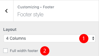
Select the footer columns you need
Make the footer full width
Change the Footer padding
Change the Footer padding in all possible viewports
Change the Footer widget titles padding and
Change the Footer widget titles padding in Mobile devices.
Footer→Colors
Here you can change most of the footer and footer contents colors. While in general you can:
Add a background color.
Set a background image and customize its appearance.
Footer→Typography
Footer Credits
After the main footer area we have reserved a Footer Credits section you can add you copyright text or any content you wish via shortcodes.
Footer Credits→Layout
Here you can
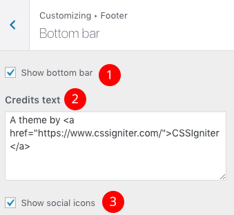
Show or hide the footer credits
Change the credit visibility in mobile devices
Footer Credits→Content
Currently there are two areas you can use to add your content. Both these support some HTML eleements.
Add your text/shortcode in the Left content area.
Add your text/shortcode in the Right content area.
Footer Credits→Colors
Here you can control all Footer Credits colors.
Footer Credits→Typography
This section gives you the option to change the credits text style.
Change the Font family and font settings of the Footer credits section
Control all font settings in any possible viewport.
Social
In this section You can add your Social Network URLs. These icons will be displayed in the Theme-Social Icons Widget automatically and wherever the Social Icon shortcode appears
Here you can add your social network URL and change your icon colors
Social→Layout
Select if you wish to open your links in new tabs
Change the font size
Change the icon size
Social→Colors
Change the Social icon and background colors
Social→Content
Add you social networks in the content area.
Utilities
This section provides control over the Lightbox (gallery popup) and the Back to top button.
Utilities→Lightbox
Here you can switch the theme Lightbox off, if you need to use a third party one, or simply nothing.
Utilities→Back to top button
This section will help you
Enable the back to top button
Change the button visibility
Change the button position and
Change the button position in various viewports
Select its background color
Change its icon color
Menus
Here you can create and assign menus to the theme. To learn more about menu creation check out the Codex’s menu user guide here.
Widgets
Through this tab you can add widgets to the theme’s sidebars. The theme features eight widgetized areas to provide you maximum flexibility when displaying your content.
Homepage Settings
Use this tab to make the Home page your static front page so you can take advantage of the homepage template we have created for you. Here you can also set the Blog page to be your default posts page.
Additional CSS
In this tab we host the custom CSS panel which you can use to insert styles for elements not covered in the rest of the tabs.
Creating a Widgetized Front Page
Navigate to Content Area→Layout and under the Layout dropdown select the Widgetized front page.
Then open in the Content Area the Content tab and set a MaxSlider Shortcode.
Then select this page as a static frontpage from Settings→Reading.
Creating a Page Builder Frontpage / Landing Page
Create a new page like described here and navigate to Content Area→Layout and under the Layout dropdown select the Contained or Full Width Page builder option
If this is your homepage select it as a static frontpage from Settings→Reading.
Creating a Rooms Listing Page
Create a new page like described here and then navigate to Content Area→Layout and under the Layout dropdown select the Room Listing option.
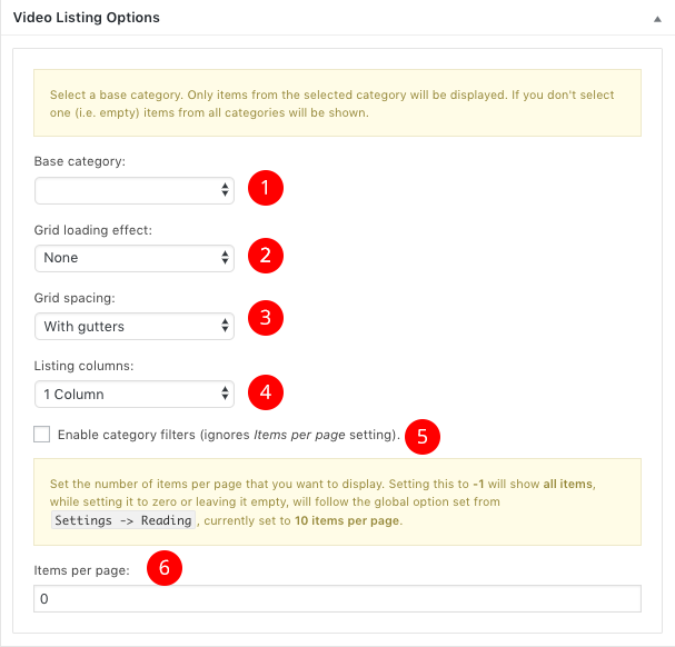
Here you can
Show or hide the page title
Select a Room category that will be the base for your Room items. Leaving this blank will fetch all your Rooms.
Change the grid loading effect
Change the grid spacing
Change the number of columns for your list
Use a masonry effect for different image sizes.
Use category filtering. This will display all categories as filter options and will also show all your rooms
Change the items per page,-1 will show them all, while not having anything here will default to the Settings→Reading Post to show option.
Adding a new Room
Adding a new Room is relatively easy. Navigate to Rooms→Add New and you will see this screen
Add a new Room name
Add some content / galleries / amenities
Change your Rooms settings.
Organize your Rooms via Categories (You can add a new category directly from this section or Categories→Add New)
Set a basic Featured image that will be used page Room listings and Room taxonomy listings
While most of them are straight forward, we will have a look a the Room details which will help you customize each Room separately, altering the main Customizer settings to your needs.
Room settings consists of 6 main customization tabs. These are exactly the same options as Pages but with certain functionality to match the Rooms post type.
These tabs are
Top Bar
Header
Hero
Content Area
Footer
Footer Credits
While most of these section are inherited from your Customizer settings we will focus on the Content Area.
Navigating to the Layout tab will give you the option to
Change the Layout for this specific area.
Show / Hide the main title.
Show / Hide the main subtitle.
While you can control your Content
Add a shortcode or content before the main room area
Add subtitle that will appear under your main Room title
Add an offer text for the room listing page
Add a slider gallery with your images
Creating an Attraction Listing Page
First Create a new page like described here then navigate to Content Area→Layout and under the Layout dropdown select the Attraction Listing option.
Show or hide the page title
Change the grid loading effect
Change the grid spacing
Change the number of columns for your list
Use a masonry effect for different image sizes.
Change the items per page,-1 will show them all, while not having anything here will default to the Settings→Reading Post to show option.
Adding a new Attraction
Attraction items are Custom post types you can add from Attractions→Add New. These items don’t have any taxonomy option though.
Add a new Attraction name
Add some content / galleries / etc
Change your Attraction settings.
Set a basic Featured image that will be used page Room listings and Room taxonomy listings
Publish your post.
Attraction settings consists of 6 main customization tabs. These are exactly the same options as Pages but with certain functionality to match the Attraction post type.
These tabs are
Top Bar
Header
Hero
Content Area
Footer
Footer Credits
and the have the same behaviour as the Page settings.
Creating a Full width page
To add new posts to your blog, go to Pages → Add new and navigate to Content Area→Layout and under the Layout dropdown select the Fullwidth or Fullwidth Narrow option.
Creating a Service page
Services are a simple pages but with a common parent page as a listing page. Creating them will be as simple as creating a new page from Page→Add New and selecting a common parent page from Page Attributes section. These services have a different Hero Layout
Besides the Hero background for Services, all other options are the same as a single page.
Adding a new page
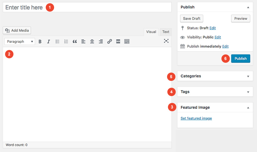
To add new posts to your blog, go to Pages > Add new and proceed to:
Add a title to your page
Enter the content in the editor
Change the page settings
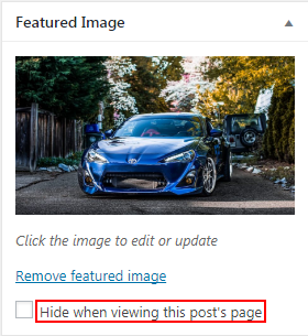
Upload a featured image by clicking “Set featured image” on the Featured Image panel
once finished clicking the Publish button to publish the post
Page Settings
This is the main settings panel which you can use to alter your page functionality and looks. Here you can alter your page to behave as a listing page for Rooms and Attraction or a listing page for children pages when the one editing is a parent to them. Lets check all Tabs one by one to identify their functionality.
Here you can bypass all Top Bar Customizers settings
Differentiate a page header from the default one you created in Customizer
Change the Hero content and styling for specific page
Change the Page type and enchant its layout functionality from Content Area
Change the Footer section properties for a certain page
Change the Footer Credits section properties for a certain page
While All tabs are mimicking the Customizer behaviour but for the page you are creating, under the Content Area tabs we have a set of special options for each page.
Page→Top Bar
This will Control the top bar layour of that particular page. If settings stay intact, customizer ones will be imported
Show or not the Top Bar for that page
Change the Top bar visibility
In the same section you can control the top bar content, again for this particular page.
Add content (shortcodes or HTML).
Add content on the left top bar area.
Add content on the right top bar area.
In the next tab you can change the Top bar colors for that page
Change the background color.
Change the border color.
Change the text color.
change the link color.
change the hover color of the link.
Page→Header
Here you can control the Header Layout
Change the Header type of the page
Change the Header padding of the page
Change the menu layout for that page
Change the menu padding
While, you can also add content before or next to the main menu, for that page only.
Also you can
Add Content like text or shortcodes before the header
Add Shortcodes or HTML in the main header area
Add A main menu
Add a Main menu that will appear on the right side when a Menu split is selected.
Finally, you can change all header Colors like
All Header area colors
All Logo colors
All Menu colors
All Sub menu colors
Page→Hero
Here you can control the Hero layout of the page. Leaving these settings untouched will automatically inherit all your Customizer settings under Customize→Hero
Choose to show or not the hero
Change the Hero height
Change the horizontal alignment of your text
change the vertical alignment of your text
Next, you can change the Hero Content, like:
Add a shortcode before the hero section
Add a title
Add a subtitle
Add a callout button text
Add a URL for your button
Along, you can change the colors or the background of the Hero section.
Add a background color
Select an image and change its position settings
Add an overlay color for your background image
Select the title text color
Select the subtitle text color
Select the button background color
Finally you can set the Hero typography settings
Change the title text font and font style.
Select the HTML tag for this element.
Select a secondary text font.
Select a secondary text HTML tag.
Page→Content Area
Here you can control the main content area Layout
Change the Page default layout
Show its title or not
Also you can
Set a shortcode to show before your main page content
Page→Footer
This is the main layout section for the page footer
You can select whether you can
Show or hide the footer
While you can also add some content before the main page footer area
Add some text or shortcode before the footer.
Also you can change all page footer colors, for that specific page
Change the Footer background
Add a Footer image and select its settings
Change the Footer Widgets colors
Page→Footer Credits
You can change the Layout of the page Footer credits
Showing or not the credits area
Also you can control the content before the page Footer Credits section
Add a shortcode or text there
Finally you can change the Footer Credits Color for this page
Change the background color of your Credits footer section for a specific page
Change the text color for the Credits footer section for a specific page
Change the like color for the Credits footer section for a specific page
Change the link hover color for the Credits footer section for a specific page
Change the border color for the Credits footer section for a specific page
Creating a page for your posts
To setup your blog page you can go to Pages → Add New and create a page named Blog. Then navigate to Settings → Reading and set that page as your posts page.
Now you can add that page to your menu to give your visitors easy access to all your posts.
In this page you can control via its Page Settings section how the hero behaves in the blog page but it will also affect the hero section of the following pages: Categories, tags, author archives & date archives. If you don’t change anything in this page, Customizer settings will be respected.
Handling Hero images in Categories / Tags
You can change in each category your Hero background image and title to your preference, from Posts→Categories and Posts→Tags under the Hero section. If no Hero image is selected, the category/tag will default to the Blog page values, and if no blog page settings exist then it will inherit the Customizer→Hero values.
Lets have a quick look how to change the Hero background for every category. First navigate to Posts→Categories and add a new or edit the category you need to change. Then scroll down to this screen:
You can set your taxonomy title
Change your taxonomy subtitle
Select a background color
Upload a background image for your hero
Change the background image settings
Following this section there is a color selection for every aspect of the taxonomy hero
while scrolling more you will get this
You can change the primary text font (title)
The primary font HTML tag
The secondary text font
The secondary font HTML tag
These settings are the same for Tag archives also.
Widgets
We have handcrafted some custom widgets to help you better display your content. You will find them under Appearance→Customize →Widgets or Appearance→Widgets
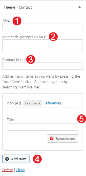
Theme-Contact
Using this widget you can create a contact box including a title a map and various complementary elements with icons that will help you add more information like telephone etc about your business.
Add a title for your Contact widget.
Add a map code (iframe).
Add a contact title
Create new complementary elements.
Add an icon code (from fontawesome.io) and some text along.
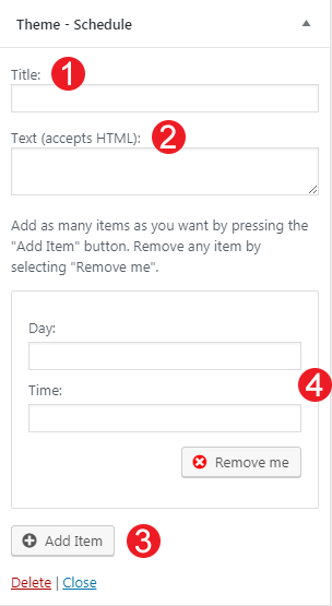
Theme-Tabular Data
This widget allows you to create a small Schedule table with extra contextual information.
Add a title for your widget
Add some complementary text. You can use HTML tags also if you wish.
Add a new item
Add your item Label.
Add the item value
Remove the item
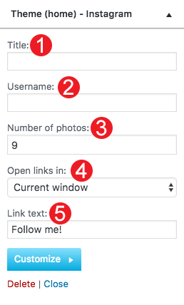
Theme(home)-Instagram
This will allow you to display your Instagram Account in your Front Page or Pre-Footer sidebar. The WP Instagram Widget must be installed and activated in order this Widget to appear
Add a title for your Instagram Widget.
Add your Instagram Account.
Add a number of photos you wish to display.
Select the Instagram Photo size.
Select whether you need your images to open in the current window or open in a new tab.
Change the link text.
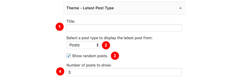
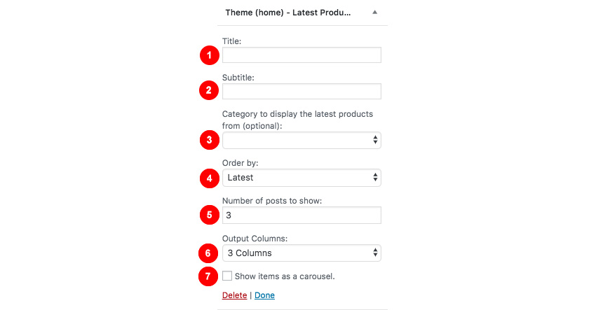
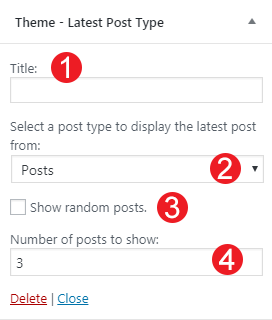
Theme (home)-Latest Posts
This widget is built to help you display your latest posts in your home widget area.
Add a title.
Add a subtitle.
Select the category your need to display the latests posts from.
Show random posts instead.
Change the post number.
Adjust the number of columns for your content.
Show carousel like widget with your posts.
Theme-Callout
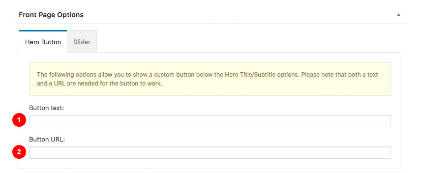
This is a simple Callout widget, that will allow you to add a text with a button in any sidebar you want.
Add a widget title
Add a Title for your Callout widget.
Add a Subtitle for your Callout widget.
Select a Button text
Select a button URL.
Theme-Buttons
This widget will help you render a list of buttons.
Select the Widget Title.
Add a new button.
Add the button title.
Add a button subtitle.
Add a button icon.
Add a button link.
Remove the button.
Theme-Page Children Menu
When you have a parent page, in any of its children that this widget is present it will create a menu linking to other children of the same parent page.
Widget Title
Hierarchy settings.
Theme-Social Icons
This widget displays your site’s social icons. In order to set them up, you need to visit Appearance→ Customize → Social → Content and provide the appropriate URLs where desired.
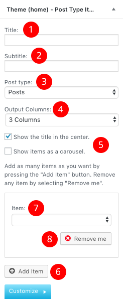
Theme(home)-Post Type Items
This widget is built to help you display any post you wish in your Homepage Widget area.
Add a title.
Add a subtitle
Select the post type.
Select the output columns.
Add the Item you wish to output.
Select the Item from the drop-down menu.
Shortcodes
You can use these shortcodes in any HTML/shortcode reserved area:
[site-socials]
This shortcode will display the site’s social icons. You can edit these icons from Customize→Socials→Content
[site-search]
Displays a search icon which, when clicked, drops down a searchform from the top of the page.
[site-title]
Displays the site title.
[site-tagline]
Displays the site tagline.
[custom-menu name="Menu name"]
Displays the *top level items* of a menu. Inside the name=”” parameter there should be the *name* of a user-created menu, not its slug. e.g. [custom-menu name=”Main Menu”]
[minicart-button]
Displays a cart button which, when clicked, expands into a minicart. Please note, this shortcode is only available when the WooCommerce plugin is activated.
[menu-items]
Displays menu items. Without any parameters prints all menu items (including subcategories etc).
All shortcode options:
columns=”3″ – How many columns to print the items into. Valid numbers: 1-4. Default “1”.
category=”category-slug” – Sets it as the base category and only displays items in that specific category (and its subcategories). Default is empty.
subcategories=”false” – Disables printing of subcategories and their items. Default is “true”.
heading=”false” – Disables printing of the top level category titles. Best when used in combination with category=”category-slug” and subcategories=”false” parameters.
h=”2″ – Sets the starting level of h-tags for the category titles. For example, h=”3″ will print top-level category titles with an <h3>. Default is “2”.
Elementor Widgets
Moliere comes with custom Elementor widgets which have the same functionality as its widgets, making landing pages easier to create.
Moriele Element
This is your Swish knife when using Elementor plugin. With Moliere Element you can render all your content from posts/pages/rooms/attractions and their taxonomies(if any) as well as manually get any part of your content using a search keyword. Let’s have a quick look
Select in how many columns your content will render
Select the main source type for your content. Notice, you can select a manual mode, where you will get the source based on you search criteria
Filter your source content by author.
Select a category. If blank all categories will be shown.
Exclude a category.
Select a posts per page
Select the offset of the rendered posts (2 for example, will leave the first two).
Select the order by a value (Date, etc)
Select the order of your results (descending etc)
Hooks
Hooks will allow you to add extra functionality at a various areas inside the theme. For example, you might need to add a simple ad banner or text after each post, or after your header! Hooks will help you achieve this.
Check this WordPress Hooks API guide to make yourself familiar with Hooks (actions/filters etc).
Visualization of basic theme hooks
Examples
The moliere_head_mast_before hook is executed right before the Site Header.
function moliere_custom_script_before_header() { // Your PHP goes here }
or use moliere_after_header add some HTML after your header and before the hero/slider area
add_action( 'moliere_after_header', 'moliere_custom_html_after_header' );
function moliere_custom_html_after_header() { ?>
<!-- Your HTML goes here -->
<?php }
To automate the process of importing and for a better experience we have natively included support for the One Click Demo Import Plugin.
Installing the Plugin
From your WordPress dashboard
Visit Plugins → Add New and
Search for One Click Demo Import and install the plugin,
Install and Activate One Click Demo Import from your Plugins page.
Manually by downloading WordPress.org
Download One Click Demo Import.
Upload the one-click-demo-import directory to your /wp-content/plugins/ directory, using your favorite method (ftp, sftp, scp, etc…)
Activate One Click DemoImport from your Plugins page.
Installing Sample Content
Once the plugin is activated you will find the actual import page in Appearance → Import Demo Data.
Click on the Import demo data button and you are done!
Troubleshooting
Although One Click Import is a quite versatile plugin, you might encounter errors, usually caused by your server configuration. As a general note, this plugin requires PHP version of at least 5.3.x, but we recommend version 5.6.x or better yet 7.x.
Please contact your hosting company and ask them to update the PHP version for your site.
GutenBee is a collection of elegant WordPress blocks enhancing your editing experience in the Gutenberg editor and vastly extending the potential of the new editor experience.
Installation
To install the plugin simply navigate to Plugins → Add New in your WordPress dashboard and search for Gutenbee!
Next, click the Install Now button and wait for the plugin to be installed. Once the plugin is installed you can click the Activate button.
That’s it. The plugin is installed and activated.
Enabling your Blocks
Navigate to Settings→GutenBee Settings and enable or disable your new custom blocks. By default, all blocks are enabled and work as expected except for the Google Maps Block, which will need first a valid API key. You learn how to obtain an API key by following the guide here.
Blocks one by one
After Installing the plugin, you will notice a new tab that appeared in your block collection that includes all active GutenBee blocks.
These new tools will help you shape your content and generate complex scenarios using the new WordPress Editor. Let’s have a look at each block.
Accordion Block
With this block you can create easily an Accordion structure, by directly adding your content editing the Title, Content and change several settings from the block’s options. Let’s take a look at the settings.
Accordion Settings
Under the Accordion Settings tab you can set up how the Accordion will work. There are three available options:
From the number of tabs slider you can select how many tabs the accordion will have.
If the collapse others on click switch is on clicking to open one tab will close/collapse the currently open one.
You can have one tab be open on page load by selecting it and toggling the start current tab open switch. This is a per tab option and you can have more than one tabs set to be open by default.
Block Appearance
Under Block Appearance you can customize the look of the block. The available options are:
Title Text Color: This option controls the color of the tab title’s text, for Default, Hover and Active State.
Title Background Color: This option controls the color of the tab title’s background, for Default, Hover and Active State.
Content Text Color: This option controls the color of the content text.
Content Background Color: This option controls the background color of the content area.
Border Color: This option modifies the color of the block’s borders.
Padding: With this option you can control the padding on each side of the block individually or all at once.
Margin: With this option you can control the margin on each side of the block individually or all at once.
Notice that the Padding and Margin options have three icons next to their label. These are the Desktop, Tablet and Mobile icons. By clicking each icon you can separately modify the values of padding/margin for each device.
Banner Block
Buttons Block
The Buttons block consists of the Button Group block which groups multiple buttons and offers options for the general appearance of the group and the Button block which controls the functionality and appearance of the individual button.
Let’s take a look at the Button Group first.
Button Group Settings
Here you can control the alignment of the entire button group and choose to display your buttons aligned to the left, right or center.
Notice that the Button Alignment has three icons next to its label. These are the Desktop, Tablet and Mobile icons. By clicking each icon you can separately modify the button group alignment for each device.
Block Appearance
Under Block Appearance you can customize the look of the block. The available options are:
Background Color: This option controls the background color of the button group.
Padding: With this option you can control the padding on each side of the block
Background Color: This option controls the background color of the button group.
Padding: With this option you can individually control the padding on each side of the block.
Margin: With this option you can control the margin on each side of the block individually or all at once..
Notice that the Padding and Margin options have three icons next to their label. These are the Desktop, Tablet and Mobile icons. By clicking each icon you can separately modify the values of padding/margin for each device.
Button Settings
Here you can set the button’s URL, select if you wish for it to open in a new tab and set the relation between the current and the linked document via the rel attribute. If you wish to add more than one attributes separate them with a space.
Block Appearance
Under the block appearance tab you can control how each button looks. Let’s take a look at the options.
Font Size: This option allows you to set the font size either via a drop down of preset values or by setting an exact pixel value in the input.
Text Color: This option allows you to set the color for the button’s text.
Background Color: This option controls the button’s background color.
Border: This option allows you to select the border style via the drop down and then select the border color and width.
Border Radius: This option allows you to round the button’s corners.
Box Shadow: This option allows you to apply an inset/outset box shadow, its color, spread, blur radius and offset.
Padding: With this option you can control the padding on each side of the block individually or all at once.
Margin: With this option you can control the margin on each side of the block individually or all at once.
Notice that the Font Size, Padding and Margin options have three icons next to their label. These are the Desktop, Tablet and Mobile icons. By clicking each icon you can separately modify the control’s values for each device.
Predefined Templates
Under the Predefined Templates tab you can choose from pre-built button sizes and button styles for easier button creation. Available button sizes are extra small, small, medium and large. Available button styles are normal and outline.
Container Block
Countdown Block
This block will allow you to create an advanced countdown element using the date and time you want as an ending point.
Here you can change the ending date and time.
Change which elements you want to display or not.
Select the font style and size as well as the padding and margin of the block.
Change the text color.
Change the background color.
Add a custom CSS class to style your block.
Date & Time Tab
In detail in this tab you will find:
Select the date and time the counter will finish.
Advanced Calendar to easily find your date.
Settings Tab
Also, you can change which parts you need to hide or show each time.
Show/Hide Days.
Show/Hide Hours.
Show/Hide Minutes.
Show/Hide Seconds.
Show/Hide Labels.
Block Appearance
Under the block appearance tab you can control how the block looks. Let’s take a look a the options.
Box Text Color: This option allows you to set the color of the count down text.
Box Background Color: Controls the color of the box’s background.
Box Label Text Color: Changes the color of the labels.
Block Background Color: Controls the background of the entire block.
Border: This option allows you to select the border style via the drop down and then select the border color and width.
Border Radius: This option allows you to round the box’s corners.
Box Shadow: This option allows you to apply an inset/outset box shadow, its color, spread, blur radius and offset.
Box Max Width: Allows you to set a maximum width for the boxes (relative to their container).
Number Font Size: Set the font size for the numbers either via a drop down of preset values or by setting an exact pixel value in the input.
Label Font Size: Set the font size for the labels either via a drop down of preset values or by setting an exact pixel value in the input.
Label Top Margin: Control the spacing between the numbers and the text below.
Padding: With this option you can control the padding on each side of the block individually or all at once.
Margin: With this option you can control the margin on each side of the block individually or all at once.
Notice that the Font Sizes, Padding and Margin options have three icons next to their label. These are the Desktop, Tablet and Mobile icons. By clicking each icon you can separately modify the control’s values for each device.
Countup Block
This block will allow to you create a count up element from a number to an ending one. You can have extra labels (prefix and suffix) before and after the counter.
Block Settings
Start Number: Input the number from which you want to start your count up from.
End Number: When this number is reached the count up ends.
Prefix: Any input here will appear to the left of the number in the count up.
Suffix: Any input here will appear to the right of the number in the count up.
Animation Duration: The time it takes for the count up to reach the end number.
Separator: This is the thousands separator, can be comma, dot, or space.
Text Font Size: Set the font size for the count up either via a drop down of preset values or by setting an exact pixel value in the input.
Title Top Margin: Control the spacing between the numbers and the text below.
Title Font Size: Set the font size for the title text either via a drop down of preset values or by setting an exact pixel value in the input.
Notice that the Font Size options have three icons next to their label. These are the Desktop, Tablet and Mobile icons. By clicking each icon you can separately modify the control’s values for each device.
Block Appearance
Under the block appearance tab you can control how the block looks. Let’s take a look a the options.
Text Color: This option allows you to set the color of count up text.
Title Color: This option allows you to set the color of the title text below the numbers.
Background Color: This option controls the block’s background color.
Border: This option allows you to select the border style via the drop down and then select the border color and width.
Border Radius: This option allows you to round the box’s corners.
Box Shadow: This option allows you to apply an inset/outset box shadow, its color, spread, blur radius and offset.
Padding: With this option you can control the padding on each side of the block individually or all at once.
Margin: With this option you can individually control the margin on each side of the block individually or all at once.
Notice that the Padding and Margin options have three icons next to their label. These are the Desktop, Tablet and Mobile icons. By clicking each icon you can separately modify the values of padding/margin for each device.
Divider Block
This is a simple divider block which will allow you to create distance between elements or add a border with various styles between them.
Block Settings
This section is used to control the look of the divider. Let’s take a look at the available options.
Style: There are four available styles to choose from, solid, dotted, dashed and double.
Weight: Controls the thickness of the divider.
Width: Controls whether the divider will span the entire width of its container or be narrower.
Height: Sets the height of the divider’s container.
Alignment: Changes the alignment of the divider, useful when the width is less than 100%. Available options are left, center and right.
Block Appearance
Under the block appearance tab you can control how the block looks. Let’s take a look a the options.
Color: This option allows you to set the color of the divider.
Background Color: Controls the color of the divider container’s background.
Background Image: Applies a background image to the divider’s container and allows you to configure its appearance.
Border: This option allows you to select the border style via the drop down and then select the border color and width.
Border Radius: This option allows you to round the divider container’s corners.
Box Shadow: This option allows you to apply an inset/outset box shadow, its color, spread, blur radius and offset.
Padding: With this option you can control the padding on each side of the block individually or all at once.
Margin: With this option you can individually control the margin on each side of the block individually or all at once.
Notice that the Background Image, Padding and Margin options have three icons next to their label. These are the Desktop, Tablet and Mobile icons. By clicking each icon you can separately modify the control’s values for each device.
Food Menu Block
Google Maps Block
This tab will allow you to create a Google Map Element as a block. In order this to work you will need to set up an API key and add it under Settings→GuttenBee Settings
Block Settings
Here you can
Change the Latitude/Longitude for your icon to appear.
Change the Zoom Level of the map.
Change the height of the map.
Disable Map Zoom while scrolling.
Change the map style.
Upload your own marker.
Add a complimentary popup with the text you want.
Map Appearance
You can use the textarea in this section to paste in a custom map style, like the ones provided by SnazzyMaps if you don’t wish to use any of the preinstalled styles.
Block Appearance
Under the block appearance tab you can control how the block looks. Let’s take a look a the options.
Background Color: Controls the color of the map’s background.
Border: This option allows you to select the border style via the drop down and then select the border color and width.
Border Radius: This option allows you to round the map’s corners.
Box Shadow: This option allows you to apply an inset/outset box shadow, its color, spread, blur radius and offset.
Padding: With this option you can control the padding on each side of the block individually or all at once.
Margin: With this option you can control the margin on each side of the block individually or all at once.
Notice that the Padding and Margin options have three icons next to their label. These are the Desktop, Tablet and Mobile icons. By clicking each icon you can separately modify the values of padding/margin for each device.
Heading Block
Create flexible headings for your content with the Heading Block.
Block Settings
This section will help you configure the heading. Let’s check out the available options.
Level: Set the level of the heading.
Font Size: Set the font size for the heading either via a drop down of preset values or by setting an exact pixel value in the input.
Alignment: Select the text alignment for the heading.
Notice that the Font Size and Alignment options have three icons next to their label. These are the Desktop, Tablet and Mobile icons. By clicking each icon you can separately modify the control’s values for each device.
Block Appearance
Under the block appearance tab you can control how the block looks. Let’s check out the options.
Text Color: This option allows you to set the color for the heading’s text.
Background Color: This option controls the heading’s background color.
Border: This option allows you to select the border style via the drop down and then select the border color and width.
Border Radius: This option allows you to round the heading container’s corners.
Box Shadow: This option allows you to apply an inset/outset box shadow, its color, spread, blur radius and offset.
Padding: With this option you can control the padding on each side of the block individually or all at once.
Margin: With this option you can individually control the margin on each side of the block individually or all at once.
Notice that the Padding and Margin options have three icons next to their label. These are the Desktop, Tablet and Mobile icons. By clicking each icon you can separately modify the values of padding/margin for each device.
Icon Block
This block will allow you to add specific icons from our handmade listing. You can style them as you need changing their size, color and type.
Block Settings
This section will help you configure the block. Let’s check out the available options.
Icon: Use the dropdown to find and select your desired icon.
View: Choose between default, stacked (rounded container with solid background) or framed (square container with border).
Icon Size: Set the size of the icon.
Alignment: Choose the alignment of the icon, available options are left, center and right.
The Shape and Padding options are made available when a view is selected to control the shape of the icon’s background and its padding. Furthermore when the Framed view is selected a Border Size option is available to control the width of the border.
Notice that the Icon Size option has three icons next to the label. These are the Desktop, Tablet and Mobile icons. By clicking each icon you can separately modify the control’s values for each device.
Icon Appearance
Under the icon appearance tab you can control how the block looks. Let’s check out the options.
Primary Color: This option allows you to set the primary icon color.
Secondary Color: This option controls the icon’s secondary color (visible only when a View is selected).
Box Shadow: This option allows you to apply an inset/outset box shadow, its color, spread, blur radius and offset.
Padding: With this option you can control the padding on each side of the block individually or all at once.
Margin: With this option you can individually control the margin on each side of the block individually or all at once.
Notice that the Padding and Margin options have three icons next to their label. These are the Desktop, Tablet and Mobile icons. By clicking each icon you can separately modify the values of padding/margin for each device.
Icon Box Block
Icon List Block
Create lists with custom icons instead of bullets.
List Settings
This section will help you configure the list. Let’s check out the available options.
List Layout: Choose between a normal or an inline list.
List Item Spacing: Set the default spacing between list items.
List Alignment: Choose the alignment of the list, available options are left, center and right.
List Item Link Display: Choose if you want to display the list items as inline or block level elements.
List Item Separator Width: Set the desired width of the list item separator.
List Item Separator Color: Set the color of the separator.
Notice that the List Item Spacing option has three icons next to the label. These are the Desktop, Tablet and Mobile icons. By clicking each icon you can separately modify the control’s values for each device.
Font Settings
This section controls the font sizes for the list icons and text. You can set the font size either via a drop down of preset values or by setting an exact pixel value in the input.
Block Appearance
Text Color: This option allows you to set the color for the list’s text.
Icon Color: This option controls the color of the list icons.
Background Color: This option controls the list’s background color.
Border: This option allows you to select the border style via the drop down and then select the border color and width.
Border Radius: This option allows you to round the heading block’s corners.
Box Shadow: This option allows you to apply an inset/outset box shadow, its color, spread, blur radius and offset.
Padding: With this option you can control the padding on each side of the block individually or all at once.
Margin: With this option you can control the margin on each side of the block individually or all at once.
Notice that the Padding and Margin options have three icons next to their label. These are the Desktop, Tablet and Mobile icons. By clicking each icon you can separately modify the values of padding/margin for each device.
Icon List Item Settings
By selecting each Icon List Item you can configure its icon via a handy drop down, add a URL where the list item will link to when clicked and choose if you want it to open the link in a new tab.
Image Block
Embed images in your content with the Image block.
Block Settings
This section will help you configure the image. Let’s check out the available options.
Firstly in the Styles section you can choose between the default or a rounded layout for the image.
Under the Image Settings tab you have the following options:
Image Width: Set a fixed width for the image.
Alt Text: Fill in an alternative text for the image, especially useful to screen reader users.
Image Size: Choose the image’s size among the available image sizes of your WordPress installation.
Image Link: Select where the image will link to when clicked..
Notice that the Image Width option has three icons next to the label. These are the Desktop, Tablet and Mobile icons. By clicking each icon you can separately modify the image’s width for each device.
Block Appearance
Under the block appearance tab you can control how the block looks. Let’s take a look a the options.
Background Color: Controls the color of the block’s background.
Border: This option allows you to select the border style via the drop down and then select the border color and width.
Border Radius: This option allows you to round the image’s corners.
Box Shadow: This option allows you to apply an inset/outset box shadow, its color, spread, blur radius and offset.
Padding: With this option you can control the padding on each side of the block individually or all at once.
Margin: With this option you can control the margin on each side of the block individually or all at once.
Notice that the Padding and Margin options have three icons next to their label. These are the Desktop, Tablet and Mobile icons. By clicking each icon you can separately modify the values of padding/margin for each device.
Image Box Block
This block will allow you to create an Image element next to a title and a subtitle. You can use any image you wish from your media library.
Image Settings
This section will help you set up the block’s image. Let’s check out the available options.
Image Alignment: Pick the alignment of the image, allows you to position the image to the left, right or over the text.
Source Size: Set the size of the source image among the available image sizes of your WordPress Installation.
Image Width: Set a fixed width for the image.
Margin: Set the margin for just the image.
Notice that the Image Width and Margin options have three icons next to the label. These are the Desktop, Tablet and Mobile icons. By clicking each icon you can separately modify the control’s values for each device.
Content Settings
This section will help you set up the block’s content. Let’s check out the available options.
Alignment: Set the text alignment.
Heading Element: Set the level of the content’s heading.
Heading Font Size: Control the font size of the heading either via a drop down of preset values or by setting an exact pixel value in the input.
Heading Bottom Margin: Controls the spacing between the heading and the text below it.
Text Font Size: Control the font size of the text either via a drop down of preset values or by setting an exact pixel value in the input.
Notice that the Font Size options have three icons next to the label. These are the Desktop, Tablet and Mobile icons. By clicking each icon you can separately modify the control’s values for each device.
Block Appearance
Under the block appearance tab you can control how the block looks. Let’s check out the options.
Title Color: This option allows you to set the color of the content heading.
Content Text Color: This option controls the color of the content text.
Block Background Color: This option controls the block’s background color.
Border: This option allows you to select the border style via the drop down and then select the border color and width.
Border Radius: This option allows you to round the block’s corners.
Box Shadow: This option allows you to apply an inset/outset box shadow, its color, spread, blur radius and offset.
Padding: With this option you can control the padding on each side of the block individually or all at once.
Margin: With this option you can individually control the margin on each side of the block individually or all at once.
Notice that the Padding and Margin options have three icons next to their label. These are the Desktop, Tablet and Mobile icons. By clicking each icon you can separately modify the values of padding/margin for each device.
Image Comparison Block
This block will allow you to create a side by side comparison for two images of your selection
Block Settings
This section will help you set up the block. Let’s check out the available options.
Default Offset: Sets the initial position of the draggable comparison slider, by default it is in the middle of the image.
Source Image Size: Set the size of the source image among the available image sizes of your WordPress Installation.
Block Appearance
Under the block appearance tab you can control how the block looks. Let’s take a look a the options.
Background Color: Controls the color of the block’s background.
Border: This option allows you to select the border style via the drop down and then select the border color and width.
Border Radius: This option allows you to round the image’s corners.
Box Shadow: This option allows you to apply an inset/outset box shadow, its color, spread, blur radius and offset.
Padding: With this option you can control the padding on each side of the block individually or all at once.
Margin: With this option you can control the margin on each side of the block individually or all at once.
Notice that the Padding and Margin options have three icons next to their label. These are the Desktop, Tablet and Mobile icons. By clicking each icon you can separately modify the values of padding/margin for each device.
Image Gallery Block
This block will allow you to create beautiful galleries using a hand picked set of images.
Block Settings
This section will help you set up the block. Let’s check out the available options.
Gallery Type: Choose between a Justified or a regular columned gallery type (with customizable column numbers).
Row Height: This is used as a lower bound for the height of each row in justified galleries.
Margins: Controls the spacing between gallery images.
Last Row: Controls how the last row is treated in justified galleries. The row can be justified, aligned left, right or center, or hidden entirely.
Randomize: Randomizes the image order on each page refresh.
Block Appearance
Under the block appearance tab you can control how the block looks. Let’s take a look a the options.
Background Color: Controls the color of the block’s background.
Border: This option allows you to select the border style via the drop down and then select the border color and width.
Border Radius: This option allows you to round the image’s corners.
Box Shadow: This option allows you to apply an inset/outset box shadow, its color, spread, blur radius and offset.
Padding: With this option you can individually (or collectively) control the padding on each side of the block.
Margin: With this option you can individually (or collectively) control the margin on each side of the block.
Notice that the Padding and Margin options have three icons next to their label. These are the Desktop, Tablet and Mobile icons. By clicking each icon you can separately modify the values of padding/margin for each device.
Paragraph Block
Create flexible paragraphs with this block.
Block Settings
This section will help you set up the block. Let’s check out the available options.
Font Size: Control the font size of the paragraph text either via a drop down of preset values or by setting an exact pixel value in the input.
Drop Cap: Makes the first letter of the paragraph larger.
Alignment: Controls the alignment of the paragraph text.
Notice that the Font Size and Alignment options have three icons next to the label. These are the Desktop, Tablet and Mobile icons. By clicking each icon you can separately modify the control’s values for each device.
Block Appearance
Under the block appearance tab you can control how the block looks. Let’s check out the options.
Text Color: This option allows you to set the color for the paragraph’s text.
Background Color: This option controls the paragraph’s background color.
Border: This option allows you to select the border style via the drop down and then select the border color and width.
Border Radius: This option allows you to round the paragraph container’s corners.
Box Shadow: This option allows you to apply an inset/outset box shadow, its color, spread, blur radius and offset.
Padding: With this option you can individually (or collectively) control the padding on each side of the block.
Margin: With this option you can individually (or collectively) control the margin on each side of the block.
Notice that the Padding and Margin options have three icons next to their label. These are the Desktop, Tablet and Mobile icons. By clicking each icon you can separately modify the values of padding/margin for each device.
Post Types Block
With this block you can select a custom post type, page, or a post and display a portion of it inside your content. This is specifically useful for landing pages, as you can select more than one items!
Block Settings
The block’s options can be split into three distinct sections. The styles, the query and the layout.
Style
This section allows you to select between predefined block styles (if available) which will change the appearance of the displayed post grid.
Querysetup
This section will create the query which will return the post types we want in our grid.
Post Type: Select a post type to pull the posts from.
Base Category: Select a category/taxonomy term to further narrow down the results.
Author: Return only posts from a specific author.
Excluded Posts: Exclude certain posts from the results.
Included Posts: Include certain posts to the results (can be used to create a grid of hand-picked posts).
Posts Per Page: Set the number of posts you want to see per page on the grid.
Pagination: Enable or disable the pagination.
Offset: Skip one or more posts from the start of the query.
Order By: Select by which attribute your posts will be ordered from (i.e. date, title, id etc).
Order: Display the posts in an ascending or descending order.
Layout
Here you can select how many columns your grid will have, choose to enable or disable grid gutters, toggle the category filtering buttons and set a label for the button on each post type item.
Post Type Templates
The post types block offers templates which allow you to change the structure of the grid items. To do that you will first need to create a child theme, or if using the one of our themes grab it from our downloads section.
Once you have the child theme installed create a folder inside it called template-parts and inside that create another folder called gutenbee.
Next navigate to the /wp-content/plugins/gutenbee/src/blocks/post-types-templates/ folder of the GutenBee plugin and copy the article-default.php and article-media.php files in the /template-parts/gutenbee/ folder you have created in the previous step.
Now you can edit these two files with your preferred code editor and modify the markup according to your needs. The article-media.php takes care of the appearance of grid items when the grid has only one column, and the article-default.php works for 2-4 columned layouts.
Progress Bar Block
You can easily create a static progress bar with several features.
Block Settings
This section will help you set up the block. Let’s check out the available options.
Percentage: Set the “completed” percentage on the bar.
Display percentage: Show a numeric representation of the percentage value on the bar.
Title Bottom Margin: Control the spacing between the bar and its title.
Title Font Size: Control the font size of the title text either via a drop down of preset values or by setting an exact pixel value in the input.
Bar Text Font Size: Control the font size of the bar’s text either via a drop down of preset values or by setting an exact pixel value in the input.
Notice that the Font Size and Alignment options have three icons next to the label. These are the Desktop, Tablet and Mobile icons. By clicking each icon you can separately modify the control’s values for each device.
Block Appearance
Under the block appearance tab you can control how the block looks. Let’s check out the options.
TitleText Color: This option allows you to set the color for the title text.
Bar Text Color: This option controls the color of the text on the bar.
Progress Background Color: This option controls the background color of the “completed” section of the bar.
Bar Background Color: This option controls the background color of the rest of the bar.
Block Background Color: This option controls the background color of the entire block.
Border: This option allows you to select the border style via the drop down and then select the border color and width.
Border Radius: This option allows you to round the block’s corners.
Box Shadow: This option allows you to apply an inset/outset box shadow, its color, spread, blur radius and offset.
Padding: With this option you can individually (or collectively) control the padding on each side of the block.
Margin: With this option you can individually (or collectively) control the margin on each side of the block.
Notice that the Padding and Margin options have three icons next to their label. These are the Desktop, Tablet and Mobile icons. By clicking each icon you can separately modify the values of padding/margin for each device.
Reviews Block
Create summary reviews with individual ratings and an automatic average score.
Block Settings
This section will help you set up the block. Let’s check out the available options.
Score Font Size: Control the font size of the score text either via a drop down of preset values or by setting an exact pixel value in the input.
Score Color: Choose the desired color for the score text.
Verdict Font Size: Control the font size of the verdict text either via a drop down of preset values or by setting an exact pixel value in the input.
Verdict Color: Choose the desired color for the verdict text.
Notice that the Font Size options have three icons next to the label. These are the Desktop, Tablet and Mobile icons. By clicking each icon you can separately modify the control’s values for each device.
Review Item Settings
This section will help you configure global review item options. Let’s check out the available options.
Display Rating: Toggle the appearance of the rating number on each rating bar.
Bar Text Font Size: Control the font size of the bar text either via a drop down of preset values or by setting an exact pixel value in the input.
Bar Height: Set the rating bar height.
Bar Text Color: Control the color of the bar’s text.
Progress Background Color: Choose the desired color for the filled portion of the bar.
Bar Background Color: Change the overall background color of the bar.
Notice that the Font Size option has three icons next to the label. These are the Desktop, Tablet and Mobile icons. By clicking each icon you can separately modify the control’s values for each device.
Block Appearance
Under the block appearance tab you can control how the block looks. Let’s take a look a the options.
Background Color: Controls the color of the block’s background.
Border: This option allows you to select the border style via the drop down and then select the border color and width.
Border Radius: This option allows you to round the block’s corners.
Box Shadow: This option allows you to apply an inset/outset box shadow, its color, spread, blur radius and offset.
Padding: With this option you can individually (or collectively) control the padding on each side of the block.
Margin: With this option you can individually (or collectively) control the margin on each side of the block.
Notice that the Padding and Margin options have three icons next to their label. These are the Desktop, Tablet and Mobile icons. By clicking each icon you can separately modify the values of padding/margin for each device.
Review Item
Selecting each review bar presents you with another option. This one allows you to set the rating number via the slider or the available input.
Slideshow Block
Create a simple Slideshow with various parameters and images.
Block Settings
This section will help you set up the block. Let’s check out the available options.
Autoplay: If enabled the slides will advance without user input.
Infinite Slide: If enabled the slider will loop around to the first slide when it reaches the end.
Arrow Navigation: Toggles the navigation arrows.
Dot Navigation: Toggles the navigation dots.
Animation Style: Choose between fade and slide animations for your slideshow.
Animation Speed: Set the animation speed for the slide/fade effect.
Autoplay Speed: Set the speed between slides.
Pause on Hover: Choose if you’d like the slideshow to pause when hovered.
Navigation Appearance
This section will help you configure the appearance of the slideshow’s navigation. Let’s check out the available options.
Arrow Navigation Color: Controls the color of the navigation arrow.
Arrow Background Color: Controls the background color of the navigation arrow.
Dot Navigation Color: Controls the color of the navigation dots.
Dot Background Color: Controls the background color of the navigation dots.
Block Appearance
Under the block appearance tab you can control how the block looks. Let’s take a look a the options.
Background Color: Controls the color of the block’s background.
Border: This option allows you to select the border style via the drop down and then select the border color and width.
Border Radius: This option allows you to round the block’s corners.
Box Shadow: This option allows you to apply an inset/outset box shadow, its color, spread, blur radius and offset.
Padding: With this option you can individually (or collectively) control the padding on each side of the block.
Margin: With this option you can individually (or collectively) control the margin on each side of the block.
Notice that the Padding and Margin options have three icons next to their label. These are the Desktop, Tablet and Mobile icons. By clicking each icon you can separately modify the values of padding/margin for each device.
Spacer Block
Add spacing between elements.
Block Settings
This section will help you set up the spacer’s height via the slider or the input.
Block Appearance
Under the block appearance tab you can control how the block looks. Let’s check out the options.
Background Color: Controls the color of the spacer’s background.
Background Image: Applies a background image to the divider’s container and allows you to configure its appearance.
Enable Parallax: Toggles the parallax effect. Needs a background image set.
Parallax Speed: Controls the speed of the parallax effect.
Border: This option allows you to select the border style via the drop down and then select the border color and width.
Border Radius: This option allows you to round the divider container’s corners.
Box Shadow: This option allows you to apply an inset/outset box shadow, its color, spread, blur radius and offset.
Margin: With this option you can individually (or collectively) control the margin on each side of the block.
Notice that the Background Image and Margin options have three icons next to their label. These are the Desktop, Tablet and Mobile icons. By clicking each icon you can separately modify the control’s values for each device.
Tabs Block
This block will allow you to create easily a tab element with your content inside.
Block Settings
This section will help you set up the number of tabs by dragging the slider.
Block Appearance
Under Block Appearance you can customize the look of the block. The available options are:
Tab Text Color: This option controls the color of the tab’s text, for the default, hover & active states.
Tab Background Color: This option controls the color of the tab’s background, for the default, hover & active states.
Content Text Color: Control the color of the content.
Content Background Color: Change the background color of the content.
Content Border Color: This option modifies the color of the content’s borders.
Padding: With this option you can individually (or collectively) control the padding on each side of the block.
Margin: With this option you can individually (or collectively) control the margin on each side of the block.
Notice that the Padding and Margin options have three icons next to their label. These are the Desktop, Tablet and Mobile icons. By clicking each icon you can separately modify the values of padding/margin for each device.
Testimonial Block
Create testimonials for your site.
Style & Image Settings
This section will help you set up the block. Let’s take a look at the available options.
Styles: Choose if you want to display a default square shaped avatar or a rounded one.
Image Width: Set a fixed width for the image.
Alt Text: Set the alternative text of the image, useful for screen reader users.
Image Size: Set the source size of the image by picking among the available ones in your installation.
Notice that the Image Width option has three icons next to the label. These are the Desktop, Tablet and Mobile icons. By clicking each icon you can separately modify the control’s values for each device.
Layout & Text Settings
This section will help you configure the block’s layout and text. Let’s take a look at the available options.
Avatar Position: Select the location of the avatar relative to the text.
Content Font Size: Control the font size of the content either via a drop down of preset values or by setting an exact pixel value in the input.
Citation Font Size: Control the font size of the citation either via a drop down of preset values or by setting an exact pixel value in the input.
Info Font Size: Control the font size of the info text either via a drop down of preset values or by setting an exact pixel value in the input.
Notice that the Font Size options have three icons next to the label. These are the Desktop, Tablet and Mobile icons. By clicking each icon you can separately modify the control’s values for each device.
Block Appearance
Under the block appearance tab you can control how the block looks. Let’s check out the options.
Text Color: This option allows you to set the color of the block’s text.
Background Color: This option controls the testimonial’s background color.
Border: This option allows you to select the border style via the drop down and then select the border color and width.
Border Radius: This option allows you to round the block’s corners.
Box Shadow: This option allows you to apply an inset/outset box shadow, its color, spread, blur radius and offset.
Padding: With this option you can individually (or collectively) control the padding on each side of the block.
Margin: With this option you can individually (or collectively) control the margin on each side of the block.
Notice that the Padding and Margin options have three icons next to their label. These are the Desktop, Tablet and Mobile icons. By clicking each icon you can separately modify the values of padding/margin for each device.
Video Block
Easily embed videos from your media library.
Block Settings
This section will help you set up the video block. Let’s take a look at the available options.
Autoplay: If enabled the video will begin playing automatically when the page loads. (does not work on mobile devices).
Loop: If enabled the playback will restart when the video reaches its end.
Muted: If enabled the video will be muted by default.
Playback Controls: If enabled will display interactive playback controls.
Play Inline: If enabled, mobile browsers will play the video in-place instead of fullscreen by default.
Preload: Choose what sort of data will be preloaded ( before the user clicks to play the video).
Poster Image: Choose an image which will be displayed as a placeholder before the playback starts.
Block Appearance
Under the block appearance tab you can control how the block looks. Let’s check out the options.
Border: This option allows you to select the border style via the drop down and then select the border color and width.
Border Radius: This option allows you to round the block’s corners.
Box Shadow: This option allows you to apply an inset/outset box shadow, its color, spread, blur radius and offset.
Padding: With this option you can individually (or collectively) control the padding on each side of the block.
Margin: With this option you can individually (or collectively) control the margin on each side of the block.
Notice that the Padding and Margin options have three icons next to their label. These are the Desktop, Tablet and Mobile icons. By clicking each icon you can separately modify the values of padding/margin for each device.
Video Embed Block
Embed videos from YouTube or Vimeo
Block Settings
This section will help you set up the video embed block. Let’s take a look at the available options.
Cover Image: Choose a cover image which will be displayed before the playback starts.
Show Controls: Show or hide the video playback controls.
Enable Autoplay: If enabled the video will begin playing automatically when the page loads. (does not work on mobile devices).
Mute: If enabled the video will be muted by default.
Loop: If enabled the playback will restart when the video reaches its end.
Modest Branding: If enabled makes YouTube branding more discreet.
Lazy Load: If enabled video assets will only be loaded once playback is initiated and not on page load.
Stick to bottom on scroll: If enabled, the video will stick to the bottom corner of the view port and keep playing once the user scrolls past it.
Start time in seconds: Set a custom timestamp to start the video playback from.
End time in seconds: Set a custom timestamp as the video’s end.
Block Appearance
Under the block appearance tab you can control how the block looks. Let’s take a look a the options.
Background Color: Controls the color of the block’s background.
Border: This option allows you to select the border style via the drop down and then select the border color and width.
Border Radius: This option allows you to round the block’s corners.
Box Shadow: This option allows you to apply an inset/outset box shadow, its color, spread, blur radius and offset.
Padding: With this option you can individually (or collectively) control the padding on each side of the block.
Margin: With this option you can individually (or collectively) control the margin on each side of the block.
Notice that the Padding and Margin options have three icons next to their label. These are the Desktop, Tablet and Mobile icons. By clicking each icon you can separately modify the values of padding/margin for each device.
Common Options
Visibility Settings
Via the Visibility Settings you can hide the block for certain type of device or user. It is available on all blocks.
The Viewport visibility toggles allow you to hide the block on desktops, tablets and mobiles. You can choose to hide it on more than one device type.
The Authentication visibility toggles allow you to display the block only to logged in or logged out users.
Additional Help
Still, have questions or problems setting up GutenBee? We will be happy to help you out in GutenBee’s support forums.
Decorist is a powerful WooCommerce theme with a unique design and a versatile product search.
Image Sizes
The minimum recommended image sizes for Decorist are:
Post thumbnail: 960x540px
Item thumbnail: 630x355px
Media Item thumbnail: 520x520px
Media Small Item thumbnail: 90x90px
Full Width single image: 1290x750px
Hero Image: 1920x300px
Large Item block: 910x510px
Long Item block: 1920x215px
Medium Item block: 630x3450px
Xtra Large Item block: 1290x725px
Notice, the original demo images are not redistributed (unless noted). Instead blurred equivalents will be imported while installing the sample content.
Getting Started
After installing the theme you will be redirected to this welcome screen. Here you can install both required and recommended plugins. While recommended plugins are optional for the theme to function, consider installing them if you want the full sample content to be imported.
Required Plugins
Here you will need to install and activate the theme specific plugin required by the theme. This will create Custom Post Types as well as various Widgets and Shortcodes. Some hosting providers block automatic installation of plugins. This means you will need to install the plugin manually as you would normally do. This plugin is located inside the /plugins/ folder in your theme archive.
Recommended plugins
Under the Recommended Plugins tab you will find a list of supported plugins that will enhance the theme’s functionality. It is recommended to install and activate them before importing your sample content.
WooCommerce: To enable eCommerce functionality for your website
Elementor: A free page builder that delivers high-end page designs and advanced capabilities.
MaxSlider : Use this plugin to help you create custom sliders and use them anywhere you wish shortcodes.
One Click Import : Use this plugin to help you import your content with just one click.
All the above are mandatory while these
WPForms use this plugin to create a contact form, then copy the shortcode it gives you and paste it in an empty page.
WP Instagram Widget: Use this plugin to help you display your Instagram feed in any of the theme’s sidebars.
plugins are complementary
Installing Sample Content
To automate the process of importing and for a better experience we have included native support for One Click Import Plugin. From the Sample Content tab, you can click the Get Started button to navigate to the sample content import screen.
You can always find the import page under Appearance → Import Demo Data.
You can install it in the Recommended Plugins tab (2) or manually from From your WordPress dashboard
Visit Plugins → Add New,
Search for ‘One Click Demo Import’ and install the plugin,
Activate ‘One Click Demo Import’ from your Plugins page.
Figure 4. One Click import screen
Click on the Import Demo Data button and you are done!
Notice: If you are using WooCommerce you will need to make these extra actions WooCommerce > Status > Tools > WooCommerce transients > Clear transients
WooCommerce > Status > Tools > Product lookup tables > Regenerate
Sometimes altering and editing sample content may go wrong. If you need a fresh start you can reset your WordPress installation using any popular resetPlugin. Beware: this will erase all data you have and not just the sample content.
This plugin requires a PHP version of at least 5.3.x, but we recommend version 5.6.x or better yet 7.x. Please contact your hosting company and ask them to update the PHP version for your site.
Customizing Your Theme
All theme’s customizations and settings can be done via WordPress’ built-in Customizer. If you haven’t used it or want to learn more about it, please read this article.
Go to Appearance > Customize and you will see this
TIP: any changes you make in the tabs below will be previewed live on the site which appears in right side of the screen, however to save these changes you need to click the Save & Publish button on the top of the bar, if you have made a change but see the button grayed out (for example changed the font size of a heading), move the cursor outside the input box, for example, to the next input box, then the button should be clickable again.
Let’s take a look at the options each tab gives you.
Header
Header Options are split into two sections.
In the Header style section you can set the layout style your wish your header to have.
Make the header full width.
Enable AJAX Search Form.
In the Primary menu bar you can select if you wish to have a sticky menu and change various display settings like the vertical padding of the menu and its text size.
Change the Vertical Padding.
Change the menu size.
Enable/Disable the sticky menu bar.
Site Identity
Here you can change the logo and favicon as well as the title and description.
Use the appropriate fields to add your information, show or hide your site title and subtitle and upload your logo and site icon.
Upload your logo
If you are uploading a retina size image (2x) this option will contain it to half of its original width
Change the site title, this will be served as an alternative to the image logo
Change the site subtitle (tagline)
Show or hide the site title
Show or hide the site tagline
Upload a site icon.
Blog Settings
This tab allows you to customize your blog and post options.
Under the Archive options, you have customized the default WordPress archive pages like category, tag, etc.
Change the Layout by selecting in how many columns you need your content to appear.
Show or hide the sidebar.
Enable the Masonry effect in case you have articles with different content and featured image height.
Select the article excerpt length.
Select a pagination method.
Moving to the Post Options you can select which elements you wish your single blog posts to have.
Here you can:
Show/Hide the featured image of your post.
Show/Hide the date the post is published
Show/Hide the author.
Show/Hide Comments
Show/Hide the post Category
Show/Hide tags
Show/Hide the author box
Show/Hide related posts
Show/Hide social sharing icons
Enable/Disable Lightbox
Colors
This tab allows you to customize the colors and background images for the entire site, the top bar and header, hero section, sidebars, and the footer.
Here you can add a generic Hero Image or Video from Appearance→Colors→Hero. This will appear by default everywhere unless you have set a different hero video or image in the page Hero Section box. You can also change the footer background image and color from Appearance→Colors→Footer section.
Typography
Through this tab, you can control the font size of key theme elements, such as headings, body, and widgets. If you want to change the default Theme fonts have a look here.
Menus
Here you can create and assign menus to the theme. To learn more about menu creation check out the Codex’s menu user guide here. Decorist has two main menu locations, one is reserved as the main navigation menu while the second is complimentary for the WooCommerce Account page or a Track your order button like our demo.
In all menu items you can add a special FontAwesome Class that will add and icon before any menu item.
Notice that there is a special menu item in the main menu, there you can link to a special product category you wish or a page in the main menu with some spacing
Adding the menu-item-first class along with a class icon like fas fa-percent for example will keep the menu item aligned left and add a Font Awesome icon to it. You can select any icon from this list here. You can add a class in any menu item from Appearance→Menus (You must have the Class field enabled from Screen Options) or from Appearance→Customize→Menus.
Titles
In this tab you can change the titles for various theme pages, like the blog, search and 404.
Footer
Here you can modify the credits text and your Footer Column Layout.
In this tab we host the custom CSS panel which you can use to insert styles for elements not covered in the rest of the tabs.
Other
Here you can download your sample content files.
WooCommerce
In this tab you can change the number of products on shop listing page and control your WooCommerce Settings.
Under the Product Catalog section you can;
Choose what you want to render in the main shop page.
Choose what you want to display in the category pages
Change the default product sorting
Change products per row
Select how many rows of products you need per page
Change the sidebar location
Show or hide, categories
Show or hide star ratings
Show or hide hero sections in category/tag listings.
You can also change your Single Product layout from the Single Product Section. Here you can control if you need to have a sidebar or not in your products.
Widgets
Through this tab you can add widgets to the theme’s sidebars. The theme features eight widgetized areas to provide you with maximum flexibility when displaying your content.
Static Front Page
Use this tab to make the Home page your static front page so you can take advantage of the homepage template we have created for you. Here you can also set the Blog page to be your default posts page.
Adding a new post
To add new posts to your blog, go to Posts > add new and proceed to:
Add a title to your post
Enter the content in the editor
Upload a featured image by clicking “Set featured image” on the Featured Image panel
Add a category
Add a tag to the post
once finished clicking the Publish button to publish the post
Creating a page for your posts
To setup your blog page you can go to Pages > Add New and create a page named Blog. Then navigate to Settings > Reading and set that page as your posts page.
Now you can add that page to your menu to give your visitors easy access to all your posts.
Adding Products
Earlier we saw how we can install WooCommerce. Let’s take a brief look at creating products. Start by going to Products > Add Product.
First we need to fill in the product title,
Add the product’s description,
In the Product Data metabox you will fill all the required product info, such as price, inventory, tax and shipping information and more,
Fill in a short product description
Add product gallery images to upload additional photos for the product,
Click Set Product Image to add the product’s featured image
Add Tags to your product to make filtering easier
Add categories for your product
This is a brief overview of adding products to your site, the product post type is a complex one, if you haven’t worked with it before please consider reading the official documentation on how to add and manage products here.
Setup the shop page
Once you install and activate WooCommerce all the default pages will be created, including the shop listing page. To make sure this was properly configured go to WooCommerce > Settings > Products > Display and check if the Shop page is selected in the Shop Page drop down.
If the drop-down is empty, locate the Shop page and select it. If you can’t find a page named Shop, just go to Pages > Add New create one and then set it as your shop page. Add this page to your menu to give your visitors access to the product listing.
Theme Pages
Let’s start by adding the first few basic pages you are going to need. Go to Pages > Add New and create the following pages:
Front Page Page
First create a page named Home and set to it the Front page Template from the Page Attributes drop down on the right. To add content to your front page go to Customize > Widgets or Appearance > Widgets and use the theme’s widgets to help you display your content. You will notice that in your Front page template page under the WordPress text Editor you have a Front page Options section.
Hero Section
This the basic section before the contents of your page and you can :
Add A Page title.
Add a Page subtitle.
Also you can style your Hero with a background image:
Align the Title.
Hide the Page title.
Add a Background Color or an Overlay color in case you have a background image with the same color of your Hero title or subtitle.
Add a background Video, from YouTube or Vimeo.
Add a background image and change its position and screen coverage.
Front page Options
Here, you can add a call-out button in your front page hero section. Under Frontpage Options you can
Add a button text and
Add a button URL
In the Slider Tab you can select a MaxSlider Slideshow to appear instead of a hero image or choose to not have a slideshow at all.
Setting Up the Frontpage
If you want to setup the frontpage you will need to assign the page with the frontpage template as your homepage from Settings→Reading. Then head over to Appearance→Customize→Widgets→Frontpage. Here you can add/edit widgets that will fetch your posts, products, categories or pages. We have 4 premade Front Pages for you.
Frontpage 1
This one consists of the following 8 widgets
Frontpage 2
This want consists of the following 4 widgets
Frontpage 3
This one has 4 widgets like show bellow
Frontpage 4
This Frontpage is created by Elementor. You can create Elementor landing page or a front page like described here
Blog
This will be your posts page. Just create and publish a blank default page named “Blog” (or whatever you wish to name it) without adding any content, no further action needed for now. You cannot control the background image from the Layout Section of this page since it is registered by WordPress.
Full Width Page
In this page you can add any content you wish without displaying the sidebar.
Default Template
In this page you can add any content you wish as you would do in a normal page. The default template gives you the option to select a Featured image layout under the Featured Image Section.
Page builder and Page Builder Contained template
The theme comes bundled with a page builder template which allows you to use your favorite page builder plugin on it and create unique layouts very easily. The main difference between them is that the Page Builder Contained template restricts the builder width to the theme’s default container width.
To use that template start by going to Pages > Add New. This will create a new page. Add a title to your page and select the Page builder template from the template drop down in the Page Attributes metabox.
That’s it. You can now start building your page using a page builder of your choice. On the theme’s demo we have used extensively the Elementorpage builder plugin.
Widgets
We have handcrafted some custom widgets to help you better display your content. You will find them under Appearance→Customize →Widgets or Appearance→Widgets
Theme-Contact
Using this widget you can create a contact box including a title a map and various complementary elements with icons that will help you add more information like telephone etc about your business.
Add a title for your Contact widget.
Add a map code (iframe).
Add a contact title
Create new complementary elements.
Add an icon code (from fontawesome.io) and some text along.
Theme-Schedule
This widget allows you to create a small Schedule table with extra contextual information.
Add a title for your widget
Add some complementary text. You can use HTML tags also if you wish.
Add a new day/time widget.
Add your day and time information for each item.
Theme(home)-Instagram
This will allow you to display your Instagram Account in your Front Page or Pre-Footer sidebar. The WP Instagram Widget must be installed and activated in order this Widget to appear
Add a title for your Instagram Widget.
Add your Instagram Account.
Add a number of photos you wish to display.
Select the Instagram Photo size.
Select whether you need your images to open in the current window or open in a new tab.
Change the link text.
Theme-Latest Post Type
This widget is built to help you display your latest posts in any widget area you wish.
Add your widget title
Select the post type you want to get the latest items.
Check if you need random posts instead.
Add the number of posts.
Theme (home)-Latest Products
Here you can display your latest products either from a category or not.
Add a title
Add a subtitle
Select if you wish a specific category you want to retrieve your latest products
Select the number of products
Select the output columns
Theme (home)-Latest Posts
This widget is built to help you display your latest posts in any widget area you wish.
Add a title.
Add a subtitle.
Select the category your need to display the latests posts from.
Show random posts instead.
Change the post number.
Adjust the number of columns for your content.
Show carousel like widget with your posts.
Theme (home)-Woocommerce Categories
This widget will display various layout of selected categories.
Add a title
Add a subtitle
Select the proper layout for your products
Add categories as Layout items
Select the item/category you want to display
Theme-Social Icons
This widget displays your site’s social icons. In order to set them up, you need to visit Appearance > Customize > Social Networks and provide the appropriate URLs where desired.
Theme(home)-Post Type Items
This widget is built to help you display any post you wish in your Homepage Widget area.
Add a title.
Select the post type.
Select the output columns.
Add the Item you wish to output.
Select the Item from the drop-down menu.
Elementor Widgets
Decorist comes with custom Elementor widgets which have the same functionality as its widgets, making landing pages easier to create.
Next Steps
Still have questions or problems setting up your CSSIgniter Theme? We will be happy to help you out! Please visit our support Hub
Nozama is a powerful WooCommerce theme with a unique design and a versatile product search.
Image Sizes
The minimum recommended image sizes for Nozama are:
Post thumbnail: 960x540px
Item thumbnail: 630x355px
Media Item thumbnail: 520x520px
Media Small Item thumbnail: 90x90px
Full Width single image: 1290x750px
Hero Image: 1920x300px
Large Item block: 910x510px
Long Item block: 1920x215px
Medium Item block: 630x3450px
Xtra Large Item block: 1290x725px
Notice, the original demo images are not redistributed (unless noted). Instead blurred equivalents will be imported while installing the sample content.
Getting Started
After installing the theme you will be redirected to this welcome screen. Here you can install both required and recommended plugins. While recommended plugins are optional for the theme to function, consider installing them if you want the full sample content to be imported.
Required Plugins
Figure 1: Welcome screen after installing Nozama
Here you will need to install and activate the theme specific plugin required by the theme. This will create Custom Post Types as well as various Widgets and Shortcodes. Some hosting providers block automatic installation of plugins. This means you will need to install the plugin manually as you would normally do. This plugin is located inside the /plugins/ folder in your theme archive.
Recommended plugins
Under the Recommended Plugins tab you will find a list of supported plugins that will enhance the theme’s functionality. It is recommended to install and activate them before importing your sample content.
Figure 2. Recommended Plugins
WooCommerce: To enable eCommerce functionality for your website
Elementor: A free page builder that delivers high-end page designs and advanced capabilities.
MaxSlider : Use this plugin to help you create custom sliders and use them anywhere you wish shortcodes.
One Click Import : Use this plugin to help you import your content with just one click.
All the above are mandatory while these
WPForms use this plugin to create a contact form, then copy the shortcode it gives you and paste it in an empty page.
WP Instagram Widget: Use the latest version of this plugin to help you display your Instagram feed in any of the theme’s sidebars.
plugins are complementary
Installing Sample Content
To automate the process of importing and for a better experience we have included native support for One Click Import Plugin. From the Sample Content tab, you can click the Get Started button to navigate to the sample content import screen.
Figure 3: Getting Started
You can always find the import page under Appearance → Import Demo Data.
You can install it in the Recommended Plugins tab (2) or manually from From your WordPress dashboard
Visit Plugins → Add New,
Search for ‘One Click Demo Import’ and install the plugin,
Activate ‘One Click Demo Import’ from your Plugins page.
Figure 4. One Click import screen
Click on the Import Demo Data button and you are done!
Notice: If you are using WooCommerce you will need to make these extra actions WooCommerce > Status > Tools > WooCommerce transients > Clear transients
WooCommerce > Status > Tools > Product lookup tables > Regenerate
Sometimes altering and editing sample content may go wrong. If you need a fresh start you can reset your WordPress installation using any popular resetPlugin. Beware: this will erase all data you have and not just the sample content.
This plugin requires a PHP version of at least 5.3.x, but we recommend version 5.6.x or better yet 7.x. Please contact your hosting company and ask them to update the PHP version for your site.
Customizing Your Theme
All theme’s customizations and settings can be done via WordPress’ built-in Customizer. If you haven’t used it or want to learn more about it, please read this article.
Go to Appearance > Customize and you will see this
TIP: any changes you make in the tabs below will be previewed live on the site which appears in right side of the screen, however to save these changes you need to click the Save & Publish button on the top of the bar, if you have made a change but see the button grayed out (for example changed the font size of a heading), move the cursor outside the input box, for example, to the next input box, then the button should be clickable again.
Let’s take a look at the options each tab gives you.
Header
Header Options are split into two sections.
In the Header style section you can set the layout style your wish your header to have.
Make the header full width.
Enable AJAX Search Form.
In the Primary menu bar you can select if you wish to have a sticky menu and change various display settings like the vertical padding of the menu and its text size.
Change the Vertical Padding.
Change the menu size.
Enable/Disable the sticky menu bar.
Site Identity
Here you can change the logo and favicon as well as the title and description.
Use the appropriate fields to add your information, show or hide your site title and subtitle and upload your logo and site icon.
Upload your logo
If you are uploading a retina size image (2x) this option will contain it to half of its original width
Change the site title, this will be served as an alternative to the image logo
Change the site subtitle (tagline)
Show or hide the site title
Show or hide the site tagline
Upload a site icon.
Blog Settings
This tab allows you to customize your blog and post options.
Under the Archive options, you have customized the default WordPress archive pages like category, tag, etc.
Show or hide the sidebar.
Select the article excerpt length.
Select a pagination method.
Moving to the Post Options you can select which elements you wish your single blog posts to have.
Here you can:
Show/Hide the featured image of your post.
Show/Hide the date the post is published
Show/Hide the author.
Show/Hide Comments
Show/Hide the post Category
Show/Hide tags
Show/Hide the author box
Show/Hide related posts
Show/Hide social sharing icons
Enable/Disable Lightbox
Colors
This tab allows you to customize the colors and background images for the entire site, the top bar and header, hero section, sidebars, and the footer.
Here you can add a generic Hero Image or Video from Appearance→Colors→Hero. This will appear by default everywhere unless you have set a different hero video or image in the page Hero Section box. You can also change the footer background image and color from Appearance→Colors→Footer section.
Typography
Through this tab, you can control the font size of key theme elements, such as headings, body, and widgets. If you want to change the default Theme fonts have a look here.
Menus
Here you can create and assign menus to the theme. To learn more about menu creation check out the Codex’s menu user guide here. Nozama has two menu locations, one is reserved as the main navigation menu while the second is complimentary for the WooCommerce Account page.
Notice that there is a special menu item, you can link to a special product category you wish or a page.
Adding the menu-item-first class along with a class icon like fas fa-star for example will keep the menu item aligned left and add a FontAwesome icon to it. You can select any icon from this list here. You can add a class in any menu item from Appearance→Menus (You must have the Class field enabled from Screen Options) or from Appearance→Customize→Menus.
For the account menu, you can use a custom class in order to render an icon before the menu item. The default one is fas fa-user.
Titles
In this tab you can change the titles for various theme pages, like the blog, search and 404.
Footer
Here you can modify the credits text and your Footer Column Layout.
In this tab we host the custom CSS panel which you can use to insert styles for elements not covered in the rest of the tabs.
Other
Here you can download your sample content files.
WooCommerce
In this tab you can change the number of products on shop listing page and control your WooCommerce Settings.
Under the Product Catalog section you can;
Choose what you want to render in the main shop page.
Choose what you want to display in the category pages
Change the default product sorting
Change products per row
Select how many rows of products you need per page
Change the sidebar location
Show or hide, categories
Show or hide star ratings
Show or hide hero sections in category/tag listings.
You can also change your Single Product layout from the Single Product Section. Here you can control if you need to have a sidebar or not in your products.
Widgets
Through this tab you can add widgets to the theme’s sidebars. The theme features eight widgetized areas to provide you with maximum flexibility when displaying your content.
Static Front Page
Use this tab to make the Home page your static front page so you can take advantage of the homepage template we have created for you. Here you can also set the Blog page to be your default posts page.
Adding a new post
To add new posts to your blog, go to Posts > add new and proceed to:
Add a title to your post
Enter the content in the editor
Upload a featured image by clicking “Set featured image” on the Featured Image panel
Add a category
Add a tag to the post
once finished clicking the Publish button to publish the post
Creating a page for your posts
To setup your blog page you can go to Pages > Add New and create a page named Blog. Then navigate to Settings > Reading and set that page as your posts page.
Now you can add that page to your menu to give your visitors easy access to all your posts.
Adding Products
Earlier we saw how we can install WooCommerce. Let’s take a brief look at creating products. Start by going to Products > Add Product.
First we need to fill in the product title,
Add the product’s description,
In the Product Data metabox you will fill all the required product info, such as price, inventory, tax and shipping information and more,
Fill in a short product description
Add product gallery images to upload additional photos for the product,
Click Set Product Image to add the product’s featured image
Add Tags to your product to make filtering easier
Add categories for your product
This is a brief overview of adding products to your site, the product post type is a complex one, if you haven’t worked with it before please consider reading the official documentation on how to add and manage products here.
Setup the shop page
Once you install and activate WooCommerce all the default pages will be created, including the shop listing page. To make sure this was properly configured go to WooCommerce > Settings > Products > Display and check if the Shop page is selected in the Shop Page drop down.
If the drop-down is empty, locate the Shop page and select it. If you can’t find a page named Shop, just go to Pages > Add New create one and then set it as your shop page. Add this page to your menu to give your visitors access to the product listing.
Theme Pages
Let’s start by adding the first few basic pages you are going to need. Go to Pages > Add New and create the following pages:
Front Page Page
First create a page named Home and set to it the Front page Template from the Page Attributes drop down on the right. To add content to your front page go to Customize > Widgets or Appearance > Widgets and use the theme’s widgets to help you display your content. You will notice that in your Front page template page under the WordPress text Editor you have a Front page Options section.
Hero Section
This the basic section before the contents of your page and you can :
Add A Page title.
Add a Page subtitle.
Also you can style your Hero with a background image:
Align the Title.
Hide the Page title.
Add a Background Color or an Overlay color in case you have a background image with the same color of your Hero title or subtitle.
Add a background Video, from YouTube or Vimeo.
Add a background image and change its position and screen coverage.
Front page Options
Here, you can add a call-out button in your front page hero section. Under Frontpage Options you can
Add a button text and
Add a button URL
In the Slider Tab you can select a MaxSlider Slideshow to appear instead of a hero image or choose to not have a slideshow at all.
Setting Up the Frontpage
If you want to setup the frontpage you will need to assign the page with the frontpage template as your homepage from Settings→Reading. Then head over to Appearance→Customize→Widgets→Frontpage and Add six widgets like this:
Blog
This will be your posts page. Just create and publish a blank default page named “Blog” (or whatever you wish to name it) without adding any content, no further action needed for now. You cannot control the background image from the Layout Section of this page since it is registered by WordPress.
Full Width Page
In this page you can add any content you wish without displaying the sidebar.
Default Template
In this page you can add any content you wish as you would do in a normal page. The default template gives you the option to select a Featured image layout under the Featured Image Section.
Page builder and Page Builder Contained template
The theme comes bundled with a page builder template which allows you to use your favorite page builder plugin on it and create unique layouts very easily. The main difference between them is that the Page Builder Contained template restricts the builder width to the theme’s default container width.
To use that template start by going to Pages > Add New. This will create a new page. Add a title to your page and select the Page builder template from the template drop down in the Page Attributes metabox.
That’s it. You can now start building your page using a page builder of your choice. On the theme’s demo we have used extensively the Elementorpage builder plugin.
Widgets
We have handcrafted some custom widgets to help you better display your content. You will find them under Appearance→Customize →Widgets or Appearance→Widgets
Theme-Contact
Using this widget you can create a contact box including a title a map and various complementary elements with icons that will help you add more information like telephone etc about your business.
Add a title for your Contact widget.
Add a map code (iframe).
Add a contact title
Create new complementary elements.
Add an icon code (from fontawesome.io) and some text along.
Theme-Schedule
This widget allows you to create a small Schedule table with extra contextual information.
Add a title for your widget
Add some complementary text. You can use HTML tags also if you wish.
Add a new day/time widget.
Add your day and time information for each item.
Theme(home)-Instagram
This will allow you to display your Instagram Account in your Front Page or Pre-Footer sidebar. The WP Instagram Widget must be installed and activated in order this Widget to appear
Add a title for your Instagram Widget.
Add your Instagram Account.
Add a number of photos you wish to display.
Select the Instagram Photo size.
Select whether you need your images to open in the current window or open in a new tab.
Change the link text.
Theme-Latest Post Type
This widget is built to help you display your latest posts in any widget area you wish.
Add your widget title
Select the post type you want to get the latest items.
Check if you need random posts instead.
Add the number of posts.
Theme (home)-Latest Products
Here you can display your latest products either from a category or not.
Add a title
Add a subtitle
Select if you wish a specific category you want to retrieve your latest products
Select the number of products
Select the output columns
Theme (home)-Latest Posts
This widget is built to help you display your latest posts in any widget area you wish.
Add a title.
Add a subtitle.
Select the category your need to display the latests posts from.
Show random posts instead.
Change the post number.
Adjust the number of columns for your content.
Show carousel like widget with your posts.
Theme (home)-Woocommerce Categories
This widget will display various layout of selected categories.
Add a title
Add a subtitle
Select the proper layout for your products
Add categories as Layout items
Select the item/category you want to display
Theme-Social Icons
This widget displays your site’s social icons. In order to set them up, you need to visit Appearance > Customize > Social Networks and provide the appropriate URLs where desired.
Theme(home)-Post Type Items
This widget is built to help you display any post you wish in your Homepage Widget area.
Add a title.
Select the post type.
Select the output columns.
Add the Item you wish to output.
Select the Item from the drop-down menu.
Elementor Widgets
Nozama comes with custom Elementor widgets which have the same functionality as its widgets, making landing pages easier to create.
Next Steps
Still have questions or problems setting up your CSSIgniter Theme? We will be happy to help you out! Please visit our support Hub
Looking for Church WordPress themes with features for sermons, podcasting, events, photos, videos, locations, staff and blogging? Here’s a list of the top 20 Church themes for WordPress.
Vidiho Pro is a video theme for WordPress. It is suited for video professionals and bloggers.
Image Sizes
The recommended image sizes are:
Post Thumbnail: 750x500px
Media Item: 555x400px
Media Item Tall: 555px in width and unlimited in height
Video Item Media: 555x950px (It is recommended to set as featured an image at least 750×950,or 1140×950 if it’s going to be on the slider)
Video Item small: 100x100px
Fullwidth image: 1140x650px
Hero Image: 1920x500px
Featured gallery small: 100x100px
Useful Plugins
These plugins provide functionality and features used directly (or not) by the Theme. So, it is recommended to install and activate them before importing your sample content.
Vidiho Pro Specific plugin: You will be asked to auto install this plugin when installing the site. You can find this under your theme /plugins/ folder.
One Click Demo Import Use this plugin to help you import your content with just one click.
Elementor A free page builder that delivers high-end page designs and advanced capabilities.
WPForms use this plugin to create a contact form, then copy the shortcode it gives you and paste it in an empty page.
Contact Form 7 use this plugin to create a contact form, then copy the shortcode it gives you and paste it in a page which will serve as your contact page.
Importing Sample Content using One Click Demo Import
To automate the process of importing and for a better experience we have natively included support for One Click Demo Import Plugin. Let’s install it first:
From your WordPress dashboard
Visit ‘Plugins > Add New’,
Search for ‘One Click Demo Import’ and install the plugin,
Activate ‘One Click Demo Import’ from your Plugins page.
From WordPress.org
Download ‘One Click Demo Import’.
Upload the ‘one-click-demo-import’ directory to your ‘/wp-content/plugins/’ directory, using your favorite method (ftp, sftp, scp, etc…)
Activate ‘One Click Demo Import’ from your Plugins page.
Once the plugin is activated you will find the actual import page in: Appearance > Import Demo Data.
Click on the Import demo data button and you are done!
This plugin requires PHP version of at least 5.3.x, but we recommend version 5.6.x or better yet 7.x. Please contact your hosting company and ask them to update the PHP version for your site.
Adding a Video Item
Getting familiar with the Video Screen
Head over to Videos→Add New. Then you should see this screen
Here you can start adding content for your video:
Add a title for your Video.
Add your Video Content.
Add Some Content for the Hero Section.
Enable the comment/discussion section.
Add a Video Category.
Select the Featured image for your item.
Change the Sidebar appearance.
Publish your package.
Adding Video Details
Here you can add the video itself along with its thumbnail and also set the post’s layout.
Add your video URL. Using minified Youtube or Vimeo URL is not recommended
Select the video thumbnail, if not a default will be selected.
Change the Video page Layout.
Controlling the Video Hero Section
In this tab you can optionally modify the hero color/image and the title’s alignment.
Select your Title Alignment.
Select a Hero image
Change the image position and whether you need to cover its container.
Adding the video to the homepage slider
Enable this option if you want the Video item you are editing to appear in the frontpage slider.
Theme pages
Let’s start by adding the first few basic pages you are going to need. Go to Pages > Add New and create the following pages:
Frontpage Widgets
To set up the homepage create a page named Home and set to it the Front page Template from the Page Attributes drop down on the right. To add content to your front page go to Customize > Widgets > Front Page or Appearance > Widgets and use the theme’s widgets to help you display your content. You will notice that in your Frontpage template page under the WordPress text Editor you have a Frontpage Options section.
Frontpage template Hero Section
This the basic section before the contents of your page and you can :
Add A Page title.
Add a Page subtitle.
Also you can style your Hero with a background image / video or color :
Align the Title.
Hide the Page title.
Add a Background Color or an Overlay color in case you have a background image with the same color of your Hero title or subtitle.
Add a background Video.
Add a background image and change its position and screen coverage.
Widgets on the theme’s demo widgetized frontpage
The frontpage on the theme’s demo consists of two Latest Video widgets along with a Latest Posts and a Latest video again widget. Finally we have a dummy Newsletter widget.
Frontpage Elementor
Elementor is a free versatile page builder which Vidiho Pro supports natively and you can use it against the Frontpage Elementor page template.
Vidiho Pro comes with four custom Elementor widgets which have the same functionality as the Vidiho Pro widgets.
Video Listing
Create a new page and select the Video Listing Template. A new section will appear where you can create video listings depending on the video category. So under the Video Listing Options you can:
Select the video category.
Change the loading Effect of the grid.
Use spaces or not between your video items.
Change the columns for your video grid
Add a category filter, this will display all items at once, ignoring any other settings.
Select how many video items you need to show each time.
Blog
This will be your posts page. Just create and publish a blank default page named “Blog” (or whatever you wish to name it) without adding any content, no further action needed for now.
Full Width Page
In this page you can add any content you wish without displaying the sidebar.
Default Page
n this page you can add any content you wish but the the sidebar. You can select under Sidebar section where you need your sidebar to appear
Also, you can select whether you need to display the featured image in that page.
by checking the “Hide when viewing this post’s page” option in your Featured image box.
Hero Section
The Hero Section is a generic options box you can find in All pages and will help your control the Hero Section for each page.
This the basic section before the contents of your page and you can :
Add A Page title.
Add a Page subtitle.
Also you can style your Hero with a background image / video or color :
Align the Title.
Hide the Page title.
Add a Background Color or an Overlay color in case you have a background image with the same color of your Hero title or subtitle.
Add a background Video.
Add a background image and change its position and screen coverage.
Customizing Your Theme
All theme customization is done via WordPress’s built in customizer. If you haven’t used it or want to learn more about it, please read this article.
Go to Appearance > Customize and you will see this
TIP: any changes you make in the tabs below will be previewed live on the site which appears in right side of the screen, however to save these changes you need to click the Save & Publish button on the top of the bar, if you have made a change but see the button grayed out (for example changed the font size of a heading), move the cursor outside the input box, for example, to the next input box, then the button should be clickable again.
Let’s take a look at the options each tab gives you.
Header
Header Options are split into two sections.
In the Header style section you can set the logo layout you wish your header to have and make it full width.
In the Primary menu bar you can select if you wish to have a sticky menu and change various display settings like the vertical padding of the menu and its text size.
Site Identity
Here you can change the logo and favicon as well as the title and description. Use the appropriate fields to add your information, show or hide your site title and subtitle and upload your logo and site icon images.
Blog Settings
This tab allows you to customize your blog and post options.
Under Post Options you can select which elements you wish your single blog posts to have. This includes showing or hiding the date, the featured image, the author and author box etc. Or even enabling/disabling the Lightbox option for your galleries.
In Archive options you have customize the default WordPress archive pages like category, tag, etc.
Change the Layout by selecting in how many columns you need your content to appear.
Enable or disable the slider.
Enable Masonry effect in case you have articles with different content and featured image height.
Select the article excerpt length.
Select a pagination method.
Video Settings
Through this tab you toggle the theme’s Floating Video feature and the appearance of the featured image in video post types.
Colors
This tab allows you to customize the colors and background images for the entire site, the top bar and header, hero section, sidebars and the footer.
Here you can add a generic Hero Image or Video from Appearance→Colors→Hero, and change the footer background image/color from Appearance→Colors→Footer
Typography
Through this tab you can control the font size of key theme elements, such as headings, body and widgets. If you want to change the default Theme fonts have a look here.
Menus
Here you can create and assign menus to the theme. To learn more about menu creation check out the Codex’s menu user guide here.
Titles
In this tab you can change the titles for various theme pages, like the blog, search and 404 as well as for your related items in single Portfolio.
Social Networks
In this section You can add your Social Network URLs. These icons will be displayed in the Theme-Social Icons Widget automatically.
Footer
Here you can modify the credits text and your Footer Column Layout.
You can change the Footer style under Customize > Footer >Footer Style by
Changing the column layout
Using a Full width footer
In addition you can under Customize > Footer > Bottom Bar
Show the bottom bar.
Change the credits text.
Show social icons in footer.
Additional CSS
In this tab we host the custom CSS panel which you can use to insert styles for elements not covered in the rest of the tabs.
Other
Here you can download your sample content files.
Widgets
Through this tab you can add widgets to the theme’s sidebars. The theme features eight Sidebar Areas in order to provide the best option to display your content.
HomePage Settings
Use this tab to make the Home page your static front page so you can take advantage of the homepage template we have created for you. Here you can also control the slider settings, slide the transition time and effect. Also you can disable or not the frontpage slider.
Widgets
We have handcrafted some custom widgets to help you better display your content. You will find them under Appearance → Customize → Widgets or Appearance → Widgets
Theme – Contact
Using this widget you can create a contact box including a title a map and various complementary elements with icons that will help you add more information like telephone etc about your business.
Add a title for your Contact widget.
Add a map code (iframe).
Add a contact title
Create new complementary elements.
Add an icon code (from fontawesome.io) and some text along.
Theme – Schedule
This widget allows you to create a small Schedule table with extra contextual information.
Add a title for your widget
Add some complementary text. You can use HTML tags also if you wish.
Add a new day/time widget.
Add your day and time information for each item.
Theme (home) – Instagram
This will allow you to display your Instagram Account in your Front Page or Pre-Footer sidebar. The WP Instagram Widget must be installed and activated in order this Widget to appear
Add a title for your Instagram Widget.
Add your Instagram Account.
Add a number of photos you wish to display.
Select whether you need your images to open in the current window or open in a new tab.
Change the link text.
Theme – Latest Post Type
This widget is built to help you display your latest posts in any widget area you wish.
Add a title.
Select the post type you want to get the latest items.
Check if you need random posts instead.
Add the number of posts.
Theme (home) – Post Type Items
This widget is built to help you display any post you wish in your Homepage Widget area.
Add a title.
Select the post type.
Select the output columns.
Center the title.
Show as Carousel.
Add the Item you wish to output.
Select the Item from the dropdown menu.
Remove the item.
Theme (home) – Latest Videos
This widget is built to help you display your latest posts in your Homepage Widget area.
Add a title.
Add a subtitle.
Select the category want to get the latest videos.
Check if you need random videos instead of latest.
Add the number of posts.
Select the output columns.
Center the widget title.
Show Items in a carousel.
Theme – Social Icons
This widget displays your site’s social icons. In order to set them up, you need to visit Appearance > Customize > Social Networks and provide the appropriate URLs where desired.
Theme (home) – Latest Posts
This will allow you to display your Latest posts in the Frontpage
Add a title.
Add a subtitle.
Select the category want to get the latest posts.
Check if you need random posts instead of latest.
Add the number of posts.
Select the output columns.
Center the widget title.
Show Items in a carousel.
Customize Widgets
In some themes widgets, You can use the Customize button to add a background image or color. You can also create a color overlay or stretch your background image to cover the entire width of the widget. You can also enable a parallax effect for your background image.
How to use the page builder template
The theme comes bundled with a page builder template which allows you to use your favorite page builder plugin on it and create unique layouts very easily.
To use that template start by going to Pages > Add New. This will create a new page. Add a title to your page and select the Page builder template from the template drop down in the Page Attributes metabox.
That’s it. You can now start building your page using the page builder of your choice, once done publish it and check it out.
Next Steps
Still have questions or problems setting up your CSSIgniter Theme? We will be happy to help you out! Please visit our support Hub
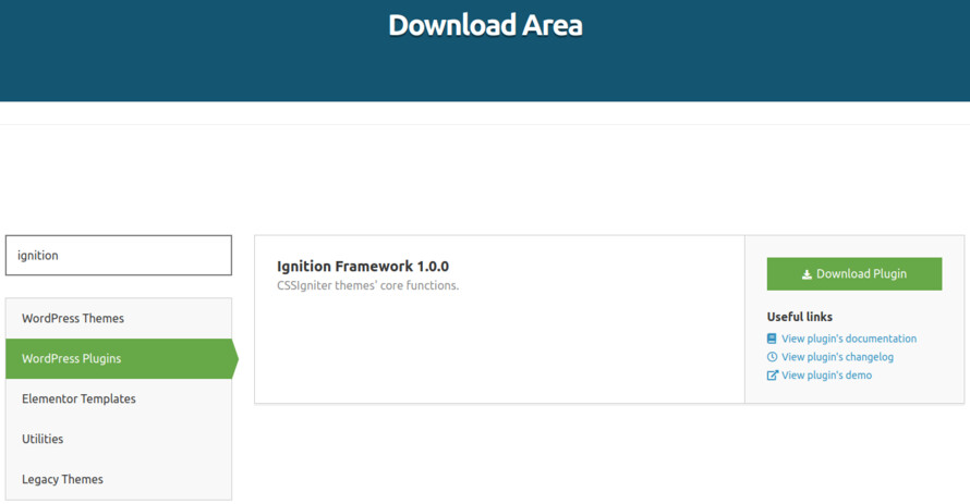
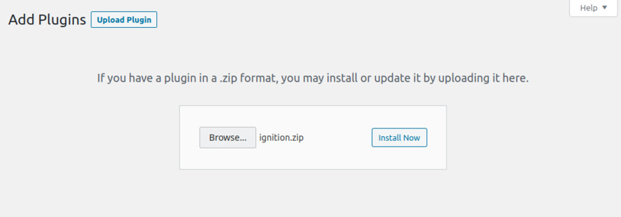
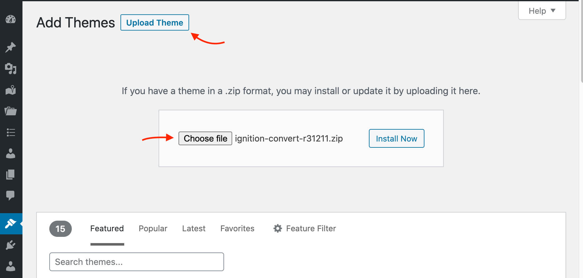
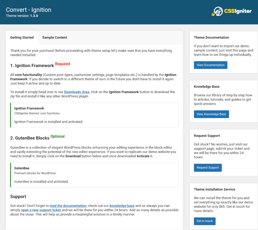
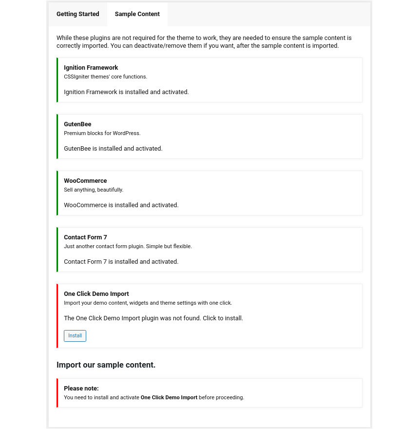
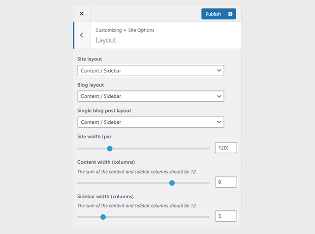
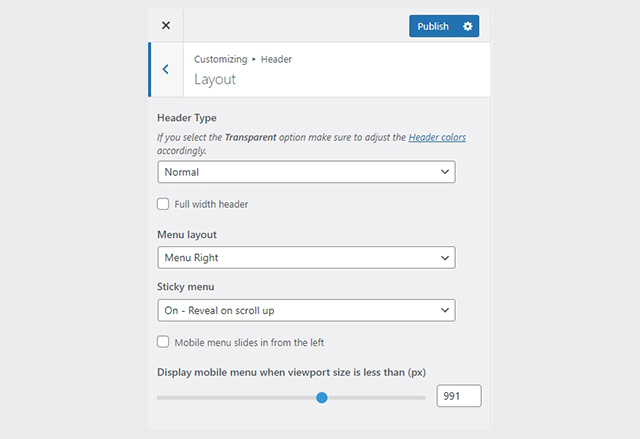
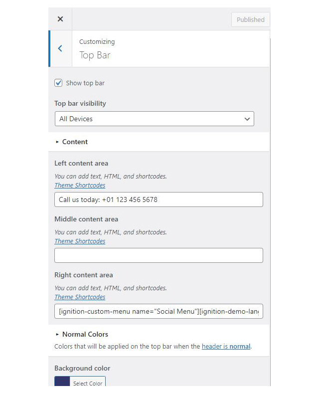

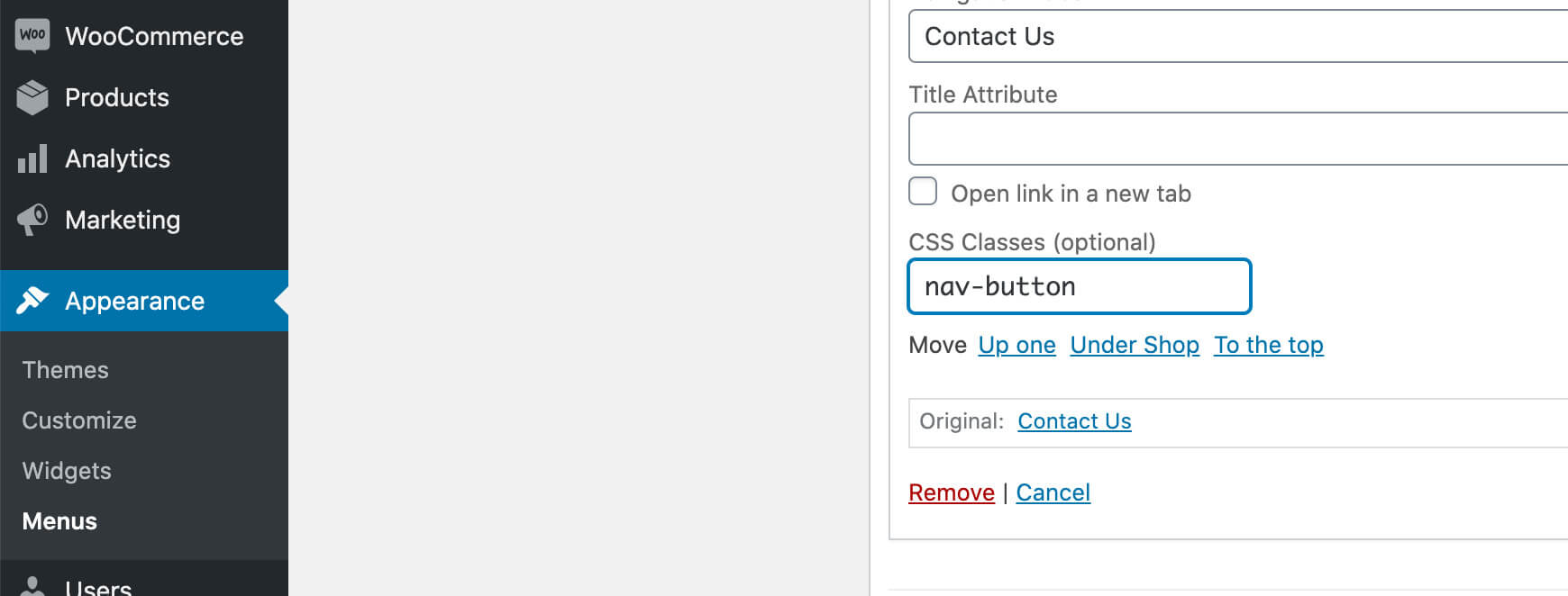
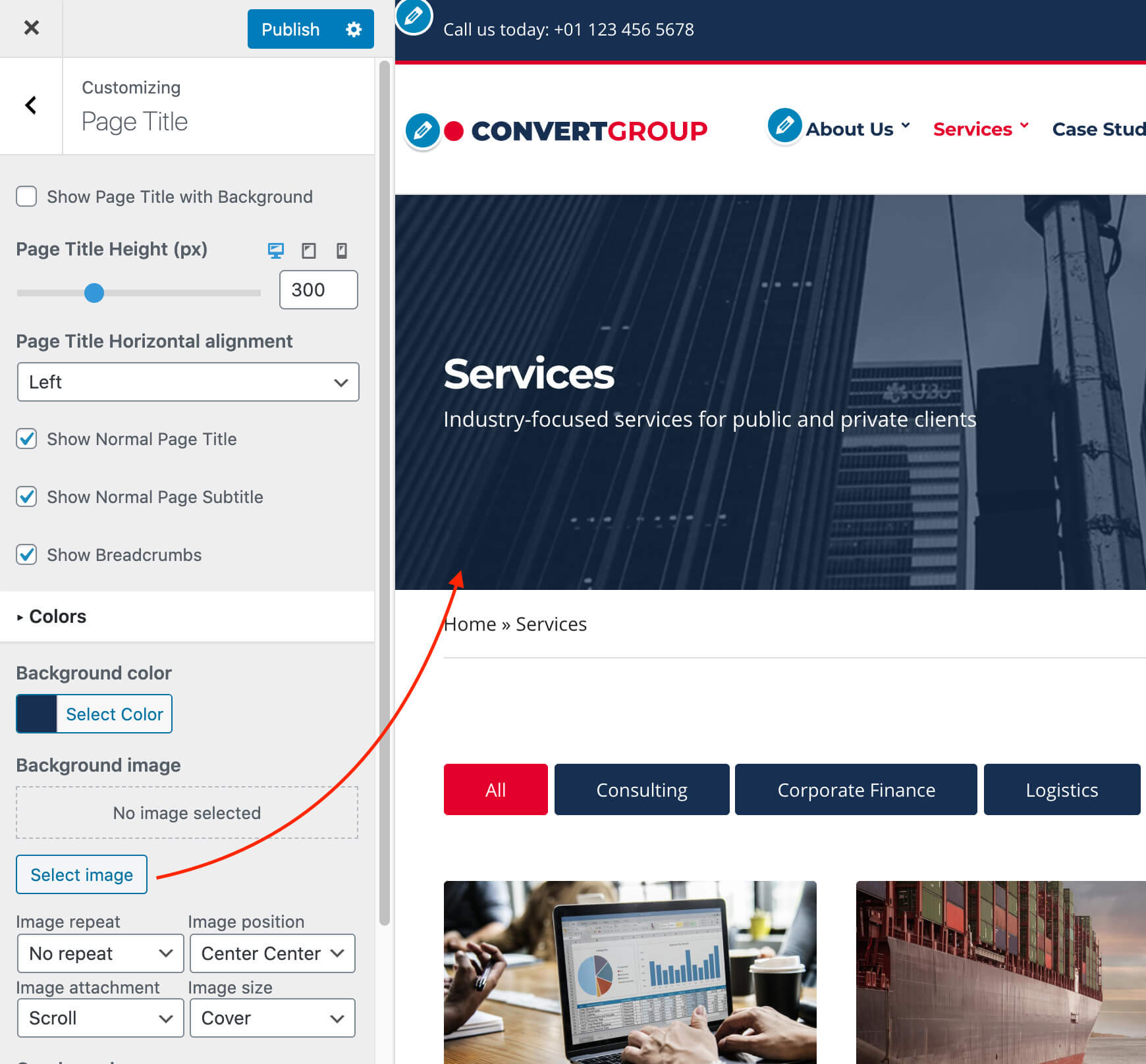
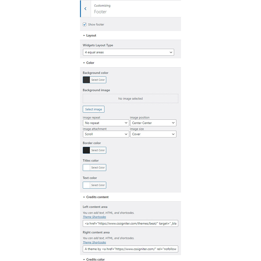
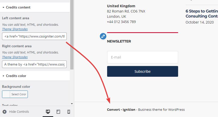
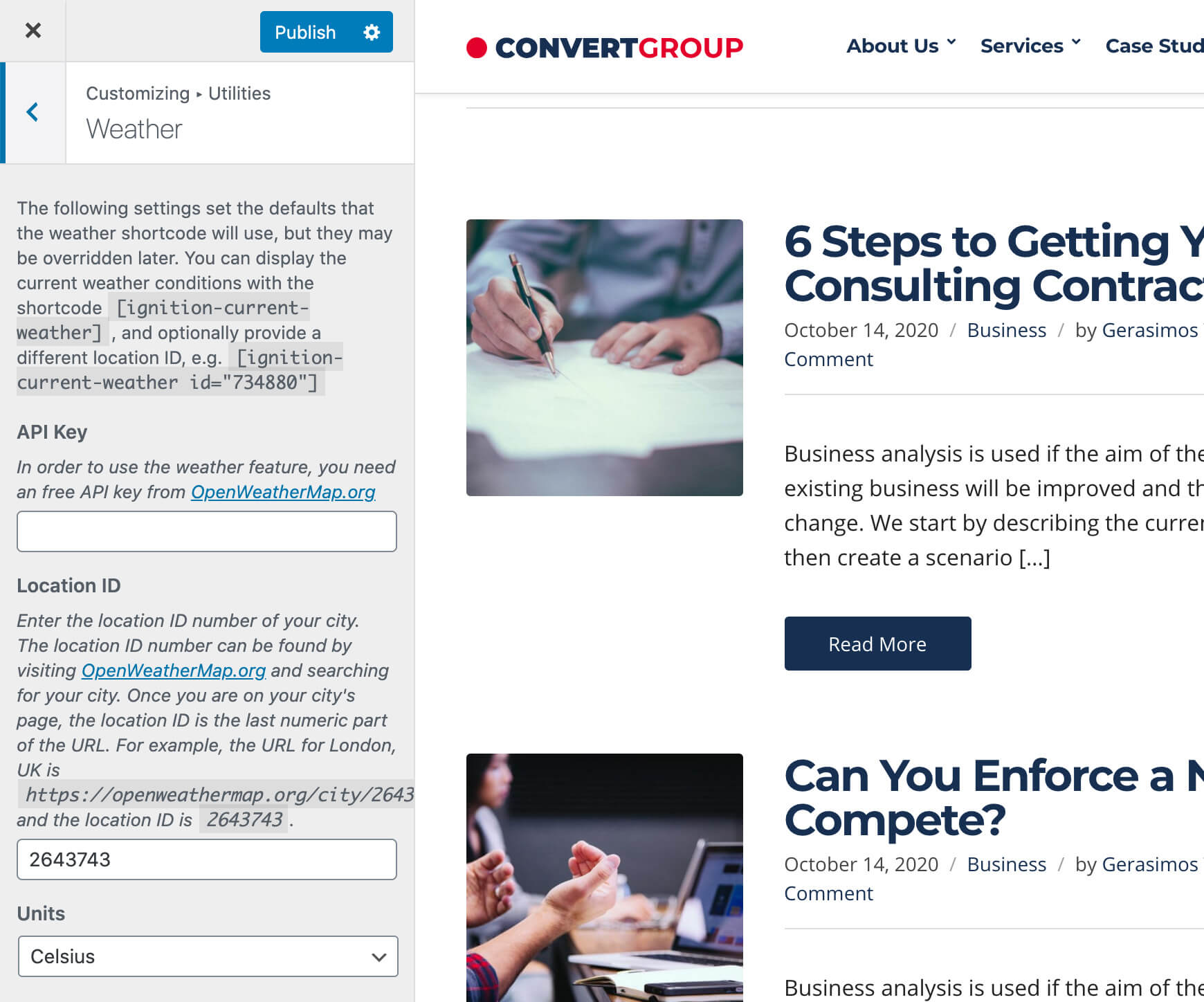

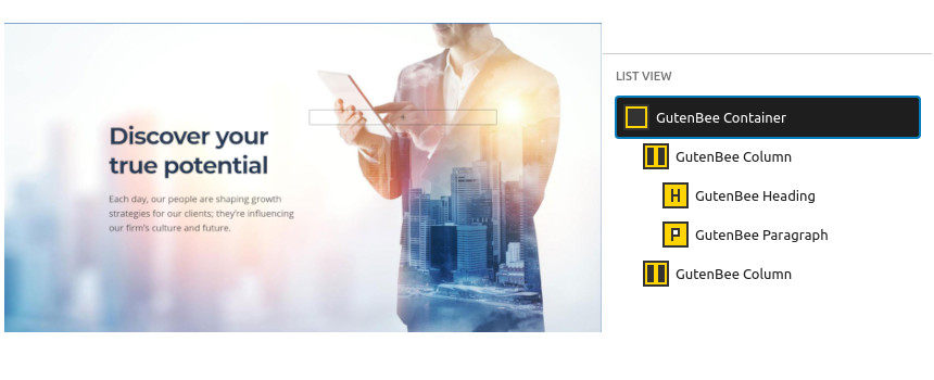
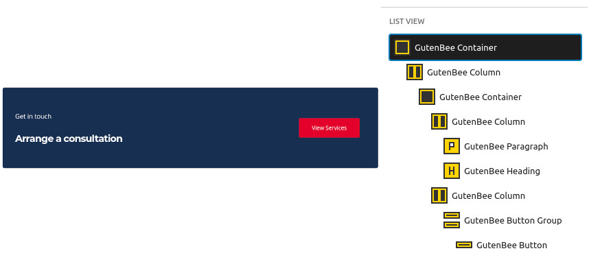
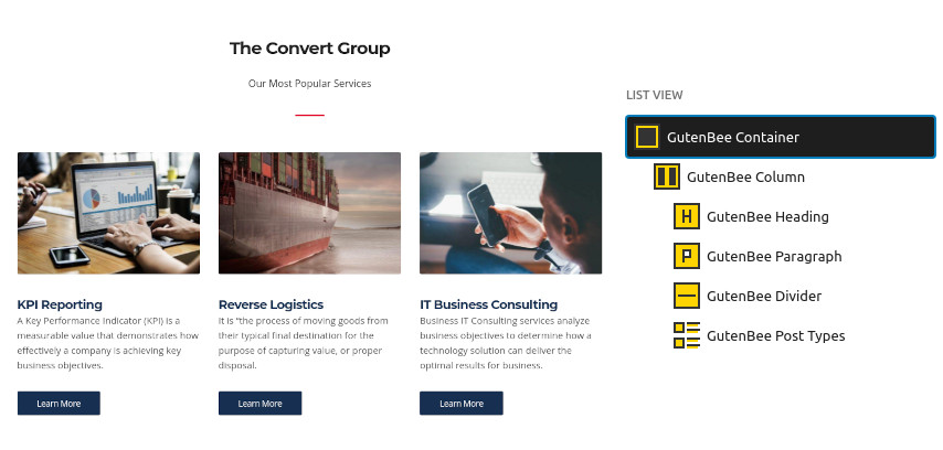
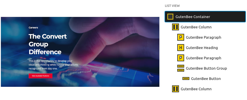
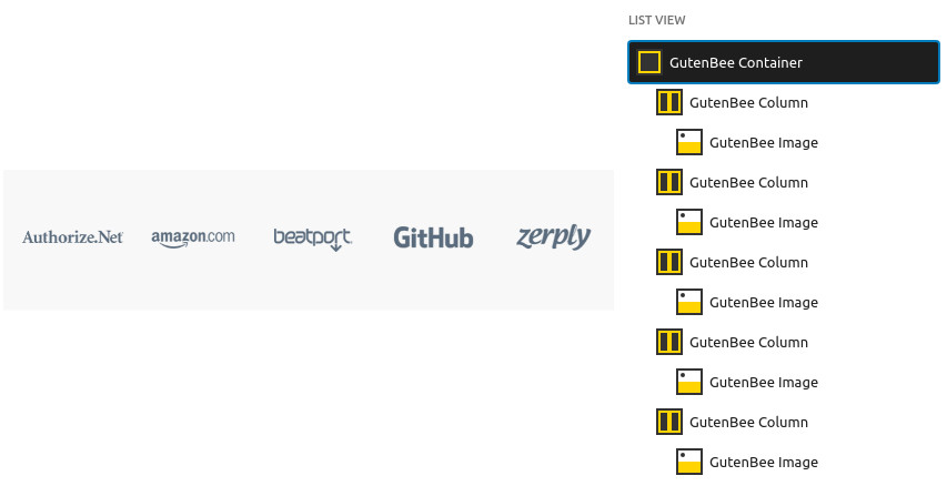

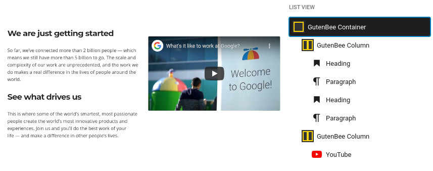
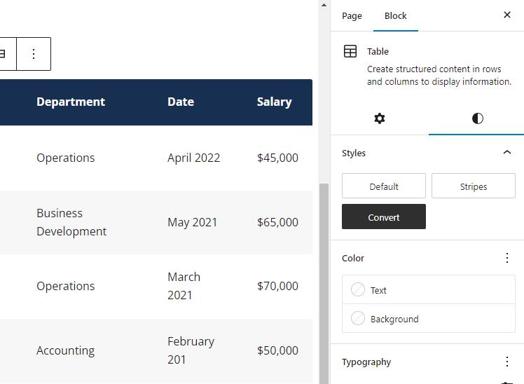
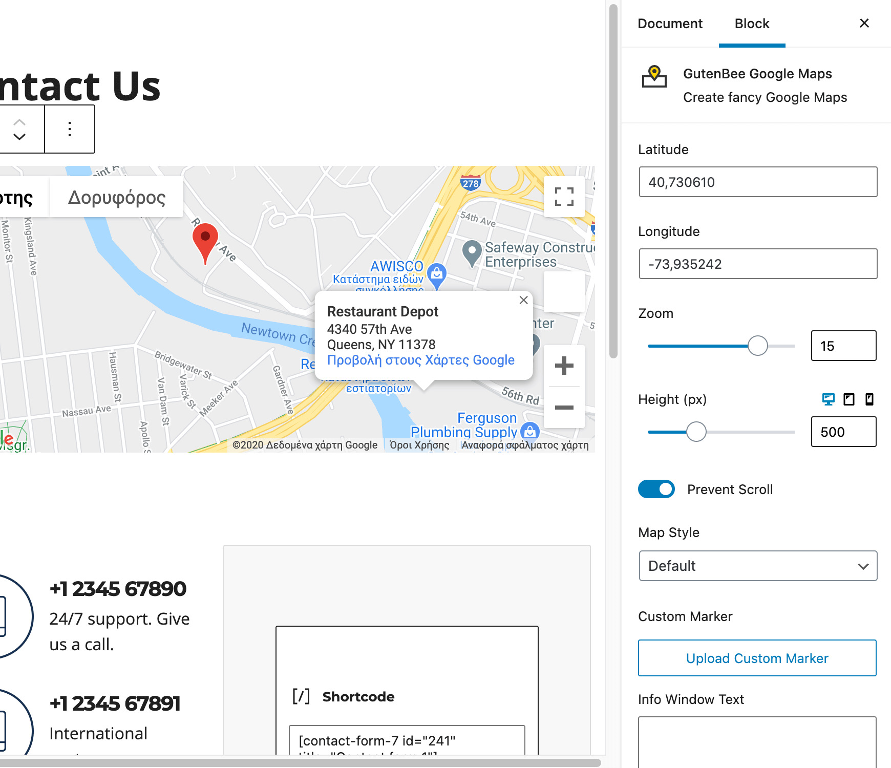
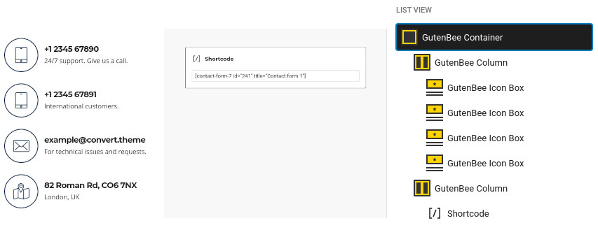
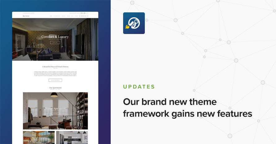
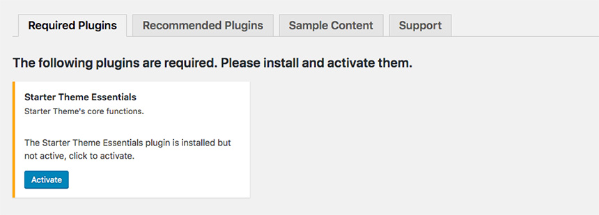

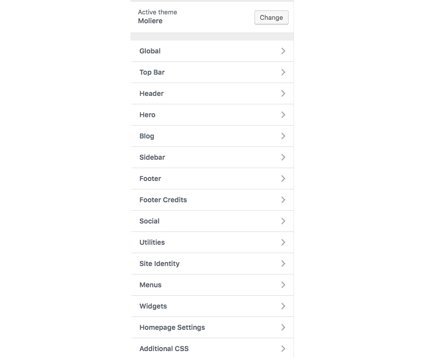
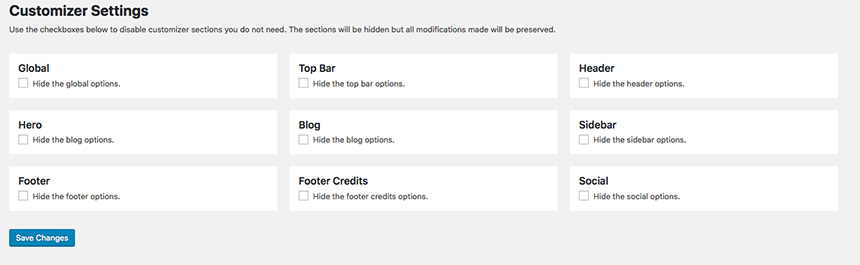

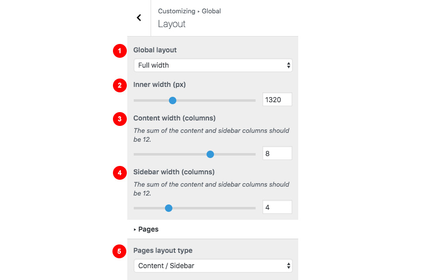

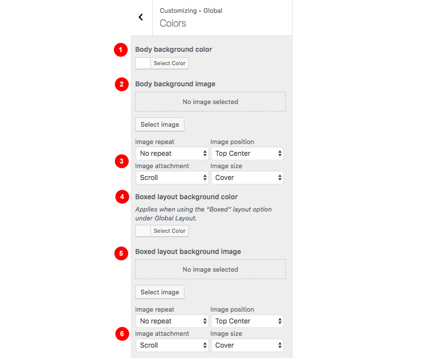
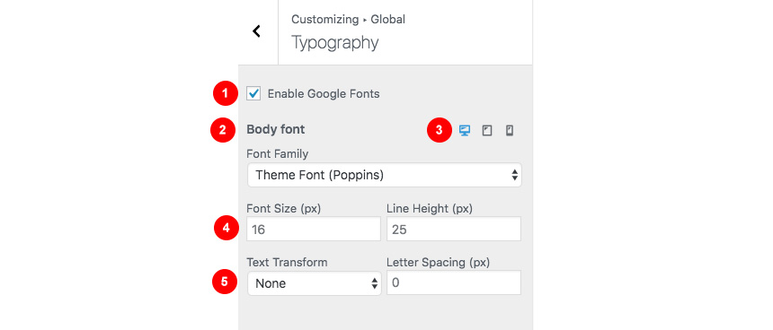

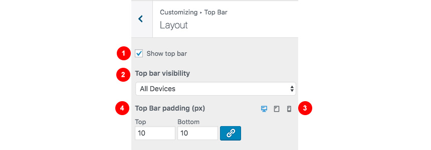
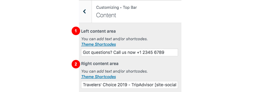
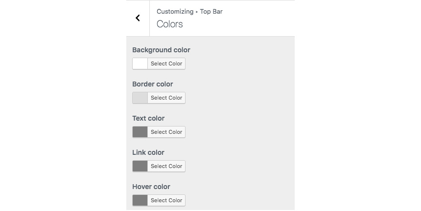
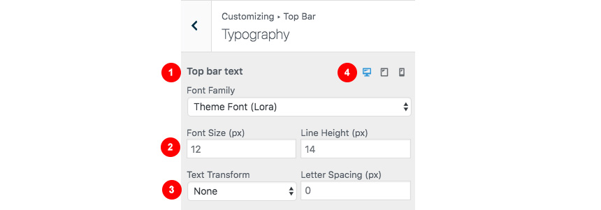

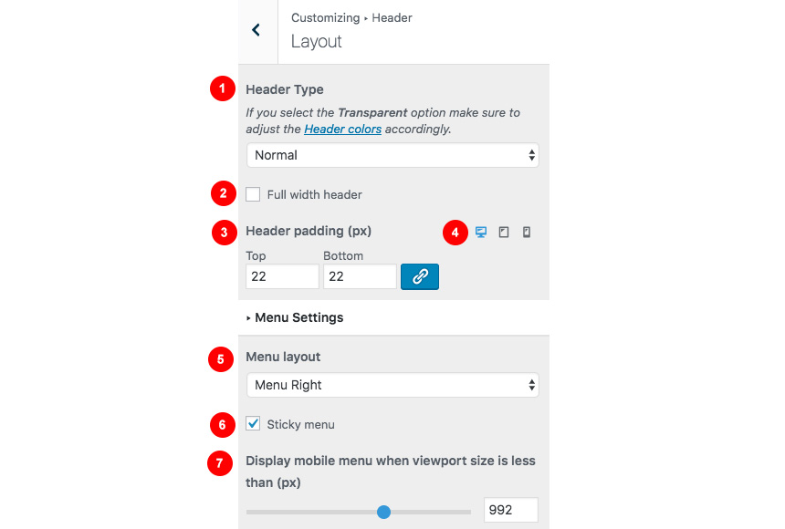
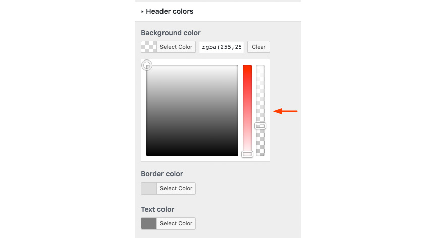

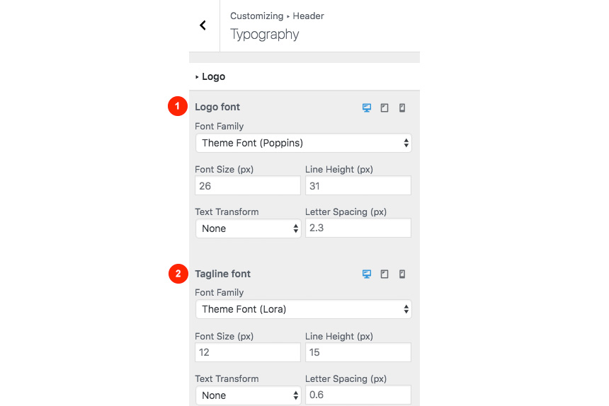
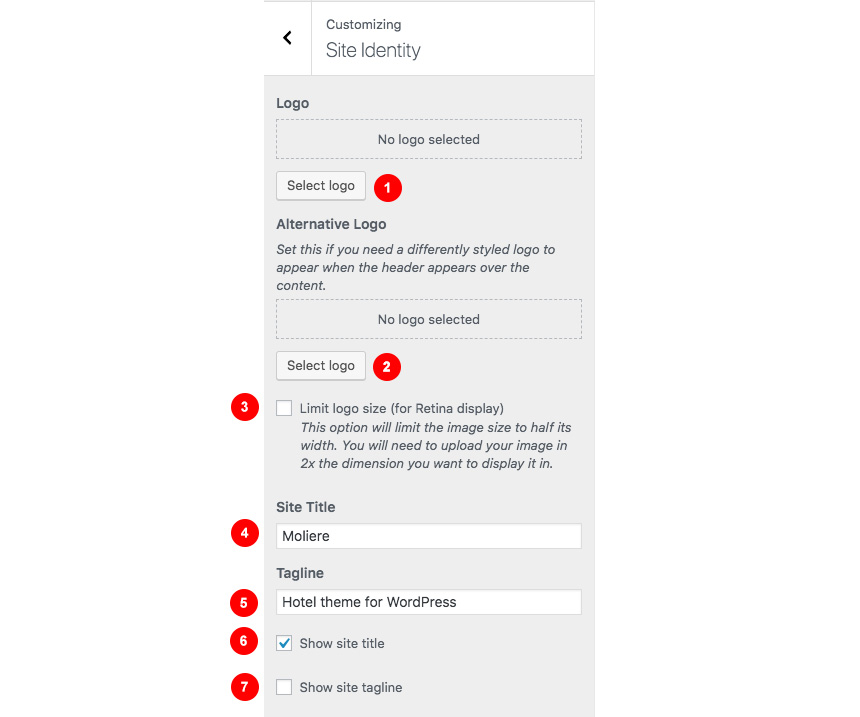


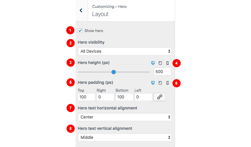
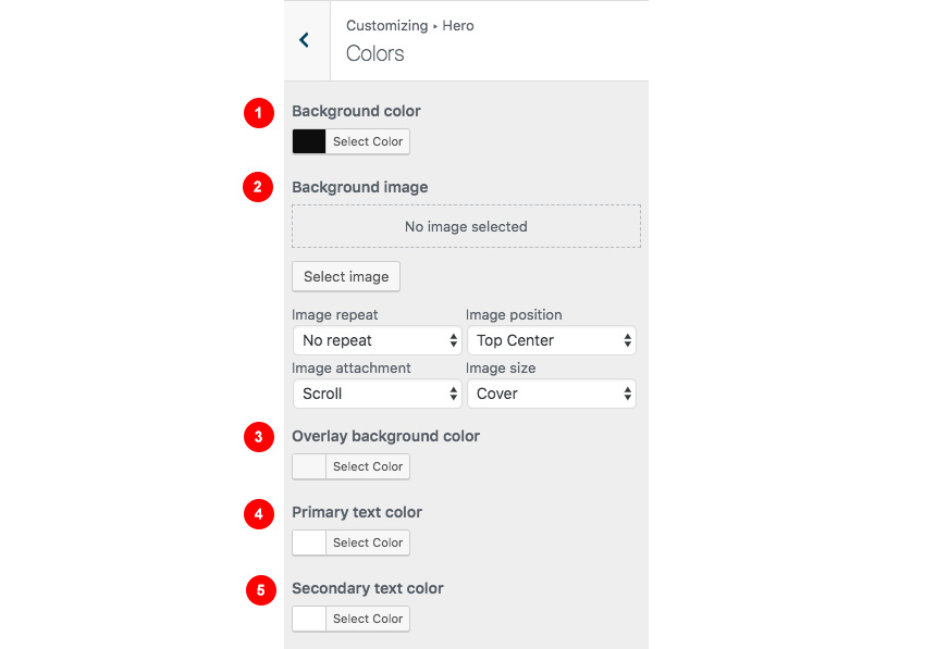
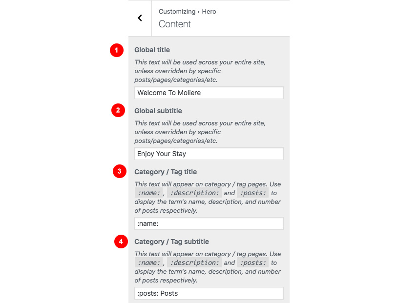
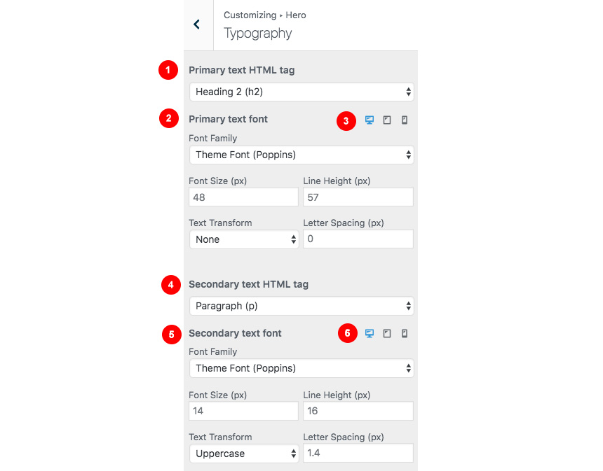

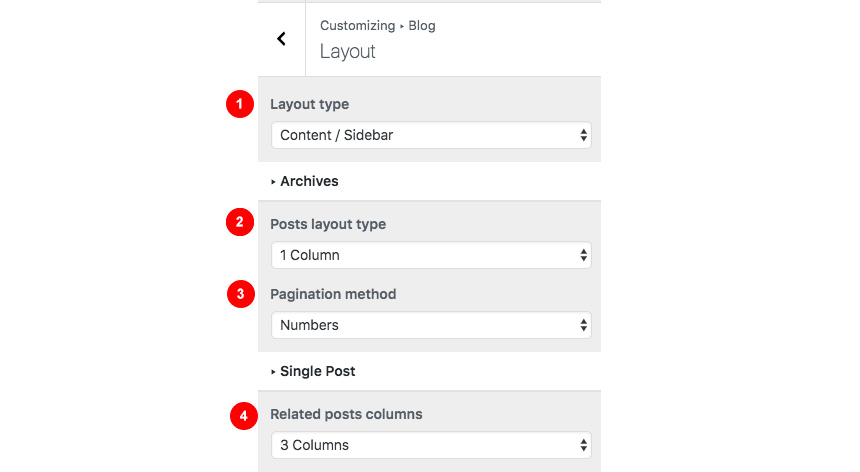

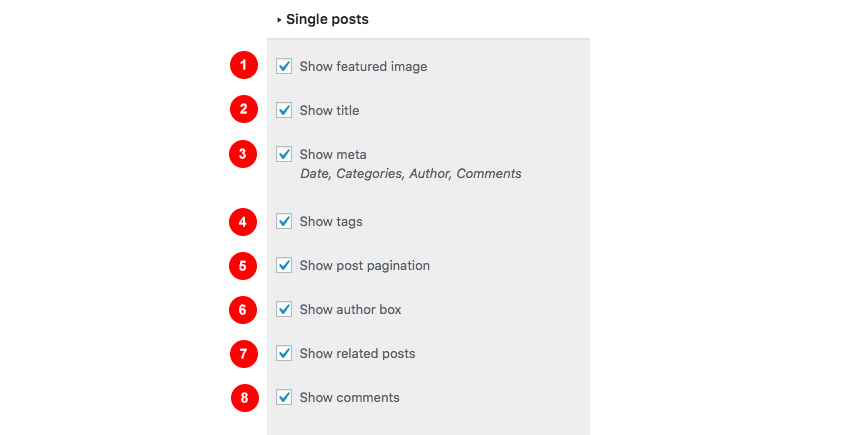
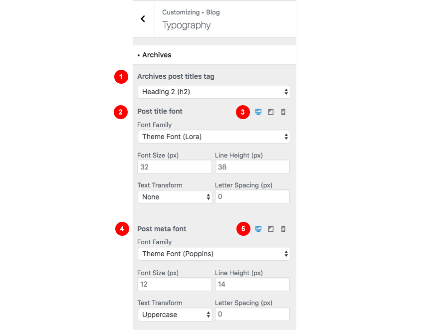
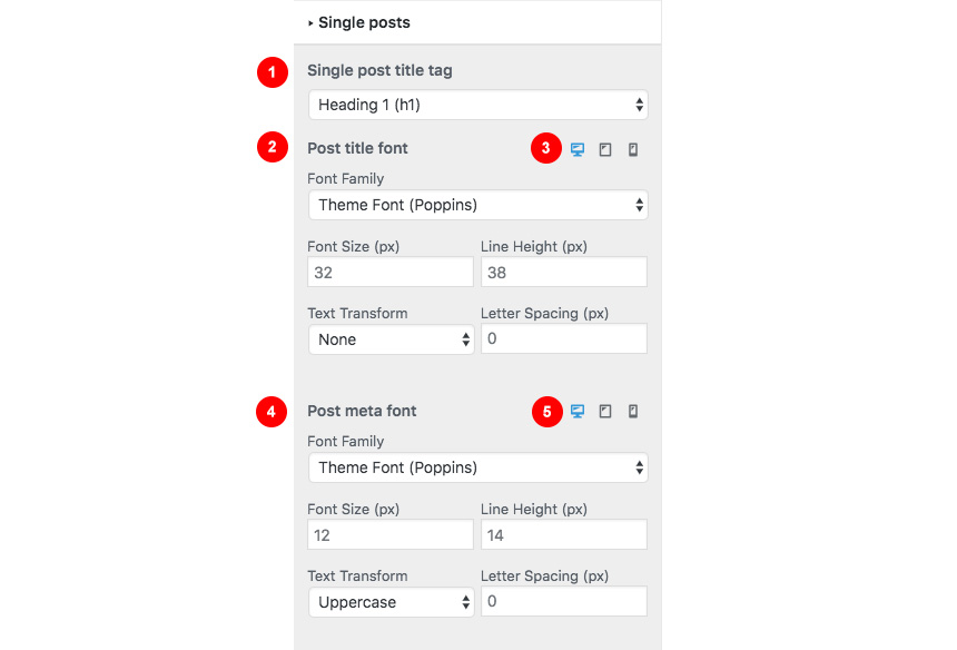

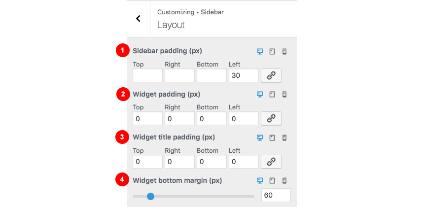
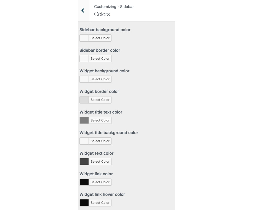
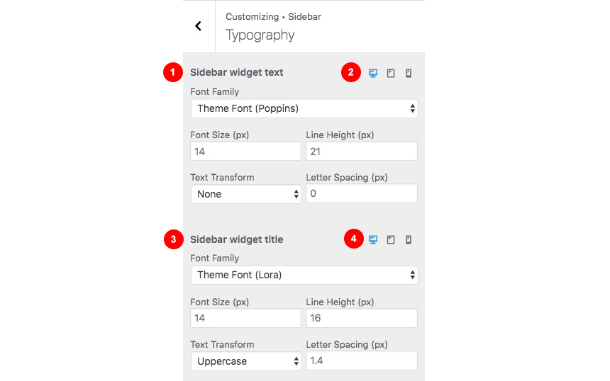

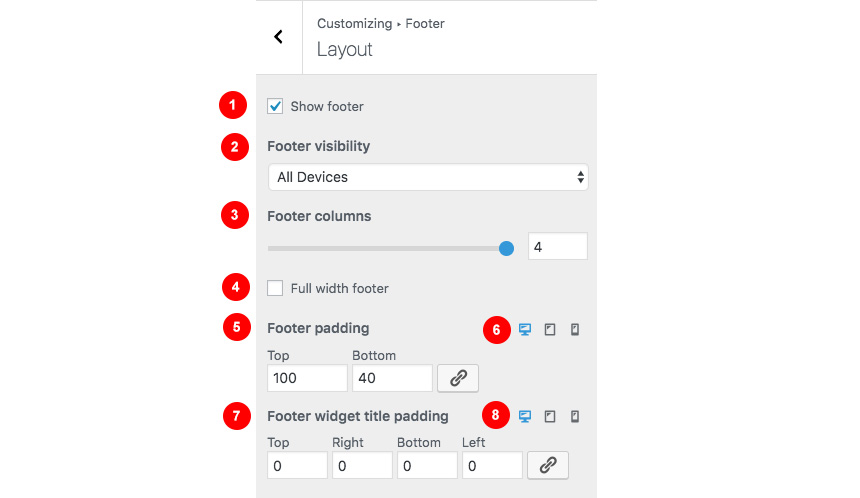
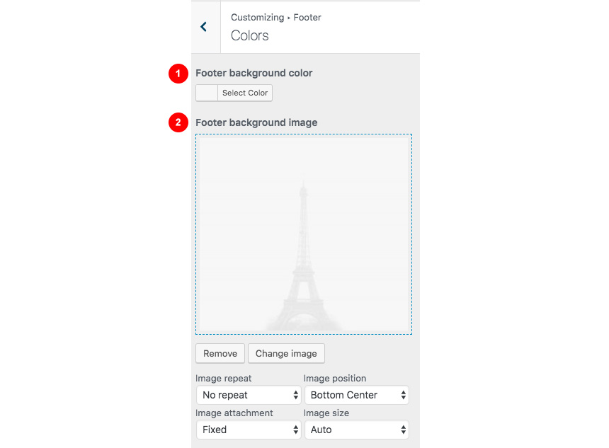
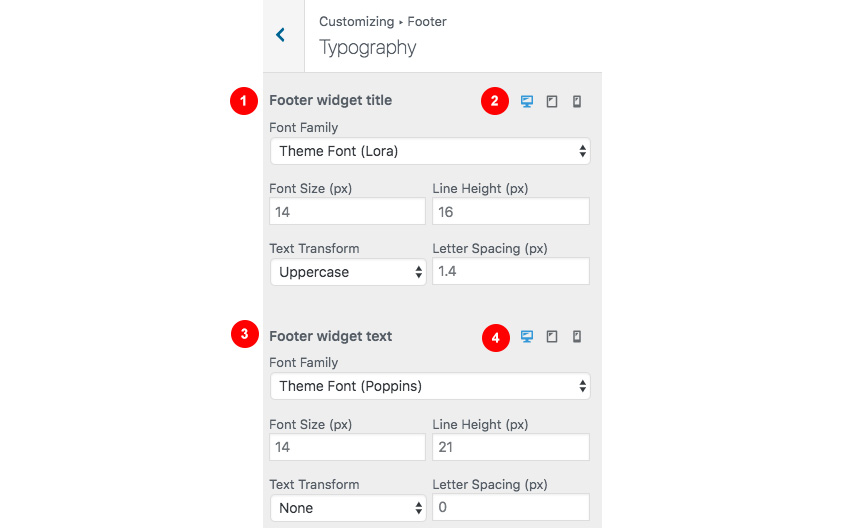


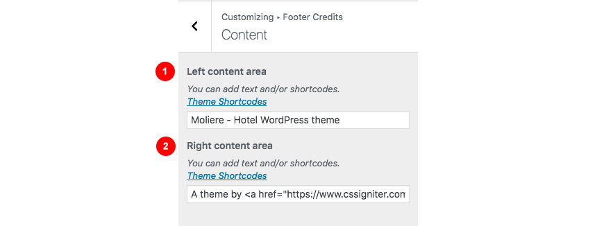
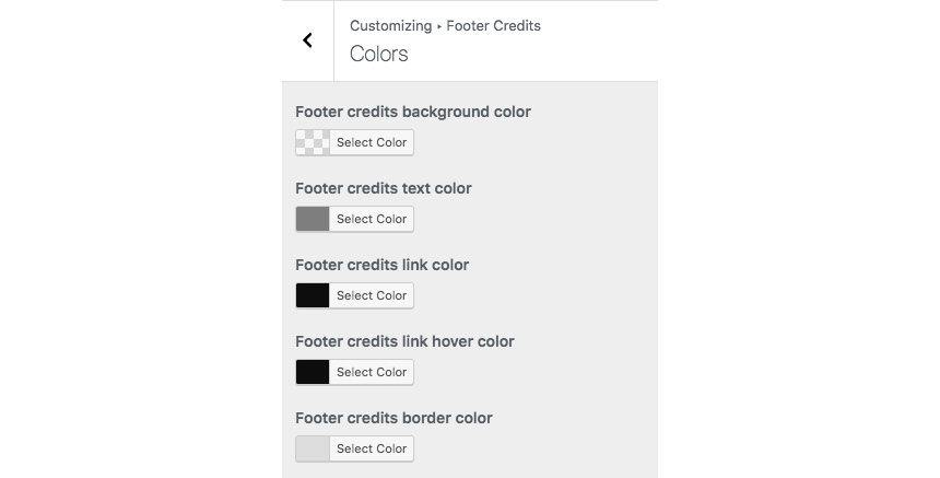
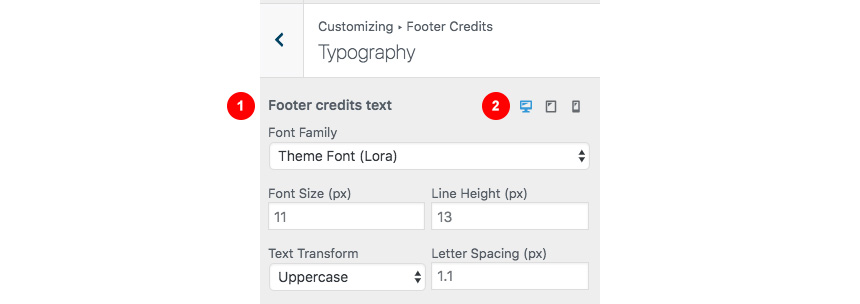
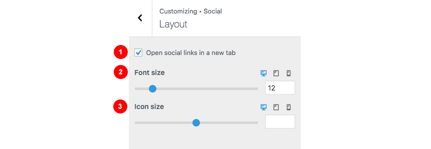
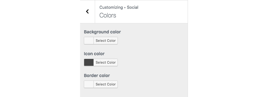
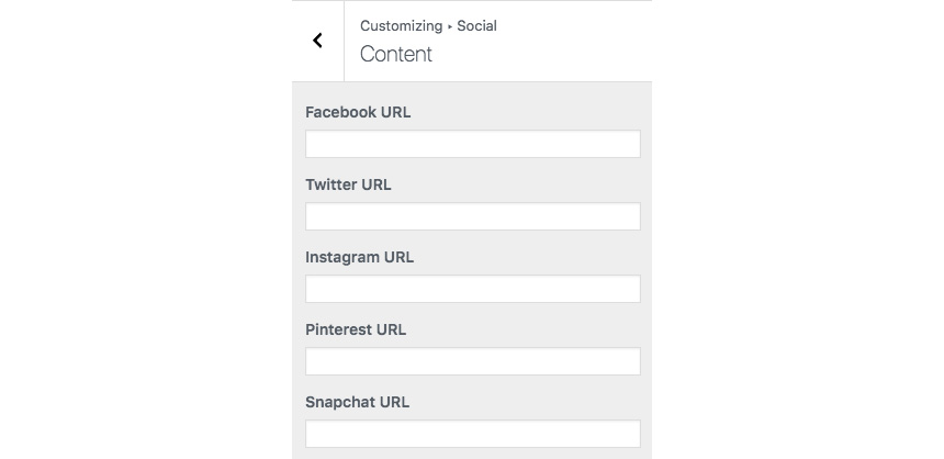

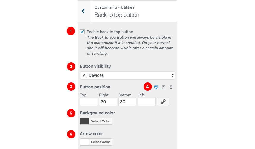
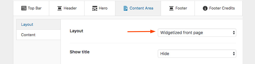
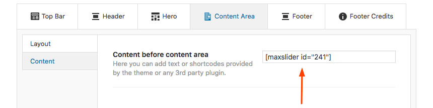
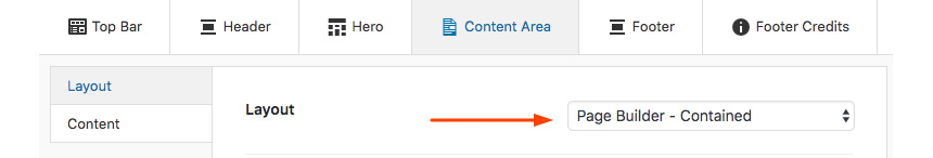
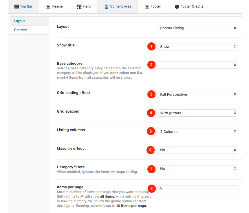
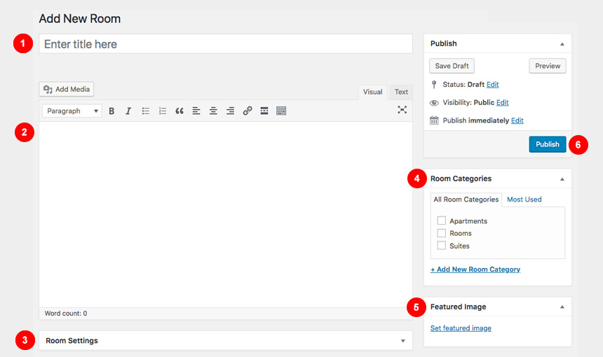
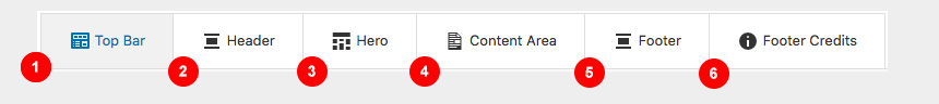

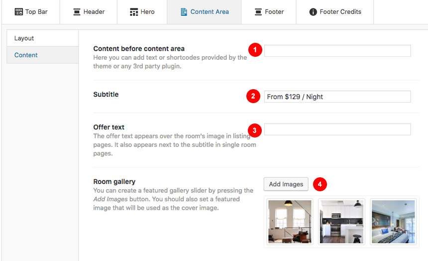
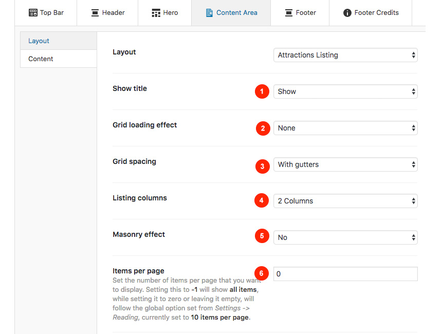
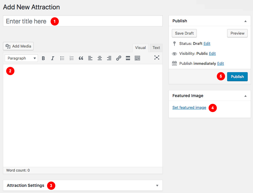

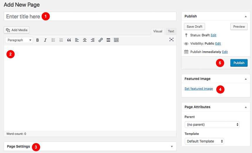
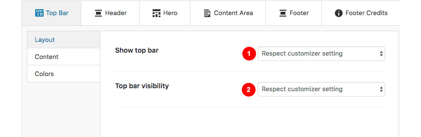
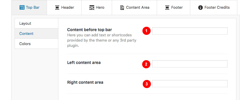
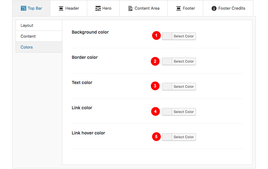
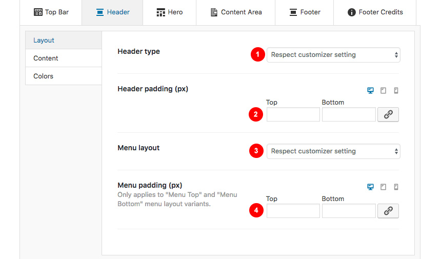
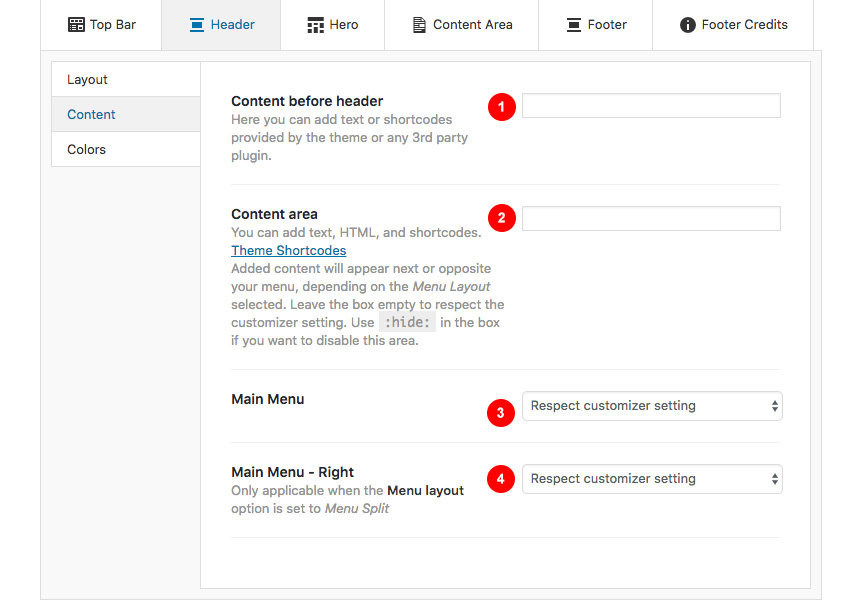
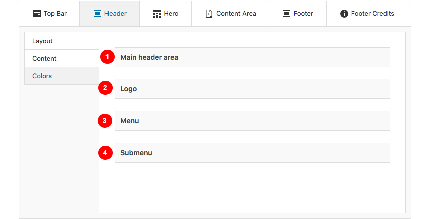

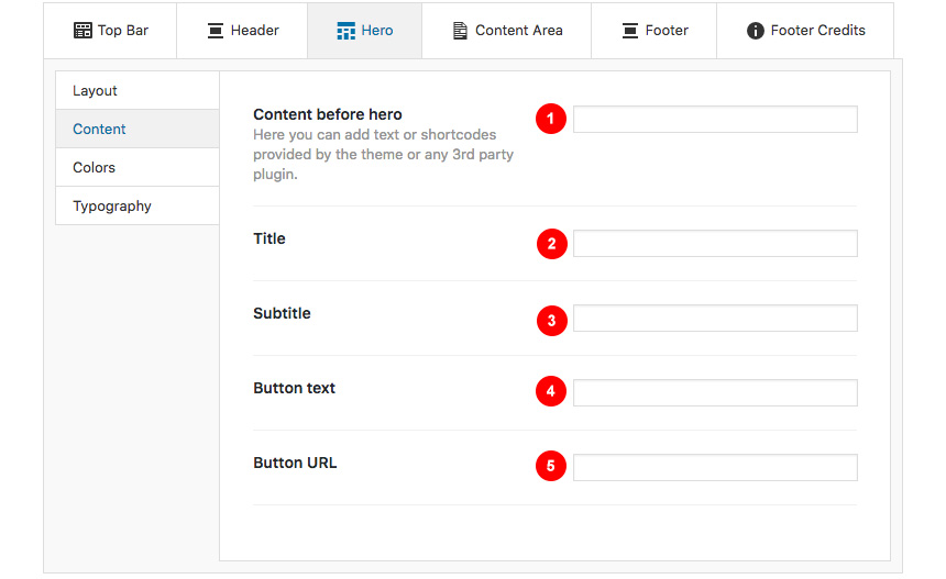
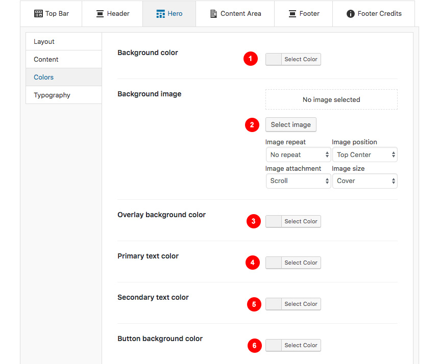
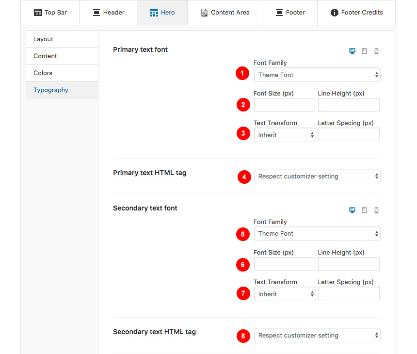
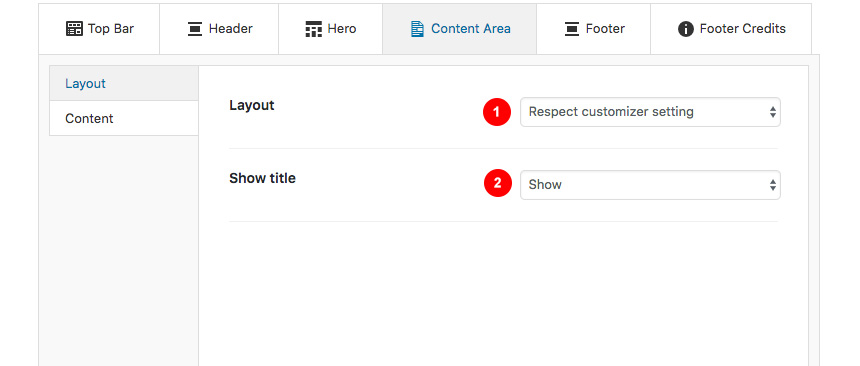
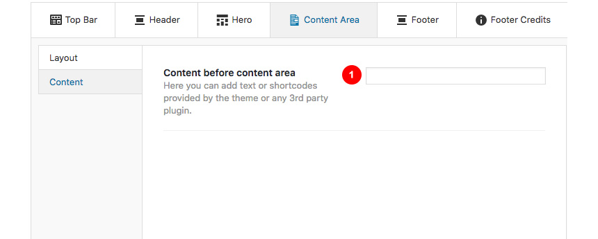
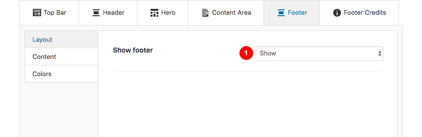


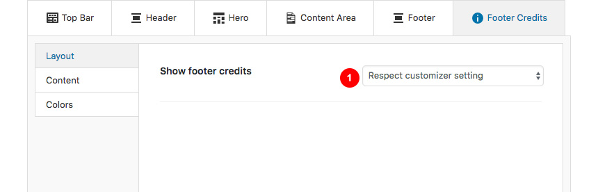
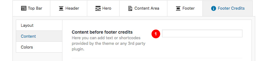
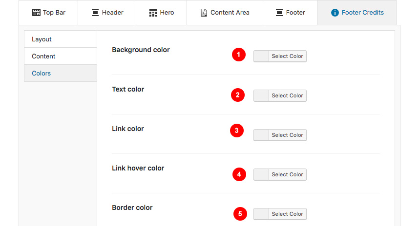
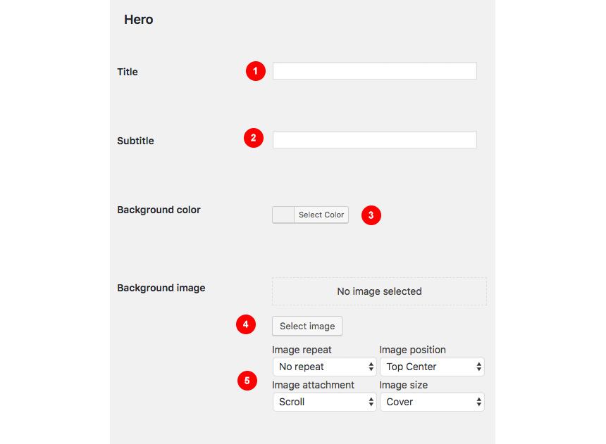
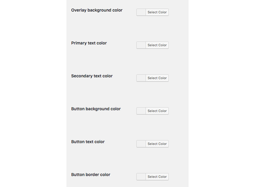
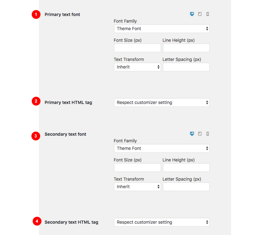


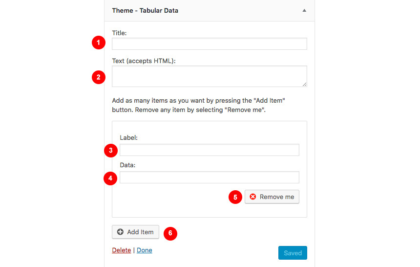
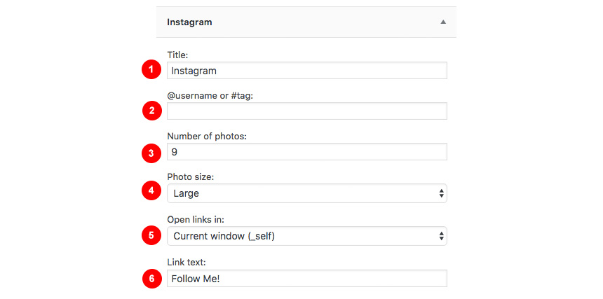

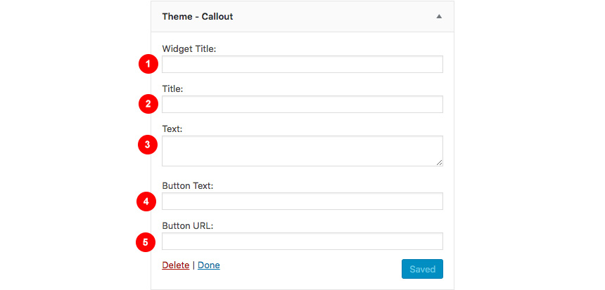

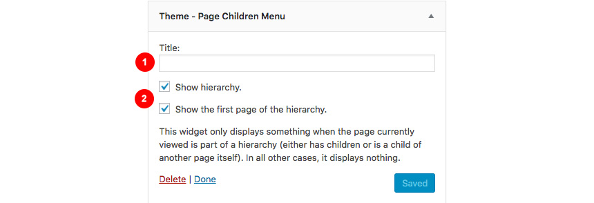
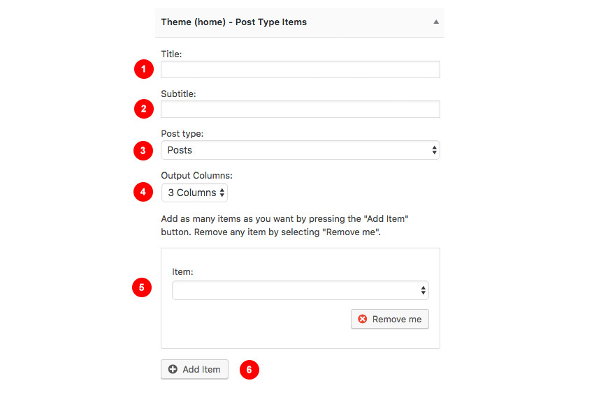
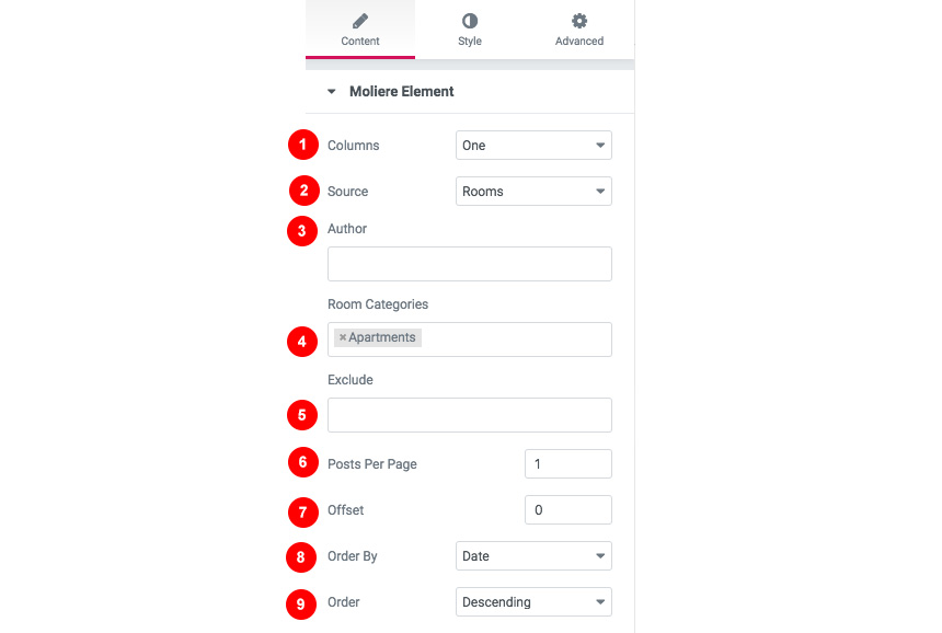

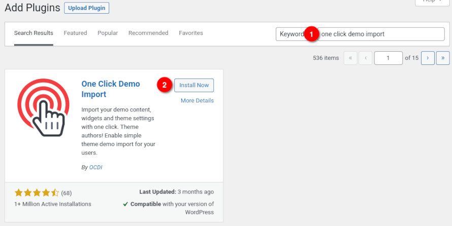
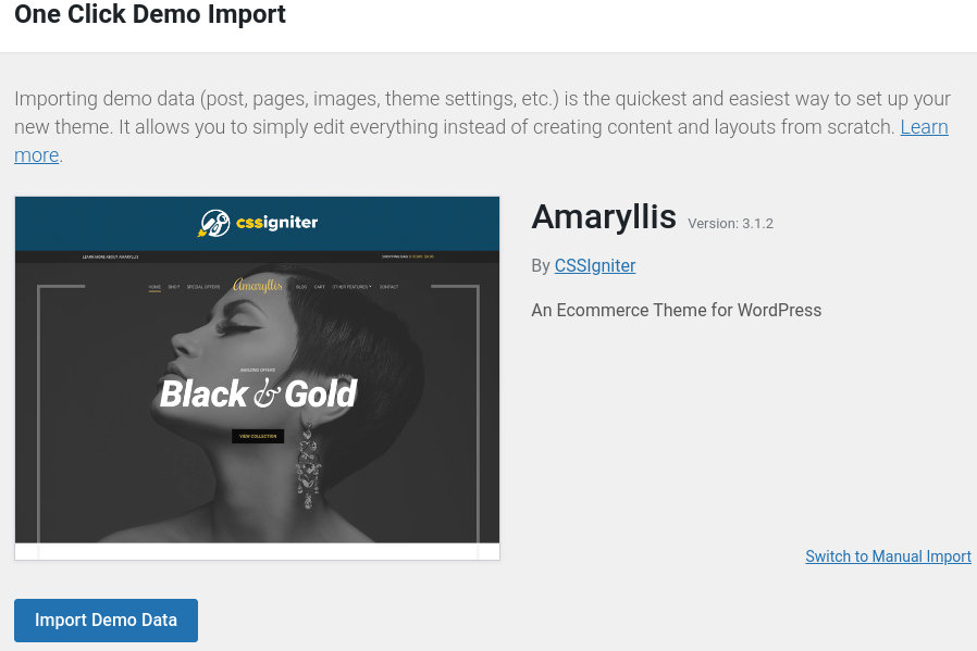
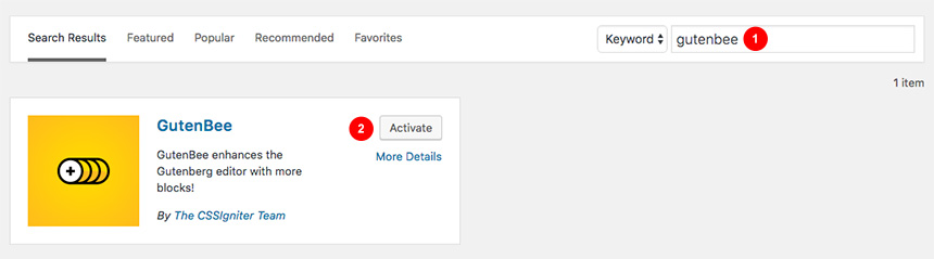

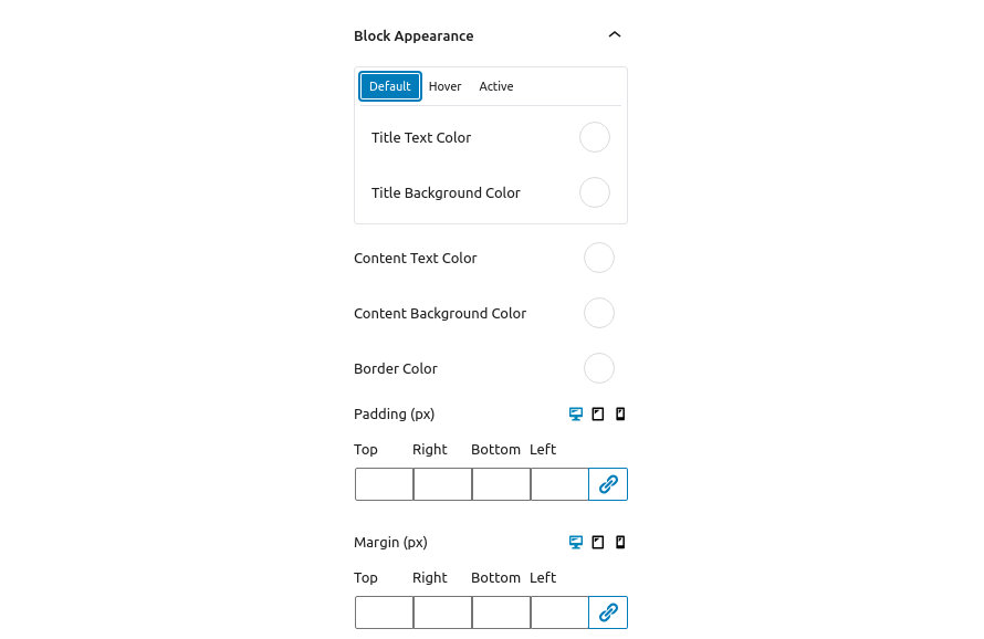

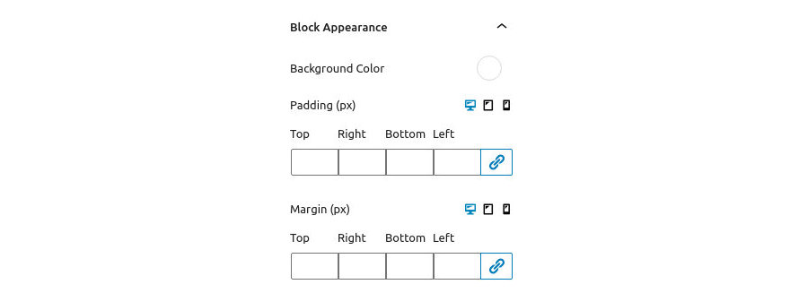
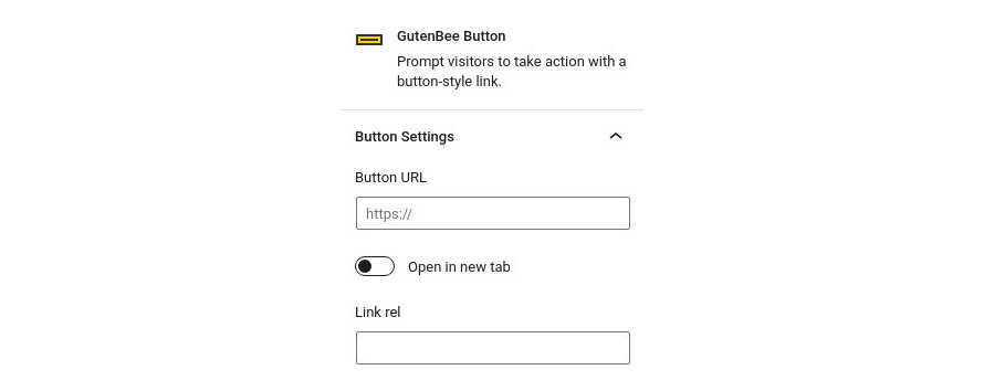
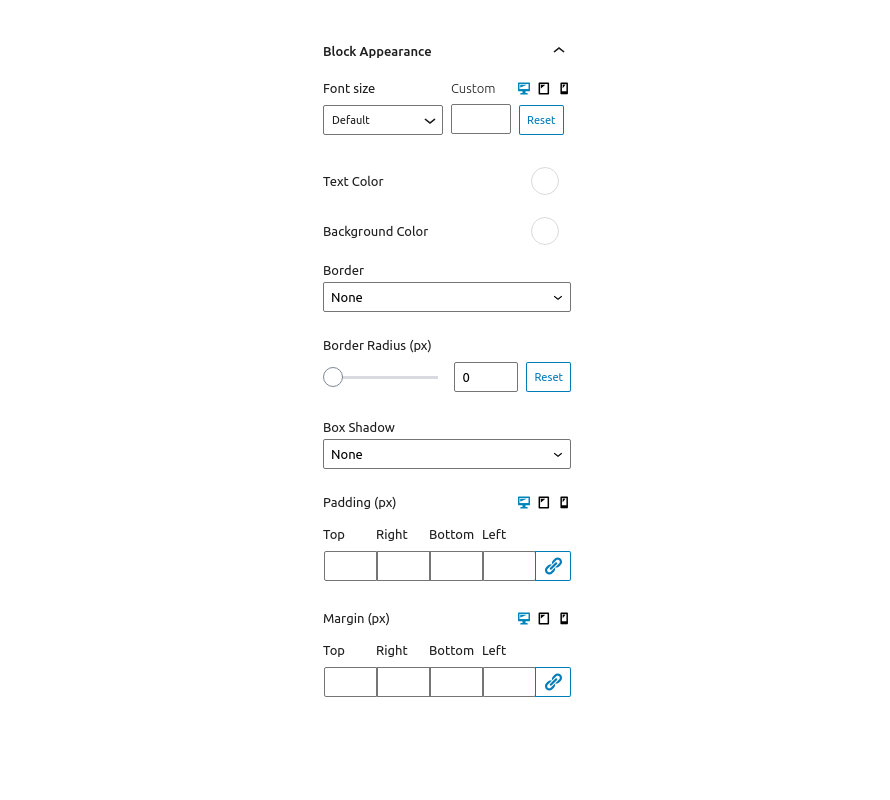

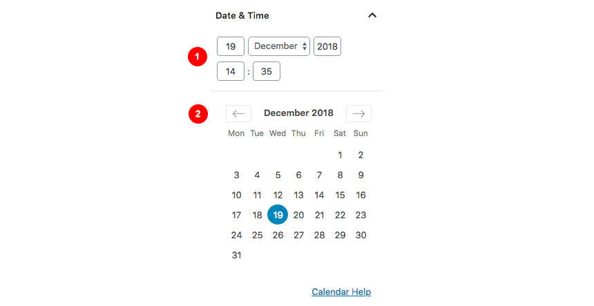

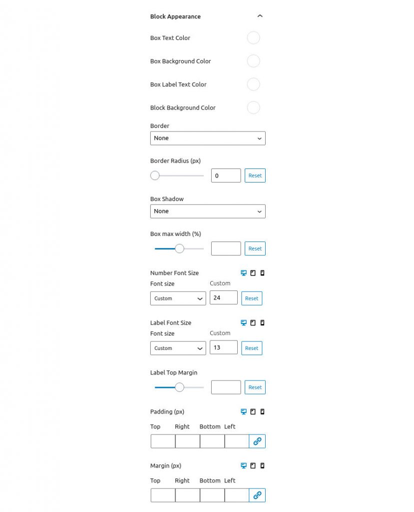
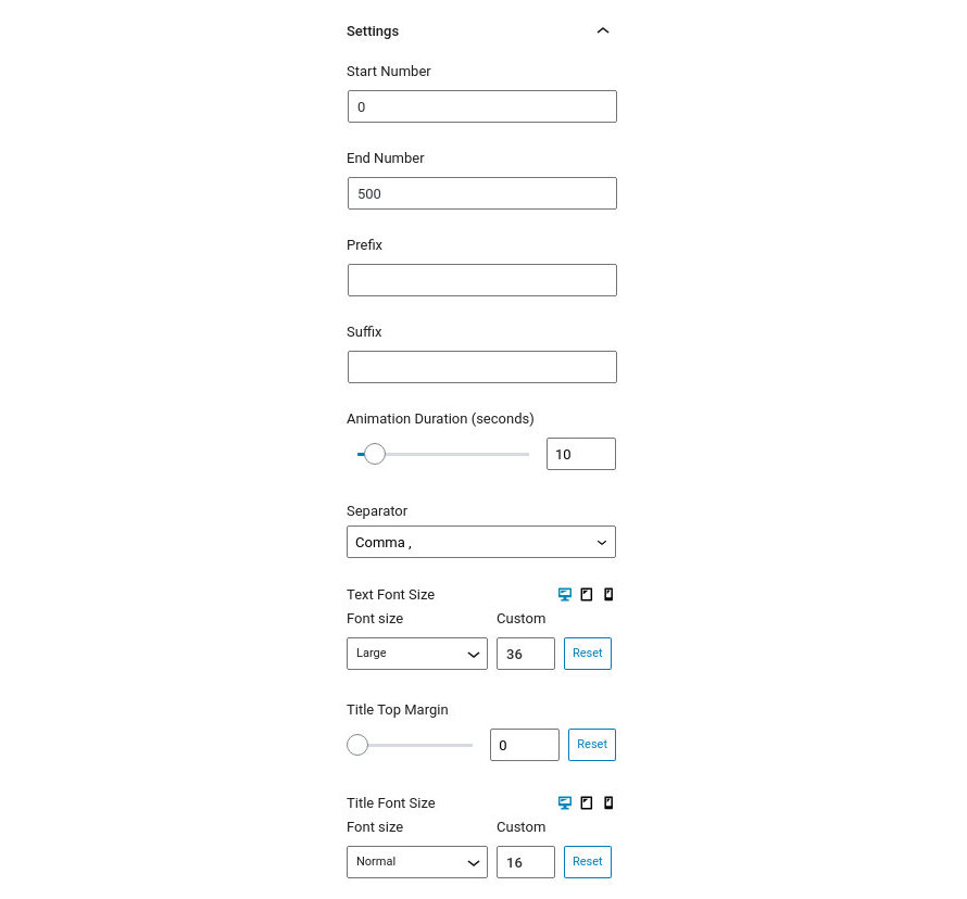
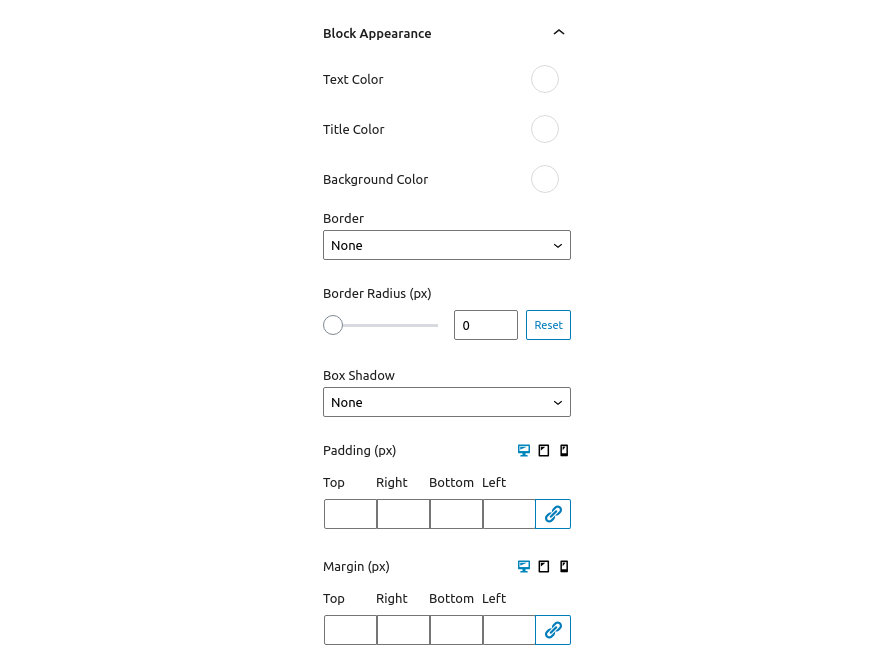
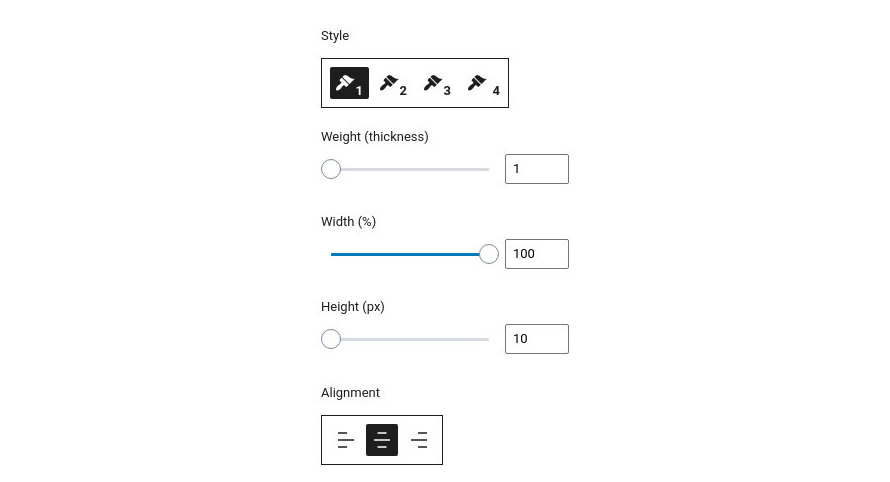
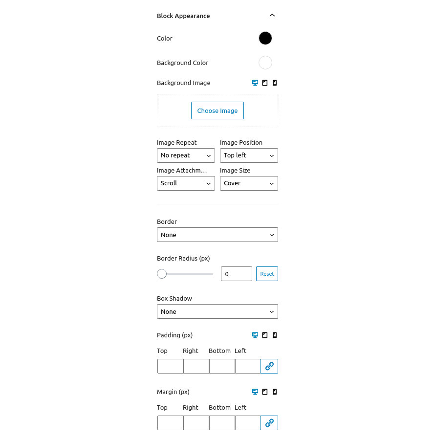


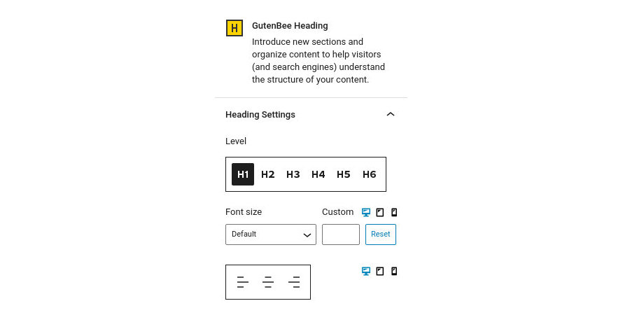
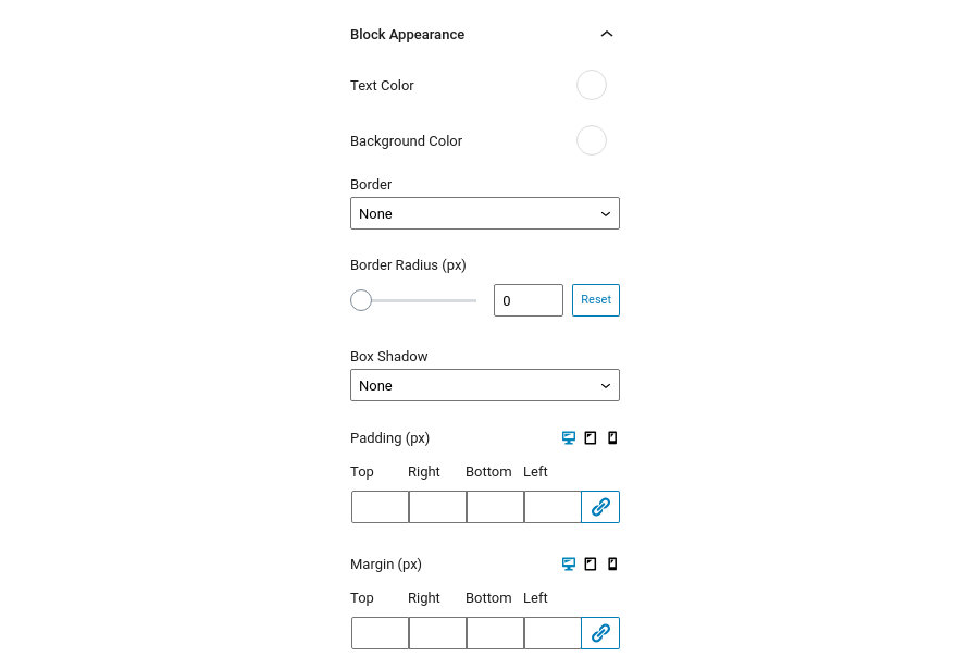
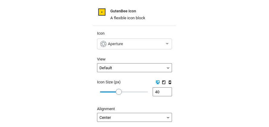
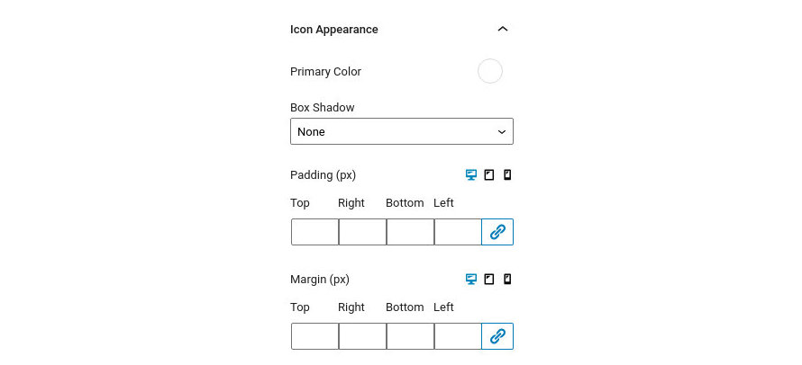
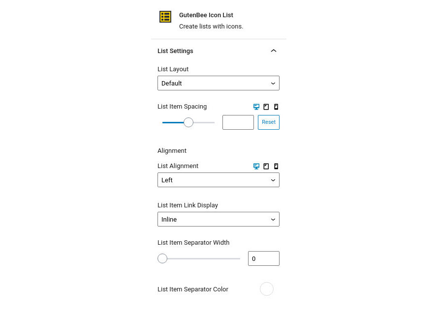
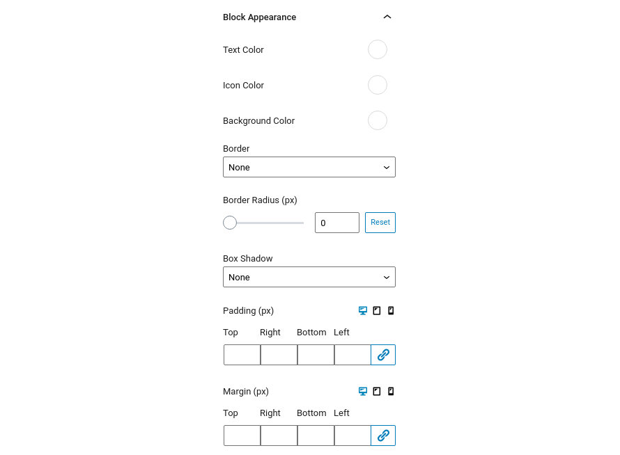
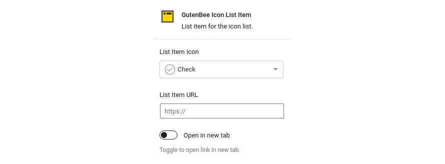
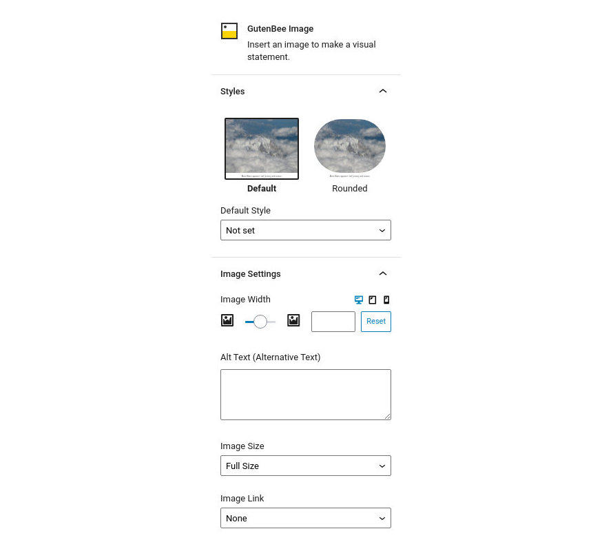
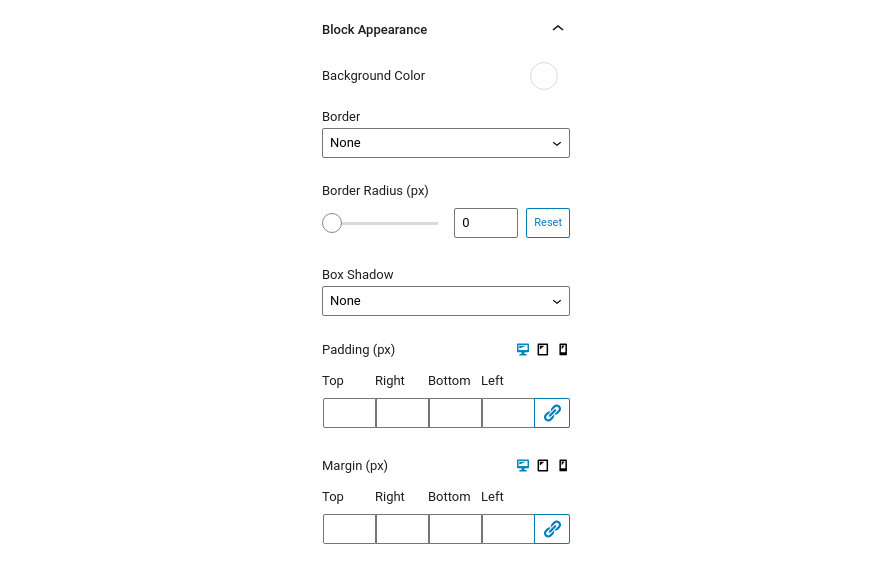
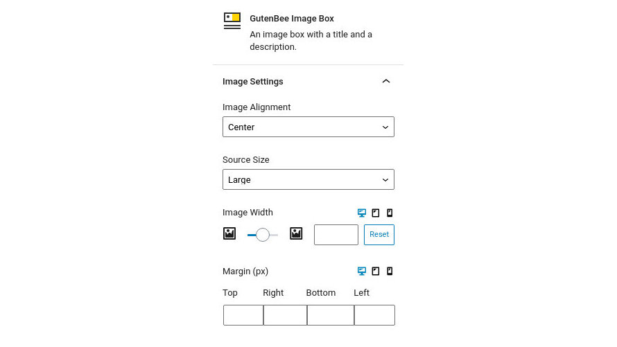
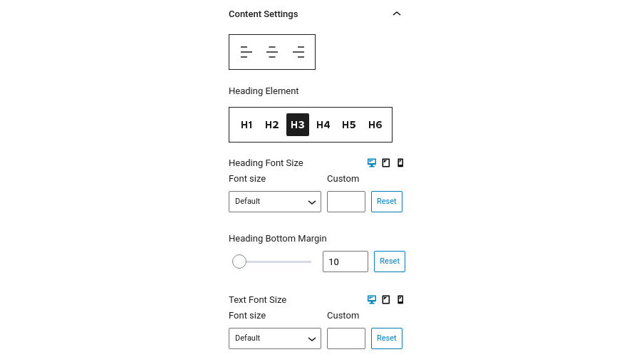
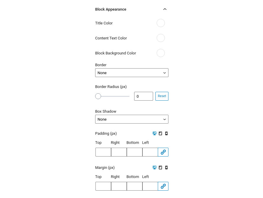

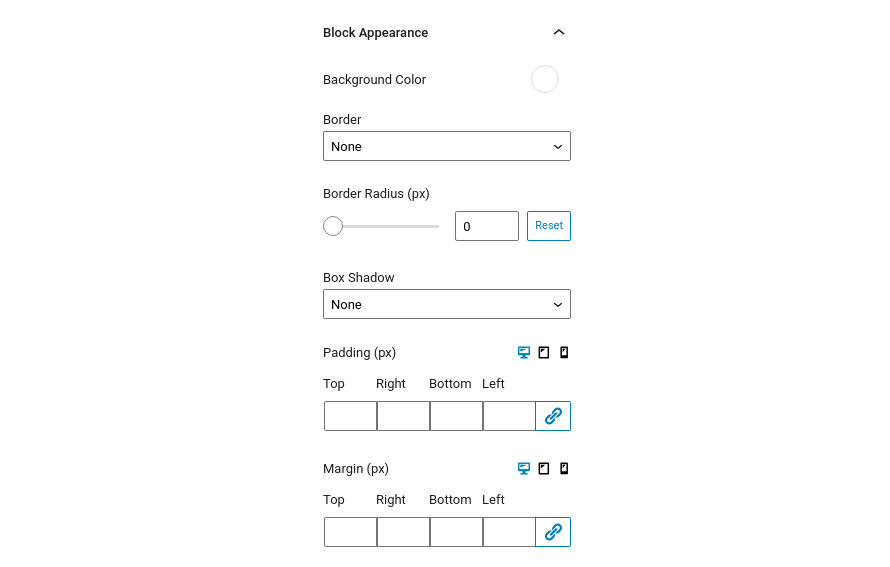
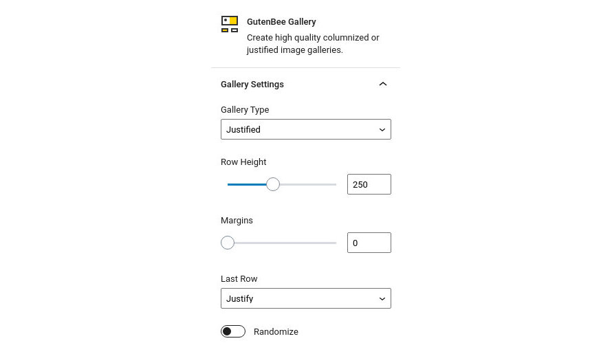
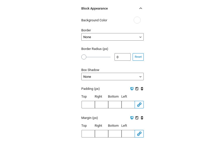
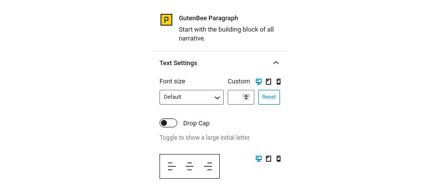
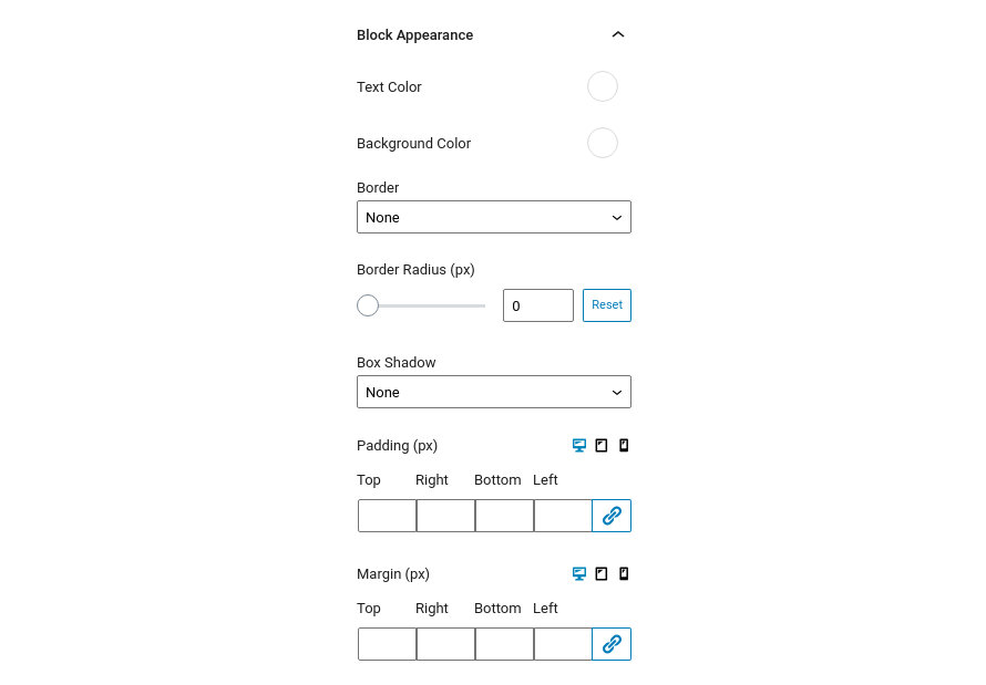
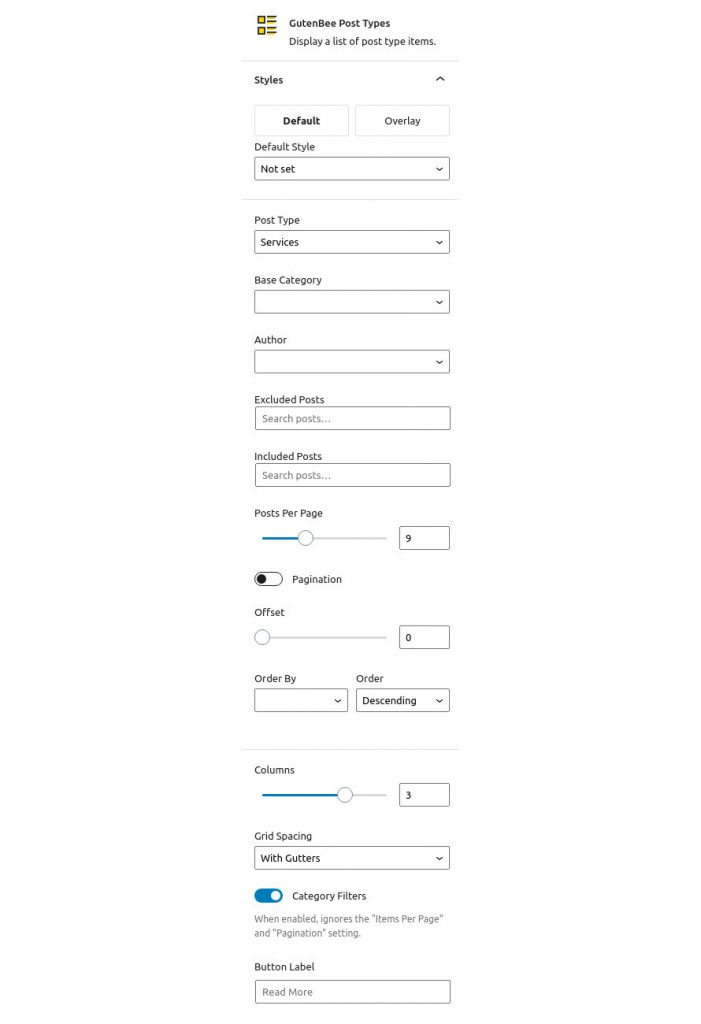
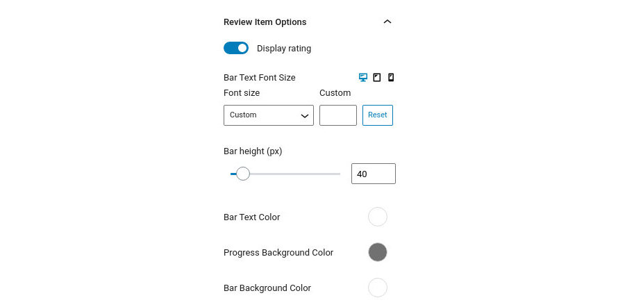


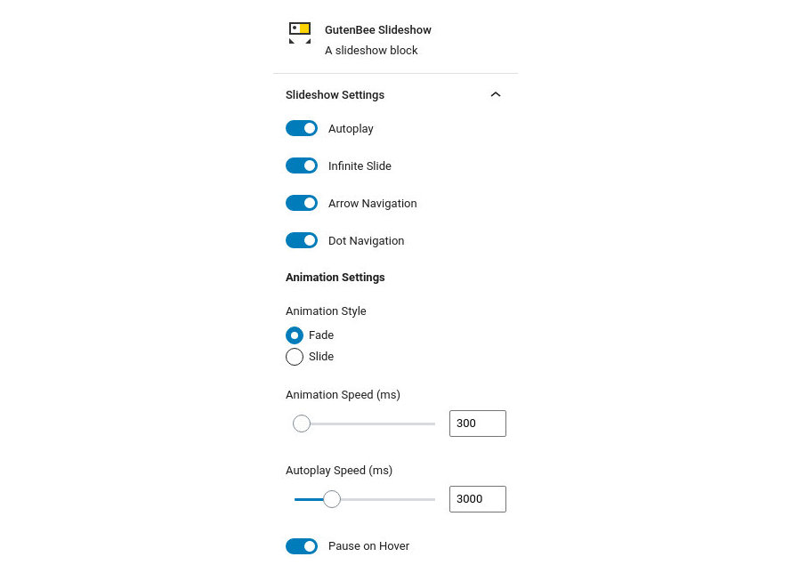

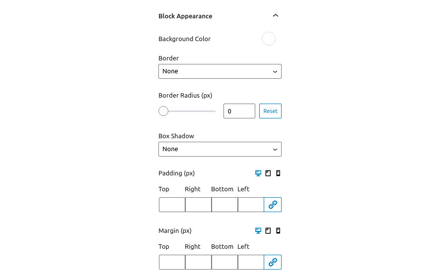
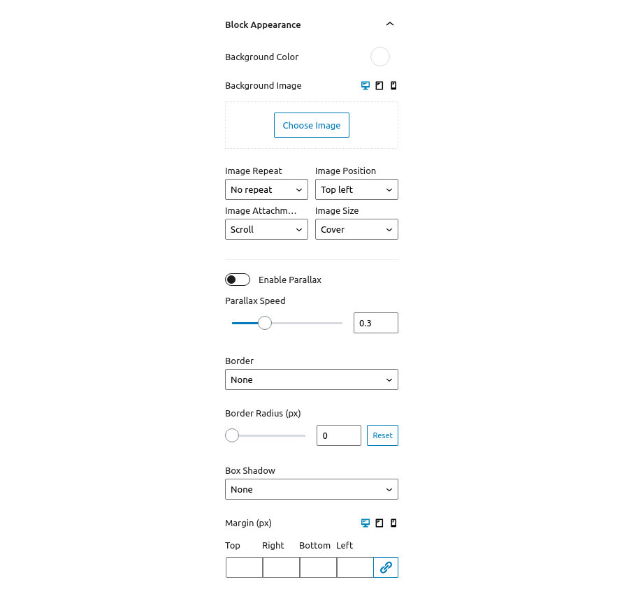

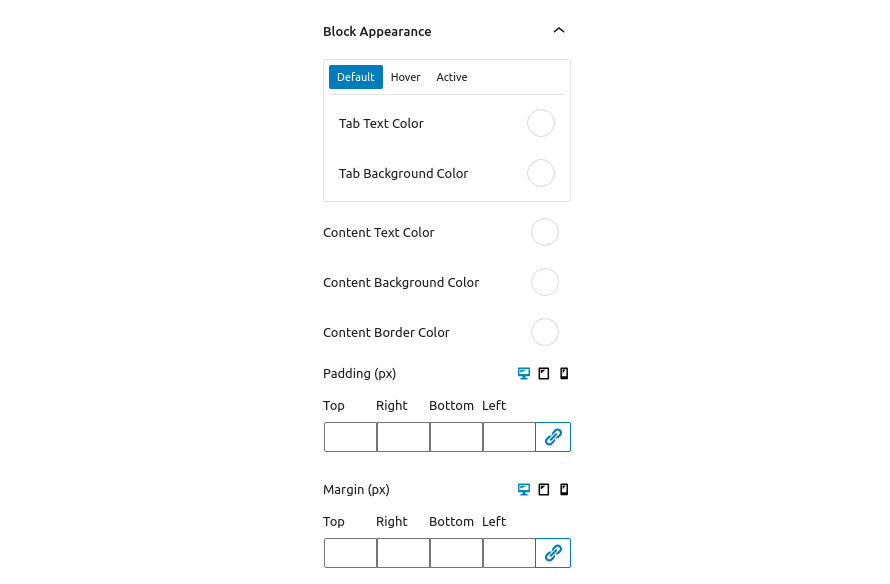
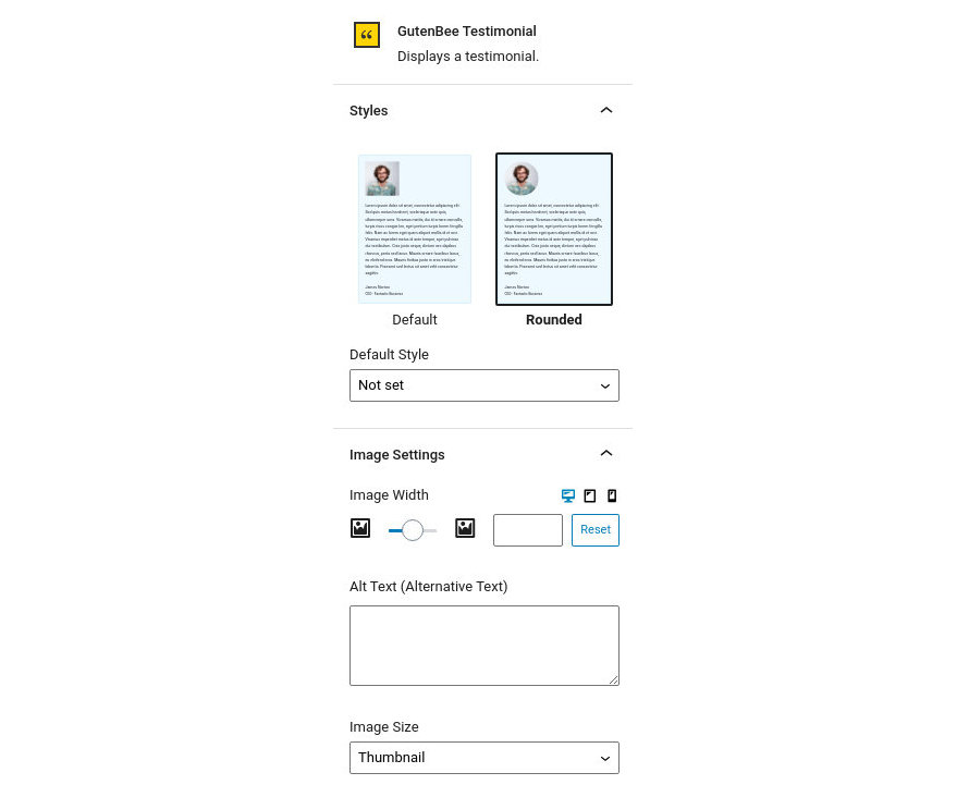
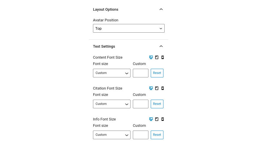
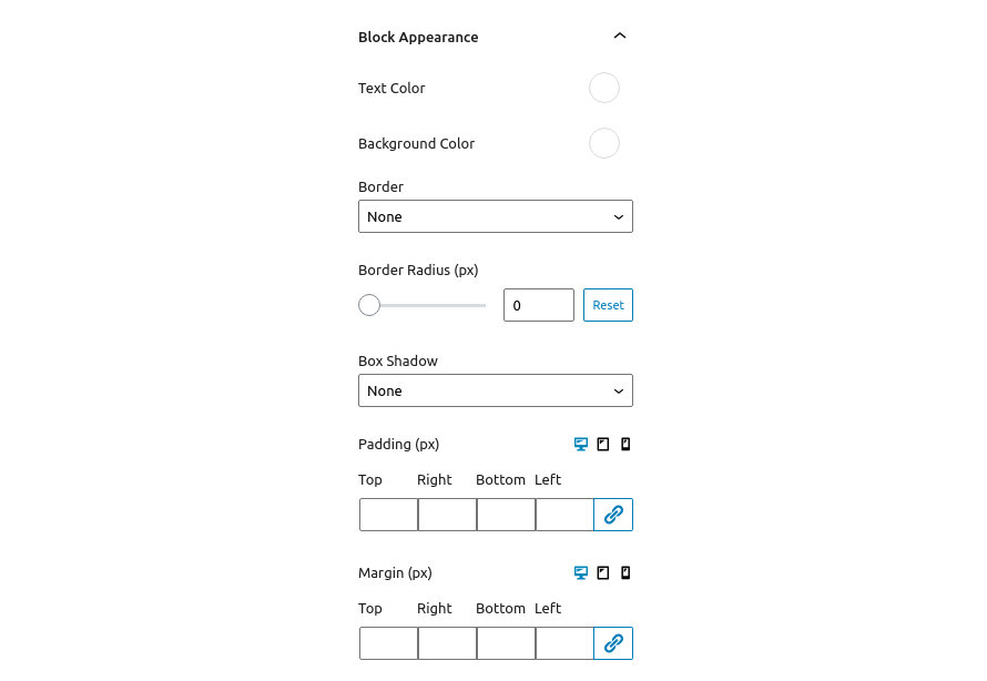
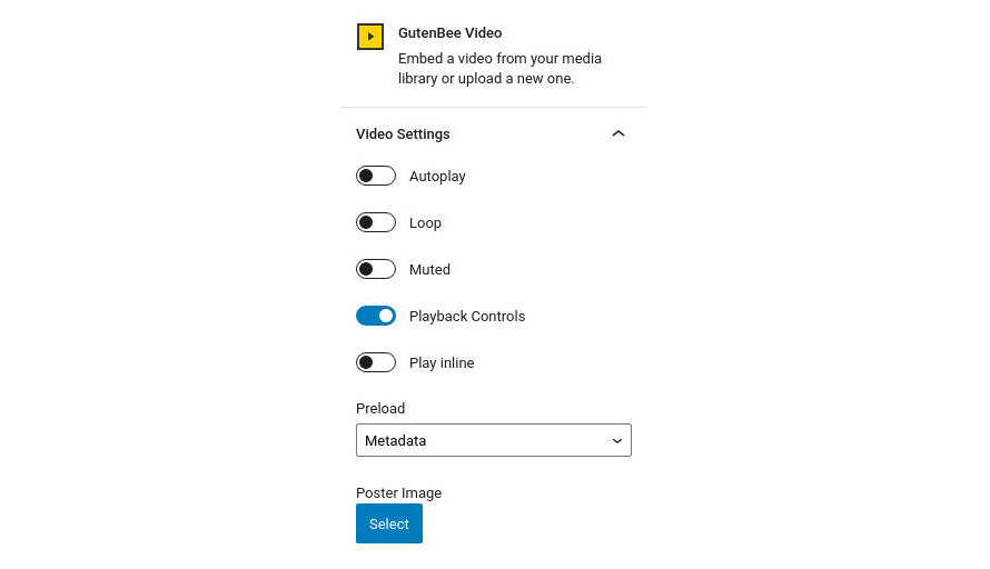
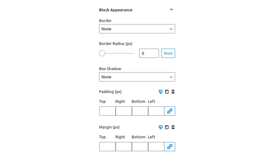
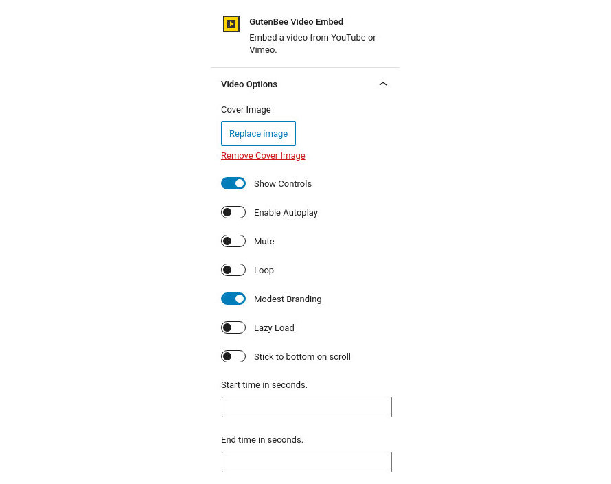
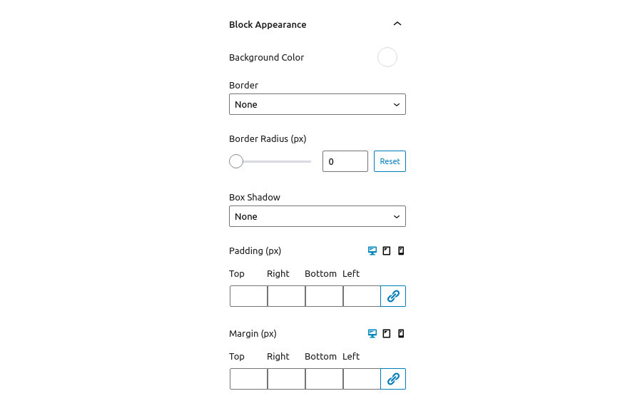
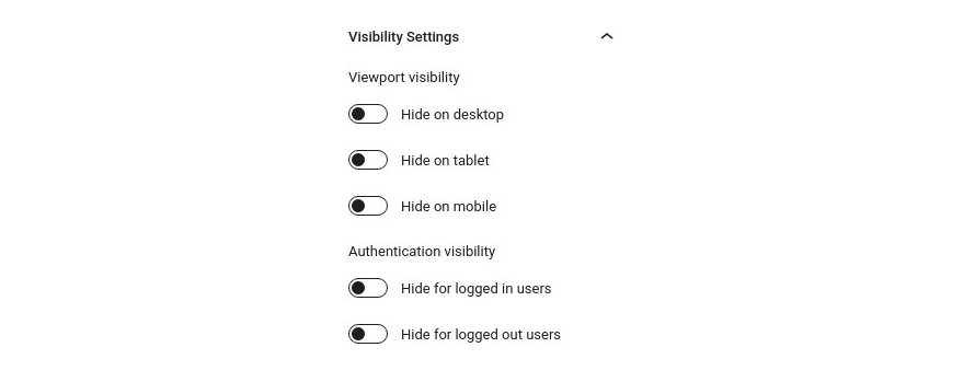


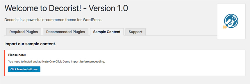


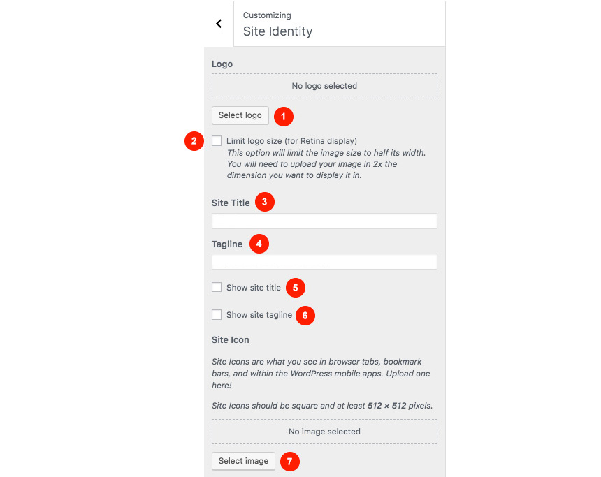

