Create a native WordPress gallery using any post type’s images
Did you know ever wanted to have a on a page a gallery of some post’s images? Or maybe on a post, a gallery of some other post type’s images.
Yeah, me too.
185 results found.

Did you know ever wanted to have a on a page a gallery of some post’s images? Or maybe on a post, a gallery of some other post type’s images.
Yeah, me too.
To create a video playlist navigate to VideoIgniter → Add New Playlist.
In the image above you’re seeing the video playlist interface. Below we take a step by step approach on adding a video track:
m3u8 HLS (HTTP Live Streaming)Keep in mind you can simply upload just one video.
Every video playlist carries a set of settings, in the free version of VideoIgniter those are:
Playlist layout: Choose where the video thumbnails will appear (left, right, or bottom) when the playlist contains more than one video.
Show fullscreen toggle: Whether to show the button that enables fullscreen viewing or not.
Show playback speed controls: Whether to show playback speed controls on the player.
Starting volume: Choose a volume that player should start with (0-100).
Navigating to VideoIgniter > Settings will reveal global settings that apply to every video playlist:
Accent Color: Choose the primary color of the video player. This will color apply as the accent color on elements like the progress bar, etc.
Branding Image: Optionally upload an image (i.e. your desired logo). Transparent png files work best, and for optimal viewing the width should be at around 400px.
Branding Image Position: Choose where the brand image will be placed (from top left to bottom right)
To display a video playlist you need to grab its shortcode (you can find it in the shortcode metabox on the right of your playlist). Simply copy the shortcode text, and then paste it in any post or page.
Alternatively, simply use VideoIgniter’s player block to quickly insert a video playlist in a post or page. Inside the post editor, add the “VideoIgniter Player” block, and select your playlist from the “Playlist” dropdown setting.
No need to hack your way through with text widgets. If you need a video playlist in any of your theme’s classic widget sidebars, VideoIgniter offers a native widget. Navigate to Appearance → Widgets or Customize → Widgets and place the VideoIgniter – Playlist widget in any sidebar. Give it a title, select a playlist from the drop-down and hit “Save“. Done!
The plugin supports the following extensions/formats:
Additionally, YouTube and Vimeo URLs are also supported.
Please note that while VideoIgniter supports these formats, not all browsers and devices may be able to play all these.
To get the plugin’s installable zip file navigate to our downloads section here and search for VideoIgniter or simply navigate to Premium WordPress Plugins and find VideoIgniter PRO.
Click the green download button and save the zip file when prompted.
Next, navigate to Plugins → Add New in your WordPress dashboard and click the Upload Plugin button.
Next click the Choose File button, search for the zip file you downloaded a moment ago, select it and then click the Install Now button.
Finally click the Activate Plugin link and you are done. The Pro version of VideoIgniter is an addon for the free version. You will need to have both plugins active.
Once you install and activate VideoIgniter PRO you get all its additional features, let’s have a closer look at them.
To create a playlist navigate to VideoIgniter → Add New Playlist.
m3u8 HLS (HTTP Live Streaming)Web Video Text Tracks (VTT) files are a standard format for displaying timed text tracks (such as subtitles or captions) with video content. They are part of the HTML5 standard and are broadly supported across modern video players and streaming services.
A VTT file is essentially a plain text file that contains time-coded data. This data aligns with the video’s timeline, enabling the display of text at specific intervals. The basic structure of a VTT file includes:
VTT files can be used not only for subtitles but also for adding chapter markers to videos. This enhances the user experience by allowing viewers to navigate directly to different sections or chapters of the video.
You can create a VTT file for either chapters or subtitles by using a text editor. Here’s a sample file:
You can add overlays while the video is playing. Overlays are small blocks of content positioned on top of the player. You can define exactly when they show up and hide, and display images, text, and an external link. Using overlays you can promote any kind of content, from other videos, to ad blocks.
The VideoIgniter PRO add-on adds additional settings on the playlist, let’s see them one by one:
With VideoIgniter PRO you can separate your playlists in categories that can help with organization and later retrieval. Please note this is an internal taxonomy, which means that you can’t use it to display all playlists of a certain category in a listing page on your site, like you would do for example with a post category. The taxonomy is here mainly for archiving purposes.
Along with these great extra features, VideoIgniter PRO comes with premium support via our dedicated support forum. Have any questions? Click here and we will help you right away!
To gain access to our custom Elementor templates you need to have installed and activated the Ignition Framework plugin, the Ignition Widgets for Elementor plugin, an Ignition Framework Theme and the CSSIgniter Connector plugin.
You can find and download all plugins from your Downloads section.
If you need any help, please read the following installation guides:
Once configured the plugin will provide access to our custom Elementor templates on active subscriptions. If your subscription is a standard club, developer club or lifetime one, you will have access to all available templates, if you have a single theme subscription you will have access to the templates of the particular theme, if available.
First, we will need to download the CSSIgniter Connector plugin. You can find and download the plugin from your Downloads section, alternatively you can get it directly from this URL.
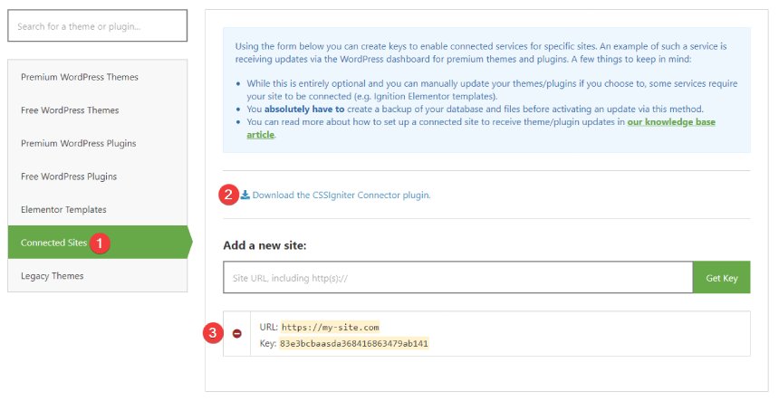
The plugin will be automatically downloaded to your computer. Keep in mind that Safari sometimes will auto extract the archive by default. Please have a look here on disabling it.
Now, head over to your WordPress installation’s dashboard and:
Select the plugin archive file you’ve just downloaded, upload and activate the plugin.
After activating the plugin navigate to Settings→CSSIgniter Connector. You will notice the screen below.
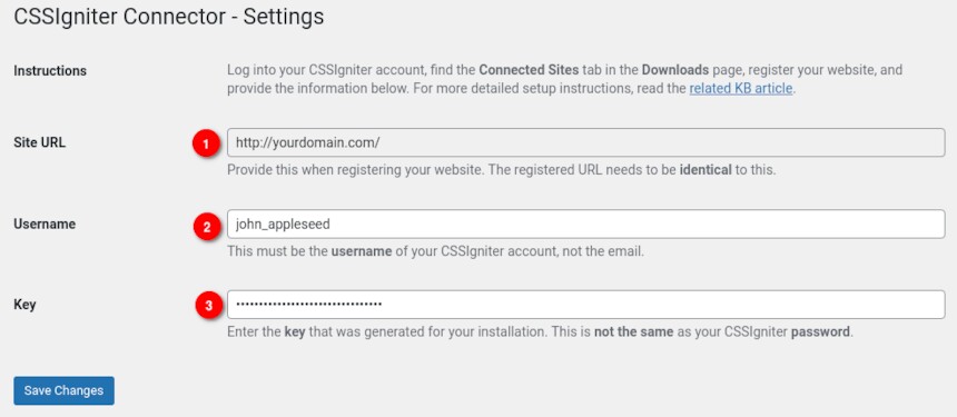
To connect the plugin with CSSIgniter you need three things. First your site’s URL (1), note this down exactly as it appears on the Connector’s settings page, your CSSIgniter username (2) (not an e-mail) and finally an API key (3). Let’s generate our API key.
Navigate back to your CSSIgniter Downloads page and go to Connected Sites.
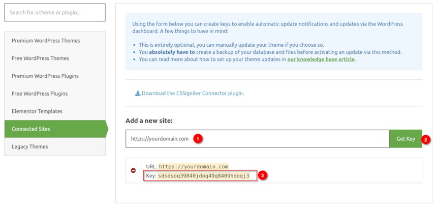
Fill in your site’s domain in the Add a new site (1) input exactly as it appeared in the Connector’s settings page and press the Get Key (2) button. Once your API Key (3) appears, copy it and paste it in the Connector’s settings page, in the Key input (labeled 3 in the previous to last image) and click the Save Changes button to connect your site to CSSIgniter.
If everything went right you are ready to access our Ignition templates for Elementor.
To access the templates you can edit any page or post with Elementor as usual and click the blue button in the add section box.
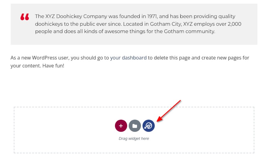
You will be presented with a pop-up similar to Elementor’s where you will find all the templates available to you, depending on your active subscription.
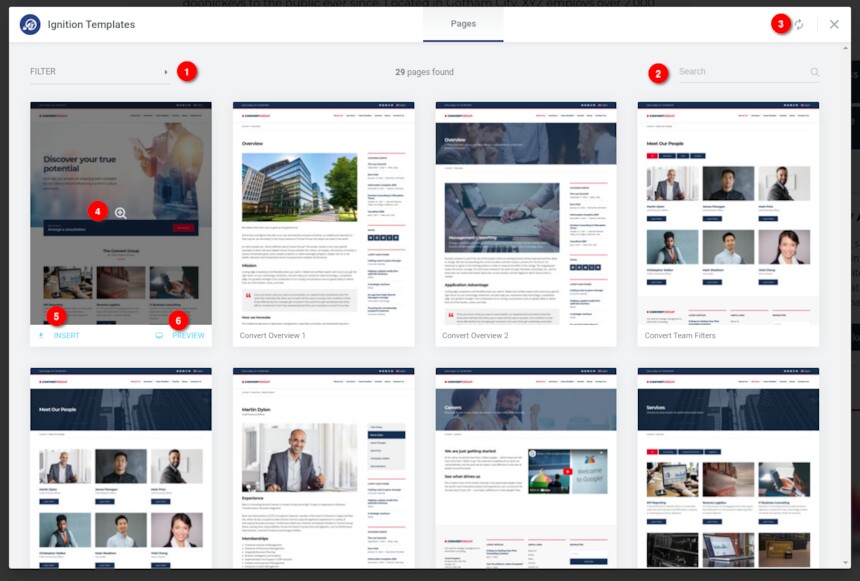
The pop-up shows all available templates in a columned layout. If your active Ignition theme has available Elementor templates these will be presented first. If your account has access to all templates the rest can be access by scrolling down. Alternatively you can use the filter (1) or search (2) functionality to find templates for your desired theme. The plugin will check for new templates regularly, but you can also force an update (3) if you wish to.
Hovering over a template’s card will give you the options to either preview the template (4 & 6) and insert it (5) to the post or page you are currently editing. Once you click the insert button Elementor will download and import the template’s content to your site. Please note that for copyright related reasons you will get blurred versions of the images used on our demos.
If you use the LiteSpeed Web Server (LSWS), you might be having issues with your WordPress installations and you might not even be aware of it.
Or you were made aware of it by a “LiteSpeed Web Server (LSWS) configuration issue” notice in your dashboard from one of CSSIgniter’s WordPress products. Let’s see what the issue is and how to fix it.
In order to avoid wasting resources, LSWS will silently kill a PHP process as soon its connection to it is closed; for example, when closing your browser’s window while the page is still loading. Although this is generally a good thing, WordPress (as well as some themes and plugins) depend on processes running even if the connection is closed.
WP-Cron specifically runs based on that assumption. On every page load, WordPress sends a non-blocking request to wp-cron.php is made. Non-blocking here simply means that WordPress doesn’t wait for the request to end; it closes the connection instantly, so that the the user doesn’t have to wait.
But WP-Cron is used by countless themes and plugins, and WordPress itself, and we just said LSWS kills such processes, silently! Doesn’t that mean that that a lot of scheduled jobs never ran, or were killed halfway?
Yes. Yes it does!
Furthermore, this affect AJAX calls too. A lot of background processing libraries such as WP Background Processing and Action Scheduler do non-blocking requests to admin-ajax.php, and such libraries are used by some quite big plugins. To name a few, WooCommerce, Elementor, WPML, WP Rocket.
Fortunately, LSWS provides a way to disable this behavior selectively, or even globally (not recommended). This is achieved by enabling the No Abort option, either via the WebAdmin Console or via the .htaccess file.
We are going the .htaccess route, and we will add the following code (provided by LiteSpeed, modified by CSSIgniter to handle non-private AJAX calls) via which we will enable noabort for wp-cron.php and admin-ajax.php, as well as all scripts under the wp-admin/ folder, but only for logged in users:
Make sure to add this code above the WordPress block that starts with:
That should do it!
The Ignition Framework, Ignition-based themes, and AudioIgniter plugin should detect the change and no longer display the “LiteSpeed Web Server (LSWS) configuration issue” admin notice.
Your host or administrator may also have enabled No Abort globally but the notice keeps appearing. In this case, and after your double-check that it is indeed enabled, just dismiss the notice to no longer see it.
Plugins such as WordFence and BackupBuddy also depend on this configuration, so the noabort code might already be in your .htaccess file. Make sure you don’t have it multiple times to avoid potential problems!
In LiteSpeed’s website you can find more technical information about noabort, as well as alternative configuration methods such as via environmental variables.
If you already have WordPress installed, it means that you meet the minimum server requirements and you can perfectly install this theme without any issues. To get the most out of your website though, you should get in touch with your web host and ask them if they meet the following criteria:
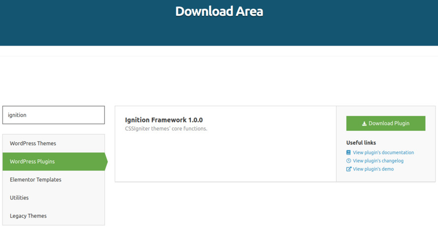
This theme requires our free Ignition framework plugin to be installed. Simply visit the Downloads area, download the Ignition Framework plugin, upload it through your Dashboard > Plugins > Add new and Activate it.
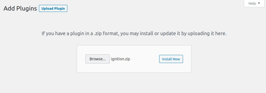
It really doesn’t matter if you install the theme or the plugin first. Just make sure to install both in order for things to function as intended.
Read here for more information regarding the plugin’s installation procedure.
Installing the theme is a very simple process. Go to your dashboard under Appearance > Themes > Add new, click Upload Theme and upload the zip file. Once uploaded click Install Now and then the Activate Theme link.
Here is a detailed overview on how to download and install the theme.
Once the theme is installed and activated you will be forwarded to the theme’s onboarding page.
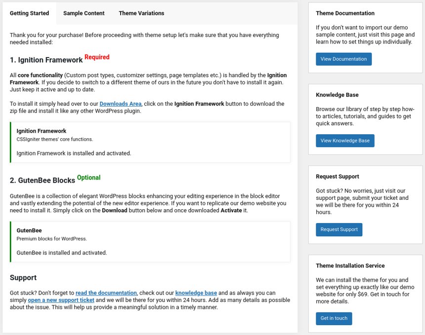
Here you will be prompted to install and activate the Ignition Framework plugin if you haven’t done so already. Here you can also install our free custom blocks plugin, GutenBee. Through the onboarding page you have access to many useful links, such as the theme’s documentation, our knowledge base articles and direct links to our support hub.
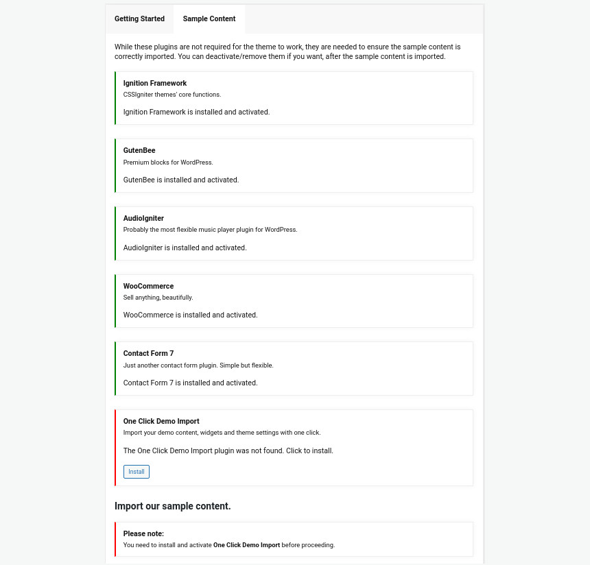
In the Sample Content tab of the onboarding page you can install and activate all the plugins required to import the sample content and proceed with its installation. More info on that on the next section.
If you like what you see in our demo website you can simply import the sample content. This means that a close approximation of our demo website will be imported in your WordPress installation. Now all you have to do is replace the content of these pages with yours. Importing the sample content can help serve as a basis on which you can continue to build and expand your site, however keep in mind that this procedure is entirely optional.
Check out this generic video guide on how to import the sample content.
Web page loading times are greatly affected by the size of your images. For best results make sure to use images with the recommended dimensions as described below:
It’s considered a good practice to set up the areas of your website that you won’t be editing a lot in the future, like the general site layout, the header, footer and some secondary functionality.
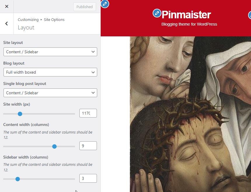
You can change your general site options under Appearance > Customize > Site Options. Under the Layout section you can control your site’s, blog’s and single blog post’s layout, as well as the site width and content/sidebar column ratio. The layout can then be overridden in each post/page individually. Under the Colors tab you can select the basic color palette for your installation and add a background image. Finally under Typography you can select the ideal font pairing from a full list of Google Fonts and customize font properties for key elements on desktop and mobile devices alike. You also have the option to disable Google Fonts altogether.
Read this knowledge base article for more information regarding the site options.
The theme’s header has the Normal type applied, its menu is centered and the sticky menu is set to reveal on scroll up. These can be configured under Customize > Header > Layout.
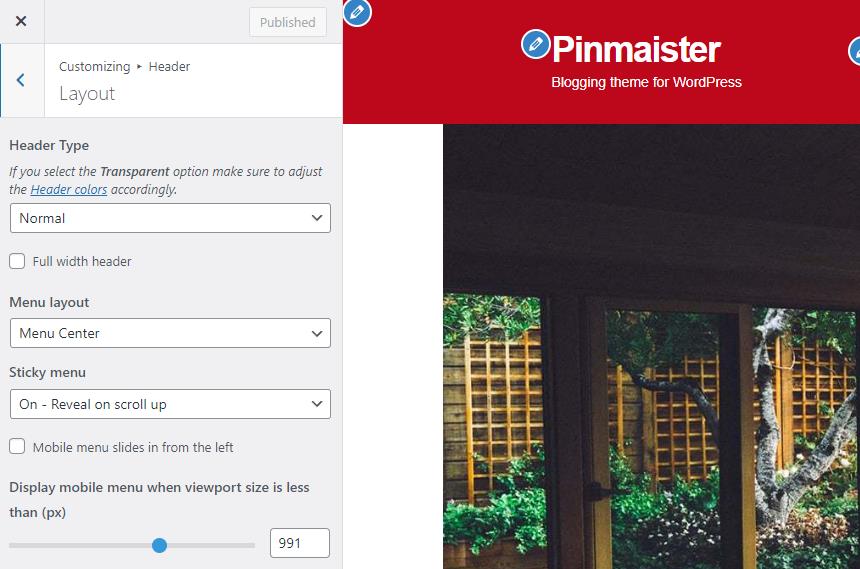
The header can be split into three key elements:
1. Top Bar
2. Logo
3. Main menu
To edit the top bar go to Customize > Top Bar. Here you can toggle the top bar entirely and fill the 3 content areas with plain text, HTML, or shortcodes. Refer to the shortcodes section below for information regarding the shortcodes. In this panel you can also customize the color scheme of the top bar, especially useful if you are using the normal header layout.
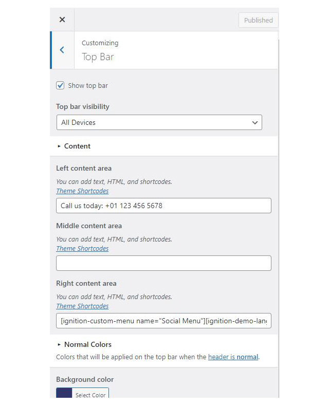
On the theme’s demo the top bar is disabled.
For the site’s logo you can use an image 200px wide (or double that if you need a retina logo). To upload your logo go to Customize > Site Identity. You can upload two logos. The main and the alternative one. The alternative logo can be used if you want a different logo to appear when the header layout is set to Transparent under Customize > Header > Layout.
Learn more about the header and its options.
If you are not familiar with WordPress menus here is a detailed guide.
Navigate to Customize > Menus. Enter a menu name (It can be anything you like) and click on the Create Menu button. In the next page click the Add Items button and start adding items to the menu. Now all you have to do is assign this menu to a location through the Menu Locations section, check the Main menu location and you are done. Your navigation menu should be now visible on your website.
The demo’s menu is set to be sticky (shy) under Customize > Header > Layout.
You can create a special button-like menu item by setting a certain class for to it. The class name is nav-button and you can set it under Appearance > Menus for the item you want. First enable this section from Screen Options.
This section allows you to create an area just below the menu which can display the page’s title & subtitle along with a background image or color.
The page title section can be modified under Customize > Page title. You can choose to disable the page title with background section entirely, change its height, alignment, content and toggle the site’s breadcrumbs. Under the Colors section you can set a background color, a background image, an overlay color and also set the primary and the secondary text colors.

In some cases, you might want to have different background images on different posts, pages and custom post types.
To achieve that create or edit a page. On the right sidebar locate the Page title image field. Upload a new image and preview this page. This will override the image set in the Customizer settings.
On the demo the Page title with background section is turned on. On single posts when a page title background image is set the page title is hidden, if no page title section background image is set the entire page title section is hidden.
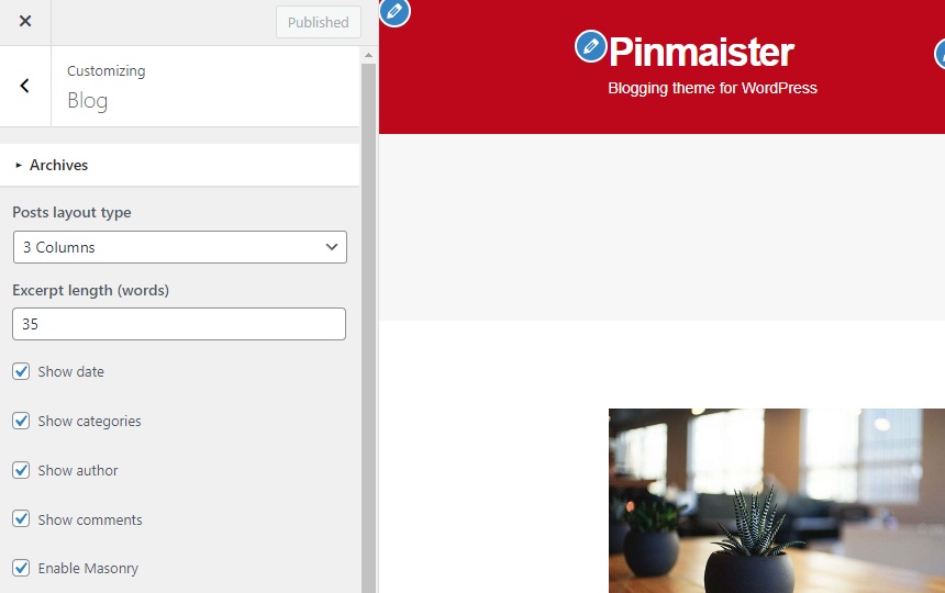
In the blog options panel, along with the regular toggles for date, categories, author and comments you can also toggle the masonry layout for post listings (blog and post category pages).
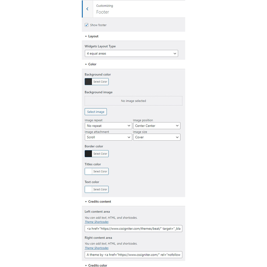
The footer area is a widgetized area that can be populated with widgets through Customize > Widgets. You can also remove the credits at the very bottom of this area by visiting Customize > Footer > Credits content. You can also adjust the colors by setting a background color & image and modify the border, title and text colors.
In the utilities section you will configuration options for various small theme features, such as the built in weather display capability, toggle for the theme’s lightbox, the block editor dark theme, back to top button, social sharing and block widget support.
Read here for more information regarding the theme’s utilities.
The homepage has the fullwidth boxed template applied to it. Under Page Settings > Content Area we have the top/bottom padding removed, under Page Settings > Page Title we have hidden the page title with background section, the normal page title and subtitle.

The homepage content starts with a wide aligned Container block with its bottom margin set to 0. Inside there is a single column with a MaxSlider block. The block displays the homepage slider with the Home slider template applied.
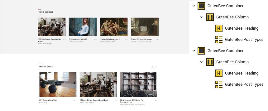
Next up we have another wide aligned Container with a background color set, top/bottom padding of 90px and bottom margin of 90px. Inside there is a single column with a Heading block with the Theme block style applied and a Post Types block displaying four hand picked posts.
The home deco section consists of another wide aligned Container block with 90px bottom margin. Inside there is a single column with a Heading block with the Theme block style applied and a Post Types block with the Carousel block style applied, displaying 6 posts from the Home Deco category in a three column layout.

The newsletter section is comprised by a wide aligned Container with a background color, 90px top/bottom padding and 90px bottom margin. Inside there are two equal columns. The left one contains a Heading with the Theme block style applied and a Core Paragraph, the right one contains another Heading with the Theme block style applied and a Core Shortcode with a demo newsletter form.
The final section of the front page is a wide aligned Container with 40px bottom padding. Inside where is a single column which contains a Heading with the Theme block style applied and a Post Types block displaying 9 items from the Art category in a four column layout with the Masonry option enabled.
This is your main blog page. You can create a new page and set it as your posts page under Customize > Homepage Settings. You can modify its appearance by changing the column number, toggling post meta, enabling masonry and more under Customize > Blog > Archive.
This is a post category archive, to create this page navigate to Appearance > Menus and from the Categories menu box add it to the menu.
This is another post category archive, to create this page navigate to Appearance > Menus and from the Categories menu box add it to the menu.
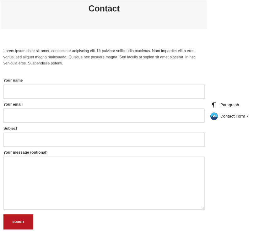
The contact page has the full width narrow template applied to it. Content-wise we have a Core Paragrarph followed by a Contact Form 7 block
The Ignition Framework offers a multitude of custom shortcodes these are:
Custom menu: [ignition-custom-menu name=”your menu name”]

Site search: [ignition-site-search]

Date: [ignition-date]

Weather: [ignition-current-weather id=”your-location-id(optional)”]

Minicart button: [ignition-minicart-button]

Language switcher: [ignition-language-switcher]

Icon link: [ignition-icon-link]

Instagram Feed: [ignition-instagram-feed]

WooCommerce search: [ignition-wc-search]
For more information have a look at this knowledge base article about shortcodes and their usage.
All themes offer six different templates which modify the location and appearance of the sidebar and the main content’s width.
Additionally pages have a common set of options which allow you to customize the appearance of the page title section, toggle breadcrumbs and more.
All settings are inherited from Customizer. So you can actually set some global settings and if you wish change certain pages to have different behavior.
For a detailed explanation of the available templates and their options you can read this article.
Ignition Framework based themes are compatible with WooCommerce giving you the ability to create awesome online stores which perfectly match the appearance of the rest of your site.
WooCommerce is an optional plugin. You don’t need to install it if you are not looking to build an online store.
After activating WooCommerce it will create and set some default pages. These will serve as your Shop, Cart, Checkout and My Account pages.
The framework offers various customization options both for the main product listing page under Customize > WooCommerce > Product Catalog and for single products under Customize > WooCommerce > Single Products.
Learn more about the WooCommerce integration and the options offered.
With the Global Sections custom post type included in all Ignition Framework based themes users can create content which can be easily reused in more than 15 key theme locations. For example users can create a newsletter subscription call to action box and immediately display it above the footer on all (or some) posts and pages, or create a banner ad an easily add it between posts in post listings etc.
Learn more about Global Sections here.
This is you main blog page. You can create a new page and set it as your posts page under Customize > Homepage Settings. You can customize it under Customize > Blog from the Archives section.
The theme provides special widget areas for your posts listings, pages and shop. You can use a plugin/module like Jetpack’s widget visibility to hide or show widgets for certain pages, posts or products.
Ignition Framework based themes work seamlessly with popular page builders like Elementor, Divi, Beaver builder and more to cater to the needs of those who like to build things visually.
If you need help during the initial installation and setup of this theme feel free to get in touch and we will get back to you within 24 hours to help.
If you already have WordPress installed, it means that you meet the minimum server requirements and you can perfectly install this theme without any issues. To get the most out of your website though, you should get in touch with your web host and ask them if they meet the following criteria:

This theme requires our free Ignition framework plugin to be installed. Simply visit the Downloads area, download the Ignition Framework plugin, upload it through your Dashboard > Plugins > Add new and Activate it.

It really doesn’t matter if you install the theme or the plugin first. Just make sure to install both in order to get the whole functionality.
Here you can find an overview of how to download and install the plugin.
Installing the theme is a very simple process. Go to your dashboard under Appearance > Themes > Add new, click Upload Theme and upload the zip file. Once uploaded click Install Now and then the Activate Theme link. Here is a detailed overview on how to download and install the theme.
Once the theme is installed and activated you will be forwarded to the theme’s onboarding page.

Here you will be prompted to install and activate the Ignition Framework plugin if you haven’t done so already. Here you can also install our free custom blocks plugin, GutenBee. Through the onboarding page you have access to many useful links, such as the theme’s documentation, our knowledge base articles and direct links to our support hub.
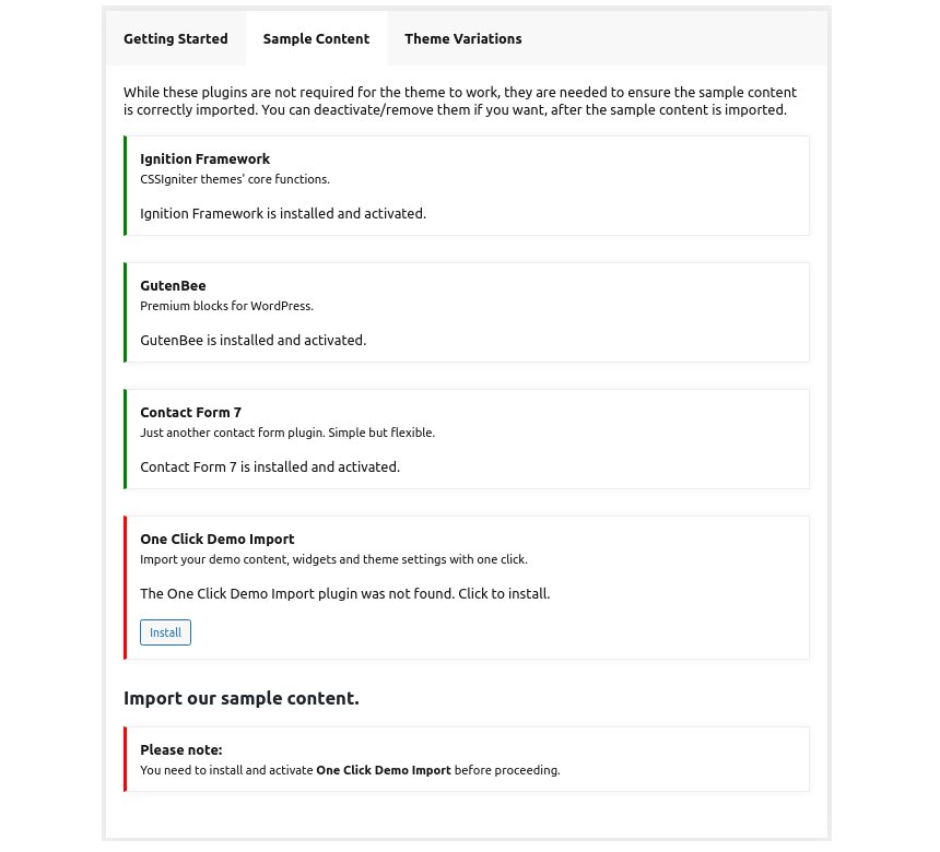
In the Sample Content tab of the onboarding page you can install and activate all the plugins required to import the sample content and proceed with its installation. More info on that on the next section.
If you like what you see in our demo website you can simply import the sample content. This means that a close approximation of our demo website will be imported in your WordPress installation. Now all you have to do is replace the content of these pages with yours. Importing the sample content can help serve as a basis on which you can continue to build and expand your site, however keep in mind that this procedure is entirely optional.
Check out a generic overview of the sample content import procedure.
Web page loading times are greatly affected by the size of your images. For best results make sure to use images with the recommended dimensions as described below:
It’s considered a good practice to set up the areas of your website that you won’t be editing a lot in the future, like the general site layout, the header, footer and some secondary functionality.
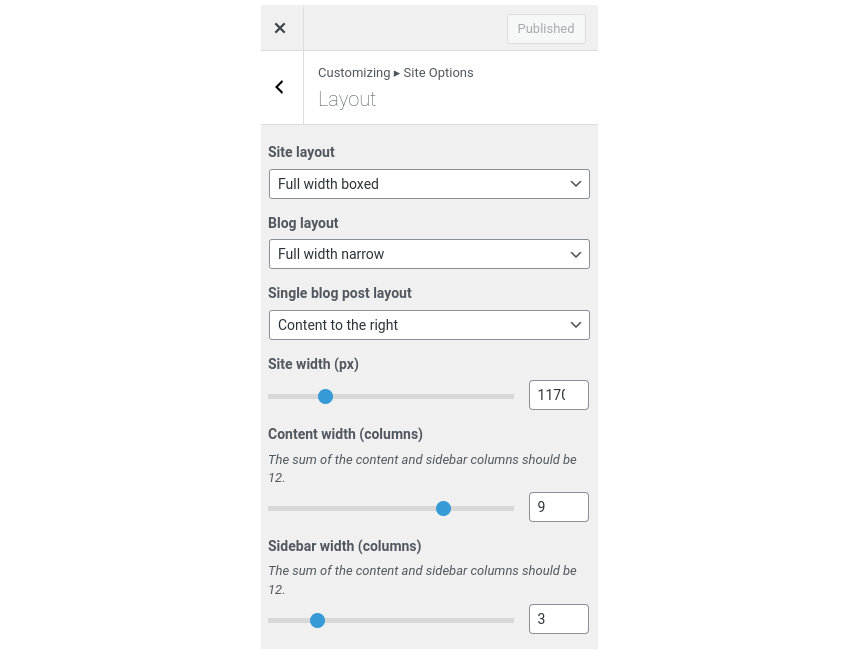
You can change your general site options under Appearance > Customize > Site Options. Under the Layout section you can control your site’s, blog’s and single blog post’s layout, as well as the site width and content/sidebar column ratio. The layout can then be overridden in each post/page individually. Under the Colors tab you can select the basic color palette for your installation and add a background image. Finally under Typography you can select the ideal font pairing from a full list of Google Fonts and customize font properties for key elements on desktop and mobile devices alike. You also have the option to disable Google Fonts altogether.
Read this knowledge base article for more information regarding the site options.
Moment features a normal header with a custom menu layout.
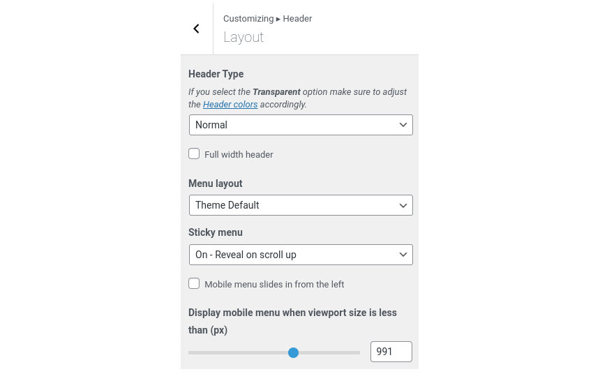
With the theme’s default menu layout enabled the menu will be presented in the form of a button which when clicked reveals a sidebar menu which slides in from the right.
The recommended maximum width of your logo is 200px (or double that if you want a retina ready logo) while you can use any height you want. To upload your logo go to Customize > Site Identity. You can upload two logos. The normal and the alternative one. The alternative logo can be used if you want a different logo to appear when the header layout is set to Transparent under Customize > Header > Layout. In the theme’s demo we don’t use a logo image.
Learn more about the header and its options.
If you are not familiar with WordPress menus here is a detailed guide.
Navigate to Customize > Menus. Enter a menu name (It can be anything you like) and click on the Create Menu button. In the next page click the Add Items button and start adding items to the menu. Now all you have to do is assign this menu to a location through the Menu Locations section, check the Main menu location and you are done. Your navigation menu should be now visible on your website.
Under the page title section you can choose to show or hide the page title and or subtitle.
In the utilities section you will configuration options for various small theme features, such as the built in weather display capability, toggle for the theme’s lightbox, the block editor dark theme, back to top button, social sharing and block widget support.
Read here for more information regarding the theme’s utilities.
For more information check out this knowledge base article about available customization options.
Creating posts on Moment is exactly the same as any other theme. Moment offers a few extra layout related options listed below.

Moment comes with four distinct post templates to help you create beautiful posts. The templates can be selected from the Summary metabox on the right hand side toolbar.
To create the front page’s layout Moment allows you to select the image size for each post. This way you can draw the reader’s attention to certain posts by making them appear, larger, taller or wider.

There are four available image sizes to choose from. If you don’t want to choose one, or you want to have a fluid homepage layout with sizes changing on every reload you can set it to random.
Moment also offers the pull left and pull right block styles for the Core Quote block which allows you to pull a quote left or right depending on the post content template you have selected. The Wide block style available for the Core Embed block, the GutenBee Video and GutenBee Video Embed blocks will make a video full width on the Content on the right/left post templates. Examples of both block styles in action can be found in this post.
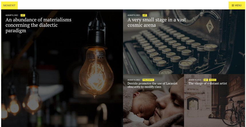
Due to its unique design, Moment features only a single page, the homepage which will list all our posts.
The homepage has the Homepage wide template applied to it and its top/bottom content padding is disabled under Page Settings > Content Area.
Content wise the page features a single Post Types block with the Overlay block style active displaying 9 posts. The pagination is enabled and set to Load more button. The column numbers here are irrelevant since the masonry layout of the front page is automatically generated by the Packery JavaScript library.
The Ignition Framework offers a multitude of custom shortcodes these are:
Custom menu: [ignition-custom-menu name=”your menu name”]

Site search: [ignition-site-search]

Date: [ignition-date]

Weather: [ignition-current-weather id=”your-location-id(optional)”]

Minicart button: [ignition-minicart-button]

Language switcher: [ignition-language-switcher]

Icon link: [ignition-icon-link]

Instagram Feed: [ignition-instagram-feed]

WooCommerce search: [ignition-wc-search]
For more information have a look at this knowledge base article about shortcodes and their usage.
All themes offer six different templates which modify the location and appearance of the sidebar and the main content’s width.
Additionally pages have a common set of options which allow you to customize the appearance of the page title section, toggle breadcrumbs and more.
All settings are inherited from Customizer. So you can actually set some global settings and if you wish change certain pages to have different behavior.
Here is a detailed explanation of the available templates and their options.
Ignition Framework based themes are compatible with WooCommerce giving you the ability to create awesome online stores which perfectly match the appearance of the rest of your site.
WooCommerce is an optional plugin. You don’t need to install it if you are not looking to build an online store.
After activating WooCommerce it will create and set some default pages. These will serve as your Shop, Cart, Checkout and My Account pages.
The framework offers various customization options both for the main product listing page under Customize > WooCommerce > Product Catalog and for single products under Customize > WooCommerce > Single Products.
Learn more about the WooCommerce integration and the options offered.
With the Global Sections custom post type included in all Ignition Framework based themes users can create content which can be easily reused in more than 15 key theme locations. For example users can create a newsletter subscription call to action box and immediately display it above the footer on all (or some) posts and pages, or create a banner ad an easily add it between posts in post listings etc.
Learn more about Global Sections here.
This is you main blog page. You can create a new page and set it as your posts page under Customize > Homepage Settings. You can customize it under Customize > Blog from the Archives section.
The theme provides special widget areas for your posts listings, pages and shop. You can use a plugin/module like Jetpack’s widget visibility to hide or show widgets for certain pages, posts or products.
Ignition Framework based themes work seamlessly with popular page builders like Elementor, Divi, Beaver builder and more to cater to the needs of those who like to build things visually.
If you need help during the initial installation and setup of this theme feel free to get in touch and we will get back to you within 24 hours to help.
If you already have WordPress installed, it means that you meet the minimum server requirements and you can perfectly install this theme without any issues. To get the most out of your website though, you should get in touch with your web host and ask them if they meet the following criteria:

This theme requires our free Ignition framework plugin to be installed. Simply visit the Downloads area, download the Ignition Framework plugin, upload it through your Dashboard > Plugins > Add new and Activate it.

It really doesn’t matter if you install the theme or the plugin first. Just make sure to install both in order to get the whole functionality.
Here you can find an overview of how to download and install the plugin.
Installing the theme is a very simple process. Go to your dashboard under Appearance > Themes > Add new, click Upload Theme and upload the zip file. Once uploaded click Install Now and then the Activate Theme link. Here is a detailed overview on how to download and install the theme.
Once the theme is installed and activated you will be forwarded to the theme’s onboarding page.

Here you will be prompted to install and activate the Ignition Framework plugin if you haven’t done so already. Here you can also install our free custom blocks plugin, GutenBee. Through the onboarding page you have access to many useful links, such as the theme’s documentation, our knowledge base articles and direct links to our support hub.
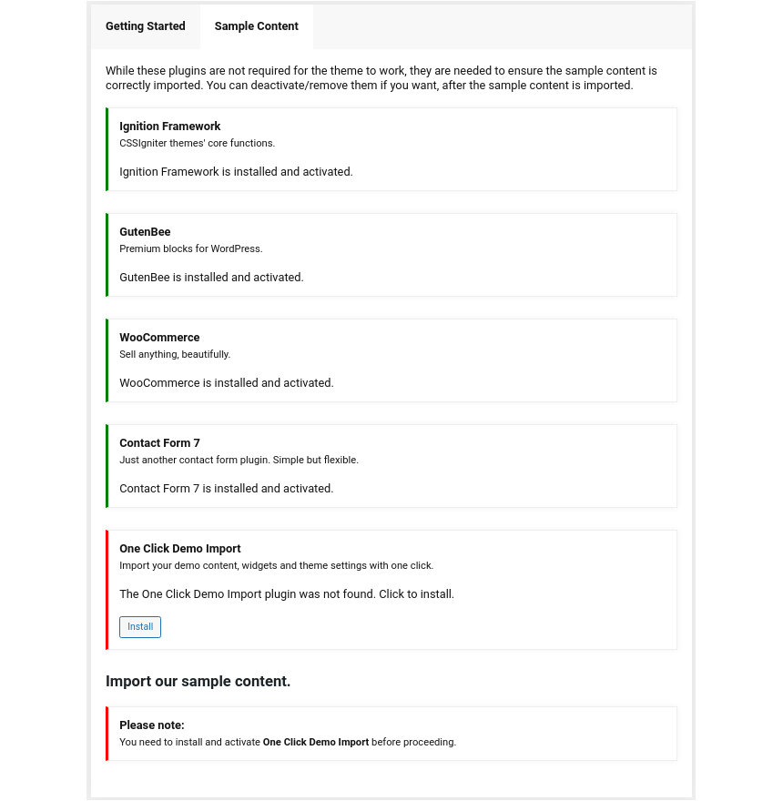
In the Sample Content tab of the onboarding page you can install and activate all the plugins required to import the sample content and proceed with its installation. More info on that on the next section.
Finally in the Theme Variations tab you have the ability to choose one of the available theme variations for the current theme. Carbone offers one of the same name and the Igloo one. Changing variations will change the color palette of your theme, it will also change Customizer options so be sure to back up your existing ones using the built in tool or another database backup plugin.
TODO: Add screenshot from the theme variation page.
If you like what you see on the demo websites of The Styler or Beaute you can simply import the sample content. This means that a close approximation of our demo website will be imported in your WordPress installation. Now all you have to do is replace the content of these pages with yours. Importing the sample content can help serve as a basis on which you can continue to build and expand your site, however keep in mind that this procedure is entirely optional.
Check out a generic overview of the sample content import procedure.
Web page loading times are greatly affected by the size of your images. For best results make sure to use images with the recommended dimensions as described below:
It’s considered a good practice to set up the areas of your website that you won’t be editing a lot in the future, like the general site layout, the header, footer and some secondary functionality.

You can change your general site options under Appearance > Customize > Site Options. Under the Layout section you can control your site’s, blog’s and single blog post’s layout, as well as the site width and content/sidebar column ratio. The layout can then be overridden in each post/page individually. Under the Colors tab you can select the basic color palette for your installation and add a background image. Finally under Typography you can select the ideal font pairing from a full list of Google Fonts and customize font properties for key elements on desktop and mobile devices alike. You also have the option to disable Google Fonts altogether.
Read this knowledge base article for more information regarding the site options.
The header on the theme consists of three key elements:
1. Top Bar
2. Logo
3. Main Menu
The layout of the header can be set globally under Customize > Header > Layout. By default the header layout is set to transparent. The menu is aligned to the left and is permanently sticky.


To edit the top bar go to Customize > Top Bar. Here you can toggle the top bar entirely or set it to display on certain devices only and fill the 3 content areas with simple text, plain HTML, or shortcodes.
The left content area on the theme’s demo contains some plain text and the right one contains the Ignition custom menu shortcode to display social icons. Refer to the shortcodes section below for information regarding the shortcodes.
Top bar colors can also be modified through this tab.
The recommended maximum width of your logo is 200px (or double that if you want a retina ready logo) while you can use any height you want. To upload your logo go to Customize > Site Identity. You can upload two logos. The normal and the alternative one. The alternative logo can be used if you want a different logo to appear when the header layout is set to Transparent under Customize > Header > Layout. On the theme’s demo we use a dark logo as the site’s main logo and a light version for the alternative one.
Learn more about the header and its options.
If you are not familiar with WordPress menus here is a detailed guide.
Navigate to Customize > Menus. Enter a menu name (It can be anything you like) and click on the Create Menu button. In the next page click the Add Items button and start adding items to the menu. Now all you have to do is assign this menu to a location through the Menu Locations section, check the Main menu location and you are done. Your navigation menu should be now visible on your website.
You can create a special button-like menu item by setting a certain class for to it. The class name is nav-button and you can set it under Appearance > Menus for the item you want. First enable this section from Screen Options.
To replicate the demo’s last menu item’s appearance which is pushed to the far right corner of the menu you can add the menu-item-push class in the CSS Classes box. Please note that for this feature to work the menu layout needs to be set to left under Customize > Header > Layout.
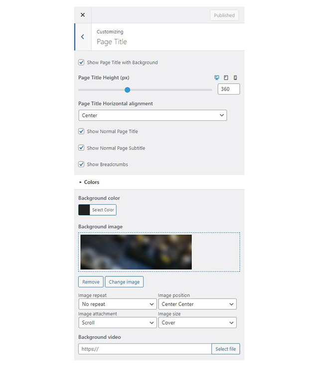
The page title section can be modified under Customize > Page title. You can choose to disable the page title section entirely, change its height, alignment, content and toggle the site’s breadcrumbs. Under the Colors section you can set a background color, a background image, an overlay color and also set the primary and the secondary text colors.
In some cases, you might want to have different background images on different posts, pages and custom post types. To achieve that set the section up globally and then create or edit a page. On the right sidebar locate the Page title image field. Upload a new image and preview this page. As you can see we have successfully overridden the image set in the Customizer settings.
By default the Page Title with Background section is enabled and the normal page title and subtitle are hidden. On the demo we have set a default background image for the section and applied a semitransparent overlay.
In our Knowledge Base you can find more info about the page title section, breadcrumbs and page template overrides.
The footer area is a widgetized area that can be populated with widgets through Customize > Widgets. You can also remove the credits at the very bottom of this area by visiting Customize > Footer > Credits content. You can also adjust the colors by setting a background color & image and modify the border, title and text colors.

In the utilities section you will configuration options for various small theme features, such as the built in weather display capability, toggle for the theme’s lightbox, the block editor dark theme, back to top button, social sharing and block widget support.
Read here for more information regarding the theme’s utilities.
For more information check out this knowledge base article about available customization options.
Navigate to Services > Add New. Then under the Service tab start adding the basic item attributes. These are:
Navigate to Team > Add New. Then under the Team Member tab start adding the basic item attributes. These are:
All three homepage templates have the Full width boxed page template applied to them. Under Page Settings > Content Area they have the top/bottom padding removed, and under Page Settings > Page Title, the Page Title with Background section and breadcrumbs hidden.

The top banner consists of a fully aligned container block with the theme grid enabled, its height set to -1 (viewport height) and its content is aligned to center bottom. The container has a background image and a semitransparent overlay applied. It also has 70px bottom padding and 0 bottom margin. Inside there is a single column with a Core Heading and a Paragraph block.

The welcome section consists of a fully aligned Container block with the theme grid enabled. It has 100px top/bottom padding (which drops to 70 and 50 on tablets and mobiles) and 0 bottom margin. Inside there is a single column with an Icon block, a Core Heading, a Paragraph serving as the subtitle, another Paragraph and an Image block with the signature.
The Services section is another fully aligned Container block with the theme grid enabled. It has a background color applied, 100px top/bottom padding (which drops to 70 and 50 on tablets and mobiles) and 0 bottom margin. Inside there is a single column containing a Core Heading and two Container blocks. Each container has three equal columns and each column contains an Icon Box block with service info.

The homepage’s pricelist section is yet another fully aligned Container block with the theme grid enabled. It has a background image set, a semi transparent overlay, 100px top/bottom padding (which drops to 70 and 50 on tablets and mobiles) and 0 bottom margin. Inside there is a single column with a Core Heading and a Food Menu block which displays six food items in a two column layout.
The team section is a fully aligned Container block with the theme grid enabled. It has 100px top/bottom padding (which drops to 70 and 50 on tablets and mobiles) and 0 bottom margin. Inside there is a single column a Core Heading, a Paragraph serving as the subtitle and a Post Types block displaying three items from the Team post type in a three column layout with the Rounded theme style enabled.

Closing out the homepage are the Testimonial and the Appointment sections. Both sections are build with a fully aligned Container block with the theme grid enabled. It has 100px top/bottom padding (which drops to 70 and 50 on tablets and mobiles) and 0 bottom margin.
The testimonial container has a background color applied and contains a single column. The column houses a Core Heading, a Paragraph serving as the subtitle and a Testimonial block.
The Appointment container also has a single column which contains a Core Heading, a Paragraph, an Icon list with three items and a Contact Form 7 block with the theme’s appointment form and the Theme Form block style applied (see below for the form’s markup if you wish to replicate it).
The pages layout and content is identical with the Home – Banner page. The only difference here is that the first container block has a Background video set under Block Appearance.

The Slider frontpage starts with a fully aligned Container block housing a single column with a MaxSlider block. On the MaxSlider block we have selected our homepage slider and applied to it the Home template. When creating the homepage slider set each slide’s content to center bottom, the slider’s height to 100vh, select dots as the preferred navigation method, select the full image size for the slider and apply the Home template to it.

The Services listing page has the full width boxed template applied to it.

Its content consists of a single Post Types block which displays 6 items from the Services post type in a 3 column layout.
The pricelist page has the full width boxed template applied and a custom Page Title background image set.

Its content consists of a Heading block with 55px bottom margin followed by a Food Menu block with 6 food menu items in a two column layout. The Food Menu block has 100px bottom margin. It is followed by another Heading with 55px bottom margin and another Food Menu block with six more food menu items.
The team listing page has the full width boxed templates applied and a custom Page Title background image set.

Its content consists of a single Post Types block with the Rounded block style applied, which displays 6 items from the Team post type in a 3 column layout.
This is your main post listing page. Create a new page and set it as your posts page under Customize > Homepage Settings. You can customize its appearance under Customize > Blog > Archives.
The shop page is created automatically when WooCommerce is activated and will list all of your products. You can customize the appearance of the product listing under Customize > WooCommerce > Product Catalog.
The appointment page starts out with a Google Maps block, followed by a Core Paragraph, a Core Heading, another Core Paragraph, an Icon List with three list items and a Contact Form 7 block with the Theme Form block style applied to it.


The Styler has a Global Section which features the Testimonial and the Appointment form. Both sections are build with a fully aligned Container block with the theme grid enabled. It has 100px top/bottom padding (which drops to 70 and 50 on tablets and mobiles) and 0 bottom margin.
The testimonial container has a background color applied and contains a single column. The column houses a Core Heading, a Paragraph serving as the subtitle and a Testimonial block.
The Appointment container also has a single column which contains a Core Heading, a Paragraph, an Icon list with three items and a Contact Form 7 block with the theme’s appointment form and the Theme Form block style applied.

The Global Section is set to display site wide before the footer. The global section is excluded from the appointment page, all shop related pages and the homepage.
To recreate the layout of the theme’s contact form present on the homepages, the global section and the appointment page you can use the following markup and tailor it to your needs.
The Ignition Framework offers a multitude of custom shortcodes these are:
Custom menu: [ignition-custom-menu name="your menu name"]

Site search: [ignition-site-search]

Date: [ignition-date]

Weather: [ignition-current-weather id="your-location-id(optional)"]

Minicart button: [ignition-minicart-button]

Language switcher: [ignition-language-switcher]

Icon link: [ignition-icon-link]

Instagram Feed: [ignition-instagram-feed]

WooCommerce search: [ignition-wc-search]
For more information have a look at this knowledge base article about shortcodes and their usage.
All themes offer six different templates which modify the location and appearance of the sidebar and the main content’s width.
Additionally pages have a common set of options which allow you to customize the appearance of the page title section, toggle breadcrumbs and more.
All settings are inherited from Customizer. So you can actually set some global settings and if you wish change certain pages to have different behavior.
Read the following article for a detailed explanation of the available templates and their options.
Ignition Framework based themes are compatible with WooCommerce giving you the ability to create awesome online stores which perfectly match the appearance of the rest of your site.
WooCommerce is an optional plugin. You don’t need to install it if you are not looking to build an online store.
After activating WooCommerce it will create and set some default pages. These will serve as your Shop, Cart, Checkout and My Account pages.
The framework offers various customization options both for the main product listing page under Customize > WooCommerce > Product Catalog and for single products under Customize > WooCommerce > Single Products.
Learn more about the WooCommerce integration and the options offered.
With the Global Sections custom post type included in all Ignition Framework based themes users can create content which can be easily reused in more than 15 key theme locations. For example users can create a newsletter subscription call to action box and immediately display it above the footer on all (or some) posts and pages, or create a banner ad an easily add it between posts in post listings etc.
Learn more about Global Sections here.
This is your main blog page. You can create a new page and set it as your posts page under Customize > Homepage Settings. You can customize it under Customize > Blog from the Archives section.
The theme provides special widget areas for your posts listings, pages and shop. You can use a plugin/module like Jetpack’s widget visibility to hide or show widgets for certain pages, posts or products.
Ignition Framework based themes work seamlessly with popular page builders like Elementor, Divi, Beaver builder and more to cater to the needs of those who like to build things visually.
If you need help during the initial installation and setup of this theme feel free to get in touch and we will get back to you within 24 hours to help.
If you already have WordPress installed, it means that you meet the minimum server requirements and you can perfectly install this theme without any issues. To get the most out of your website though, you should get in touch with your web host and ask them if they meet the following criteria:

This theme requires our free Ignition framework plugin to be installed. Simply visit the Downloads area, download the Ignition Framework plugin, upload it through your Dashboard > Plugins > Add new and Activate it.

It really doesn’t matter if you install the theme or the plugin first. Just make sure to install both in order to get the whole functionality.
For more information about the installation procedure along with some small videos check out this article.
Installing the theme is a very simple process. Go to your dashboard under Appearance > Themes > Add new, click Upload Theme and upload the zip file. Once uploaded click Install Now and then the Activate Theme link. For a more detailed overview on how to download and install the theme check out this article and have a look at the video demonstration in the next section.
Once the theme is installed and activated you will be forwarded to the theme’s onboarding page.

Here you will be prompted to install and activate the Ignition Framework plugin if you haven’t done so already. Here you can also install our free custom blocks plugin, GutenBee. Through the onboarding page you have access to many useful links, such as the theme’s documentation, our knowledge base articles and direct links to our support hub.

In the Sample Content tab of the onboarding page you can install and activate all the plugins required to import the sample content and proceed with its installation. More info on that on the next section.
If you like what you see in our demo website you can simply import the sample content. This means that a close approximation of our demo website will be imported in your WordPress installation. Now all you have to do is simply replace the content of these pages with your content. Importing the sample content can help serve as a basis on which you can continue to build and expand your site, however keep in mind that this procedure is entirely optional.
Check out this generic video guide on how to import the sample content.
Web page loading times are greatly affected by the size of your images. For best results make sure to use images with the recommended dimensions as described below:
It’s considered a good practice to set up the areas of your website that you won’t be editing a lot in the future, like the general site layout, the header, footer and some secondary functionality.
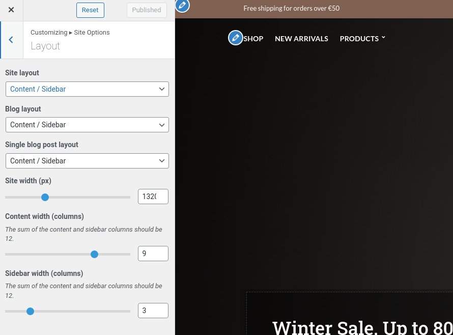
You can change your general site options under Appearance > Customize > Site Options. Under the Layout section you can control your site’s and blog’s layout, as well as the site width and content/sidebar column ratio. The layout can then be overridden in each post/page individually. Under the Colors tab you can select the basic color palette for your installation and add a background image. Finally under Typography you can select the ideal font pairing from a full list of Google Fonts and customize font properties for key elements on desktop and mobile devices alike. You also have the option to disable Google Fonts altogether.
Read this knowledge base article for more information regarding the site options.
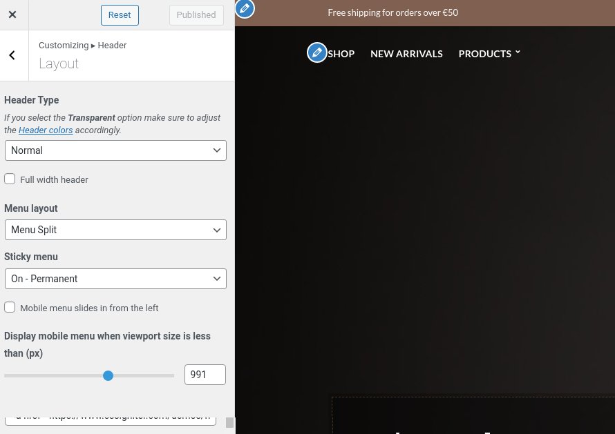
The theme’s header is set to the normal layout under Customize > Header > Layout with a split menu which is permanently sticky.
The header on the theme consists of three key elements:
1. Top Bar
2. Logo
3. Main Menu
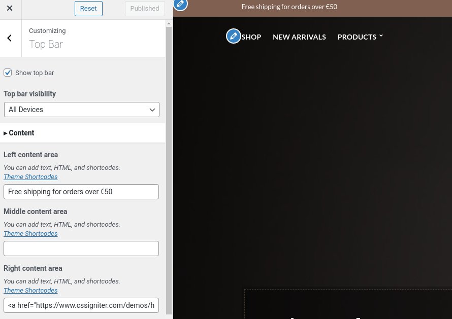
To edit the top bar go to Customize > Top Bar. Here you can toggle the top bar entirely and fill the 3 content areas with simple text, plain HTML, or shortcodes. Refer to the shortcodes section below for information regarding the shortcodes.
The left content area on the theme’s demo contains some text, the middle one is blank and the right one hosts a link and the following shortcode which will display the social menu:
[ignition-custom-menu name="Social"]
Top bar colors can also be modified through this tab.
The recommended maximum width of your logo is 200px (or 400px is you want a retina ready logo) while you can use any height you want. To upload your logo go to Customize > Site Identity. You can upload two logos. The normal and the alternative one. The alternative logo can be used if you want a different logo to appear when the header layout is set to Transparent under Customize > Header > Layout. In the theme’s demo we use both logos.
Learn more about the header and its options.
If you are not familiar with WordPress menus here is a detailed guide.
Navigate to Customize > Menus. Enter a menu name (It can be anything you like) and click on the Create Menu button. In the next page click the Add Items button and start adding items to the menu. Now all you have to do is assign this menu to a location through the Menu Locations section, check the Main menu location and you are done. Your navigation menu should be now visible on your website.
You can create a special button-like menu item by setting a certain class for to it. The class name is nav-button and you can set it under Appearance > Menus for the item you want. First enable this section from Screen Options.
The page title section can be modified under Customize > Page title. You can choose to disable the page title section entirely, change its height, alignment, content and toggle the site’s breadcrumbs. Under the Colors section you can set a background color, a background image, an overlay color and also set the primary and the secondary text colors.
The page title with background option is disabled on the theme’s demo. The theme is set to display the Normal Page title, Subtitle and Breadcrumbs. If you choose to use it on your site you might want to have different background images on different posts, pages and custom post types.
To achieve that set the section up globally and then create or edit a page. On the right sidebar locate the Page title image field. Upload a new image and preview this page. As you can see we have successfully overridden the image set in the Customizer settings.
In our Knowledge Base you can find more info about the page title section, the breadcrumbs and the page template overrides.
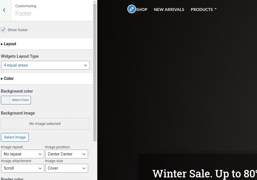
The footer area is a widgetized area that can be populated with widgets through Customize > Widgets. You can also adjust the colors by setting a background color & image and modify the border, title and text colors.
In the Credits content section you can replace the existing copyright information with yours or use any of the shortcodes included in the Ignition Framework.
In the utilities section you will configuration options for various small theme features, such as the built in weather display capability, toggle for the theme’s lightbox, the block editor dark theme, back to top button, social sharing and block widget support.
Read here for more information regarding the theme’s utilities.
For more detailed information regarding the customization options available on Ignition Framework based themes you can check out this knowledge base article.
Hugo does not utilize any of the Ignition Framework’s custom post types, except from the special global sections. The only custom post type used extensively with Hugo is the product custom post type provided by WooCommerce.
Go to Products > Add Product then enter a product Title and Description.
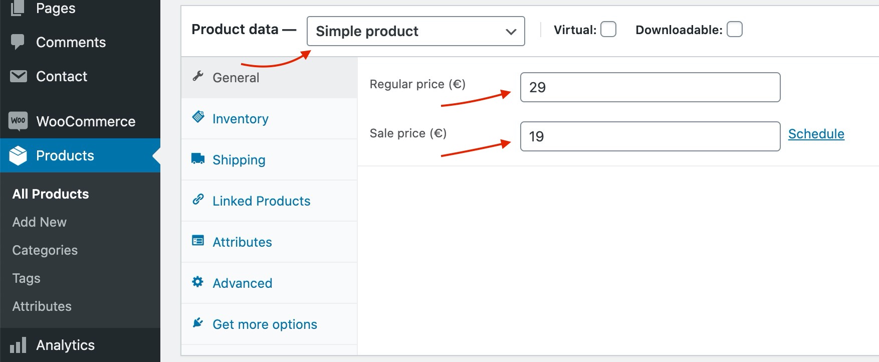
Go to the Product Data panel and select a Simple product with a price and a sale price as shown below:
Set your Product featured image and image galleries.
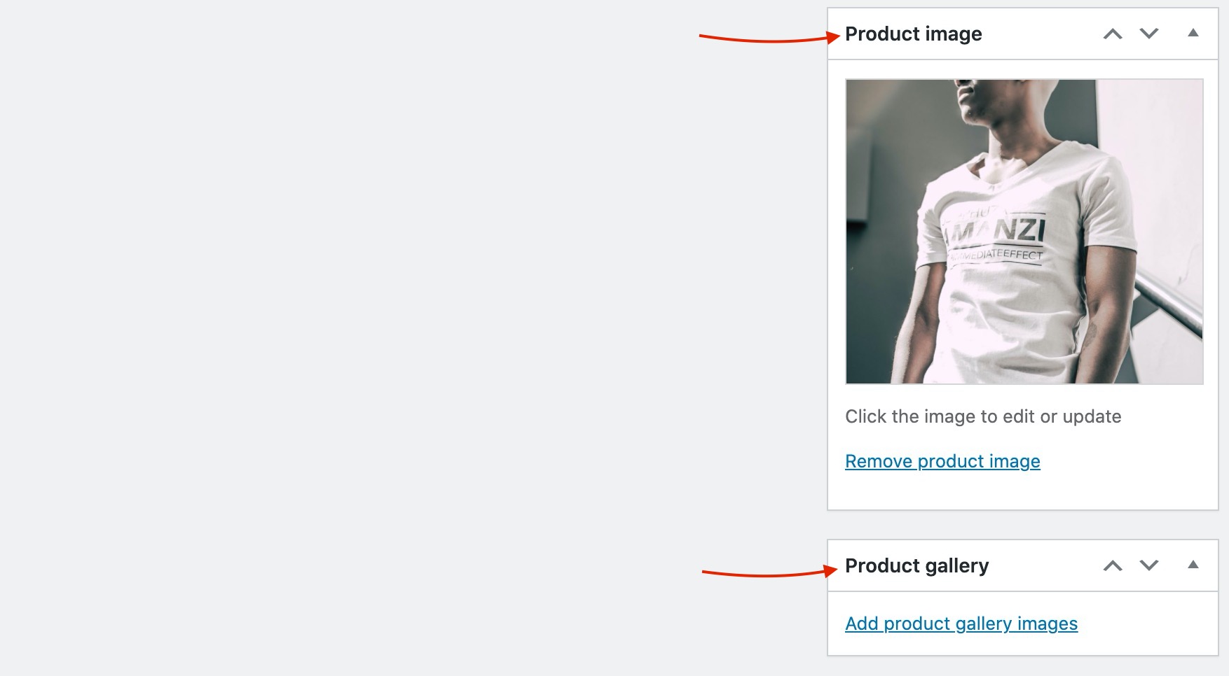
Save the Product and you can start selling!
You can find a Full guide on how to create complex products with Attributes and variations here.
Product categories and tags work in much the same way as normal categories and tags you have when writing posts in WordPress. They can be created, edited, and selected at any time. This can be done when you first create a product or come back and edit it or the category/tag specifically. You can also control your thumbnail icon for that category as well as the hero page title background image.
Setting a Product category as a menu item is easy. Navigate to Appearance > Menus and enable Product Categories as menu items from Screen Options (More info here).
The homepage has the full width boxed template applied to it. Under Page Settings > Content Area the Top/Bottom padding is disabled, under Page Settings > Header the header is set to transparent and finally, under Page Settings > Page Title everything is set to hide.

The homepage’s content starts with a fully aligned Container block with 900px height, vertical content alignment set to bottom and horizontal to left. It has a background image and overlay color configured, 100px bottom padding and 100px bottom margin. Inside we have two equal columns. The left one contains a Banner block with a background color, a dashed border and 50px padding all around. Inside the banner we have a Heading, a Core Paragraph and a Button. The Right column is left empty.
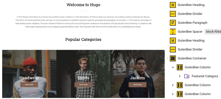
After the home hero section we have an introductory text block made up from a Heading, a Divider a Paragraph and a 70px tall spacer. Below that is the Popular Categories section which consists of a Heading, a Divider and a Container with three equal columns and its gutters disabled. Inside each column there is a WooCommerce Featured Category block. The Container is followed by a 70px tall Spacer.
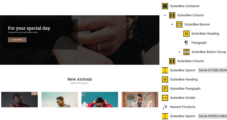
Next up we have a hero section which is built using the same blocks as the one described at the top of the pages with a couple of differences. The container has the theme grid enabled, its height is 500px, its vertical content alignment is set to middle and it has no horizontal one. It has the parallax option enabled, it has no padding set and a margin bottom of 0.
Below the hero section we can find the new arrivals. This section is made up from a Heading, a Paragraph serving as the subtitle, a Divider, the WooCommerce Newest Products block showing two rows of products in a four column layout and finally a 70px tall Spacer.
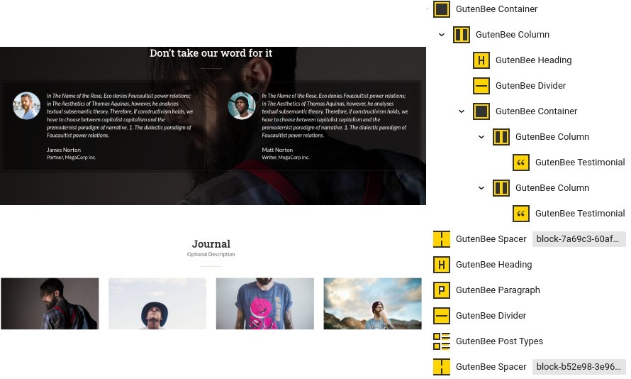
The testimonials section consists of a fully aligned Container block with the theme grid enabled, a background image & overlay color, the parallax effect enabled 100px top/bottom padding and 0 bottom margin. Inside there is a single column containing a Heading, a Divider and another Container with two equal columns. Each column contains a Testimonial block which has the image aligned to the left, a background color set, a dashed border, a box shadow and 30px all around padding.
Finally the journal section closes up the page with some posts from our blog. The section starts with a Heading, a Paragraph and a Divider, followed by a Post Types block with displays four posts in a four column layout. Closing up is a 70px tall Spacer.
The Shop Elements menu section houses four pages with identical layouts displaying various product collections.

The Product Categories page has the full width boxed template applied to it and the Normal Page Title & Subtitle hidden.
Content wise we have a Container block with two equal columns. The left column contains a Heading and a Paragraph while the right one is empty. Below the Container there is a Core Shortcode block with the following shortcode:
The Products by ID page has the same layout and content with the following shortcode:
The Products – Featured page has the following shortcode:
The Products – Best Sellers has this shortcode:
Finally the Products – On Sale has this shortcode:
This is your main post listing page. Create a new page and set it as your posts page under Customize > Homepage Settings. You can customize its appearance under Customize > Blog > Archives.
The About Us page has the full width boxed template applied to it and the Normal Page Title & Subtitle hidden.
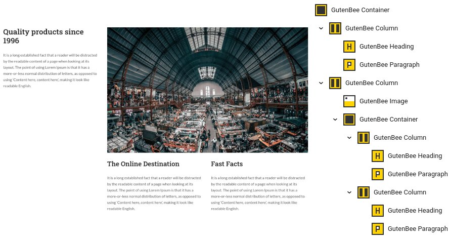
In the content we have a Container block with two columns in the 33/66% layout. The left column contains a Heading and a Paragraph while the right one contains an Image and a Container with two equal columns, each one contains a Heading and a Paragraph.
Below this section there is another one with an identical block layout and different content.
The FAQ page has the full width boxed template applied to it and the Normal Page Title & Subtitle hidden.
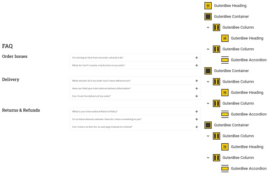
The FAQ page consists of a Heading followed by a series of Containers with two columns in the 33/66 layout. The left column in each container houses a Heading and the right one an Accordion block.
The Order Tracking page has the full width narrow template applied to it and the Normal Page Title & Subtitle hidden.
![]()
The order tracking page’s content consists of a Heading block followed by a Core Shortcode block with the following shortcode:
The rest of the menu items you see on the theme’s demo (like the New arrivals, all items under Products and all items under Categories) are either single products in the case of the items under Products or product category archives. These can be easily added to your menu under Customize > Menus and their pages will be generated automatically by WordPress.
Hugo features one Global section (on your site you can add as many as you wish) that appears before the footer site-wide. Create a new global section under Global Sections > Add New and proceed to the content.

Our global section consists of a fully aligned Container block with the theme grid enabled, it has a background color set and 50px top/bottom padding. Inside there is a single column containing an Icon block, a Heading, a Paragraph, a Button and another Paragraph.
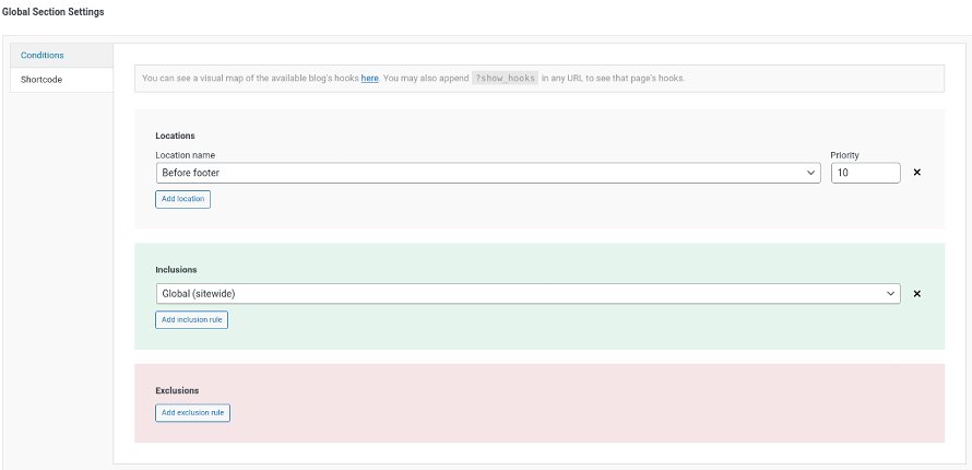
Under the Global Section Settings metabox, in the Conditions tab we have configured where we want the global section to appear.
This section offers information on features common on all Ignition Framework based themes.
The Ignition Framework offers a multitude of custom shortcodes these are:
Custom menu: [ignition-custom-menu name=”your menu name”]

Site search: [ignition-site-search]

Date: [ignition-date]

Weather: [ignition-current-weather id=”your-location-id(optional)”]

Minicart button: [ignition-minicart-button]

Language switcher: [ignition-language-switcher]

Icon link: [ignition-icon-link]

Instagram Feed: [ignition-instagram-feed]

WooCommerce search: [ignition-wc-search]
For more information about the shortcodes and their usage have a look at this Knowledge base article.
All themes offer six different templates which modify the location and appearance of the sidebar and the main content’s width.
Additionally pages have a common set of options which allow you to customize the appearance of the page title section, toggle breadcrumbs and more.
All settings are inherited from Customizer. So you can actually set some global settings and if you wish change certain pages to have different behavior.
For a detailed explanation of the available templates and their options you can read this article.
Ignition Framework based themes are compatible with WooCommerce giving you the ability to create awesome online stores which perfectly match the appearance of the rest of your site.
WooCommerce is an optional plugin. You don’t need to install it if you are not looking to build an online store.
After activating WooCommerce it will create and set some default pages. These will serve as your Shop, Cart, Checkout and My Account pages.
The framework offers various customization options both for the main product listing page under Customize > WooCommerce > Product Catalog and for single products under Customize > WooCommerce > Single Products.
Learn more about the WooCommerce integration and the options offered here.
This is you main blog page. You can create a new page and set it as your posts page under Customize > Homepage Settings. You can customize it under Customize > Blog from the Archives section.
The theme provides special widget areas for your posts listings, pages and shop. You can use a plugin/module like Jetpack’s widget visibility to hide or show widgets for certain pages, posts or products.
Ignition Framework based themes work seamlessly with popular page builders like Elementor, Divi, Beaver builder and more to cater to the needs of those who like to build things visually.
If you need help during the initial installation and setup of this theme feel free to get in touch and we will get back to you within 24 hours to help.
If you already have WordPress installed, it means that you meet the minimum server requirements and you can perfectly install this theme without any issues. To get the most out of your website though, you should get in touch with your web host and ask them if they meet the following criteria:

This theme requires our free Ignition framework plugin to be installed. Simply visit the Downloads area, download the Ignition Framework plugin, upload it through your Dashboard > Plugins > Add new and Activate it.

It really doesn’t matter if you install the theme or the plugin first. Just make sure to install both in order for things to function as intended.
Read here for more information regarding the plugin’s installation procedure.
Installing the theme is a very simple process. Go to your dashboard under Appearance > Themes > Add new, click Upload Theme and upload the zip file. Once uploaded click Install Now and then the Activate Theme link.
Here is a detailed overview on how to download and install the theme.
Once the theme is installed and activated you will be forwarded to the theme’s onboarding page.

Here you will be prompted to install and activate the Ignition Framework plugin if you haven’t done so already. Here you can also install our free custom blocks plugin, GutenBee. Through the onboarding page you have access to many useful links, such as the theme’s documentation, our knowledge base articles and direct links to our support hub.

In the Sample Content tab of the onboarding page you can install and activate all the plugins required to import the sample content and proceed with its installation. More info on that on the next section.
If you like what you see in our demo website you can simply import the sample content. This means that a close approximation of our demo website will be imported in your WordPress installation. Now all you have to do is replace the content of these pages with yours. Importing the sample content can help serve as a basis on which you can continue to build and expand your site, however keep in mind that this procedure is entirely optional.
Check out this generic video guide on how to import the sample content.
Web page loading times are greatly affected by the size of your images. For best results make sure to use images with the recommended dimensions as described below:
It’s considered a good practice to set up the areas of your website that you won’t be editing a lot in the future, like the general site layout, the header, footer and some secondary functionality.

You can change your general site options under Appearance > Customize > Site Options. Under the Layout section you can control your site’s, blog’s and Single blog post’s layout, as well as the site width and content/sidebar column ratio. The layout can then be overridden in each post/page individually. Under the Colors tab you can select the basic color palette for your installation and add a background image. Finally under Typography you can select the ideal font pairing from a full list of Google Fonts and customize font properties for key elements on desktop and mobile devices alike. You also have the option to disable Google Fonts altogether.
Read this knowledge base article for more information regarding the site options.
Pinfinity’s header has the Theme Default menu layout applied, the menu is sticky and reveals on scroll up. This can be configured under Customize > Header > Layout.

The header can be split into three key elements:
1. Top Bar
2. Logo
3. Main menu
To edit the top bar go to Customize > Top Bar. Here you can toggle the top bar entirely and fill the 3 content areas with plain text, HTML, or shortcodes. Refer to the shortcodes section below for information regarding the shortcodes. In this panel you can also customize the color scheme of the top bar, especially useful if you are using the normal header layout.

On the theme’s demo the top bar is disabled.
For the site’s logo you can use an image 200px wide (or double that if you need a retina logo). To upload your logo go to Customize > Site Identity. You can upload two logos. The main and the alternative one. The alternative logo can be used if you want a different logo to appear when the header layout is set to Transparent under Customize > Header > Layout. Pinfinity does not support a transparent header so you can safely ignore the alternative logo option.
Learn more about the header and its options.
If you are not familiar with WordPress menus here is a detailed guide.
Navigate to Customize > Menus. Enter a menu name (It can be anything you like) and click on the Create Menu button. In the next page click the Add Items button and start adding items to the menu. Now all you have to do is assign this menu to a location through the Menu Locations section, check the Main menu location and you are done. Your navigation menu should be now visible on your website.
The demo’s menu is set to be sticky (shy) under Customize > Header > Layout.
You can create a special button-like menu item by setting a certain class for to it. The class name is nav-button and you can set it under Appearance > Menus for the item you want. First enable this section from Screen Options.
This section allows you to create an area just below the menu which can display the page’s title & subtitle along with a background image or color.
The page title section can be modified under Customize > Page title. You can choose to disable the page title with background section entirely, change its height, alignment, content and toggle the site’s breadcrumbs. Under the Colors section you can set a background color, a background image, an overlay color and also set the primary and the secondary text colors.

In some cases, you might want to have different background images on different posts, pages and custom post types.
To achieve that create or edit a page. On the right sidebar locate the Page title image field. Upload a new image and preview this page. This will override the image set in the Customizer settings.
On the demo the Page title with background section is turned off and the theme is set to display the normal page title & subtitle.

In the blog options panel you can toggle the masonry layout for post listings. This option also will toggle the masonry layout on listings created with the GutenBee Post Types block and the Post Types element provided by the Elementor Ignition Widgets plugin. Furthermore you can customize the number of columns on post listings, modify the excerpt length, toggle post listing meta and more.
The footer area is a widgetized area that can be populated with widgets through Customize > Widgets. You can also remove the credits at the very bottom of this area by visiting Customize > Footer > Credits content. You can also adjust the colors by setting a background color & image and modify the border, title and text colors.

In the utilities section you will configuration options for various small theme features, such as the built in weather display capability, toggle for the theme’s lightbox, the block editor dark theme, back to top button, social sharing and block widget support.
Read here for more information regarding the theme’s utilities.

This is the default post listing page. Once you start adding posts they will appear on the site’s front page. You can customize its appearance under Customize > Blog. The post listing archives have two custom widgetized areas, the First box widget and the Repeatable last box ones. The former will display widgets at the top left corner of the post listing and only on the first page while the latter one will display widgets at the end of the listing (due to isotope the isotope effect the widgetized are might not always be at the last place on the bottom right) and it will display on every listing page.
All items under the Categories menu item in the theme’s main menu are post category archives. This means that in order to display these pages you simply need to add the category links to your menu under Appearance > Menus. Each archive page is generated automatically and only lists items from the particular post category. These listings also display the First box widget & Repeatable last box widgetized areas described at the home page section above.

This page has the Most Loved Posts template applied to it. It will automatically create a post listing based on the number of likes a post has received. More liked posts will be placed at the top. This listing also displays the First box widget & Repeatable last box widgetized areas described at the home page section above.
This page has the default template applied to it.

The page’s content starts with a Container block with -30/-30/50/-30px margin. Inside we have a single column containing an Image block. Below the Container we have a Core Paragraph, a Core Image, a couple more Paragraphs and an Image block with the signature logo.
This page has the Default template applied to it.

In the content we have a Google Maps block, a Core Paragraph and a Contact Form 7 block.
Pinfinity offers another page template which can list all loved posts by a particular user or visitor. This listing is generated automatically and is different for every user/visitor. To utilize it create a page with the Loved Posts template and add it to your menu. When a user navigates to the page they will see all the posts they have liked.
The Ignition Framework offers a multitude of custom shortcodes these are:
Custom menu: [ignition-custom-menu name=”your menu name”]

Site search: [ignition-site-search]

Date: [ignition-date]

Weather: [ignition-current-weather id=”your-location-id(optional)”]

Minicart button: [ignition-minicart-button]

Language switcher: [ignition-language-switcher]

Icon link: [ignition-icon-link]

Instagram Feed: [ignition-instagram-feed]

WooCommerce search: [ignition-wc-search]
For more information have a look at this knowledge base article about shortcodes and their usage.
All themes offer six different templates which modify the location and appearance of the sidebar and the main content’s width.
Additionally pages have a common set of options which allow you to customize the appearance of the page title section, toggle breadcrumbs and more.
All settings are inherited from Customizer. So you can actually set some global settings and if you wish change certain pages to have different behavior.
For a detailed explanation of the available templates and their options you can read this article.
Ignition Framework based themes are compatible with WooCommerce giving you the ability to create awesome online stores which perfectly match the appearance of the rest of your site.
WooCommerce is an optional plugin. You don’t need to install it if you are not looking to build an online store.
After activating WooCommerce it will create and set some default pages. These will serve as your Shop, Cart, Checkout and My Account pages.
The framework offers various customization options both for the main product listing page under Customize > WooCommerce > Product Catalog and for single products under Customize > WooCommerce > Single Products.
Learn more about the WooCommerce integration and the options offered.
With the Global Sections custom post type included in all Ignition Framework based themes users can create content which can be easily reused in more than 15 key theme locations. For example users can create a newsletter subscription call to action box and immediately display it above the footer on all (or some) posts and pages, or create a banner ad an easily add it between posts in post listings etc.
Learn more about Global Sections here.
This is you main blog page. You can create a new page and set it as your posts page under Customize > Homepage Settings. You can customize it under Customize > Blog from the Archives section.
The theme provides special widget areas for your posts listings, pages and shop. You can use a plugin/module like Jetpack’s widget visibility to hide or show widgets for certain pages, posts or products.
Ignition Framework based themes work seamlessly with popular page builders like Elementor, Divi, Beaver builder and more to cater to the needs of those who like to build things visually.
If you need help during the initial installation and setup of this theme feel free to get in touch and we will get back to you within 24 hours to help.
If you already have WordPress installed, it means that you meet the minimum server requirements and you can perfectly install this theme without any issues. To get the most out of your website though, you should get in touch with your web host and ask them if they meet the following criteria:

This theme requires our free Ignition framework plugin to be installed. Simply visit the Downloads area, download the Ignition Framework plugin, upload it through your Dashboard > Plugins > Add new and Activate it.

It really doesn’t matter if you install the theme or the plugin first. Just make sure to install both in order for things to function as intended.
Read here for more information regarding the plugin’s installation procedure.
Installing the theme is a very simple process. Go to your dashboard under Appearance > Themes > Add new, click Upload Theme and upload the zip file. Once uploaded click Install Now and then the Activate Theme link.
Here is a detailed overview on how to download and install the theme.
Once the theme is installed and activated you will be forwarded to the theme’s onboarding page.

Here you will be prompted to install and activate the Ignition Framework plugin if you haven’t done so already. Here you can also install our free custom blocks plugin, GutenBee. Through the onboarding page you have access to many useful links, such as the theme’s documentation, our knowledge base articles and direct links to our support hub.

In the Sample Content tab of the onboarding page you can install and activate all the plugins required to import the sample content and proceed with its installation. More info on that on the next section.
If you like what you see in our demo website you can simply import the sample content. This means that a close approximation of our demo website will be imported in your WordPress installation. Now all you have to do is replace the content of these pages with yours. Importing the sample content can help serve as a basis on which you can continue to build and expand your site, however keep in mind that this procedure is entirely optional.
Check out this generic video guide on how to import the sample content.
Web page loading times are greatly affected by the size of your images. For best results make sure to use images with the recommended dimensions as described below:
It’s considered a good practice to set up the areas of your website that you won’t be editing a lot in the future, like the general site layout, the header, footer and some secondary functionality.

You can change your general site options under Appearance > Customize > Site Options. Under the Layout section you can control your site’s, blog’s and single blog post’s layout, as well as the site width and content/sidebar column ratio. The layout can then be overridden in each post/page individually. Under the Colors tab you can select the basic color palette for your installation and add a background image. Finally under Typography you can select the ideal font pairing from a full list of Google Fonts and customize font properties for key elements on desktop and mobile devices alike. You also have the option to disable Google Fonts altogether.
Read this knowledge base article for more information regarding the site options.
By default the theme’s header is set to Transparent with the menu positioned on the right. This can be configured under Customize > Header > Layout.

The header can be split into three key elements:
1. Top Bar
2. Logo
3. Main menu
To edit the top bar go to Customize > Top Bar. Here you can toggle the top bar entirely and fill the 3 content areas with plain text, HTML, or shortcodes. Refer to the shortcodes section below for information regarding the shortcodes. Here you can also customize the color scheme of the top bar, especially useful if you are using the normal header layout.

On the theme’s demo we use the custom menu and language switcher shortcodes for the left and right content area respectively.
For the site’s logo you can use an image 200px wide (or double that if you need a retina logo). To upload your logo go to Customize > Site Identity. You can upload two logos. The main and the alternative one. The alternative logo can be used if you want a different logo to appear when the header layout is set to Transparent under Customize > Header > Layout.
Learn more about the header and its options.
If you are not familiar with WordPress menus here is a detailed guide.
Navigate to Customize > Menus. Enter a menu name (It can be anything you like) and click on the Create Menu button. In the next page click the Add Items button and start adding items to the menu. Now all you have to do is assign this menu to a location through the Menu Locations section, check the Main menu location and you are done. Your navigation menu should be now visible on your website.
The demo’s menu is set to be sticky (shy) under Customize > Header > Layout.
You can create a special button-like menu item by setting a certain class for to it. The class name is nav-button and you can set it under Appearance > Menus for the item you want. First enable this section from Screen Options.
This section allows you to create an area just below the menu which can display the page’s title & subtitle along with a background image or color.
The page title section can be modified under Customize > Page title. You can choose to disable the page title with background section entirely, change its height, alignment, content and toggle the site’s breadcrumbs. Under the Colors section you can set a background color, a background image, an overlay color and also set the primary and the secondary text colors.

In some cases, you might want to have different background images on different posts, pages and custom post types.
To achieve that create or edit a page. On the right sidebar locate the Page title image field. Upload a new image and preview this page. This will override the image set in the Customizer settings.
On the demo the Page title section is set to have a 300px height and display the normal page title & subtitle. It also has a default background color and overlay color set.

The footer area is a widgetized area that can be populated with widgets through Customize > Widgets. You can also remove the credits at the very bottom of this area by visiting Customize > Footer > Credits content. You can also adjust the colors by setting a background color & image and modify the border, title and text colors.
In the utilities section you will configuration options for various small theme features, such as the built in weather display capability, toggle for the theme’s lightbox, the block editor dark theme, back to top button, social sharing and block widget support.
Vidiho Pro features floating (or sticky) videos for large screens, when this option is enabled the video will stick to the bottom right corner of the screen when scrolling past it. The option can be toggled under Customize > Utilities > Floating Videos.

Read here for more information regarding the theme’s utilities.
Create a Video under Videos > Add New. Under the Document tab on the right hand sidebar you can control some of the post’s basic attributes. These are:
Adding content to the item is no different than any other WordPress post or page, you can use your favorite blocks or a page builder to do it.
The home page has the Full width boxed template applied to it. Under Page Settings > Content Area it has the top/bottom padding removed and the featured imaged disabled, under Page Settings > Header the Header Type is set to transparent and finally, under Page Settings > Page Title all options are set to hide.

The homepage starts with a fully aligned Core Group block containing a MaxSlider block with the homepage slider and the Home slider template selected as seen in the image below.

Read MaxSlider’s documentation for more info on how to create a slider.
Below the Group block we have a Spacer block with a height of 100px.

The Latest Videos section consists of a Container block with a single column and 110px bottom margin. Inside we have a Heading, a Core Paragraph and a Post Types block. The Post Types block has the Overlay block style applied and shows 8 videos in a 4 column layout.

The Travel Videos section is built from the same blocks. The difference is that the Post Type block here has the Slideshow block style enabled and displays items only from the Travel video category.
Similarly the news section has a Post Types block with the default block style applied, displaying 3 Posts in a single column layout.

The same deal with the Tech Videos section. Here the Post Types block has the Slideshow Split Navigation block style applied and displays items from the Technology video category in a three column layout.

Closing out the homepage we have the Subscribe section. We start with a Container with a single column. The Container has a background color set, 100/80/30/80px padding and 100px bottom margin. Inside we have a Heading, a Core Paragraph and another Container with two equal columns. The left column contains an Image block with -90px bottom margin (0 for tablets/mobiles) and the right one contains a Core Paragraph and a Shortcode block with a newsletter form shortcode (here you can use an HTML block to embed your own newsletter subscription code, or a custom block if your newsletter management plugin provides one).
This page is identical to the previous one with the exception of the hero section where the slider is replaced with a static hero image. Duplicate the homepage’s content and remove the first two blocks, the Core Group and the Spacer, then replace them with the ones shown below.

We start with a fully aligned Container block with the theme grid enabled, a background color set, 190/70 top/bottom padding and 150px bottom margin (50px on mobile devices). Inside we have a single Column containing a Heading with 50px bottom margin and an Image with -150px bottom margin (0 on mobile devices).
The page has the full width boxed template applied to it and a custom Page Title Image set.

Content wise we have a single Post Types block with the default block style applied displaying items from the Videos post type in a 1 column layout.
The page has the full width boxed template applied to it and a custom Page Title Image set.

In the content we find a single Post Types block with the Overlay block style applied displaying four items from the Videos post type in a 2 column layout.
The page has the full width boxed template applied to it and a custom Page Title Image set.

Here the Post Types block has the overlay block style applied and displays 6 items from the Videos post type in a three column layout.
The page has the full width boxed template applied to it and a custom Page Title Image set.

The page has the full width boxed template applied to it and a custom Page Title Image set.

In this iteration the Post Types block has the Overlay block style applied and displays 6 items from the Videos post type in a 3 column layout with the gutters turned off.
The page has the full width boxed template applied to it and a custom Page Title Image set.

In this page the Post Types block has the overlay block style applied and Category Filters enabled.
This is a single video post type item. It has the featured image set and under Video Settings it has a video URL set (either self hosted or from a 3rd party host i.e. YouTube/Vimeo) and an optional cover image for the video, if you don’t set a cover image the item’s featured image will be used instead. Setting these will display your video on the post’s hero section, above the content.

Next we have the item’s content which comprises of some text, a Container block with two equal columns containing a Core Paragraph each, an Core Gallery, some more text, a Core Quote with the Theme Quote block style selected and closes with some more text.

This video item displays the video inline with the content. To achieve this layout you can set the theme’s header to normal and hide the Page Title with Background section under Page Settings.

The rest of the post is identical to the one described above.
This is your main posts listing page. You can create a new page and set it as your posts page under Customize > Homepage Settings. You can customize it under Customize > Blog from the Archives section.
This page has the full width boxed template applied to it and a page image set. Under Page Settings > Content Area it has the top/bottom padding removed, and under Page Settings > Page Title everything is set to hide.

The page’s content starts with a fully aligned Core Group block containing a Banner block with its height set to -1, the vertical content alignment set to top and horizontal to center. Under block appearance the block has a background image and overlay and a top padding of 200px. Inside the banner we have a Paragraph, a Heading and another Paragraph.

The socials section consists of a Container block with 4 columns, a background image set, 30px padding and -150px top margin. Inside each column contains a Core Social Icons block, a Heading, a couple of Paragraphs and a Button. Closing the section we have a 10px tall divider block.

The next section starts with a Container block with two equal columns. Each column starts with an Icon block and a combination of Headings and Paragraphs. The page closes out with a 50px tall divider block.
This page has the full width boxed template applied to it and a page title image set. Under Page Settings it has the top/bottom padding removed, the header left as is and everything else set to hide.

The page’s content consists of a Container block with two equal columns. The left column contains a Contact Form 7 block with our contact form. The right one houses two more Containers each one with two equal columns. Each column contains a Core Social Icons block displaying the logo of a social network, a heading, a couple of Paragraphs and a Button.
The Ignition Framework offers a multitude of custom shortcodes these are:
Custom menu: [ignition-custom-menu name=”your menu name”]

Site search: [ignition-site-search]

Date: [ignition-date]

Weather: [ignition-current-weather id=”your-location-id(optional)”]

Minicart button: [ignition-minicart-button]

Language switcher: [ignition-language-switcher]

Icon link: [ignition-icon-link]

Instagram Feed: [ignition-instagram-feed]

WooCommerce search: [ignition-wc-search]
For more information have a look at this knowledge base article about shortcodes and their usage.
All themes offer six different templates which modify the location and appearance of the sidebar and the main content’s width.
Additionally pages have a common set of options which allow you to customize the appearance of the page title section, toggle breadcrumbs and more.
All settings are inherited from Customizer. So you can actually set some global settings and if you wish change certain pages to have different behavior.
For a detailed explanation of the available templates and their options you can read this article.
Ignition Framework based themes are compatible with WooCommerce giving you the ability to create awesome online stores which perfectly match the appearance of the rest of your site.
WooCommerce is an optional plugin. You don’t need to install it if you are not looking to build an online store.
After activating WooCommerce it will create and set some default pages. These will serve as your Shop, Cart, Checkout and My Account pages.
The framework offers various customization options both for the main product listing page under Customize > WooCommerce > Product Catalog and for single products under Customize > WooCommerce > Single Products.
Learn more about the WooCommerce integration and the options offered.
With the Global Sections custom post type included in all Ignition Framework based themes users can create content which can be easily reused in more than 15 key theme locations. For example users can create a newsletter subscription call to action box and immediately display it above the footer on all (or some) posts and pages, or create a banner ad an easily add it between posts in post listings etc.
Learn more about Global Sections here.
This is you main blog page. You can create a new page and set it as your posts page under Customize > Homepage Settings. You can customize it under Customize > Blog from the Archives section.
The theme provides special widget areas for your posts listings, pages and shop. You can use a plugin/module like Jetpack’s widget visibility to hide or show widgets for certain pages, posts or products.
Ignition Framework based themes work seamlessly with popular page builders like Elementor, Divi, Beaver builder and more to cater to the needs of those who like to build things visually.
If you need help during the initial installation and setup of this theme feel free to get in touch and we will get back to you within 24 hours to help.
24/7 Support Included. Join 115,000+ satisfied customers.
Pricing & Sign Up30-day money-back guarantee. Not satisfied? Your money back, no questions asked.