The Ignition Framework extends the default WordPress template hierarchy by adding an extra search path for each search template.
For example, when a user visits a single post WordPress searches for a single.php template file in the following locations in order: child theme (if available) > parent theme. On Ignition Framework themes the search path becomes: child theme (if available) > parent theme > Ignition Framework Plugin. If the template file is not found in any of these paths WordPress then falls back to a more generic template, such as the singular.php in this case and repeats the search in the same manner child theme (if available) > parent theme > Ignition Framework Plugin.
All template files provided by the Ignition Framework plugin live in the /wp-content/plugins/ignition/template-files/ folder. You can check out this image to get a visual presentation of the framework’s template files and structure.
Overriding templates and template parts
Example 1: Let’s say you need to override the index.php template file and are using the Convert theme. Looking in the theme’s root folder you will notice there is a index.php file, so you need to copy this file from /wp-content/themes/ignition-convert/ to the child theme’s root folder at /wp-content/themes/ignition-convert-child/ and edit the copied file to achieve the appearance you are after.
NOTICE: If you are indeed planning to edit the index.php file make sure you know what you are doing and won’t cause unexpected changes, because the index.php file is the base template file used by WordPress, all template searches fall back to it if no other suitable alternative is not found, as can be seen in the template hierarchy visual here.
Example 2: In this example we want to spice up the 404 page template. Looking among the Convert theme files we notice that there is no 404.php file, this means we need to look in the framework plugin’s template files. All framework template files live in the /wp-content/plugins/ignition/template-files/ folder. Indeed there is a 404.php file here. We need to copy that file to our child theme, preserving any folder structure, but omitting the /template-files/ folder. In this case the 404.php file will be copied to the child theme’s root folder at /wp-content/themes/ignition-convert-child/ and can then be modified.
Example 3: For this example we are looking to modify the discography listing item on the Beat theme. The layout of the item is provided by a template part (a file that contains code which might be used multiple times on a template or shared across more than one templates). The template part lives under /wp-content/themes/ignition-beat/template-parts/item-ignition-discography.php copy the file over to the /wp-content/themes/ignition-beat-child/template-parts/ folder and you are ready to proceed with customizations.
Example 4: Finally let’s say we need to modify the appearance of the artist listing template part on Beat. If we look in the /template-parts/ folder of Beat we see there’s no related file, our next search location is the /template-files/template-parts/ folder of the Ignition Framework plugin, however there’s no template part there either. This means that the listing item gets its layout from the item.php file in the /template-parts/ folder of the plugin. We need to copy this file in the /wp-content/themes/ignition-beat/template-parts/folder and rename it to item-ignition-team.php (the team post type is the one used to present the artists). Now we can edit its content and all changes will be reflected just on the artist listing items.
ATTENTION: Avoid directly editing any theme or plugin template files because all modifications will be lost when the theme/plugin are updated. Always prefer using a child theme to preserve your changes.
ATTENTION: This documentation is about the new version of Medi. If you are using the legacy version visit its documentation page here.
Server Requirements
If you already have WordPress installed, it means that you meet the minimum server requirements and you can perfectly install this theme without any issues. To get the most out of your website though, you should get in touch with your web host and ask them if they meet the following criteria:
PHP version 7.4 or greater.
MySQL version 5.6 or greater OR MariaDB version 10.1 or greater.
HTTPS support.
Prerequisites
Ignition Framework
This theme requires our free Ignition framework plugin to be installed. Simply visit the Downloads area, download the Ignition Framework plugin, upload it through your Dashboard > Plugins > Add new and Activate it.
It really doesn’t matter if you install the theme or the plugin first. Just make sure to install both in order for things to function as intended.
Installing the theme is a very simple process. Go to your dashboard under Appearance > Themes > Add new, click Upload Theme and upload the zip file. Once uploaded click Install Now and then the Activate Theme link. Here is a detailed overview on how to download and install the theme.
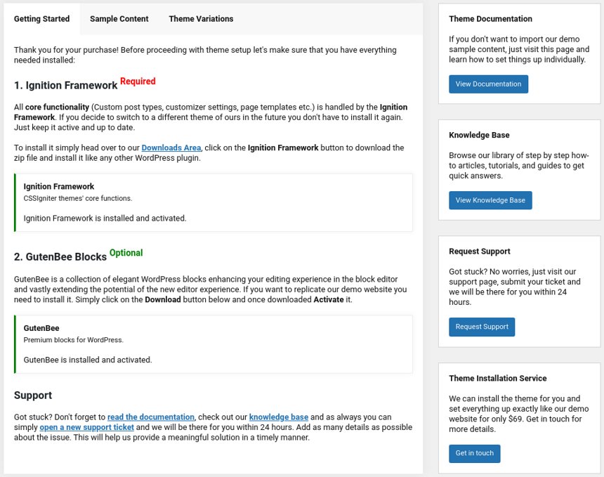
Once the theme is installed and activated you will be forwarded to the theme’s onboarding page.
Here you will be prompted to install and activate the Ignition Framework plugin if you haven’t done so already. Here you can also install our free custom blocks plugin, GutenBee. Through the onboarding page you have access to many useful links, such as the theme’s documentation, our knowledge base articles and direct links to our support hub.
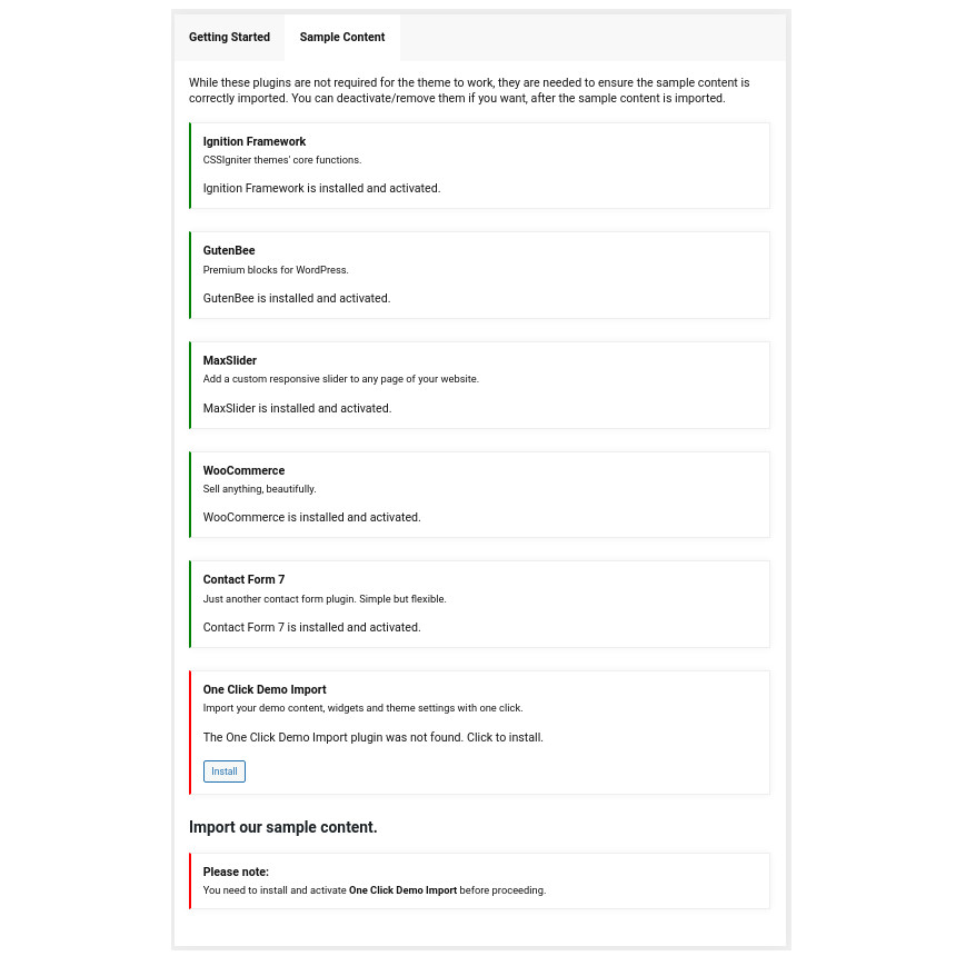
In the Sample Content tab of the onboarding page you can install and activate all the plugins required to import the sample content and proceed with its installation. More info on that on the next section.
NOTE: The only plugin required for the theme to work properly is the Ignition Framework plugin, all other plugins are entirely optional if you don’t need their functionality or are not planning on importing the sample content. You can safely skip installing and activating them if you are sure you don’t need them.
How to import the sample content
If you like what you see in our demo website you can simply import the sample content. This means that a close approximation of our demo website will be imported in your WordPress installation. Now all you have to do is simply replace the content of these pages with yours.
In your WordPress dashboard visit Appearance > Theme Options > Sample Content.
Click Install and then Activate for each of the required plugins.
Click the Get Started button and in the next screen, move over the screenshot of the builder/variation of your preference and click the Import Demo button.
NOTE: Due to the nature of the import mechanism some links may link back to our demo website. If you are not sure how to update / change these links simply get in touch and we’ll help you out.
Image sizes
Web page loading times are greatly affected by the size of your images. For best results make sure to use images with the recommended dimensions as described below:
NOTE: All image sizes are the minimum recommended, adding larger image sizes will result in cropping them to fit these sizes
Setting up site-wide sections
It’s considered a good practice to set up the areas of your website that you won’t be editing a lot in the future, like the general site layout, the header, footer and some secondary functionality.
General Site Options
You can change your general site options under Appearance > Customize > Site Options. Under the Layout section you can control your site’s, blog’s and single blog post’s layout, as well as the site width and content/sidebar column ratio. The layout can then be overridden in each post/page individually. Under the Colors tab you can select the basic color palette for your installation and add a background image. Finally under Typography you can select the ideal font pairing from a full list of Google Fonts and customize font properties for key elements on desktop and mobile devices alike. You also have the option to disable Google Fonts altogether.
Header
The header on the theme consists of three key elements:
1. Top Bar
2. Logo
3. Main Menu
Top Bar
To edit the top bar go to Customize > Top Bar. Here you can toggle the top bar entirely and fill the 3 content areas with simple text, plain HTML, or shortcodes. Refer to the shortcodes section below for information regarding the shortcodes.
Logo
The recommended maximum width of your logo is 200px while you can use any height you want. To upload your logo go to Customize > Site Identity. You can upload two logos. The normal and the alternative one. The alternative logo can be used if you want a different logo to appear when the header layout is set to Transparent under Customize > Header > Layout.
This article offers more information regarding the header and its options.
Navigate to Customize > Menus. Enter a menu name (It can be anything you like) and click on the Create Menu button. In the next page click the Add Items button and start adding items to the menu. Now all you have to do is assign this menu to a location through the Menu Locations section, check the Main menu location and you are done. Your navigation menu should be now visible on your website.
Create a menu button
You can create a special button-like menu item by setting a certain class for to it. The class name is nav-button and you can set it under Appearance > Menus for the item you want. First enable this section from Screen Options.
This is a predefined class you can use for your menu items
The page title section
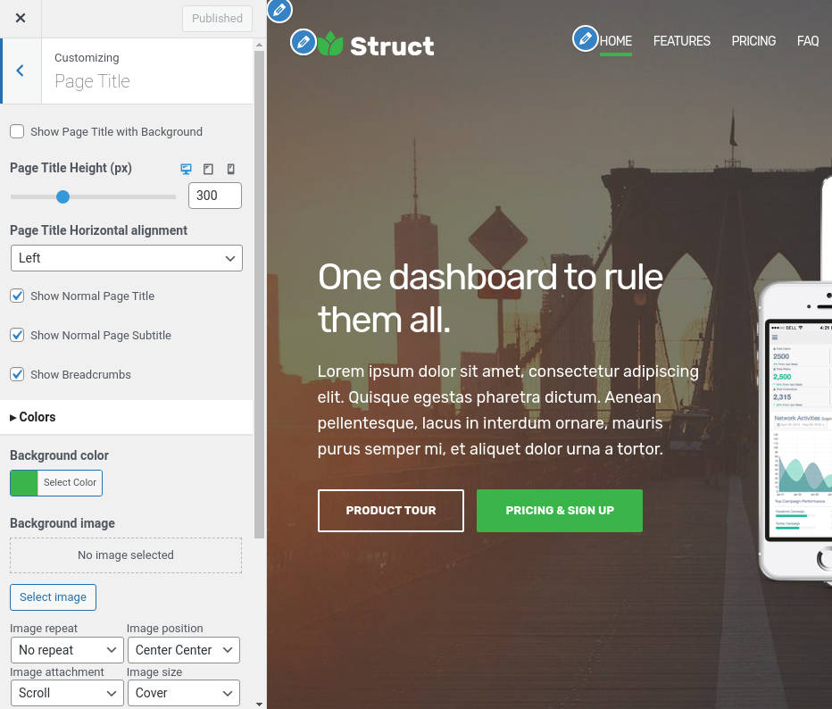
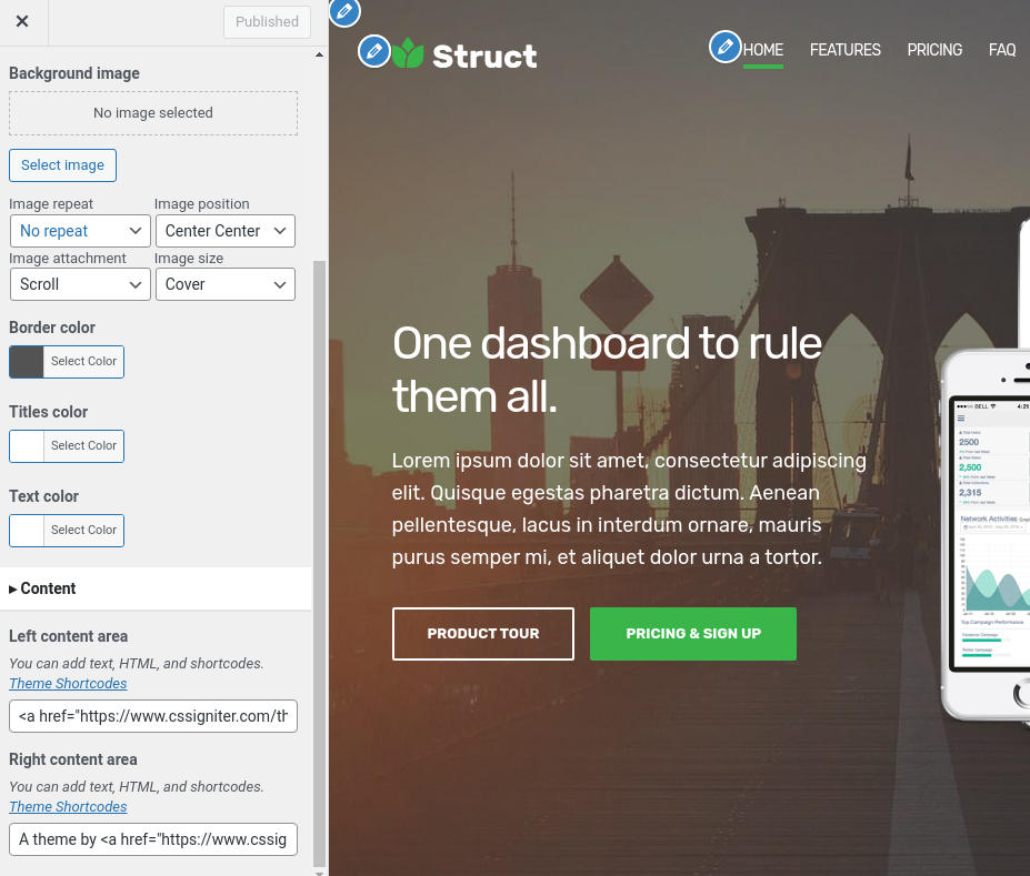
This section allows you to create an area just below the menu which can display the page’s title & subtitle along with a background image or color.
The page title section can be modified under Customize > Page title. You can choose to disable the page title with background section entirely, change its height, alignment, content and toggle the site’s breadcrumbs. Under the Colors section you can set a background color, a background image, an overlay color and also set the primary and the secondary text colors.
In some cases, like in our demo website, you might want to have different background images on different posts, pages and custom post types.
To achieve that create or edit a page. On the right sidebar locate the Page title image field. Upload a new image and preview this page. As you can see we have successfully overridden the image set in the Customizer settings.
NOTE: The purpose of the Transparent header option is to have your main header components (Top bar, Logo & Main Menu) on top of a background image or background color which means that you have to set on in the Customize > Page title > Color section.
The footer area is a widgetized area that can be populated with widgets through Customize > Widgets. You can also remove the credits at the very bottom of this area by visiting Customize > Footer > Credits content section. You can also adjust the colors by setting a background color & image and modify the border, title and text colors.
In the content section you can replace the existing copyright information with yours or use any of the shortcodes included in the Ignition Framework.
Utilities
Lightbox
The theme offers a lightbox for your images which is by default disabled to avoid conflicts with third party plugins which offer lightboxes. If you want to use it you can enable it under Customize > Utilities > Lightbox.
Weather
You can choose to show the weather for a chosen location using the weather shortcode anywhere inside your installation. First you will need to set it up by providing an API key and location under Customize >Utilities > Weather.
Block editor Dark Mode
Some themes have dark color schemes which are reflected in the block editor, this can make working with certain blocks a bit harder. Enabling the editor dark mode using the provided checkbox will apply certain styles to the editor in order to improve the content creation experience.
Navigate to Services > Add New. Then under the Service tab start adding the basic item attributes. These are:
Summary: Control the location and appearance of the sidebar. More info about these options can be found here.
Categories: Set a category for the item which will also serve as a filter on the post type’s listing pages.
Featured image: Will appear on all related listings and on the item’s single page.
Excerpt: Add a manual excerpt that will appear on post listings and on the page title section as a subtitle (if applicable).
Page Title image: Set a custom post title background image for the item. Leave blank if you want to keep the default settings configured earlier.
Page Settings: Here you can fine tune the item’s appearance. E.g. toggle the featured image, change header type, hide the page title/subtitle, breadcrumbs etc. All our demo services respect the Customizer options. More info about these options can be found here.
Create a Service sidebar navigation
Create a new menu under Customize > Menus, don’t set any location to it and add your service posts as menu items. If custom post types don’t appear when trying to add them to the menu you can enable them under Screen Options.
Under the Widgets panel in the Customizer add a Navigation menu widget in the Services sidebar and select the services menu you have just created for it.
Create a new Event
Navigate to Events > Add New. Then under the Event tab start adding the basic item attributes. These are:
Summary: Control the location and appearance of the sidebar. More info about these options can be found here.
Categories: Set a category for the item which will also serve as a filter on the post type’s listing pages.
Featured image: Will appear on all related listings and on the item’s single page.
Excerpt: Add a manual excerpt that will appear on post listings and on the page title section as a subtitle (if applicable).
Page Τitle image: Set a custom post title background image for the item. Leave blank if you want to keep the default settings configured earlier.
Page Settings: Here you can fine tune the item’s appearance. E.g. toggle the featured image, change header type, hide the page title/subtitle, breadcrumbs etc. Demo items inherit options from the Customizer. More info about these options can be found here.
Event Settings: Select your Event Date, time and Location.
Create a new Team Member
Navigate to Team > Add New. Then under the Team Member tab start adding the basic item attributes. These are:
Summary: Control the location and appearance of the sidebar. More info about these options can be found here.
Categories: Set a category for the item which will also serve as a filter on the post type’s listing pages.
Featured image: Will appear on all related listings and on the item’s single page.
Excerpt: Add a manual excerpt that will appear on post listings and on the page title section as a subtitle (if applicable).
Page Title image: Set a custom post title background image for the item. Leave blank if you want to keep the default settings configured earlier.
Page Settings: Here you can fine tune the item’s appearance. E.g. toggle the featured image, change header type, hide the page title/subtitle, breadcrumbs etc. Demo items inherit options from the Customizer. More info about these options can be found here.
Setting up the pages
NOTE: All blocks used in the construction of the pages below are provided by the GutenBee plugin unless mentioned otherwise.
Homepage
Create a new page from Pages > Add New, then select from the right side under Summary the Full width boxed template. Then from Page Settings > Content area check the Remove top/bottom content padding. Under Page Settings > Header leave the Header Type as is and under Page Settings > Page Title set all options to hide. Now we are ready to start adding GutenBee blocks in order to re-create the demo’s homepage layout.
The homepage’s hero section consists of a GutenBee container block with the Theme Grid option enabled full alignment, 740px height, bottom content alignment and a background image set under Block Appearance. It contains two columns. The left column contains an Image, a Heading, a Paragraph and a Button block. The right column is intentionally left empty.
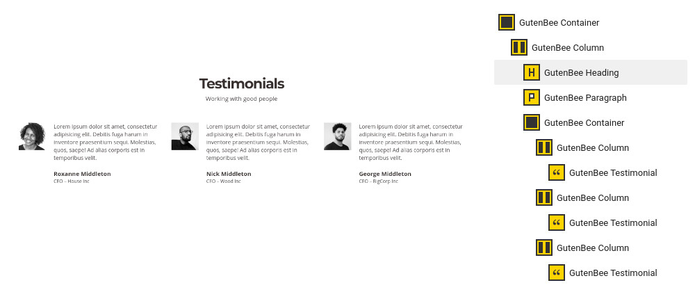
The testimonial section below the homepage hero consists of a container block with the Theme Grid option enabled and its alignment set to full. Inside it we find a single column containing a Paragraph, a Heading, a Core Spacer and a Testimonial block.
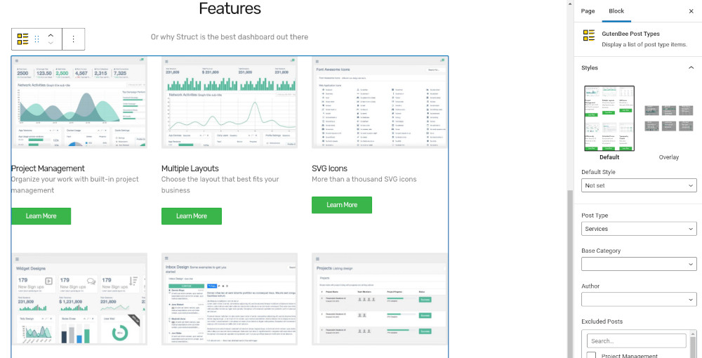
Next up is the services presentation section. This consists of a container block with full alignment, a single column and the Theme Grid option enabled, inside we find a single column, with a Paragraph, a Heading, a Core Spacer and a Post Types block with the service post type selected displaying 4 items in 2 columns.
Following is a Container with full alignment, Theme Grid enabled, 740px height, bottom content alignment and a background image set under Block Appearance. Inside are two columns. The left is blank and the right contains a Heading, a Paragraph and a Button.
The values section consists of a Container with full alignment, Theme Grid enabled and a background color set under Block Appearance. Inside we have a single column which contains a Paragraph, a Heading, a Core Spacer and another Container. The inner container has a three column layout with each column containing two Icon Boxes.
The team section has the same block composition as the services section above. The Post Types block here displays 3 team members in a 3 column layout.
Closing up the homepage is a Container with full alignment, Theme Grid enabled and a background color set under Block Appearance. Inside we have a single column with a Paragraph, a Heading, a Core Spacer and a Slideshow block with the logos of the partners.
Creating Team Member and Service listing pages
Create a new page under Pages > Add New. Set the page template under Summary section to Full width boxed. Fill in a custom Excerpt which will appear as the page’s custom subtitle, then select a background image from Page Settings > Page Title > Colors section, and select to show the page title over it from Page Settings > Page Title > Layout section by selecting Show Page Title with Background.
The grids are created using the GutenBee Post Types block. Start by adding the block in the editor, select one of the available Styles (default and overlay are available on Medi) and proceed to set up your post query. From the post type dropdown pick the post type you want to display, the number of post items, columns, pagination, toggle category filters (post items need to be in categories, if enabled ignores pagination) and more. Once done you can add more blocks to the page if you want, or publish the page.
About page
This is a page with the Full width boxed layout applied to it. It has a custom excerpt, a Page Title background image and the Show Page Title with Background option enabled under the Page Settings meta box.
The about page starts with three alternating image/content sections. Each consists of a Container block with two columns. One column hosts the content in the form of a Core Heading, and two Paragraph blocks while the other hosts the Image block. The content and the image swap positions in each row.
The values section closing the about page is identical to the values section of the front page.
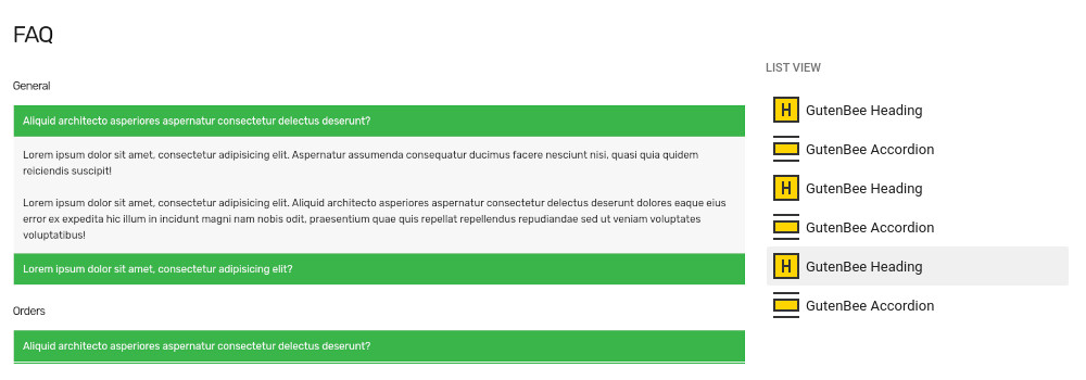
FAQ Page
This is a page with the Full width boxed layout applied to it. It has a custom excerpt, a Page Title background image and the Show Page Title with Background option enabled under the Page Settings meta box.
The content of the page consists of three identical blocks of the Container block with a single column, containing a Heading and an Accordion block.
Contact us page
This will serve as your contact page, with a contact form, map and some details for your business. We are using Contact Form 7 plugin to display a contact form, but you can use any plugin you wish.
Create a new page from Pages > Add New. Under Summary set the template to Full width boxed.
The page consists of a Container block with two columns. The left column houses a Paragraph and the Contact Form 7 block, however you can use any other form provided by a plugin of your choosing. The right column contains a Google Maps block and a few Heading/Paragraph block sets with the business’ info.
Common features
This section offers information on features common on all Ignition Framework based themes.
Shortcodes
The Ignition Framework offers a multitude of custom shortcodes these are:
Custom menu: [ignition-custom-menu name="your menu name"]

Site search: [ignition-site-search]

Date: [ignition-date]

Weather: [ignition-current-weather id="your-location-id(optional)"]

Minicart button: [ignition-minicart-button]

Language switcher: [ignition-language-switcher]

Icon link: [ignition-icon-link]

Instagram Feed: [ignition-instagram-feed]

WooCommerce search: [ignition-wc-search]
All themes offer six different templates which modify the location and appearance of the sidebar and the main content’s width.
Additionally pages have a common set of options which allow you to customize the appearance of the page title section, toggle breadcrumbs and more.
All settings are inherited from Customizer. So you can actually set some global settings and if you wish change certain pages to have different behavior.
Ignition Framework based themes are compatible with WooCommerce giving you the ability to create awesome online stores which perfectly match the appearance of the rest of your site.
WooCommerce is an optional plugin. You don’t need to install it if you are not looking to build an online store.
After activating WooCommerce it will create and set some default pages. These will serve as your Shop, Cart, Checkout and My Account pages.
The framework offers various customization options both for the main product listing page under Customize > WooCommerce > Product Catalog and for single products under Customize > WooCommerce > Single Products.
With the Global Sections custom post type included in all Ignition Framework based themes users can create content which can be easily reused in more than 15 key theme locations. For example users can create a newsletter subscription call to action box and immediately display it above the footer on all (or some) posts and pages, or create a banner ad an easily add it between posts in post listings etc.
This is you main blog page. You can create a new page and set it as your posts page under Customize > Homepage Settings. You can customize it under Customize > Blog from the Archives section.
Widget areas
The theme provides special widget areas for your posts listings, pages and shop. You can use a plugin/module like Jetpack’s widget visibility to hide or show widgets for certain pages, posts or products.
Support
If you need help during the initial installation and setup of this theme feel free to get in touch and we will get back to you within 24 hours to help.
ATTENTION: This documentation is about the new version of Milos. If you are using the legacy version visit its documentation page here.
Server Requirements
If you already have WordPress installed, it means that you meet the minimum server requirements and you can perfectly install this theme without any issues. To get the most out of your website though, you should get in touch with your web host and ask them if they meet the following criteria:
PHP version 7.4 or greater.
MySQL version 5.6 or greater OR MariaDB version 10.1 or greater.
HTTPS support.
Prerequisites
Ignition Framework
This theme requires our free Ignition framework plugin to be installed. Simply visit the Downloads area, download the Ignition Framework plugin, upload it through your Dashboard > Plugins > Add new and Activate it.
It really doesn’t matter if you install the theme or the plugin first. Just make sure to install both in order for things to function as intended.
Installing the theme is a very simple process. Go to your dashboard under Appearance > Themes > Add new, click Upload Theme and upload the zip file. Once uploaded click Install Now and then the Activate Theme link. Here is a detailed overview on how to download and install the theme.
Once the theme is installed and activated you will be forwarded to the theme’s onboarding page.
Here you will be prompted to install and activate the Ignition Framework plugin if you haven’t done so already. Here you can also install our free custom blocks plugin, GutenBee. Through the onboarding page you have access to many useful links, such as the theme’s documentation, our knowledge base articles and direct links to our support hub.
In the Sample Content tab of the onboarding page you can install and activate all the plugins required to import the sample content and proceed with its installation. More info on that on the next section.
NOTE: The only plugin required for the theme to work properly is the Ignition Framework plugin, all other plugins are entirely optional if you don’t need their functionality or are not planning on importing the sample content. You can safely skip installing and activating them if you are sure you don’t need them.
How to import the sample content
If you like what you see in our demo website you can simply import the sample content. This means that a close approximation of our demo website will be imported in your WordPress installation. Now all you have to do is simply replace the content of these pages with your content. Importing the sample content can help serve as a basis on which you can continue to build and expand your site, however keep in mind that this procedure is entirely optional.
In your WordPress dashboard visit Appearance > Theme Options > Sample Content.
Click Install and then Activate for each of the required plugins.
Click the Get Started button and in the next screen the Import Demo Data button.
NOTE: Due to the nature of the import mechanism some links may link back to our demo website. If you are not sure how to update / change these links simply get in touch and we’ll help you out.
Image sizes
Web page loading times are greatly affected by the size of your images. For best results make sure to use images with the recommended dimensions as described below:
NOTE: All image sizes are the minimum recommended, adding larger image sizes will result in cropping them to fit these sizes
Setting up site-wide sections
It’s considered a good practice to set up the areas of your website that you won’t be editing a lot in the future, like the general site layout, the header, footer and some secondary functionality.
General Site Options
You can change your general site options under Appearance > Customize > Site Options. Under the Layoutsection you can control your site’s, blog’s and single blog post’s layout, as well as the site width and content/sidebar column ratio. The layout can then be overridden in each post/page individually. Under the Colors tab you can select the basic color palette for your installation and add a background image. Finally under Typography you can select the ideal font pairing from a full list of Google Fonts and customize font properties for key elements on desktop and mobile devices alike. You also have the option to disable Google Fonts altogether.
Header
The header on the theme consists of three key elements:
1. Top Bar
2. Logo
3. Main Menu
Top Bar
To edit the top bar go to Customize > Top Bar. Here you can toggle the top bar entirely and fill the 3 content areas with simple text, plain HTML, or shortcodes. We have used a custom menu and the language switcher on the theme’s demo. Refer to the shortcodes section below for information regarding the shortcodes.
Logo
On the theme’s demo we haven’t set a logo. To upload a logo navigate to Customize > Site Identity. The recommended maximum width of your logo is 200px while you can use any height you want. You can upload two logos. The normal and the alternative one. The alternative logo can be used if you want a different logo to appear when the header layout is set to Transparent under Customize > Header > Layout.
This article offers more information regarding the header and its options.
Navigate to Customize > Menus. Enter a menu name (It can be anything you like) and click on the Create Menu button. In the next page click the Add Items button and start adding items to the menu. Now all you have to do is assign this menu to a location through the Menu Locations section, check the Main menu location and you are done. Your navigation menu should be now visible on your website.
Create a menu button
You can create a special button-like menu item by setting a certain class for to it. The class name is nav-button and you can set it under Appearance > Menus for the item you want. First enable this section from Screen Options.
This is a predefined class you can use for your menu items
The page title section
This section allows you to create an area just below the menu which can display the page’s title & subtitle along with a background image or color.
The page title section can be modified under Customize > Page title. You can choose to disable the page title with background section entirely, change its height, alignment, content and toggle the site’s breadcrumbs. Under the Colors section you can set a background color, a background image, an overlay color and also set the primary and the secondary text colors.
In some cases, like in our demo website, you might want to have different background images on different posts, pages and custom post types.
To achieve that create or edit a page. On the right sidebar locate the Page title image field. Upload a new image and preview this page. As you can see we have successfully overridden the image set in the Customizer settings.
NOTE: The purpose of the Transparent header option is to have your main header components (Top bar, Logo & Main Menu) on top of a background image or background color which means that you have to set on in the Customize > Page title > Color section.
The footer area is a widgetized area that can be populated with widgets through Customize > Widgets. You can also remove the credits at the very bottom of this area by visiting Customize > Footer > Credits content section. You can also adjust the colors by setting a background color & image and modify the border, title and text colors.
In the content section you can replace the existing copyright information with yours or use any of the shortcodes included in the Ignition Framework.
Utilities
Lightbox
The theme offers a lightbox for your images which is by default disabled to avoid conflicts with third party plugins which offer lightboxes. If you want to use it you can enable it under Customize > Utilities > Lightbox.
Weather
You can choose to show the weather for a chosen location using the weather shortcode anywhere inside your installation. First you will need to set it up by providing an API key and location under Customize >Utilities > Weather.
Block editor Dark Mode
Some themes have dark color schemes which are reflected in the block editor, this can make working with certain blocks a bit harder. Enabling the editor dark mode using the provided checkbox will apply certain styles to the editor in order to improve the content creation experience.
For more detailed information regarding the customization options available on Ignition Framework based themes you can check out this knowledge base article.
Custom post types
Create a new Accommodation post
Accommodation items on the demo have the Full width narrow template set to it under Summary.
Navigate to Accommodation > Add New. Then under the Accommodation tab start adding the basic item attributes. These are:
Summary: Control the location and appearance of the sidebar. More info about these options can be found here.
Categories: Set a category for the item which will also serve as a filter on the post type’s listing pages.
Featured image: Will appear on all related listings and on the item’s single page.
Excerpt: Add a manual excerpt that will appear on post listings and on the page title section as a subtitle (if applicable).
Page Title image: Set a custom post title background image for the item. Leave blank if you want to keep the default settings configured earlier.
Page Settings: Here you can fine tune the item’s appearance. E.g. toggle the featured image, change header type, hide the page title/subtitle, breadcrumbs etc. All our demo accommodation items have the Disable featured image for this Accommodation option selected (in favor of the slider) while the rest are fetched from the global Customizer options. More info about these options can be found here.
Setting up the pages
NOTE: All blocks used in the construction of the pages below are provided by the GutenBee plugin unless mentioned otherwise.
Homepage
Create a new page from Pages > Add New, then select from the right side under Summary the Full width boxed template. Then from Page Settings check the Remove top/bottom content padding leave the Header Type as is and set all other options to hide. Now we are ready to start adding GutenBee blocks in order to re-create the demo’s homepage layout.
The homepage’s hero section consists of a GutenBee container block with the Theme Grid option enabled and a Full width alignment. It contains a single column with a heading, a paragraph block and a button block.
Next up we have a spacer and a testimonial. The testimonial consists of a Heading block, a Container with a single column and a Core Pullquote block.
The rooms section consists of a Container block with a full alignment and the theme grid enabled. Inside we find a column, a heading, a paragraph and the Post Types block which displays three accommodation items in three columns.
The gallery section consists of a Heading, a Paragraph and a Gallery block. The gallery block sports the Theme Border style and displays a Justified gallery.
The next hero section has the exact same layout as the hero section at the top of the page with a Heading, a Paragraph and a Button block.
Closing the homepage we have a contact us section consisting of a Heading, a Paragraph and a Container block. The container has a single column with a Core shortcode block which contains the shortcode of a contact form. The form in the demo comes from the Contact Form 7 plugin, but you can use any plugin you prefer.
Creating the accommodation listing page
Create a new page under Pages > Add New. Set the page template under Summary section to Full width boxed. Hide the page title with background, normal page title & normal page subtitle.
Post listing grids are created with the help of the GutenBee Post Types plugin. In the case of Milos we have two instances of the block creating to distinct grids one over and one under the testimonial. They both sport the Overlay block style, both display three items in three columns. The first block pulls items from the Suites category and the second one from the Rooms one.
Single room
The single room starts out with a Slideshow block. The main amenities are presented below the slider with a Container block with four columns, each containing an Icon Box. A brief description is provided by a Heading a Core Paragraph and a GutenBee Paragraph block. The detailed amenities section consists of a Container block with two columns. The left column is left blank with just a background image set to the block, the right column contains a Heading and a Core List. The rest of the item’s content is comprised by a mix of GutenBee and Core blocks pictured above.
Rooms & Rates
The rooms & rates page starts with a Core Image and two Core paragraphs. Next we have a GutenBee Heading, a Core Table with room names and their rates, some text in the form of a Core Paragraph and a Core Quote block. Closing out the page we have a Divider, a Heading and a Button block.
Dining
The restaurant page has the Full width narrow template applied to it and the featured image is disabled under Page Settings > Content Area.
The page starts out with some content provided by two Core Paragraphs. The menu section starts with a GutenBee Heading and a GutenBee Paragraph, next we have the title of each menu category provided by a Heading block. The Food Menu block is responsible for the presentation of our menu items, which are displayed in three groups of four in a two column layout. Between the last two menu blocks we have a Core Pullquote surrounded by two Core Spacers.
Contact
The contact page has the Full width boxed layout applied to it, with all page settings at their default values.
The page starts with a Google Maps block set to 500px height. Next we have a Container block with two columns and centered content alignment. The left column contains a Heading, a Paragraph and a Core Shortcode block which houses the contact form’s shortcode. The right column’s content is provided by a mix of Heading, Paragraph and Icon blocks.
Common features
This section offers information on features common on all Ignition Framework based themes.
Shortcodes
The Ignition Framework offers a multitude of custom shortcodes these are:
Custom menu: [ignition-custom-menu name="your menu name"]

Site search: [ignition-site-search]

Date: [ignition-date]

Weather: [ignition-current-weather id="your-location-id(optional)"]

Minicart button: [ignition-minicart-button]

Language switcher: [ignition-language-switcher]

Icon link: [ignition-icon-link]

Instagram Feed: [ignition-instagram-feed]

WooCommerce search: [ignition-wc-search]
All themes offer six different templates which modify the location and appearance of the sidebar and the main content’s width.
Additionally pages have a common set of options which allow you to customize the appearance of the page title section, toggle breadcrumbs and more.
All settings are inherited from Customizer. So you can actually set some global settings and if you wish change certain pages to have different behavior.
Ignition Framework based themes are compatible with WooCommerce giving you the ability to create awesome online stores which perfectly match the appearance of the rest of your site.
WooCommerce is an optional plugin. You don’t need to install it if you are not looking to build an online store.
After activating WooCommerce it will create and set some default pages. These will serve as your Shop, Cart, Checkout and My Account pages.
The framework offers various customization options both for the main product listing page under Customize > WooCommerce > Product Catalog and for single products under Customize > WooCommerce > Single Products.
With the Global Sections custom post type included in all Ignition Framework based themes users can create content which can be easily reused in more than 15 key theme locations. For example users can create a newsletter subscription call to action box and immediately display it above the footer on all (or some) posts and pages, or create a banner ad an easily add it between posts in post listings etc.
This is you main blog page. You can create a new page and set it as your posts page under Customize > Homepage Settings. You can customize it under Customize > Blog from the Archives section.
Widget areas
The theme provides special widget areas for your posts listings, pages and shop. You can use a plugin/module like Jetpack’s widget visibility to hide or show widgets for certain pages, posts or products.
Support
If you need help during the initial installation and setup of this theme feel free to get in touch and we will get back to you within 24 hours to help.
We have just released a new plugin to make the Ignition Framework’s compatibility with Elementor even better. Use it to create post grids and listings using the framework’s and theme’s build in styling and templates to perfectly match the appearance of the rest of your site.
To get the plugin navigate to our downloads section and click on Premium WordPress Plugins, locate Ignition Widgets for Elementor and click the download button.
Once you have downloaded the plugin’s zip file, navigate to Plugins > Add New in your WordPress dashboard. Click on the Upload Plugin button, next click Choose File, locate and select the downloaded zip and click Install Now.
After the installation finishes you can press the Activate Plugin button to activate it.
Using the widgets
Edit any post or page with Elementor and scroll down in the widgets list to the Ignition Widgets section. In this section you will find all the available Ignition Elementor widgets, which are described below.
The post types widget
Using the post types widget you can create post grids for any custom post type provided by the theme, with optional category filtering. You can also fine tune the query to return posts based on a certain taxonomy, author and more.
Selecting source posts
Start by selecting the post type from which you would like to pull posts from. All available post types will appear in the drop down.
TIP: Depending on your activated theme you might get a smaller post type source list than the one pictured above, that’s normal, it just means that your theme does not use these custom post types and does not load them.
Category filtering
Next you can choose if you’d like to enable category filtering for the post items you will display. To do that toggle the Enable Filters switch and from the drop down select the taxonomy you’d like to base the filtering on.
Query customization
Following the filtering options you will find options to fine-tune the query in order to display just the items you need. Let’s take a closer look at the query options.
Here you can select taxonomy terms from which you want to pull posts from. So if you need to display posts from one or two categories, you select them here.
This option allows you to display posts only from one or more selected authors.
Exclude individual items from the results.
Include individual items in the results
Set how many items you want to display.
Toggle pagination.
Select the offset you want, if for example you want to skip the first two or three posts because you displayed them above in a hero section, just set the offset to 3 and you are good to go.
Select the post ordering source.
Select whether you want posts ordered in an ascending or descending fashion.
Select the number of columns you want on your posts grid.
And finally, choose if grid items will have gutters or not.
Element styles
Some themes offer alternative styles for their items. You can select your preferred one from the Element Styles dropdown. In the example screenshot above you can see Convert’s default item style and the alternative overlay offered one.
Color options
Under the Style tab you will find color options for key item elements such as the title, meta, excerpt and more. Additionally you will find comprehensive color options for item buttons and the filtering system.
Templating
The appearance of listing items on the plugin can be modified thanks to Ignition Framework’s templating system support for which is baked in the Ignition Elementor Widgets plugin. To modify the items on your installation, install your current theme’s child theme and create in it a folder called template-parts and in it a folder called ignition-elementor-widgets. In the template-parts/ignition-elementor-widgets folder copy the two files found in the plugins template-parts folder the article-default.php and the article-media.php. The first file is used on listings with two to four columns, while the second file is responsible for the appearance of items in single column layouts. Edit the files you have just copied over and modify their markup to achieve the layout you want for your post grids.
Icon Box
With the icon box widget you can create a piece of content which displays an icon along with a heading and description.
From the content tab you can pick your icon, select if you want a stacked or a framed view for it, set the title & description for the icon box, make it a link if you want to, set the icon’s position relative to the text and finally pick the HTML tag for the title.
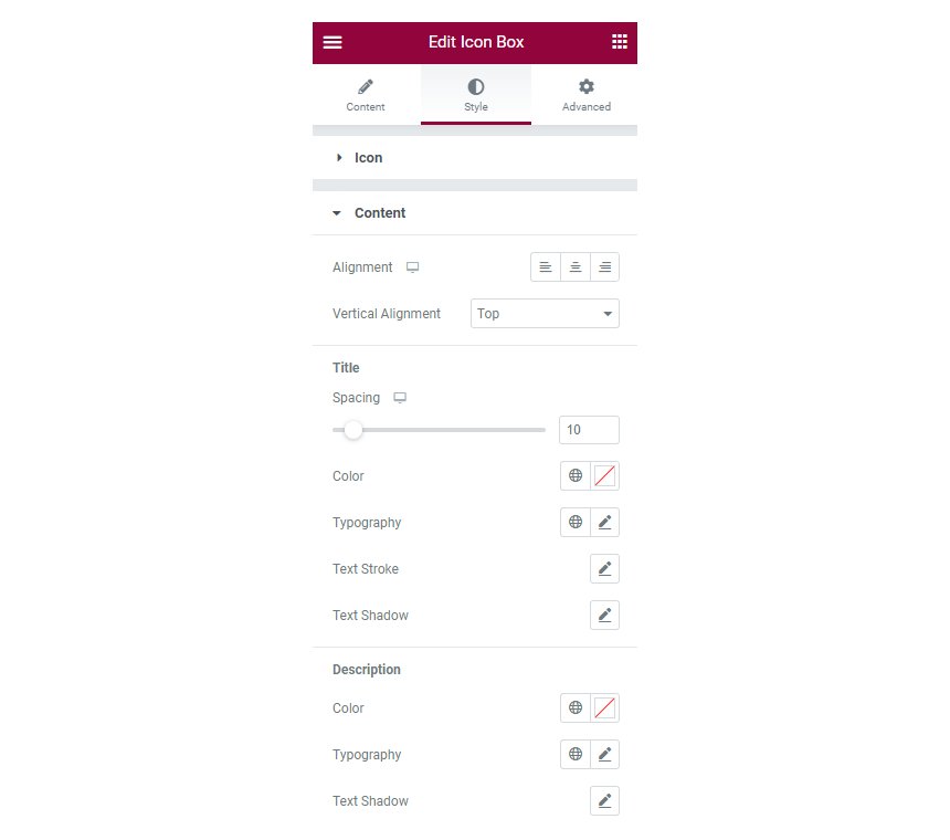
Icon box styling
Under the style tab you can customize the appearance of both the icon and the accompanying text. From the icon section you can modify the icon’s color for normal and hover state, change the spacing between the icon and the text, control the icon’s size, rotate it and add a box shadow.
From the content section you can change the text’s alignment and individually control the colors and typography of the title and description.
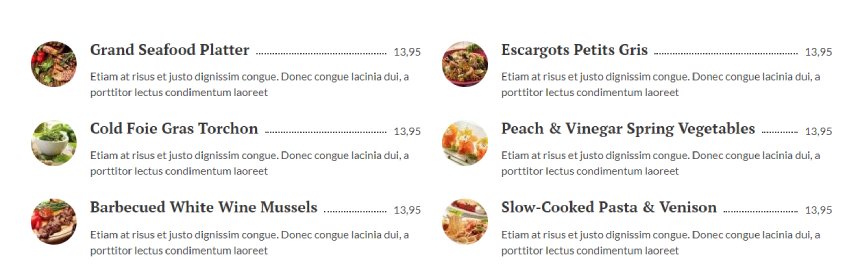
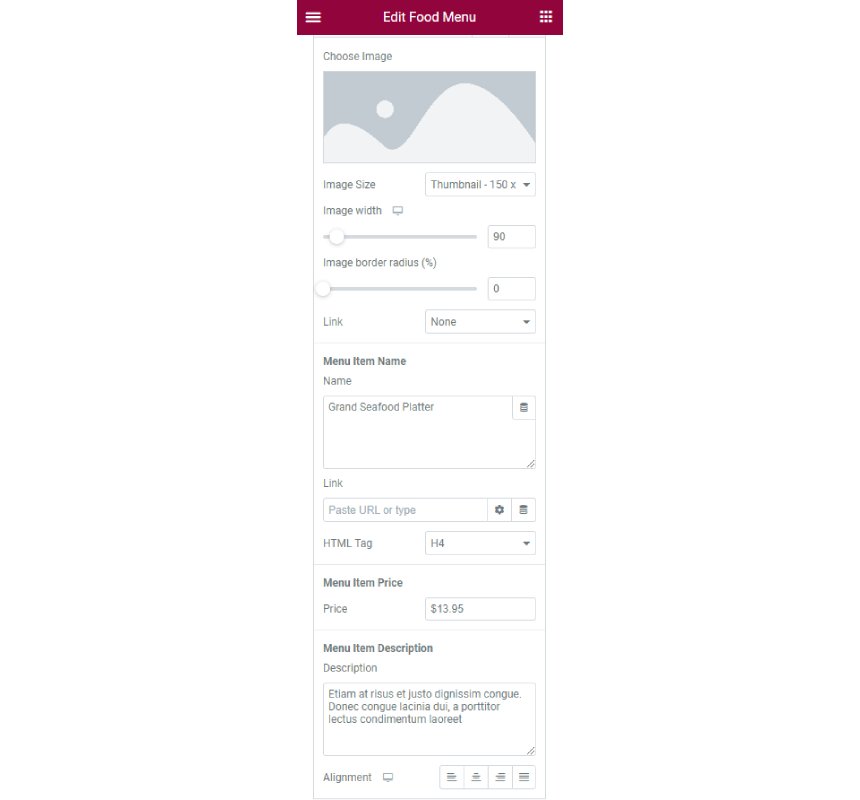
Food Menu
With the food menu widget you can create beautiful menus and pricelists for your restaurant, bar, café and more.
Under the content tab in the sidebar you can control the number of columns your menu will have and then setup each food menu item. Each item accepts an image, a title, a price and a description.
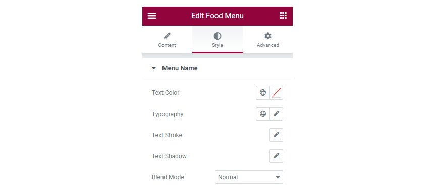
Food Menu styling
Under the Style tab you can individually modify the styling for the food menu title, price and description.
Options include text color, typography, stroke, text shadow and blend mode for each specific section.
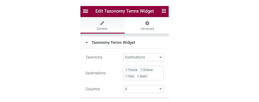
Taxonomy Terms
With the taxonomy terms widget you can create grids for any taxonomy term.
To use the widget drag & drop it in the content, pick your preferred taxonomy, select which items from the taxonomy you want to display, set the number of columns and you are done.
Import Elementor page templates
To gain access to our custom Elementor templates you need to install, activate and configure the CSSIgniter Connector plugin.
Getting Started with the CSSIgniter Connector
Once configured the plugin will provide access to our custom Elementor templates on active subscriptions. If your subscription is a standard club, developer club or lifetime one, you will have access to all available templates, if you have a single theme subscription you will have access to the templates of the particular theme, if available.
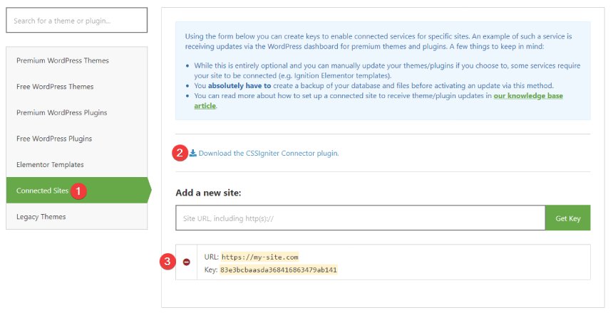
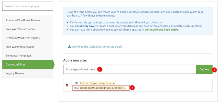
Step 1. Download the Connector Plugin
First we will need to download the CSSIgniter Connector plugin. You can find and download the plugin from your Downloads section, alternatively you can get it directly from this URL.
Navigate to the Connected Sites tab.
Download the CSSIgniter Connector plugin.
Any available API keys will appear here.
The plugin will be automatically downloaded to your computer. Keep in mind that Safari sometimes will auto extract the archive by default. Please have a look here on disabling it.
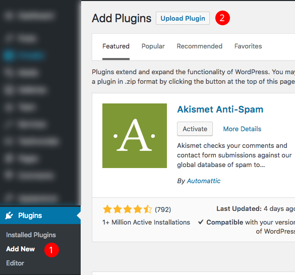
Step 2. Install the plugin
Now, head over to your WordPress installation’s dashboard and:
Navigate to Plugins→Add New from your Dashboard and
Click on the Upload Plugin.
Select the plugin archive file you’ve just downloaded, upload and activate the plugin.
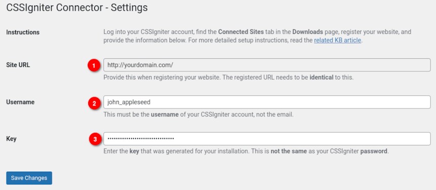
Step 3. Connect the Plugin with CSSIgniter
After activating the plugin navigate to Settings→CSSIgniter Connector. You will notice the screen below.
To connect the plugin with CSSIgniter you need three things.
First your site’s URL, note this down exactly as it appears on the Connector’s settings page
Add your site’s URL exactly as it appears on the Connector’s settings page.
Click the Get Key button
Copy the API key.
Go back to your Connector’s settings page in your site’s dashboard and paste the API Key in the Key input (labeled 3 in the previous to last image) then click Save Changes.
If everything went right you are ready to access our Ignition templates for Elementor.
Access and import the Elementor page templates
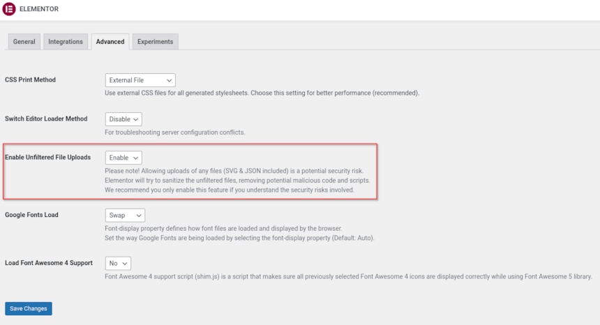
NOTICE: Some page templates contain SVGs which by default can’t be imported to WordPress. To enable SVG import first install and activate the SVG Support plugin, then in your WordPress dashboard navigate to Elementor > Settings > Advanced and enable Unfiltered File Uploads as seen in the image below.
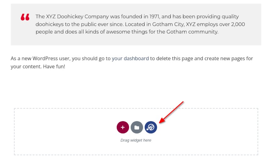
To access the templates you can edit any page or post with Elementor as usual and click the blue button in the add section box.
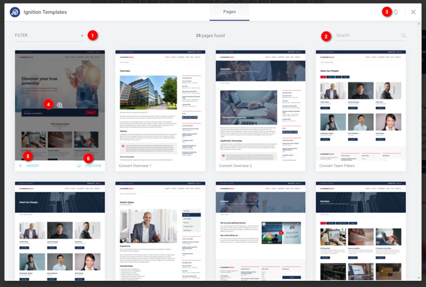
You will be presented with a pop-up similar to Elementor’s where you will find all the templates available to you, depending on your active subscription.
The pop-up shows all available templates in a columned layout. If your active Ignition theme has available Elementor templates these will be presented first. If your account has access to all templates the rest can be access by scrolling down. Alternatively you can use the filter (1) or search (2) functionality to find templates for your desired theme. The plugin will check for new templates regularly, but you can also force an update (3) if you wish to.
Hovering over a template’s card will give you the options to either preview the template (4 & 6) and insert it (5) to the post or page you are currently editing. Once you click the insert button Elementor will download and import the template’s content to your site. Please note that for copyright related reasons you will get blurred versions of the images used on our demos.
Support
Feel free to contact us directly through our support hub if you have questions regarding the plugin’s usage or experience any unexpected issues.
ATTENTION: This documentation is about the new version of Struct. If you are using the legacy version please visit its documentation page here.
Server Requirements
If you already have WordPress installed, it means that you meet the minimum server requirements and you can install this theme without any issues. To get the most out of your website though, you should get in touch with your web host and ask them if they meet the following criteria:
PHP version 7.4 or greater.
MySQL version 5.6 or greater or MariaDB version 10.1 or greater.
HTTPS support.
Prerequisites
Ignition Framework
This theme requires our free Ignition framework plugin to be installed. Simply visit the Downloads area, download the Ignition Framework plugin, upload it through your Dashboard > Plugins > Add new and Activate it.
It really doesn’t matter if you install the theme or the plugin first. Just make sure to install both in order for things to function as intended.
Installing the theme is a very simple process. Go to your dashboard under Appearance > Themes > Add new, click Upload Theme and upload the zip file. Once uploaded click Install Now and then the Activate Theme link. Here is a detailed overview on how to download and install the theme.
Once the theme is installed and activated you will be forwarded to the theme’s onboarding page.
Here you will be prompted to install and activate the Ignition Framework plugin if you haven’t done so already. Here you can also install our free custom blocks plugin, GutenBee. Through the onboarding page you have access to many useful links, such as the theme’s documentation, our knowledge base articles and direct links to our support hub.
In the Sample Content tab of the onboarding page you can install and activate all the plugins required to import the sample content and proceed with its installation. More info on that on the next section.
NOTE: The only plugin required for the theme to work properly is the Ignition Framework plugin, all other plugins are entirely optional if you don’t need their functionality or are not planning on importing the sample content. You can safely skip installing and activating them if you are sure you don’t need them.
How to import the sample content
If you like what you see in our demo website you can simply import the sample content. This means that a close approximation of our demo website will be imported in your WordPress installation. Now all you have to do is simply replace the content of these pages with yours.
In your WordPress dashboard visit Appearance > Theme Options > Sample Content.
Click Install and then Activate for each of the required plugins.
Click the Get Started button and in the next screen, move over the screenshot of the builder/variation of your preference and click the Import Demo button.
NOTE: Due to the nature of the import mechanism some links may link back to our demo website. If you are not sure how to update / change these links simply get in touch and we’ll help you out.
Image sizes
Web page loading times are greatly affected by the size of your images. For best results make sure to use images with the recommended dimensions as described below:
NOTE: All image sizes are the minimum recommended, adding larger image sizes will result in cropping them to fit.
Setting up the global sections of your website
A good place to start when creating a new site is with sections that are common throughout the site and stay relatively unchanged as time passes, like the header and footer.
General Site Options
Global site options can be modified under the Site Options panel.
Under the Layout tab you can modify the site’s, blog’s and single blog post’s layout, configure the overall content width and fine tune the content/sidebar column ratio.
Under the Colors tab you can fine tune the theme’s main colors scheme and set a background image.
Finally under the Typography tab you can customize the site’s font pairing by choosing among a huge selection of Google Fonts. Google Fonts can be disabled entirely if so desired.
Header
The theme’s header can be broken down to three main components, the Top Bar, the Logo area and the Main Menu. Below we’ll take a look at each one.
Navigate to Appearance > Customize in your dashboard or click the Customize button on the WordPress admin bar to access the theme’s customization options.
Top Bar
The Top Bar section offers 3 content areas which can host text, HTML or one of the theme’s custom shortcodes. Please refer to the shortcodes section below for more information. Furthermore, here you can modify the top bar’s background, text and border colors.
Logo
Under the Site Identity section you can upload your site’s main and alternative logos. The alternative logo can be used if you want a different logo to appear when the header layout is set to Transparent under Customize > Header > Layout. The recommended maximum width of your logo is 200px, height is not restricted.
To create your main menu navigate to the Menus tab in the Customizer and click on the Create New Menu button. Give it a name and check the Main Menu location for it to appear in. Click next to start adding your items and once done click Publish to save your changes.
Create a menu button
You can create a special button-like menu item by setting a certain class for to it. The class name is nav-button and you can set it under Appearance > Menus for the item you want. First enable this section from Screen Options.
This is a predefined class you can use to create menu buttons.
Page Title section
This section allows you to create an area just below the menu which can display the page’s title & subtitle along with a background image or color.
The page title section is common across all posts and pages and can be customized under the Page Title tab. The section’s height, content and its alignment, its colors and background image and finally the site’s breadcrumbs can be controlled from here.
The page title section’s background image can be overridden on each post or page if desired. When editing a post or page, in the right hand sidebar you will find a Page TitleImage section where you can upload a background image to display instead of the default one.
NOTE: The purpose of the Transparent header option is to have your main header components (Top bar, Logo & Main Menu) on top of a background image or background color which means that you have to set on in the Customize > Page title > Color section.
NOTE: The page title section on Struct is not enabled by default and is not used on the theme’s demo.
Footer
The footer area is a widgetized area that can be populated with widgets through Customize > Widgets. You can also remove the credits at the very bottom of this area by visiting Customize > Footer > Credits content. You can also adjust the colors by setting a background color & image and modify the border, title and text colors.
Utilities
Lightbox
The theme offers a lightbox for your images which is by default disabled to avoid conflicts with third party plugins which offer lightboxes. If you want to use it you can enable it under Customize > Utilities > Lightbox.
Weather
You can choose to show the weather for a chosen location using the weather shortcode anywhere inside your installation. First you will need to set it up by providing an API key and location under Customize >Utilities > Weather.
Block editor Dark Mode
Some themes have dark color schemes which are reflected in the block editor, this can make working with certain blocks a bit harder. Enabling the editor dark mode using the provided checkbox will apply certain styles to the editor in order to improve the content creation experience.
Create a new Portfolio item under Portfolio > Add New. Under the Portfolio tab on the right hand sidebar you can control some of the post’s basic attributes. These are:
Summary: Control the location and appearance of the sidebar.
Categories: Set a category for the item which will also serve as a filter on the post type’s listing pages.
Featured image: Will appear on all related listings and on the item’s single page.
Excerpt: Add a manual excerpt that will appear on post listings and on the page title section as a subtitle (if applicable).
Page Title image: Set a custom post title background image for the item. Leave blank if you want to keep the default settings configured earlier.
Page Settings: Here you can fine tune the item’s appearance. E.g. toggle the featured image, change header type, hide the page title/subtitle, breadcrumbs etc.
Create a navigation menu for Portfolio items
Create a new menu under Customize > Menus, don’t set any location to it and add your portfolio posts as menu items. If custom post types don’t appear when trying to add them to the menu you can enable them under Screen Options.
Under the Widgets panel in the Customizer add a Custom menu widget in the Portfolio sidebar and select the portfolio menu you have just created for it.
Creating a new Service Item
Create a new Service item under Services > Add New. Under the Service tab on the right hand sidebar you can control some of the post’s basic attributes. These are:
Summary: Control the location and appearance of the sidebar.
Categories: Set a category for the item which will also serve as a filter on the post type’s listing pages.
Featured image: Will appear on all related listings and on the item’s single page.
Excerpt: Add a manual excerpt that will appear on post listings and on the page title section as a subtitle (if applicable).
Page Title image: Set a custom post title background image for the item. Leave blank if you want to keep the default settings configured earlier.
Page Settings: Here you can fine tune the item’s appearance. E.g. toggle the featured image, change header type, hide the page title/subtitle, breadcrumbs etc.
Creating a new Team Member
Create a new Team item under Team > Add New. Under the Team Member tab on the right hand sidebar you can control some of the post’s basic attributes. These are:
Summary: Control the location and appearance of the sidebar.
Categories: Set a category for the item which will also serve as a filter on the post type’s listing pages.
Featured image: Will appear on all related listings and on the item’s single page.
Excerpt: Add a manual excerpt that will appear on post listings and on the page title section as a subtitle (if applicable).
Page Title image: Set a custom post title background image for the item. Leave blank if you want to keep the default settings configured earlier.
Page Settings: Here you can fine tune the item’s appearance. E.g. toggle the featured image, change header type, hide the page title/subtitle, breadcrumbs etc.
Setting up the pages
Homepage
Create a new page under Pages > Add New, then select from the right side under Summary the Full widthboxed template. From Page Settings > Content Area check the Remove top/bottom content padding and under Page Settings > Page Title set all options to hide.
Now let’s take a look at the blocks that build our content. All blocks used here are provided by our free GutenBee custom blocks plugin, unless mentioned otherwise.
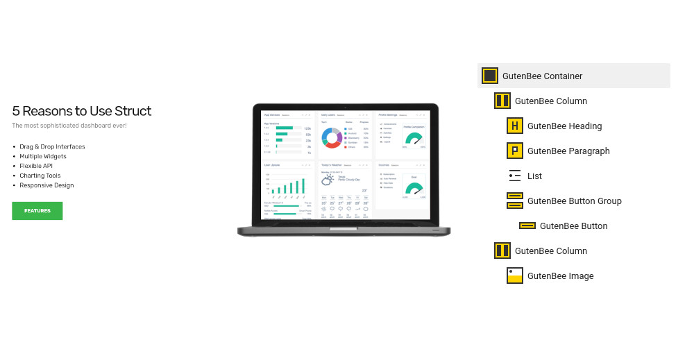
The homepage main hero section features a Container block with two columns, full alignment and a background image set under Block Attributes. In the left column we have a Heading, a Paragraph and a Button. The right hosts an Image Block.
The next section consists again of a Container block with two columns. The left column houses a Heading, a Paragraph a core list block and a Button. The right column hosts an Image block.
The inner hero section is also a fully aligned Container block with a background image and two columns. The left column includes a Heading, a Paragraph and a Testimonial block. The right column is empty.
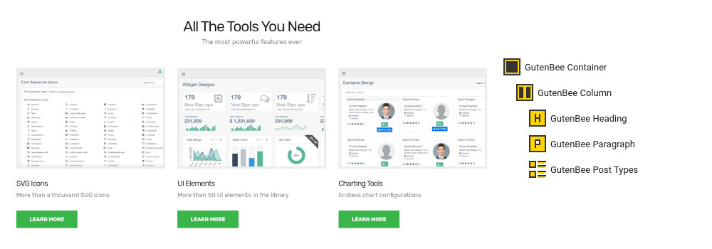
The home services section starts again with a GutenBee Container with a single column and centered content. Inside we have a GutenBee Heading, a GutenBee Paragraph and the GutenBee Post Types block. The Post Types block has the Services post type selected and displays three items in a three column layout.
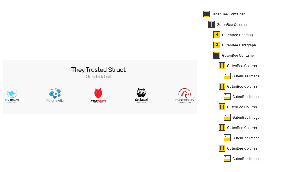
The clients section starts again with a fully aligned GutenBee Container with a single column and centered content. Inside we have the usual heading and paragraph blocks. Next is another GutenBee Container with five columns. Each column contains a GutenBee Image block with the logo of each client.
The intro section consists of a Container block with a single column. The column contains a Heading, a Paragraph and a Video Embed.
The next section consists of a Container with a single full width column, the content in the column is centered horizontally. Inside it we have a Heading and a Paragraph. Next there is another Container with four columns. Each column hosts an Image Box. Closing the section is a Button.
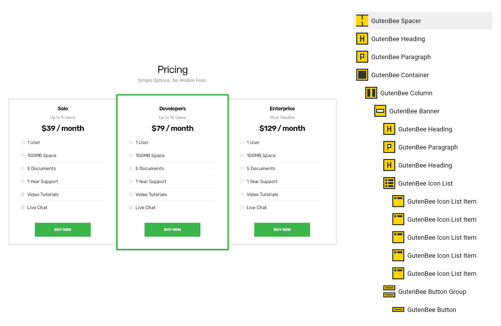
To create the pricing section we start with a Spacer just after the second inner hero section. After that we add a Heading, a Paragraph and a Container with three columns. In each column we have a Banner block with a 4px border and 20px padding. In the banner block we have a Heading, A Paragraph, another Heading for the price, an Icon list and we close up the column with a Button. To make a column pop-out change the color of the border and apply some more padding to its banner.
Creating Portfolio, Team and Services Pages
To create a post listing page start by creating a new page under Pages > Add New. Set the page template under Summary section to Full width boxed.
Next, add a GutenBee Post Types block to the page and select the post type you wish to display posts from. Select the default or Overlay style depending on how you want your items to appear. Select how many items you want to display and toggle the pagination if desired. Finally you can select the number of columns of the post grid and enable category filters.
Pricing page
Create a new page under Pages > Add New and set the page template under Summary section to Full width boxed.
The pricing page begins with a pricing table identical to the one described above for the homepage. Next we have an Image block with credit card logos and finally another Container block with two columns. Each column hosts two sets of core heading-paragraph blocks.
About page
Create a new page under Pages > Add New and set the page template under Summary section to Full width boxed.
The alternating timeline layout is created by a GutenBee Container with a single column. Inside it we find three more GutenBee Containers with a two column layouts. The left column contains a GutenBee Paragraph and a GutenBee Icon Box block and the right column is left empty. This pattern repeats, only each time the opposite column is empty, so for the second timeline item the left column will be empty for the third again the right etc.
The team section consists of a GutenBee Heading, a GutenBee Paragraph and a GutenBee Post Types block which displays the Team post type.
Finally the hiring section consists of a GutenBee Heading, a GutenBee Paragraph, a core table block and a GutenBee Button.
FAQ page
Create a new page under Pages > Add New and set the page template under Summary section to Full width boxed.
The FAQ page consists of three sets of alternating GutenBee Heading and GutenBee Accordion blocks.
Contact page
Create a new page under Pages > Add New and set the page template under Summary section to Full width.
The contact page starts with a GutenBee Google Maps block. Next we have a GutenBee Container block with the Theme Grid option enabled. Inside we have two columns. The left column houses four GutenBee Icon Boxes and the right one has a shortcode block containing the contact form shortcode from your preferred contact form plugin.
Common features
This section offers information on features common on all Ignition Framework based themes.
Shortcodes
The Ignition Framework offers a multitude of custom shortcodes these are:
Custom menu: [ignition-custom-menu name=”your menu name”]

Site search: [ignition-site-search]

Date: [ignition-date]

Weather: [ignition-current-weather id=”your-location-id(optional)”]

Minicart button: [ignition-minicart-button]

Language switcher: [ignition-language-switcher]

Icon link: [ignition-icon-link]

Instagram Feed: [ignition-instagram-feed]

WooCommerce search: [ignition-wc-search]
All themes offer six different templates which modify the location and appearance of the sidebar and the main content’s width.
Additionally pages have a common set of options which allow you to customize the appearance of the page title section, toggle breadcrumbs and more.
All settings are inherited from Customizer. So you can actually set some global settings and if you wish change certain pages to have different behavior.
Ignition Framework based themes are compatible with WooCommerce giving you the ability to create awesome online stores which perfectly match the appearance of the rest of your site.
WooCommerce is an optional plugin. You don’t need to install it if you are not looking to build an online store.
After activating WooCommerce it will create and set some default pages. These will serve as your Shop, Cart, Checkout and My Account pages.
The framework offers various customization options both for the main product listing page under Customize > WooCommerce > Product Catalog and for single products under Customize > WooCommerce > Single Products.
With the Global Sections custom post type included in all Ignition Framework based themes users can create content which can be easily reused in more than 15 key theme locations. For example users can create a newsletter subscription call to action box and immediately display it above the footer on all (or some) posts and pages, or create a banner ad an easily add it between posts in post listings etc.
This is you main blog page. You can create a new page and set it as your posts page under Customize > Homepage Settings. You can customize it under Customize > Blog from the Archives section.
Widget areas
The theme provides special widget areas for your posts listings, pages and shop. You can use a plugin/module like Jetpack’s widget visibility to hide or show widgets for certain pages, posts or products.
Support
If you need help during the initial installation and setup of this theme feel free to get in touch and we will get back to you within 24 hours to help.
ATTENTION: This documentation is about the Ignition Framework-based version of Technico. If you are using the legacy version please visit its documentation page here.
Server Requirements
If you already have WordPress installed, it means that you meet the minimum server requirements and you can install this theme without any issues. To get the most out of your website though, you should get in touch with your web host and ask them if they meet the following criteria:
PHP version 7.4 or greater.
MySQL version 5.6 or greater or MariaDB version 10.1 or greater.
HTTPS support.
Prerequisites
Ignition Framework
This theme requires our free Ignition framework plugin to be installed. Simply visit the Downloads area, download the Ignition Framework plugin, upload it through your Dashboard > Plugins > Add new and Activate it.
It really doesn’t matter if you install the theme or the plugin first. Just make sure to install both in order for things to function as intended.
Installing the theme is a very simple process. Go to your dashboard under Appearance > Themes > Add new, click Upload Theme and upload the zip file. Once uploaded click Install Now and then the Activate Theme link. Here is a detailed overview on how to download and install the theme.
Once the theme is installed and activated you will be forwarded to the theme’s onboarding page.
Here you will be prompted to install and activate the Ignition Framework plugin if you haven’t done so already. Here you can also install our free custom blocks plugin, GutenBee. Through the onboarding page you have access to many useful links, such as the theme’s documentation, our knowledge base articles and direct links to our support hub.
In the Sample Content tab of the onboarding page, you can install and activate all the plugins required to import the sample content and proceed with its installation. More information on this can be found in the next section.
NOTE: The only plugin required for the theme to work properly is the Ignition Framework plugin, all other plugins are entirely optional if you don’t need their functionality or are not planning on importing the sample content. You can safely skip installing and activating them if you are sure you don’t need them.
Finally, in the Theme Variations tab, you can select one of the available variations for the current theme. The Technico theme offers two variations: Technico and PipeMaster. Changing the variation will update the color palette of your theme and may also modify Customizer options. Be sure to back up your current settings using the built-in tool or another database backup plugin.
Check out this video guide on how to install the theme preset and sample content:
How to import the sample content
If you like what you see in our demo website you can simply import the sample content. This means that a close approximation of our demo website will be imported in your WordPress installation. Now all you have to do is simply replace the content of these pages with yours.
In your WordPress dashboard visit Appearance > Theme Options > Sample Content.
Click Install and then Activate for each of the required plugins.
Click the Get Started button and in the next screen, move over the screenshot of the builder/variation of your preference and click the Import Demo button.
NOTE: Due to the nature of the import mechanism some links may link back to our demo website. If you are not sure how to update / change these links simply get in touch and we’ll help you out.
Image sizes
Web page loading times are greatly affected by the size of your images. For best results make sure to use images with the recommended dimensions as described below:
NOTE: All image sizes are the minimum recommended, adding larger image sizes will result in cropping them to fit.
Setting up the global sections of your website
A good place to start when creating a new site is with sections that are common throughout the site and stay relatively unchanged as time passes, like the header and footer.
General Site Options
Global site options can be modified under the Site Options panel.
Under the Layout tab you can modify the site’s, blog’s and single blog post’s layout, configure the overall content width and fine tune the content/sidebar column ratio.
Under the Colors tab you can fine tune the theme’s main colors scheme and set a background image.
Finally under the Typography tab you can customize the site’s font pairing by choosing among a huge selection of Google Fonts. Google Fonts can be disabled entirely if so desired.
Header
The theme’s header can be broken down to three main components, the Top Bar, the Logo area and the Main Menu. Below we’ll take a look at each one.
Navigate to Appearance > Customize in your dashboard or click the Customize button on the WordPress admin bar to access the theme’s customization options.
Top Bar
The Top Bar section offers 3 content areas which can host text, HTML or one of the theme’s custom shortcodes. Please refer to the shortcodes section below for more information. Furthermore, here you can modify the top bar’s background, text and border colors.
Logo
Under the Site Identity section you can upload your site’s main and alternative logos. To upload your logo go to Customize > Site Identity. You can upload two logos. The main and the alternative one. The alternative logo can be used if you want a different logo to appear when the header layout is set to Transparent under Customize > Header > Layout. In the theme’s demo we do not use any logo. The recommended maximum width of your logo is 200px, height is not restricted.
To create your main menu navigate to the Menus tab in the Customizer and click on the Create New Menu button. Give it a name and check the Main Menu location for it to appear in. Click next to start adding your items and once done click Publish to save your changes.
You can create a special button-like menu item by setting a certain class for to it. The class name is nav-button and you can set it under Appearance > Menus for the item you want. First enable this section from Screen Options.
This is a predefined class you can use to create menu buttons.
Page Title section
This section allows you to create an area just below the menu which can display the page’s title & subtitle along with a background image or color.
The page title section is common across all posts and pages and can be customized under the Customizer > Page Title tab. The section’s height, content and its alignment, its colors and background image and finally the site’s breadcrumbs can be controlled from here.
The page title section’s background image can be overridden on each post or page if desired. When editing a post or page, in the right hand sidebar you will find a Page TitleImage section where you can upload a background image to display instead of the default one.
Please note: The purpose of the Transparent header option is to have your main header components (Top bar, Logo & Main Menu) on top of a background image or background color which means that you have to set on in the Customize > Page title > Color section.
Footer
The footer area is a widgetized area that can be populated with widgets through Customize > Widgets. You can also remove the credits at the very bottom of this area by visiting Customize > Footer > Credits content. You can also adjust the colors by setting a background color & image and modify the border, title and text colors.
Utilities
Lightbox
The theme offers a lightbox for your images which is by default disabled to avoid conflicts with third party plugins which offer lightboxes. If you want to use it you can enable it under Customize > Utilities > Lightbox.
Weather
You can choose to show the weather for a chosen location using the weather shortcode anywhere inside your installation. First you will need to set it up by providing an API key and location under Customize >Utilities > Weather.
Block editor Dark Mode
Some themes have dark color schemes which are reflected in the block editor, this can make working with certain blocks a bit harder. Enabling the editor dark mode using the provided checkbox will apply certain styles to the editor in order to improve the content creation experience.
Create a new Portfolio item under Portfolio > Add New. Under the Portfolio tab on the right hand sidebar you can control some of the post’s basic attributes. These are:
Summary: Control the location and appearance of the sidebar.
Categories: Set a category for the item which will also serve as a filter on the post type’s listing pages.
Featured image: Will appear on all related listings and on the item’s single page.
Excerpt: Add a manual excerpt that will appear on post listings and on the page title section as a subtitle (if applicable).
Page Title image: Set a custom post title background image for the item. Leave blank if you want to keep the default settings configured earlier.
Page Settings: Here you can fine tune the item’s appearance. E.g. toggle the featured image, change header type, hide the page title/subtitle, breadcrumbs etc.
Create a navigation menu for Portfolio items
Create a new menu under Customize > Menus, don’t set any location to it and add your portfolio posts as menu items. If custom post types don’t appear when trying to add them to the menu you can enable them under Screen Options.
Under the Widgets panel in the Customizer add a Custom menu widget in the Portfolio sidebar and select the portfolio menu you have just created for it.
Creating a new Service post
Create a new Service item under Services > Add New. Under the Service tab on the right hand sidebar you can control some of the post’s basic attributes. These are:
Summary: Control the location and appearance of the sidebar.
Categories: Set a category for the item which will also serve as a filter on the post type’s listing pages.
Featured image: Will appear on all related listings and on the item’s single page.
Excerpt: Add a manual excerpt that will appear on post listings and on the page title section as a subtitle (if applicable).
Page Title image: Set a custom post title background image for the item. Leave blank if you want to keep the default settings configured earlier.
Page Settings: Here you can fine tune the item’s appearance. E.g. toggle the featured image, change header type, hide the page title/subtitle, breadcrumbs etc.
Creating a new Team Member post
Create a new Team item under Team > Add New. Under the Team Member tab on the right hand sidebar you can control some of the post’s basic attributes. These are:
Summary: Control the location and appearance of the sidebar.
Categories: Set a category for the item which will also serve as a filter on the post type’s listing pages.
Featured image: Will appear on all related listings and on the item’s single page.
Excerpt: Add a manual excerpt that will appear on post listings and on the page title section as a subtitle (if applicable).
Page Title image: Set a custom post title background image for the item. Leave blank if you want to keep the default settings configured earlier.
Page Settings: Here you can fine tune the item’s appearance. E.g. toggle the featured image, change header type, hide the page title/subtitle, breadcrumbs etc.
Setting up the pages
Homepage
Create a new page under Pages > Add New, then select from the right side under Summary the Full widthboxed template. From Page Settings > Content Area check the Remove top/bottom content padding and under Page Settings > Page Title set all options to hide.
Now let’s take a look at the blocks that build our content.
The homepage main hero section features a GutenBee Container block with two columns and a background image set under Block Attributes. In the left column we have a GutenBee Heading, a GutenBee Paragraph and a GutenBee Button. The right column is empty.
The homepage services section consists of a GutenBee Container with a single full width column, the content in the column is centered horizontally. Inside it we have a GutenBee Heading and a GutenBee Paragraph. Next there is another GutenBee Container with three columns. Each column hosts a GutenBee Image Box. Closing the section is a GutenBee Button.
The demo’s homepage features two inner hero sections which consist of a GutenBee Container with a single full width column and center aligned content. Inside we have a GutenBee Heading, a GutenBee Paragraph and a GutenBee Button.
The team section starts again with a GutenBee Container with a single column and centered content. Inside we have a GutenBee Heading, a GutenBee Paragraph and the GutenBee Post Types block. The Post Types block has the Team post type selected and displays three items in a three column layout.
To create the pricing section we start with a GutenBee Spacer just after the second inner hero section. After that we add a GutenBee Heading, a GutenBee Paragraph and a GutenBee Container with three columns. In each column we have a GutenBee Banner block with a 4px border and 20px padding. In the banner block we have a GutenBee Heading, A GutenBee Paragraph, another GutenBee Heading for the price, a GutenBee Icon list and we close up the column with a GutenBee Button. To make a column pop-out change the color of the border and apply some more padding to its banner.
The clients section starts again with a GutenBee Container with a single column and centered content. Inside we have the usual heading and paragraph blocks. Next is another GutenBee Container with four columns. Each column contains a GutenBee Image block with the logo of each client.
The testimonials section starts again with a GutenBee Container with a single column and centered content. Inside we have the usual heading and paragraph blocks. Next is another GutenBee Container with three columns. Each column contains a GutenBee Testimonial block with a left positioned avatar.
The DIY section is identical with the Meet The Team one, with the difference that the GutenBee Post Types block is set to display posts.
Finally the call to action section is the same as the two inner hero sections without the GutenBee Paragraph block.
Creating Portfolio, Team and Services Pages
To create a post listing page start by creating a new page under Pages > Add New. Set the page template under Summary section to Full width boxed.
Next, add a GutenBee Post Types block to the page and select the post type you wish to display posts from. Select the default or Overlay style depending on how you want your items to appear. Select how many items you want to display and toggle the pagination if desired. Finally, you can select the number of columns of the post grid and enable category filters.
Overview page
Create a new page under Pages > Add New and set the page template under Summary section to Full width boxed.
The page starts with a GutenBee Heading and a GutenBee Paragraph block. Then we have a GutenBee Container with a yellow border and a background image set under Block Attibutes. Inside we have two columns, the right one houses another heading and the left one some content in the form of a paragraph block.
The alternating timeline layout is created by a GutenBee Container with a single column. In it we find another GutenBee Container with a two column layout. The left column contains a GutenBee Paragraph and a GutenBee Image Box block and the right column is left empty. This pattern repeats only each time the opposite column is empty, so for the second timeline item the left column will be empty for the third again the right etc.
The team section consists of a GutenBee Heading, a GutenBee Paragraph and a GutenBee Post Types block which displays the Team post type.
Finally the hiring section consists of a GutenBee Heading, a GutenBee Paragraph, a core table block and a GutenBee Button.
FAQ page
Create a new page under Pages > Add New and set the page template under Summary section to Full width boxed.
The FAQ page consists of three GutenBee Containers. Each container has two columns. The left column houses a GutenBee Heading with the FAQ section title and the right column a GutenBee Accordion block. After each container we have a GutenBee Divider block to provide some visual separation.
Contact page
Create a new page under Pages > Add New and set the page template under Summary section to Full width.
The contact page starts with a GutenBee Google Maps block. Next we have a GutenBee Container block with the Theme Grid option enabled. Inside we have two columns. The left column houses four GutenBee Icon Boxes and the right one has a shortcode block containing the contact form shortcode from your preferred contact form plugin.
Common features
This section offers information on features common on all Ignition Framework based themes.
Shortcodes
The Ignition Framework offers a multitude of custom shortcodes these are:
Custom menu: [ignition-custom-menu name=”your menu name”]

Site search: [ignition-site-search]

Date: [ignition-date]

Weather: [ignition-current-weather id=”your-location-id(optional)”]

Minicart button: [ignition-minicart-button]

Language switcher: [ignition-language-switcher]

Icon link: [ignition-icon-link]

Instagram Feed: [ignition-instagram-feed]

WooCommerce search: [ignition-wc-search]
All themes offer six different templates which modify the location and appearance of the sidebar and the main content’s width.
Additionally pages have a common set of options which allow you to customize the appearance of the page title section, toggle breadcrumbs and more.
All settings are inherited from Customizer. So you can actually set some global settings and if you wish change certain pages to have different behavior.
Ignition Framework based themes are compatible with WooCommerce giving you the ability to create awesome online stores which perfectly match the appearance of the rest of your site.
WooCommerce is an optional plugin. You don’t need to install it if you are not looking to build an online store.
After activating WooCommerce it will create and set some default pages. These will serve as your Shop, Cart, Checkout and My Account pages.
The framework offers various customization options both for the main product listing page under Customize > WooCommerce > Product Catalog and for single products under Customize > WooCommerce > Single Products.
With the Global Sections custom post type included in all Ignition Framework based themes users can create content which can be easily reused in more than 15 key theme locations. For example users can create a newsletter subscription call to action box and immediately display it above the footer on all (or some) posts and pages, or create a banner ad an easily add it between posts in post listings etc.
This is you main blog page. You can create a new page and set it as your posts page under Customize > Homepage Settings. You can customize it under Customize > Blog from the Archives section.
Widget areas
The theme provides special widget areas for your posts listings, pages and shop. You can use a plugin/module like Jetpack’s widget visibility to hide or show widgets for certain pages, posts or products.
Support
If you need help during the initial installation and setup of this theme feel free to get in touch and we will get back to you within 24 hours to help.
All Ignition Framework based themes come with out of the box WooCommerce support. In this article we’ll provide some info regarding the integration and highlight some of its key features.
To create an online stored based on an Ignition Framework based theme you will need to install and activate WooCommerce. Once the plugin is installed and activated it will create a set of default required pages like the shop, cart, checkout and my account.
If the theme’s demo features an online store it is possible to import its sample content which will include sample products for the store. Instructions can be found here this article.
After WooCommerce has been activated (and optionally the sample content is imported), the product listing can be found in the Shop page. The appearance of the shop page on Ignition Framework themes can be customized under the WooCommerce > Product Catalog panel in the Customizer.
Shop Layout
Product Catalog
There are four shop layouts available:
Content / Sidebar: In this layout the products will be presented on the left hand side and the shop sidebar containing the shop widgets will appear on the right. example
Sidebar / Content: In this layout the products will be presented on the right hand side and the shop sidebar containing the shop widgets will appear on the left. example
Full width boxed: In this layout the product listing will take up the entire content width and the widget sidebar will be moved in a button operated drawer. example
Full width narrow: Same as the full width boxed layout with a narrower content area.
Shop widgets can be added under Customize > Widgets > Shop (the sidebar is visible when a shop related page is viewed).
In the same tab users can also choose to display an alternative image when each product is hovered ( the first gallery image ), set the number of products which will display on each product listing page, display a single or dual column shop listing on mobile devices, modify the appearance of cross-sells, up-sells, related products and more.
Single product options
On the single product view WooCommerce by default displays the featured image and below it the rest of the product gallery’s images (if any). Framework based themes offer alternative layouts for product images. The layouts can be found under WooCommerce > Single Product. The options are:
Default: The product gallery thumbnails are displayed below the featured image on the left hand side of the single product view.
List: The product gallery images are displayed one below the other in the same size as the featured image. In this layout the product’s title, price and short description stick to the top of the page until users scroll past the image list.
Thumbnails left: The product gallery thumbnails are presented to the left of the featured image.
Thumbnails right: The product gallery thumbnails are presented to the right of the featured image.
The column number of the related and up-sells sections below the product’s content can be configured under WooCommerce > Product Catalog in the Customizer.
Store Notice
You can toggle the visibility of the store notice text so you can promote your events and products site-wide.
Product Images
In this tab you can choose if and how all product thumbnails are being cropped.
Chekout
In the Checkout tab you can customize the appearance of the checkout page. Set the required form fields, the Terms and Conditions page as well as the Privacy Policy page and short text which will be displayed in the checkout page.
Shop page
The shop page’s layout can be customized using the framework’s page customization options. All shop related pages, such as product category listings and single products will inherit any options set under the shop page, for example if you set up a shop page with a transparent header and a background image, they will be inherited on product listings and single products. Pages like the cart, checkout and my account do not inherit these options due to the way they are created (essentially a shortcode is added in their content) and need to be configured separately to match the rest of the shop. However they will inherit global options for pages set in the Customizer.
Shortcodes
The framework offers three very useful shortcodes for online stores. These are the following:
[ignition-site-search post_type="product"]
This shortcode will create a simple site search field which with the added post_type parameter restricts the results to just products. Very useful for helping customers find products they are looking for. The shortcode is ideal for top bar or header content areas.
[ignition-minicart-button]
Again a shortcode perfect for any top bar or header content area, it will display the WooCommerce minicart allowing users to quickly access and modify their cart. example.
[ignition-wc-search]
This shortcode creates a flexible, AJAX powered search box for products. It can be placed in the header to give customers quick access to everything the store has to offer.
[ignition-wc-login]
This shortcode will display a “My account” link (in case the user is already logged in) or a “Login” link. Use it under Customize > Top Bar in any content field you wish.
For more info regarding the above shortcodes and any other provided by the framework check out this article. WooCommerce also comes with some built-in shortcodes information for which you can find here.
Whether you want to spice up your post’s content with some images to make it more pleasing to the reader’s eye, or are a photography professional who wants to promote and showcase your work, you need a simple and effective way of creating galleries and adding them in the content. The WordPress block editor offers a quick and easy way of bundling a few images in a gallery and placing them along the text, but if you need something more complex you might need to take a look at custom blocks provided by plugins like FooGallery.
Yet another Ignition Framework based theme is available to our customers. Spencer is a beautiful and stylish business blogging theme ideal for all professionals who rely on their content to make an impression on their readers. Read more about the theme below
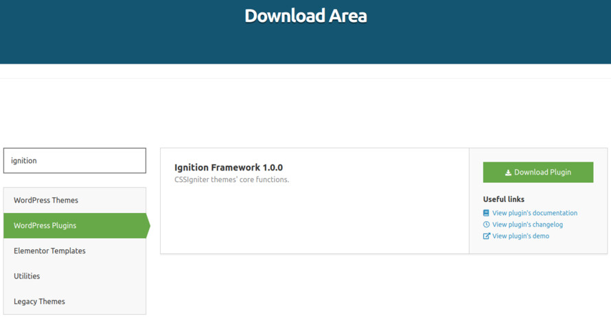
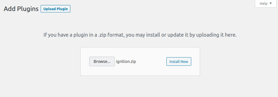
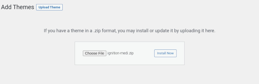
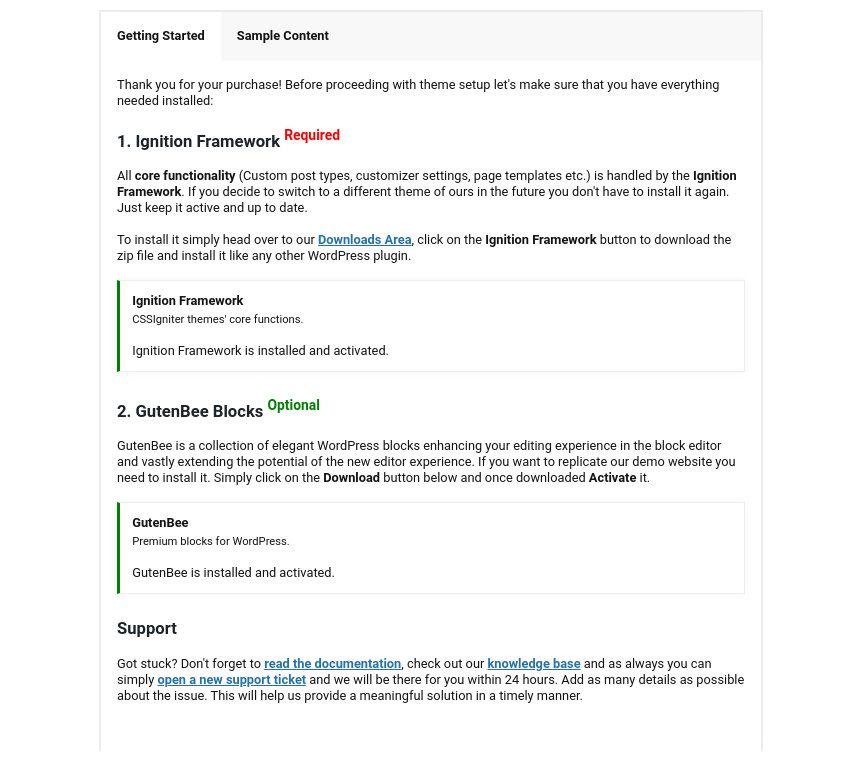
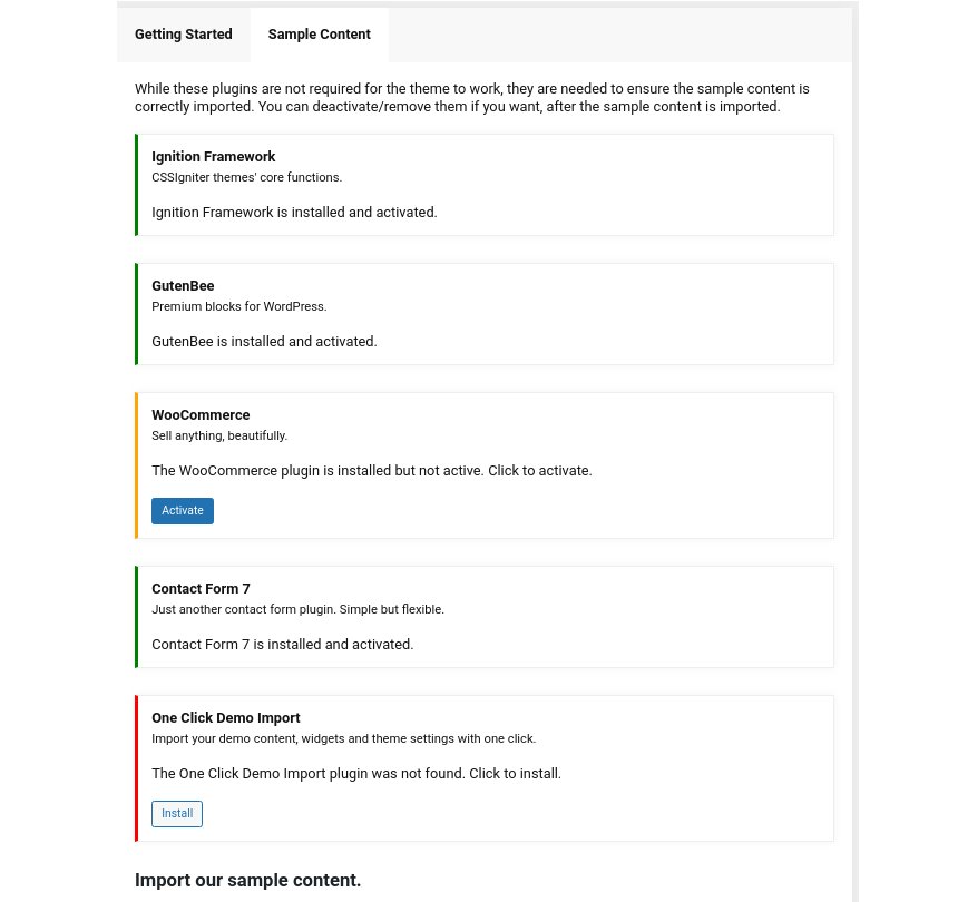
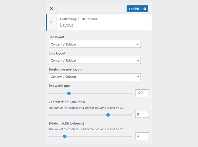
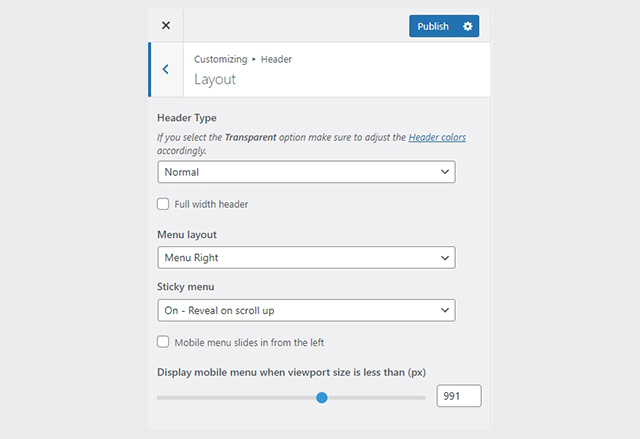
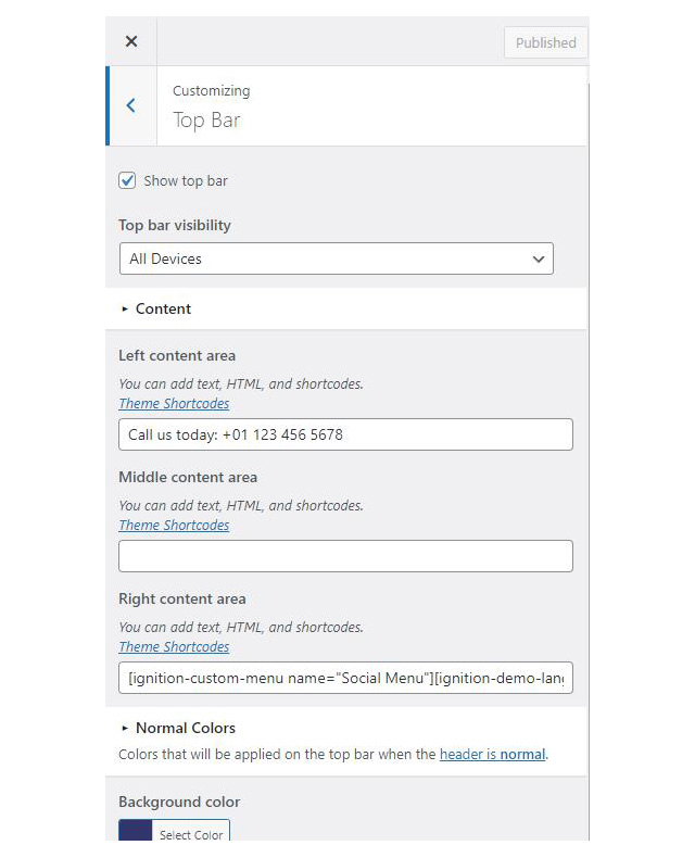
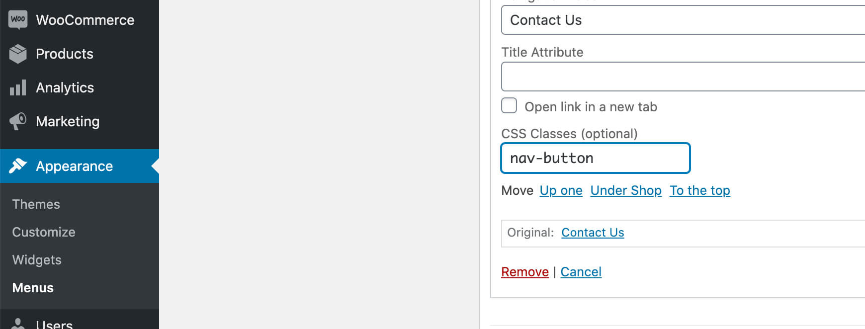


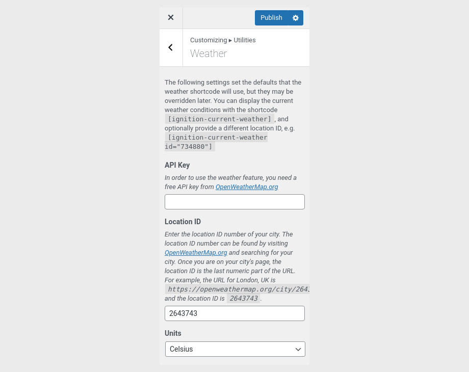


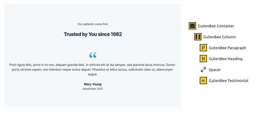


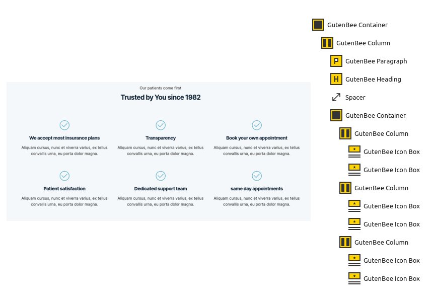


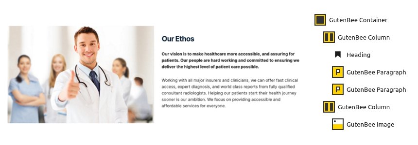

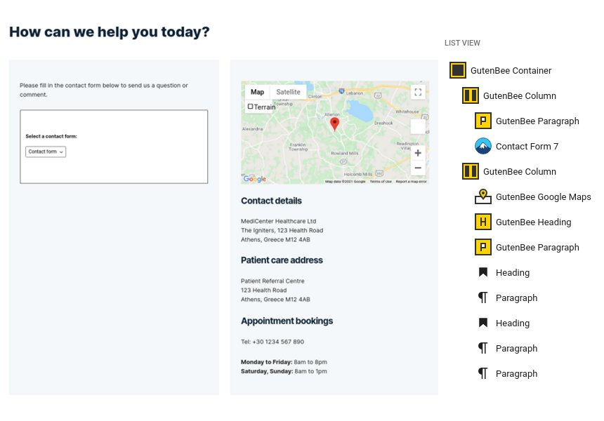

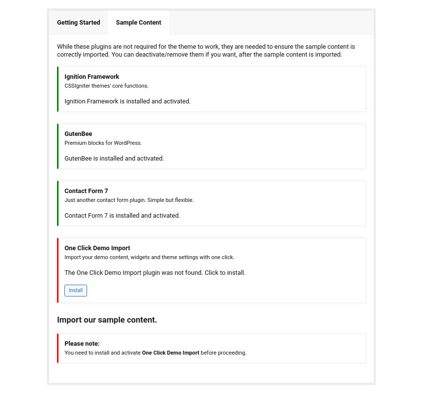
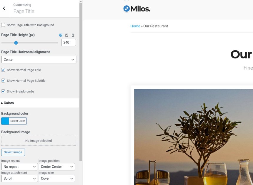
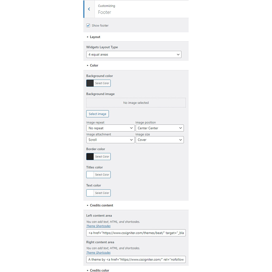
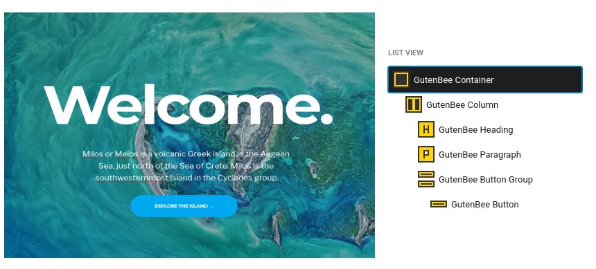
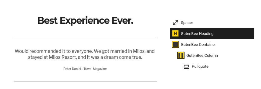
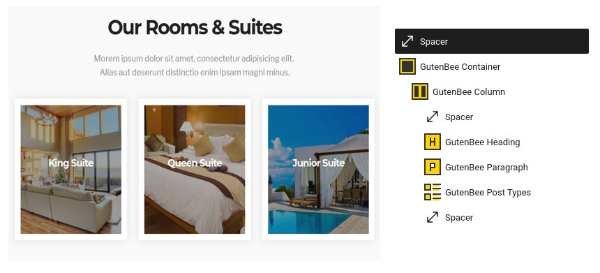
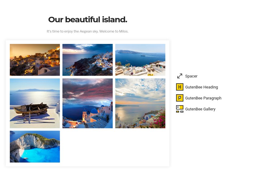
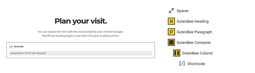
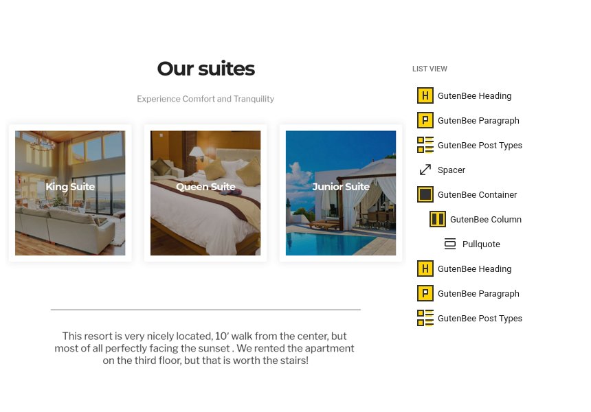
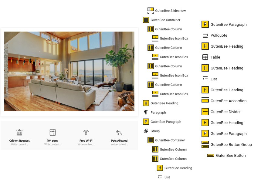
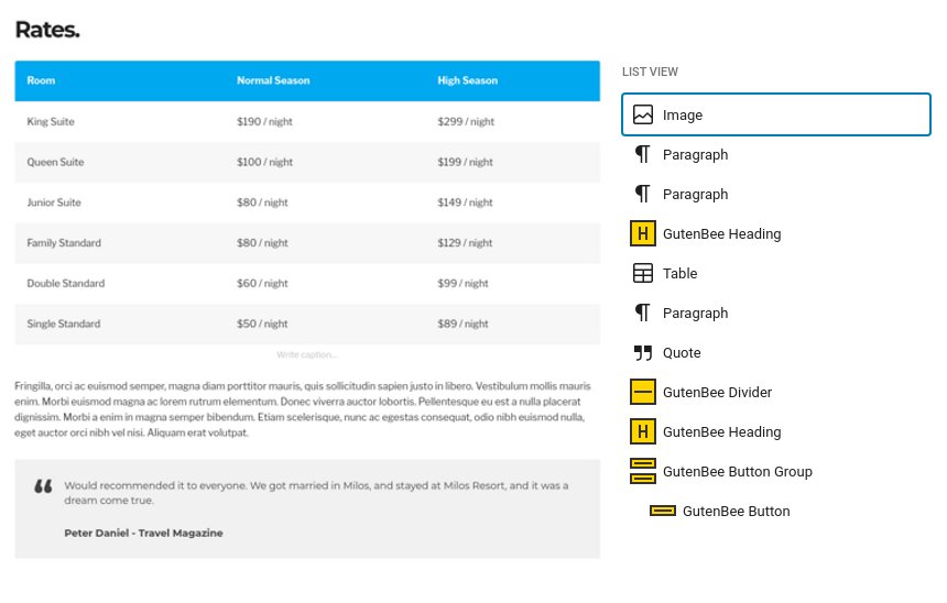
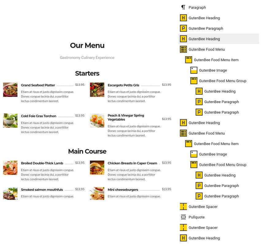
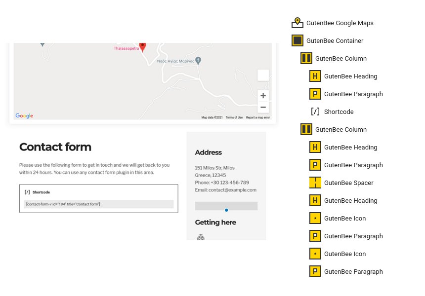
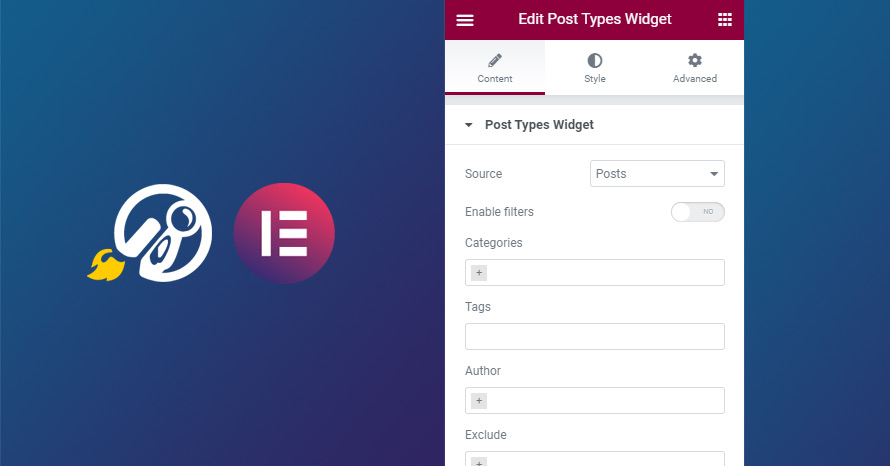

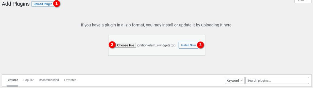

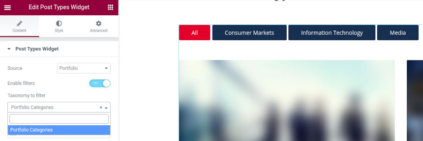
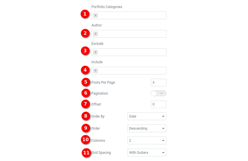
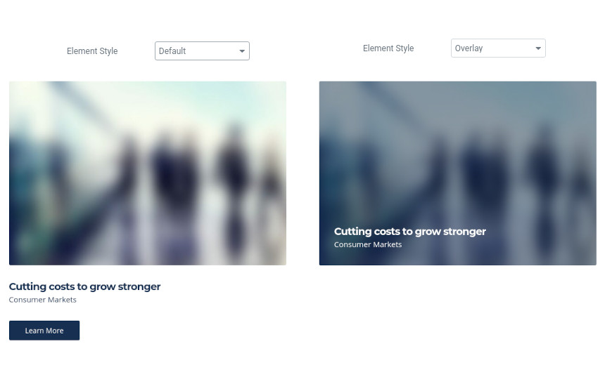
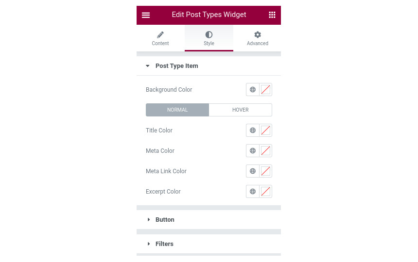

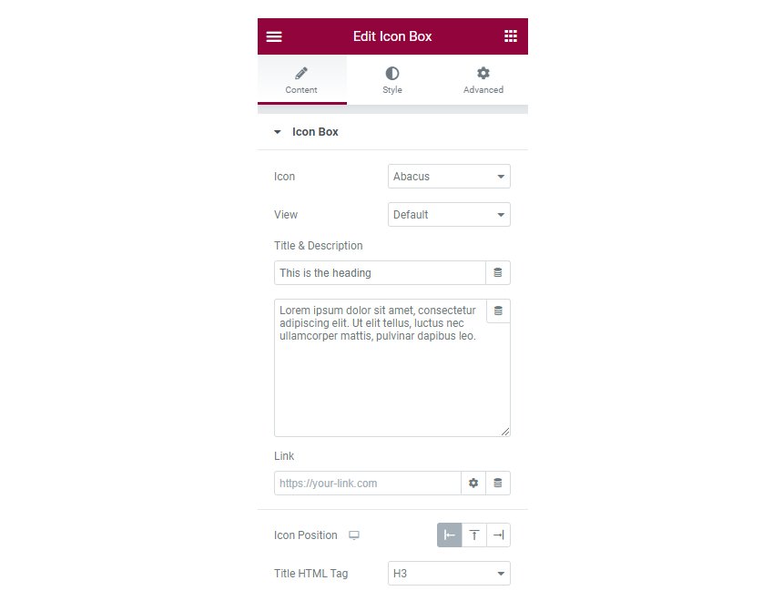
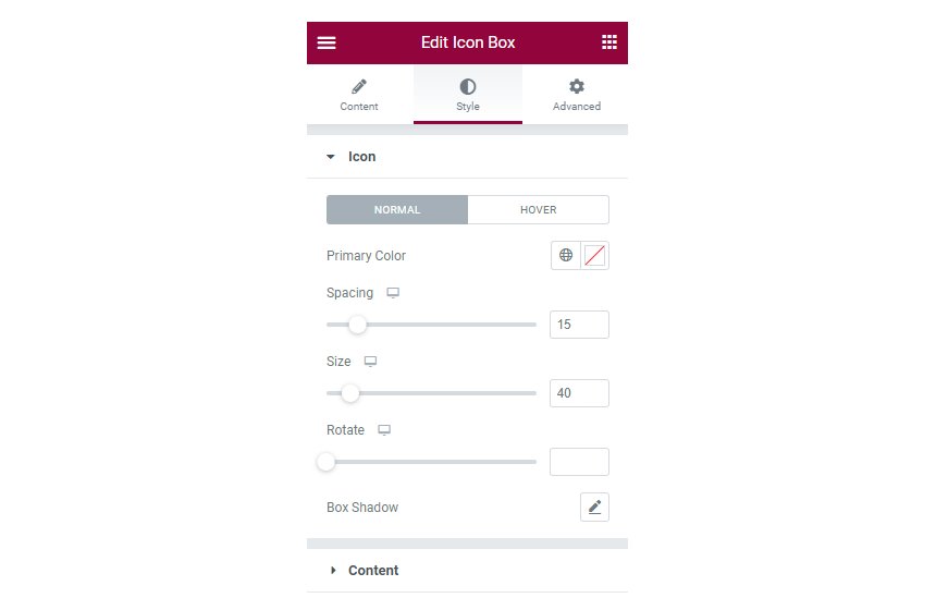