Documentation for Struct
Server Requirements
If you already have WordPress installed, it means that you meet the minimum server requirements and you can install this theme without any issues. To get the most out of your website though, you should get in touch with your web host and ask them if they meet the following criteria:
- PHP version 7.4 or greater.
- MySQL version 5.6 or greater or MariaDB version 10.1 or greater.
- HTTPS support.
Prerequisites
Ignition Framework
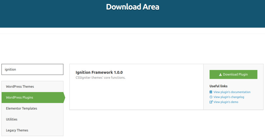
This theme requires our free Ignition framework plugin to be installed. Simply visit the Downloads area, download the Ignition Framework plugin, upload it through your Dashboard > Plugins > Add new and Activate it.
It really doesn’t matter if you install the theme or the plugin first. Just make sure to install both in order for things to function as intended.
Read this for more information about the plugin installation procedure.
Theme installation
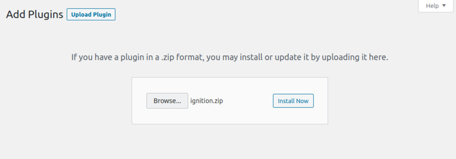
Installing the theme is a very simple process. Go to your dashboard under Appearance > Themes > Add new, click Upload Theme and upload the zip file. Once uploaded click Install Now and then the Activate Theme link. Here is a detailed overview on how to download and install the theme.

Once the theme is installed and activated you will be forwarded to the theme’s onboarding page.
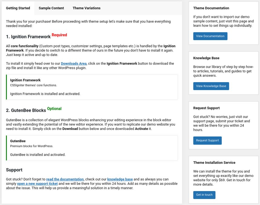
Here you will be prompted to install and activate the Ignition Framework plugin if you haven’t done so already. Here you can also install our free custom blocks plugin, GutenBee. Through the onboarding page you have access to many useful links, such as the theme’s documentation, our knowledge base articles and direct links to our support hub.
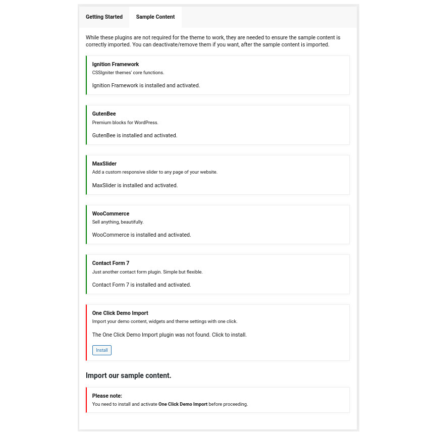
In the Sample Content tab of the onboarding page you can install and activate all the plugins required to import the sample content and proceed with its installation. More info on that on the next section.
How to import the sample content
If you like what you see in our demo website you can simply import the sample content. This means that a close approximation of our demo website will be imported in your WordPress installation. Now all you have to do is simply replace the content of these pages with yours.
A generic video guide on how to import the sample content can be found here.
The procedure:
- In your WordPress dashboard visit Appearance > Theme Options > Sample Content.
- Click Install and then Activate for each of the required plugins.
- Click the Get Started button and in the next screen, move over the screenshot of the builder/variation of your preference and click the Import Demo button.

Image sizes
Web page loading times are greatly affected by the size of your images. For best results make sure to use images with the recommended dimensions as described below:
- Main post thumbnail: 870x580px
- Item: 615x410px
- Large Item: 1170x780px
- Article Media 510x510px
- Mini-cart items 160x160px
Setting up the global sections of your website
A good place to start when creating a new site is with sections that are common throughout the site and stay relatively unchanged as time passes, like the header and footer.
General Site Options
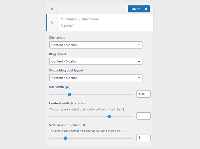
Global site options can be modified under the Site Options panel.
Under the Layout tab you can modify the site’s, blog’s and single blog post’s layout, configure the overall content width and fine tune the content/sidebar column ratio.
Under the Colors tab you can fine tune the theme’s main colors scheme and set a background image.
Finally under the Typography tab you can customize the site’s font pairing by choosing among a huge selection of Google Fonts. Google Fonts can be disabled entirely if so desired.
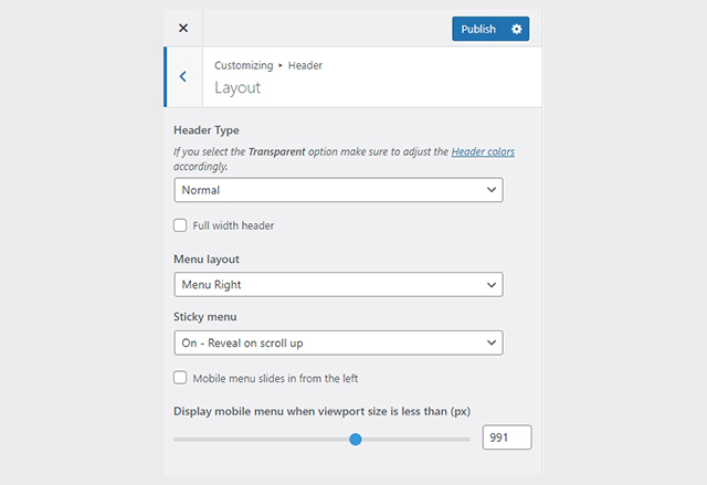
Header
The theme’s header can be broken down to three main components, the Top Bar, the Logo area and the Main Menu. Below we’ll take a look at each one.
Navigate to Appearance > Customize in your dashboard or click the Customize button on the WordPress admin bar to access the theme’s customization options.
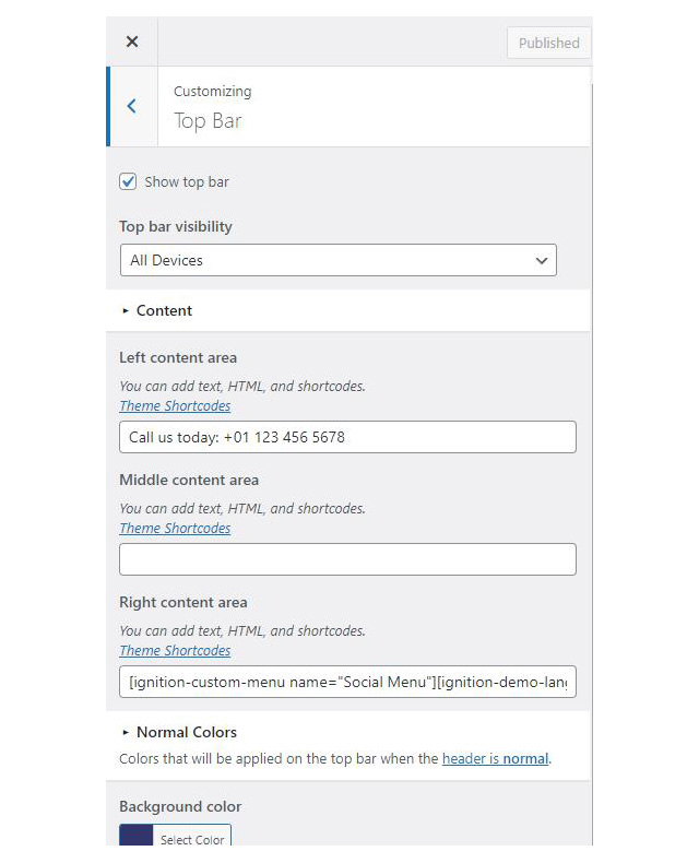
Top Bar
The Top Bar section offers 3 content areas which can host text, HTML or one of the theme’s custom shortcodes. Please refer to the shortcodes section below for more information. Furthermore, here you can modify the top bar’s background, text and border colors.
Logo

Under the Site Identity section you can upload your site’s main and alternative logos. The alternative logo can be used if you want a different logo to appear when the header layout is set to Transparent under Customize > Header > Layout. The recommended maximum width of your logo is 200px, height is not restricted.
Main Menu
If you are not familiar with WordPress menus here is a detailed guide.
To create your main menu navigate to the Menus tab in the Customizer and click on the Create New Menu button. Give it a name and check the Main Menu location for it to appear in. Click next to start adding your items and once done click Publish to save your changes.
Create a menu button
You can create a special button-like menu item by setting a certain class for to it. The class name is nav-button and you can set it under Appearance > Menus for the item you want. First enable this section from Screen Options.
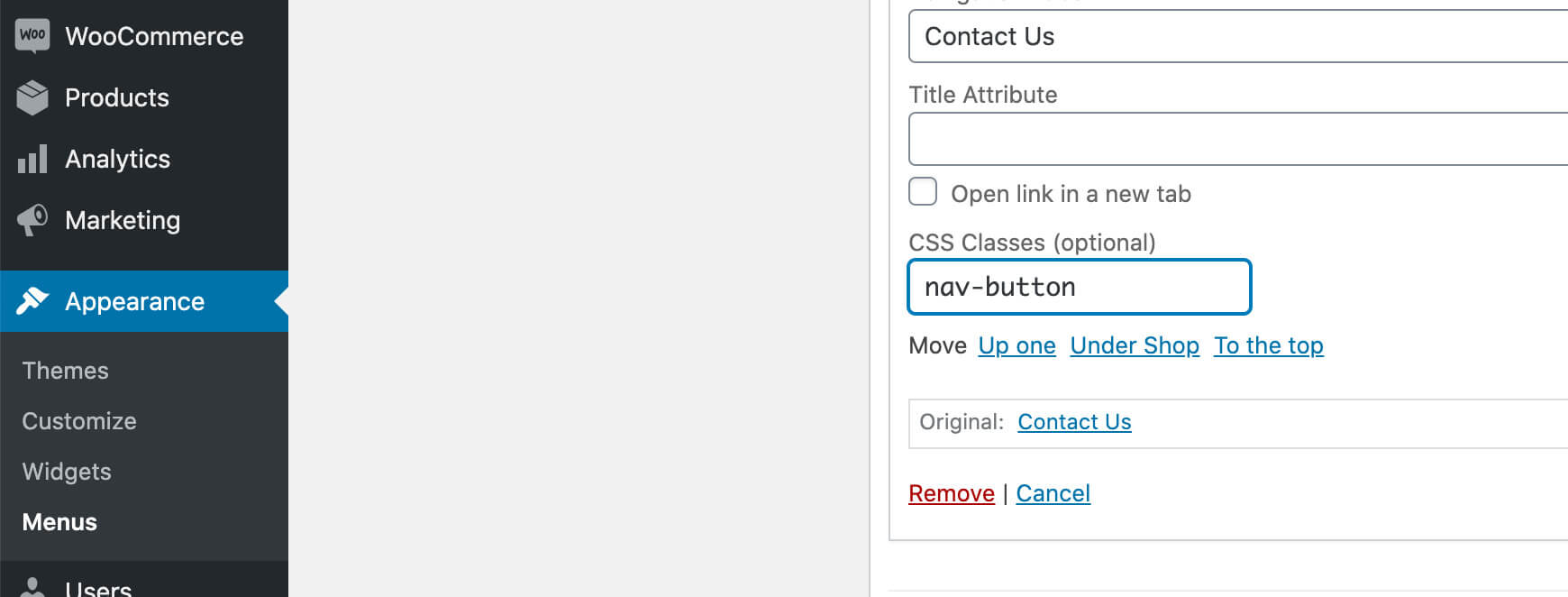
This is a predefined class you can use to create menu buttons.
Page Title section
This section allows you to create an area just below the menu which can display the page’s title & subtitle along with a background image or color.
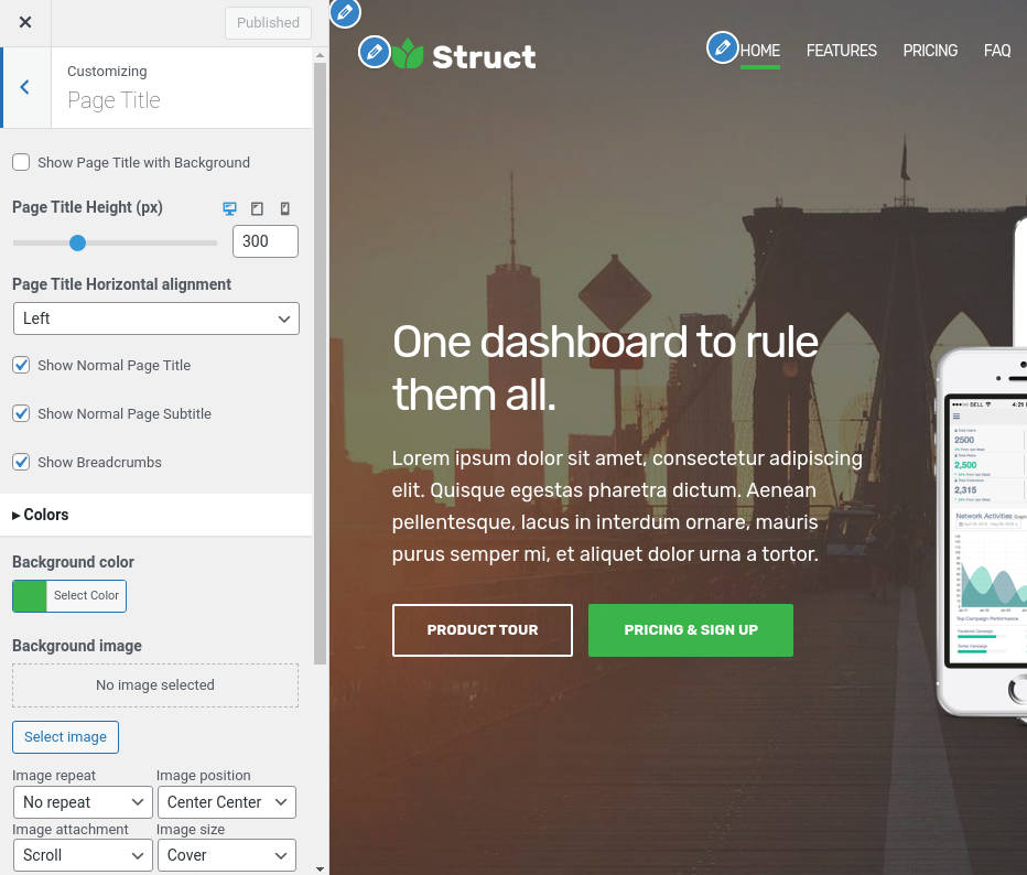
The page title section is common across all posts and pages and can be customized under the Page Title tab. The section’s height, content and its alignment, its colors and background image and finally the site’s breadcrumbs can be controlled from here.
The page title section’s background image can be overridden on each post or page if desired. When editing a post or page, in the right hand sidebar you will find a Page Title Image section where you can upload a background image to display instead of the default one.
Footer
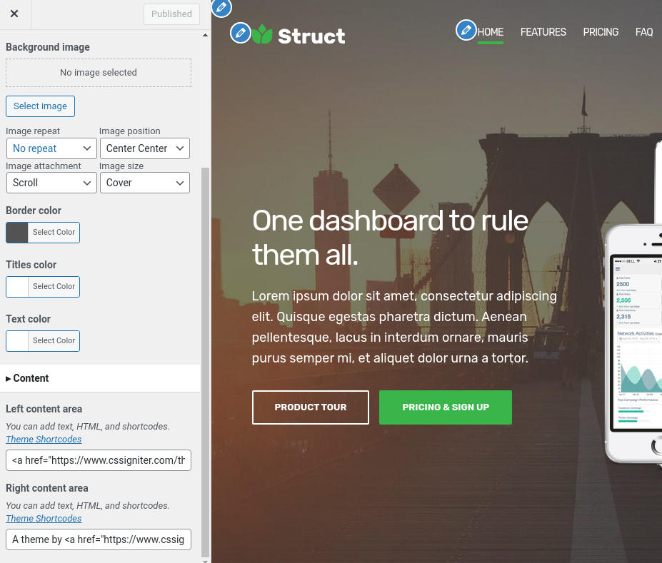
The footer area is a widgetized area that can be populated with widgets through Customize > Widgets. You can also remove the credits at the very bottom of this area by visiting Customize > Footer > Credits content. You can also adjust the colors by setting a background color & image and modify the border, title and text colors.
Utilities
Lightbox
The theme offers a lightbox for your images which is by default disabled to avoid conflicts with third party plugins which offer lightboxes. If you want to use it you can enable it under Customize > Utilities > Lightbox.
Weather
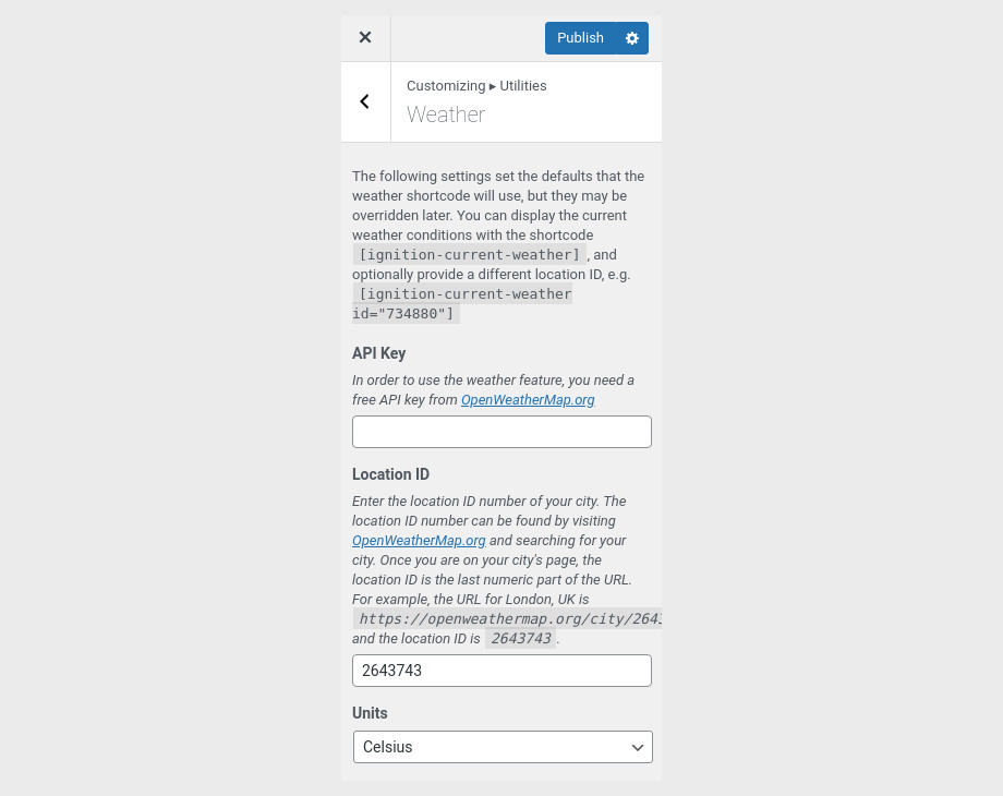
You can choose to show the weather for a chosen location using the weather shortcode anywhere inside your installation. First you will need to set it up by providing an API key and location under Customize > Utilities > Weather.
Block editor Dark Mode
Some themes have dark color schemes which are reflected in the block editor, this can make working with certain blocks a bit harder. Enabling the editor dark mode using the provided checkbox will apply certain styles to the editor in order to improve the content creation experience.
For more information check out this knowledge base article about available customization options.
Custom post types
Creating a new Portfolio Item
Create a new Portfolio item under Portfolio > Add New. Under the Portfolio tab on the right hand sidebar you can control some of the post’s basic attributes. These are:
- Summary: Control the location and appearance of the sidebar.
- Categories: Set a category for the item which will also serve as a filter on the post type’s listing pages.
- Featured image: Will appear on all related listings and on the item’s single page.
- Excerpt: Add a manual excerpt that will appear on post listings and on the page title section as a subtitle (if applicable).
- Page Title image: Set a custom post title background image for the item. Leave blank if you want to keep the default settings configured earlier.
- Page Settings: Here you can fine tune the item’s appearance. E.g. toggle the featured image, change header type, hide the page title/subtitle, breadcrumbs etc.
Create a navigation menu for Portfolio items
Create a new menu under Customize > Menus, don’t set any location to it and add your portfolio posts as menu items. If custom post types don’t appear when trying to add them to the menu you can enable them under Screen Options.
Under the Widgets panel in the Customizer add a Custom menu widget in the Portfolio sidebar and select the portfolio menu you have just created for it.
Creating a new Service Item
Create a new Service item under Services > Add New. Under the Service tab on the right hand sidebar you can control some of the post’s basic attributes. These are:
- Summary: Control the location and appearance of the sidebar.
- Categories: Set a category for the item which will also serve as a filter on the post type’s listing pages.
- Featured image: Will appear on all related listings and on the item’s single page.
- Excerpt: Add a manual excerpt that will appear on post listings and on the page title section as a subtitle (if applicable).
- Page Title image: Set a custom post title background image for the item. Leave blank if you want to keep the default settings configured earlier.
- Page Settings: Here you can fine tune the item’s appearance. E.g. toggle the featured image, change header type, hide the page title/subtitle, breadcrumbs etc.
Creating a new Team Member
Create a new Team item under Team > Add New. Under the Team Member tab on the right hand sidebar you can control some of the post’s basic attributes. These are:
- Summary: Control the location and appearance of the sidebar.
- Categories: Set a category for the item which will also serve as a filter on the post type’s listing pages.
- Featured image: Will appear on all related listings and on the item’s single page.
- Excerpt: Add a manual excerpt that will appear on post listings and on the page title section as a subtitle (if applicable).
- Page Title image: Set a custom post title background image for the item. Leave blank if you want to keep the default settings configured earlier.
- Page Settings: Here you can fine tune the item’s appearance. E.g. toggle the featured image, change header type, hide the page title/subtitle, breadcrumbs etc.
Setting up the pages
Homepage
Create a new page under Pages > Add New, then select from the right side under Summary the Full width boxed template. From Page Settings > Content Area check the Remove top/bottom content padding and under Page Settings > Page Title set all options to hide.
Now let’s take a look at the blocks that build our content. All blocks used here are provided by our free GutenBee custom blocks plugin, unless mentioned otherwise.

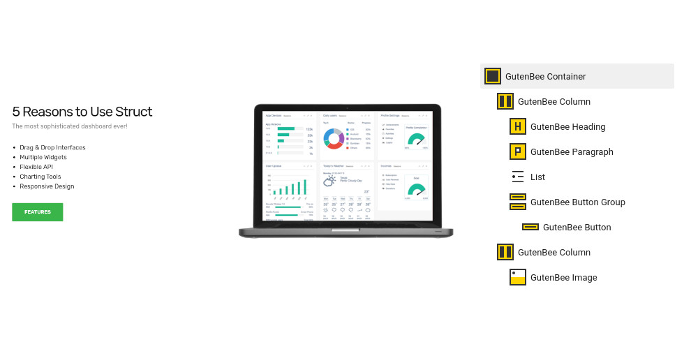
The homepage main hero section features a Container block with two columns, full alignment and a background image set under Block Attributes. In the left column we have a Heading, a Paragraph and a Button. The right hosts an Image Block.
The next section consists again of a Container block with two columns. The left column houses a Heading, a Paragraph a core list block and a Button. The right column hosts an Image block.

The inner hero section is also a fully aligned Container block with a background image and two columns. The left column includes a Heading, a Paragraph and a Testimonial block. The right column is empty.
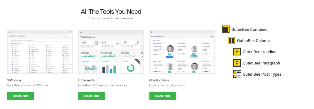
The home services section starts again with a GutenBee Container with a single column and centered content. Inside we have a GutenBee Heading, a GutenBee Paragraph and the GutenBee Post Types block. The Post Types block has the Services post type selected and displays three items in a three column layout.
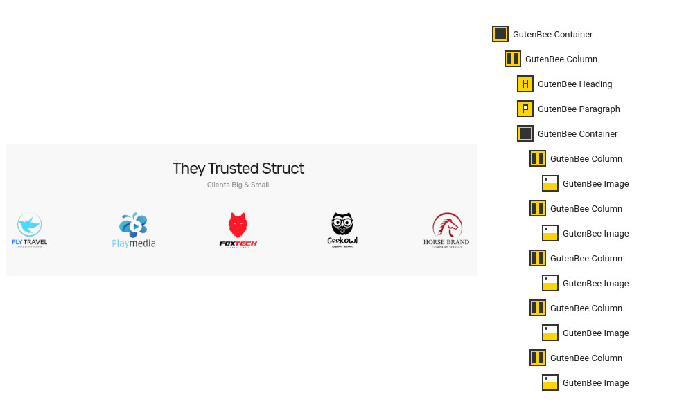
The clients section starts again with a fully aligned GutenBee Container with a single column and centered content. Inside we have the usual heading and paragraph blocks. Next is another GutenBee Container with five columns. Each column contains a GutenBee Image block with the logo of each client.

The intro section consists of a Container block with a single column. The column contains a Heading, a Paragraph and a Video Embed.

The next section consists of a Container with a single full width column, the content in the column is centered horizontally. Inside it we have a Heading and a Paragraph. Next there is another Container with four columns. Each column hosts an Image Box. Closing the section is a Button.
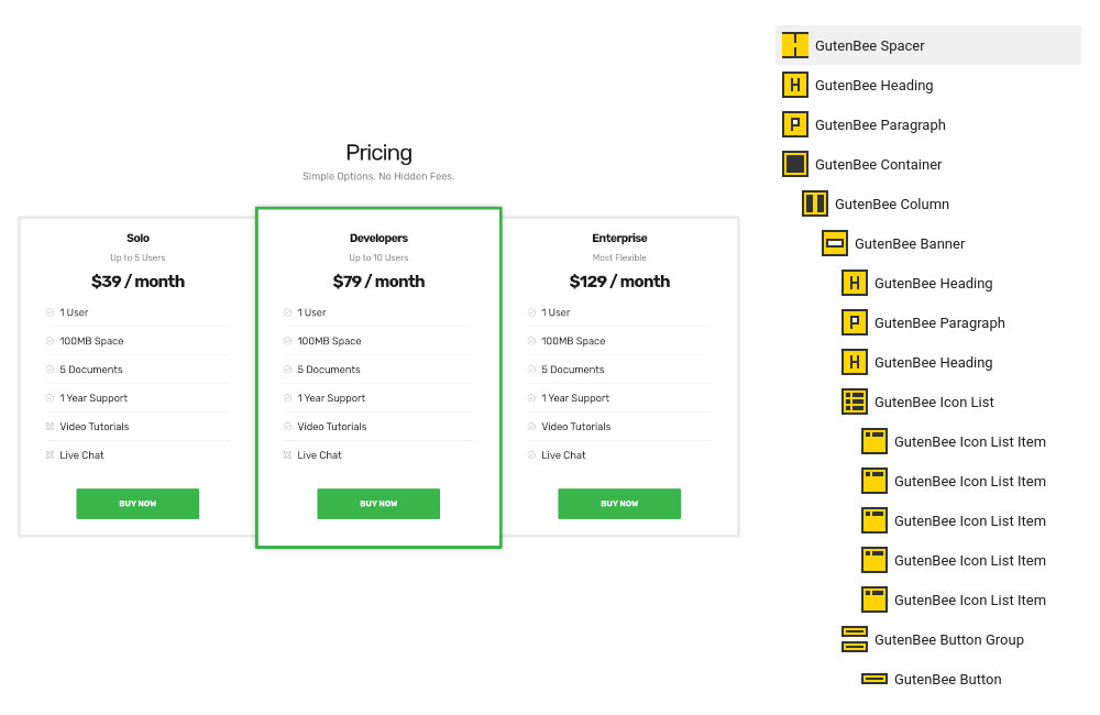
To create the pricing section we start with a Spacer just after the second inner hero section. After that we add a Heading, a Paragraph and a Container with three columns. In each column we have a Banner block with a 4px border and 20px padding. In the banner block we have a Heading, A Paragraph, another Heading for the price, an Icon list and we close up the column with a Button. To make a column pop-out change the color of the border and apply some more padding to its banner.
Creating Portfolio, Team and Services Pages
To create a post listing page start by creating a new page under Pages > Add New. Set the page template under Summary section to Full width boxed.
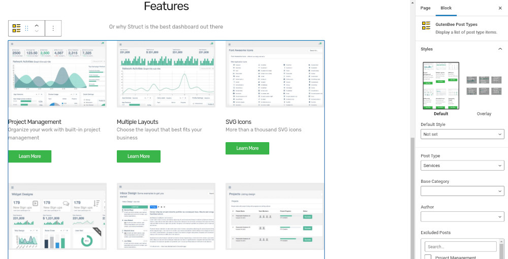
Next, add a GutenBee Post Types block to the page and select the post type you wish to display posts from. Select the default or Overlay style depending on how you want your items to appear. Select how many items you want to display and toggle the pagination if desired. Finally you can select the number of columns of the post grid and enable category filters.
Pricing page
Create a new page under Pages > Add New and set the page template under Summary section to Full width boxed.

The pricing page begins with a pricing table identical to the one described above for the homepage. Next we have an Image block with credit card logos and finally another Container block with two columns. Each column hosts two sets of core heading-paragraph blocks.
About page
Create a new page under Pages > Add New and set the page template under Summary section to Full width boxed.

The alternating timeline layout is created by a GutenBee Container with a single column. Inside it we find three more GutenBee Containers with a two column layouts. The left column contains a GutenBee Paragraph and a GutenBee Icon Box block and the right column is left empty. This pattern repeats, only each time the opposite column is empty, so for the second timeline item the left column will be empty for the third again the right etc.
The team section consists of a GutenBee Heading, a GutenBee Paragraph and a GutenBee Post Types block which displays the Team post type.
Finally the hiring section consists of a GutenBee Heading, a GutenBee Paragraph, a core table block and a GutenBee Button.
FAQ page
Create a new page under Pages > Add New and set the page template under Summary section to Full width boxed.
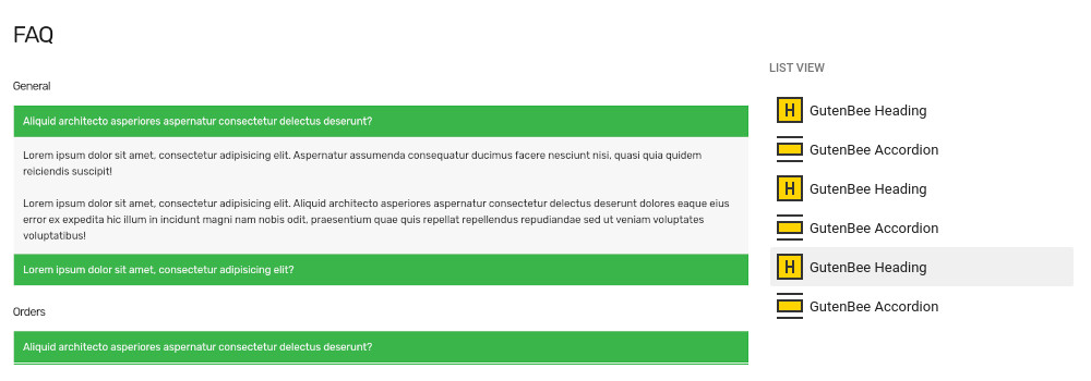
The FAQ page consists of three sets of alternating GutenBee Heading and GutenBee Accordion blocks.
Contact page
Create a new page under Pages > Add New and set the page template under Summary section to Full width.

The contact page starts with a GutenBee Google Maps block. Next we have a GutenBee Container block with the Theme Grid option enabled. Inside we have two columns. The left column houses four GutenBee Icon Boxes and the right one has a shortcode block containing the contact form shortcode from your preferred contact form plugin.
Common features
This section offers information on features common on all Ignition Framework based themes.
Shortcodes
The Ignition Framework offers a multitude of custom shortcodes these are:
Custom menu: [ignition-custom-menu name=”your menu name”]

Site search: [ignition-site-search]

Date: [ignition-date]

Weather: [ignition-current-weather id=”your-location-id(optional)”]

Minicart button: [ignition-minicart-button]

Language switcher: [ignition-language-switcher]

Icon link: [ignition-icon-link]

Instagram Feed: [ignition-instagram-feed]

WooCommerce search: [ignition-wc-search]
For more information have a look at this knowledge base article about shortcodes and their usage.
Page options
All themes offer six different templates which modify the location and appearance of the sidebar and the main content’s width.
Additionally pages have a common set of options which allow you to customize the appearance of the page title section, toggle breadcrumbs and more.
All settings are inherited from Customizer. So you can actually set some global settings and if you wish change certain pages to have different behavior.
Read the following article for a detailed explanation of the available templates and their options.
WooCommerce
Ignition Framework based themes are compatible with WooCommerce giving you the ability to create awesome online stores which perfectly match the appearance of the rest of your site.
WooCommerce is an optional plugin. You don’t need to install it if you are not looking to build an online store.
After activating WooCommerce it will create and set some default pages. These will serve as your Shop, Cart, Checkout and My Account pages.
The framework offers various customization options both for the main product listing page under Customize > WooCommerce > Product Catalog and for single products under Customize > WooCommerce > Single Products.
Learn more about the WooCommerce integration and the options offered here.
Global Sections
With the Global Sections custom post type included in all Ignition Framework based themes users can create content which can be easily reused in more than 15 key theme locations. For example users can create a newsletter subscription call to action box and immediately display it above the footer on all (or some) posts and pages, or create a banner ad an easily add it between posts in post listings etc.
Check out our knowledge base article for more information about Global Sections.
Blog page
This is you main blog page. You can create a new page and set it as your posts page under Customize > Homepage Settings. You can customize it under Customize > Blog from the Archives section.
Widget areas
The theme provides special widget areas for your posts listings, pages and shop. You can use a plugin/module like Jetpack’s widget visibility to hide or show widgets for certain pages, posts or products.
Support
If you need help during the initial installation and setup of this theme feel free to get in touch and we will get back to you within 24 hours to help.