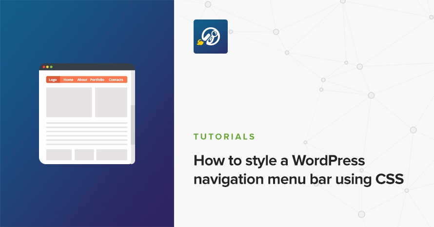
How to style a WordPress navigation menu bar using CSS
Writing styles for navigation menus nowadays is mostly a routine job; after all, CSS has made strides in the last few years, we can even mimic hover-intent on menus without any JavaScript at all (a topic which we’ll cover on a dedicated tutorial).
WordPress isn’t much different, the native menu functionality is powerful and versatile enough to give us with exactly the HTML we’d require, plus a few more options for providing a better user experience to our users. The aim of this post is to take you through those and provide a complete solution on how to style a native WordPress navigation menu.
Adding a WordPress menu to our website
Displaying a nav menu on your WordPress site is generally very simple, it only takes a couple of lines:
Then all you have to do is go through the usual process of creating a menu and adding items to it via the admin dashboard.
For this tutorial we’ll assume our menu’s structure is as follows:
├── Home
├── Blog
|   ├── News
|   ├── Sports
|   ├── Fashion
|   |   ├── Article #1 Title
|   |   ├── Article #1 Title
|   ├── Business
├── About
└── Contact
So basically a menu of three levels (our final styles will support infinite nested levels). This would produce roughly the following markup:
I said “roughly” before, and that’s because although the actual HTML structure will remain the same throughout our website, WordPress will add very specific classes depending on what page we’re currently viewing.
We need to keep in mind that WordPress adds the following three important classes to the menu’s <li> elements with the following rules:
- .menu-item-has-children: Menu items that contain sub-items (just like “Blog” and “Fashion” in our example).
- .current-menu-item: Menu items that correspond to the currently viewed page (so in our example we just opened the homepage as “Home” contains this class).
- .current-menu-ancestor: Menu items that are ancestors (parents, grandparents) of the menu item which corresponds to the currently rendered page.
We’ll very soon see how to use these classes in our stylesheets.
WordPress also adds a few other classes that generally do not concern us in a normal menu, but can become useful in very specific use-cases so be sure to check them out.
Giving the menu some structure
With the markup in place it’s time to start styling our menu. We’ll be using Sass instead of vanilla CSS. Sass comes very handy here, especially in styling menus where there’s a lot of nesting involved. It’s extra useful because (as with most things in WordPress) we need to style everything on our menu under its main class namespace (.navigation-main). This will prevent our styles from “bleeding” out to other potential menus we might have in our theme.
In general, when I write styles for a navigational component with a complex functionality I like to split styles into blocks “structure/functionality” and “presentation/appearance” styles, even if that means that I have to be a bit more verbose or even duplicate some selectors. I’ve found that it provides a clear separation of concerns and becomes a much more maintainable paradigm, especially when the component’s presentational requirements become very complex (think animations, different colors for each sub-item, etc). We’re not going to deal with that kind of stuff right now, but it’s a good practice to have in mind when the CSS concerns are so cleanly separated in a particular isolated component such as this one.
This is all it takes to imbue the functionality of a standard navigation menu, and support infinite nested levels. We absolutely position all sub-menus, offset them out of screen (we don’t set their display property to “none”) and we reposition them on hover making them visible.
Here’s how this all looks:
Try hovering over “Blog”, and then “Fashion”.
It’s kinda ugly though, so let’s make it a bit prettier.
Adding appearance and visual clues to the menu
Pretty basic stuff, some background and link colors:
And here’s how it looks now:
Although our menu is starting to look good it’s missing a couple of things which are quite important for a good user experience.
First of all, it would be nice if while the user hovers over different nav items their parents and ancestors remain highlighted. It helps with visual identification of the current hovered path and it just looks better, so let’s fix that with the following extra selector:
Secondly, we must highlight the nav items which correspond to the currently viewed page. That means that, if a user is at “Home” we should highlight the “Home” item, and if a user is viewing “Article #1” the menu should highlight all its ancestors up to and including “Blog”.
Here’s where the classes we mentioned before come into play, and it’s very simple to handle the above scenarios:
Check out how “Home” now remains active and how if you navigate all the way through “Article #1” its ancestors will also stay highlighted:
Adding visual clues for items with children
It’s also a standard good practice to provide a visual clue (such as an arrow) for items with nested sub-menus. The tricky part here is that items belonging to the first level (main menu) should have arrows pointing down, while the rest should point right. As a final step let’s see how we’d go about this:
Note that I’m creating CSS triangles with the border trick but you’re free to use whatever you wish, e.g. FontAwesome icons (fa-angle-down is a good choice).
And the result:
Pretty good! Looks like we’re all done with our menu, perfectly styled and ready for deployment.
Going the extra mile: Making the menu accessible
Our menu is pretty much finished but it would be awesome if we could make it accessible to keyboard users, navigating with the tab button. For this we’ll need to write some very basic JavaScript and only add a couple of classes to our CSS:
This toggles a class on a menu item every time we focus on its link. This way we can simply alter our CSS to display the sub-menus when that class is present:
And we’re done! Let’s look at a complete example with more nested levels and the current menu item on a lower level than the main menu. Try hovering over and tabbing through and it should all work great!
Let us know in the comments how you prefer to style your WordPress menus or any tips and tricks you might have up your sleeve, and, oh! if you’d also like to convert your menu into a mobile drawer for mobile devices we’ve got you covered :)
63 responses to “How to style a WordPress navigation menu bar using CSS”
Thanks i must say am using it on my blog now and the menu is awesome
Thanks For THis article. With this, i can be able to modify and make some changes on my theme by myself.
Yes man
Hello, Sir,
Kindly solve my problem. I am using Unconditional WordPress theme. It doesn’t support the second level of the menu. I am not able to navigate to subpages. I like this theme and don’t want to change it but the sub-menu problem is existing.
Kindly help.
Regards
Hello.
Your best option would be to post in the theme’s support forum on WordPress.org here https://wordpress.org/support/theme/unconditional
Perhaps the author or someone using the theme has a solution for your issue.
Best regards.
Thanks man
Thanks for sharing this article it really help me to understand well
Great post. Extremely helpful. But how can we make this menu responsive?
Thanks for the kind comments! Making a menu responsive is kind of a custom deal as you’d need to know your requirements before doing so, you could get away with a simple display: block on everything and implement some JavaScript in order to hide/show the menu entirely on click or you can use the magnificent jQuery mmenu plugin http://mmenu.frebsite.nl/ which is our choice as well.
I was able to modify my theme a little bit if customize it to my test using this particular guide.
But I have a question to ask. Is it possible for Google to stop indexing your blog when a new theme is installed?
Since I installed the theme my post is not coming up
Hiya, generally blocking your site from search engines has nothing to do with the theme but WordPress and the server itself. Here’s an article by WPBeginner with a lot of info of how to accomplish that: https://www.wpbeginner.com/beginners-guide/how-to-stop-search-engines-from-crawling-a-wordpress-site/
There’s even a setting in the WordPress dashboard options.
Thanks for your response, I have been able to resolve the issue because my whole site was affected and i was worried if it’s the theme
I did notice same on one of my blog and i couldn’t fetch and render via Google webmasters tools but i think most times it’s the DNA that is the main cause.
Happy blogging
You mean to say the DNS yes that may be the cause
Thanks for the article. How we can expand this code to mega menu?
Heya, glad you liked it. Implementing a mega menu is a bit more involved to fit in a comment, plus there’s all sorts of different mega menus around (images etc) so generally it’s up to the developer to do it, but the logic remains the same pretty much, in your child ul > li elements add a div element and content inside it :)
Hi, this was very helpful, as I’m just getting into CSS as I help a friend of mine with his business website (wordpress). One thing that has been bugging me though is the navigation “block”. There are 20 categories with dropdowns. It’s currently set to float, so it’s only taking up 4 rows on the page, but the “justification” is to the left. Just for aesthetic purposes, is there a way to set the navigation block so that each line of links is “centered” – so there’s the same amount of “padding” on the left and right of each line?
Hiya, you’d have to set display: flex on the ul.navigation and then justify-content: space-between.
Hello,
Thank you for the tuto !
I’ve got two probleme :
The submenu disappear when the mouse left the parent element of the submenu. So when the mouse flies over an submenu item, the submenu disappear.
The other probleme is the z-index. I don’t anderstand why the menu is under the other elements of the page, I think the probleme is dependant of my theme OKAB but if you have an issue for me it would be cool.
Thanks
For the first issue I think you’ve added some kind of `margin` on your parent submenu elements and as such while the pointer leaves the element it loses hover state. Please try to check if you have some kind of margin and replace it with padding if possible.
For the second issue unfortunately there’s no way to help you directly, you need to check which element has a higher z-index and what that z-index is and adjust the menu to use a higher one!
Are you using wordpress v5 ?
At the time this was written no but shouldn’t make any difference.
I must confess, this post is helpful to me.
Thank you very much for this post, I was able to fix some issues with it. Keep up the good work here.
What a great work there, it works perfectly well on my blog. Thanks
What a great work there, it works perfectly well on my blog. Thanks
this guide worked perfectly for me
i love this blog
i hope to find another solution to my blog problem
you just solve my problem I thank you ones again i love your website keep it up have bookmarked it
What a great guide there, it works perfectly well on my blog. Thanks
Thanks for sharing
Wow! This is a great guide, this is what I have been searching for but actually I found it here, thanks bro.
hi i need a solution for how to make navbars active for their respective pages in wordpress
Hello, the post has this covered, you need to style the ‘current-menu-item’ classes. WordPress also adds a different classes if it’s a page menu. You can see all CSS selectors that WP adds to its menu here and style accordingly: https://developer.wordpress.org/reference/functions/wp_nav_menu/#menu-item-css-classes
Thanks for sharing this information with us it really helped me understand
you just solve my problem I thank you ones again i love your website keep it up have bookmarked it
Really good here, styling a WordPress website following your guide makes it super simple.
wow, thanks man, you made everything easy for me, styling my blog to my taste hasn’t been easy
Hello,
Thank you for the tuto !
I’ve got two probleme :
The submenu disappear when the mouse left the parent element of the submenu. So when the mouse flies over an submenu item, the submenu disappear.
The other probleme is the z-index. I don’t anderstand why the menu is under the other elements of the page, I think the probleme is dependant of my theme OKAB but if you have an issue for me it would be cool.
Thanks
Hello, we’d have to have some kind of code example or url to help out with the issue if there’s one available.
Thanks for bringing up this article
Thanks for sharing this
I really appreciate your time and effort on this article because it full of valuable information
Please i need more update till on this topic
Very detailed article, I think with this i can actually modify and make some changes on my theme by myself.
How to set it up for mobile as well? Adding some kind of “hamburger” style where the menu is collapsed on mobile devices, using a css break.
Is that possible?
Hello Roberta.
This process is a bit more involved and outside the scope of this guide I’m afraid. However I can offer some info to help you proceed. On our themes we tend to use mmenu.js to help us with mobile menus. The site has quite a lot of information and examples on how to implement it on your site, and it also offers a WordPress plugin.
yeah exactly
Well where do u post all these css codes?
Hello! Typically you would put them in your theme’s style.css or even better a child-theme’s style.css.
If I update the theme, hope it would not be overriden?
Hello Eddy.
If you edited theme files directly then I’m afraid the answer is yes, if you update the theme changes will be lost. All changes should be made in a child theme (here’s a guide on how to create one) so they can be preserved after an update. If you only need CSS for your modifications you can place it in the “Additional CSS” section under Appearance -> Customize, this way you can preserve CSS changes without the need of a child theme.
Sincerely I would say this site has been helpful
Hello I cannot login my account anymore please help
Hello.
I hope this has been resolved. If not, please contact us through our support page here and we’ll help you along.
I would say this is the best site ever
Hi,
What you Recommend the CSS which can load faster ? I have a blog where my sites load is too slow according to Google page speed site.
Hello Oliver.
You could try plugins like Autoptimize to minify and concatenate styles and scripts, additionally you could check out caching plugins for WordPress.
Best regards.
Your article was really impressive. Do keep post like this…
Hey man,
A lot of thanks 4 ur coding, was very usefull and simple, I am retaken stuff about css and remember than before I had a lot of work with make this menu, but you really make it easier…
Thx man…
A pretty useful tutorial. Still very useful even in 2022.
Very informative, Thanks for sharing. I think with this i can actually modify and make some changes on my theme by myself.
can this still work for for my work
Hello Sam.
Yes, this tutorial will still work.