WordPress and CSS Grid: Building a flexible listing template (2, 3 or 4 columns)
Listing templates are every WordPress theme’s bread and butter. Every type of content needs to be displayed somehow and listing templates are the norm when it comes to showcasing content that falls within the same family, i.e. posts, pages, products, or any kind of other custom post types. We use them extensively here at CSSIgniter with a lot of options like headings, animations, post meta visibility, and more. Our main and most wanted option though is the column number setting, i.e. choosing in how many columns to split the cards each post is contained within.
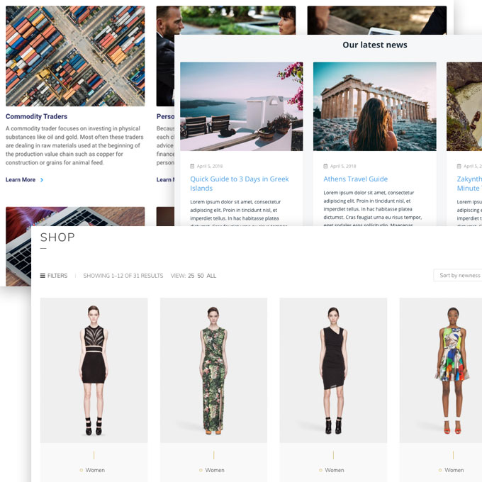
The figure above showcases how we lay out custom post types in a few of our most recent themes, Blockchain, Listee, and Løge.
In our HTML and CSS, we create our grid using Flexbox (we actually use our own version of the Bootstrap grid) and in this tutorial we’ll see how we can easily create a “CSS Grid Framework” with none other than the shiny new CSS Grid!
CSS Grid
We’ve talked about CSS Grid in our previous tutorial “Creating a simple WordPress blogging layout with CSS Grid and Flexbox“, and to sum up, CSS Grid is a new, powerful, and pragmatic solution CSS has to offer for authoring layouts. In this regard, it’s much more powerful than Flexbox and the difference with it is mainly about their scope: CSS Grid is meant for constructing and managing site-wide layouts (header, main content areas, sidebar, footer) and Flexbox more for component-level positioning (fine tuning alignment, element positioning, etc).
As previously said, in this post we’ll focus on re-creating a reusable column grid solution (using generic HTML classes, much like Bootstrap or other grid frameworks do) which will aid us in providing column options in our WordPress listing templates. Keep in mind that although this is a perfectly valid usage of CSS Grid’s powers, it also might appear a bit anachronistic, since CSS Grid is by itself a grid framework and shouldn’t require generic markup. That said, use cases vary wildly and the flexibility to give more options to our themes’ users is more important than puristic discussions.
A simple listing template
Creating a listing template is very simple within WordPress, we just need to make a new Page Template and loop through our content with WP_Query:
The above code is very similar to what we use in our themes (although a bit simplified for clarity). It will output ALL the posts in our WordPress site (notice posts_per_page = -1). The most important thing though for this tutorial is the markup we output for each post (within the WP_Query loop), and more specifically the .row and .col-6 classes, which we’ll examine right away.
The markup
For the markup we are going to follow Bootstrap’s norm: We are going to build a 12 column grid, with a gutter of our own choosing; a .row wrapper will be our grid’s container and each child underneath will have a .col- prefixed wrapper to signify its column span.
The first block in the above HTML markup would result into a two column (visually) appearance (as we are using 6 out of 12 columns for each item, and 12/6 = 2). Similarly, we’ll be able to create a 3 column appearance with col-4 and a four column appearance with col-3 classes. I know this might sound backward for anyone that is unfamiliar with how grids work, but remember that the number after the col- suffix is meant to signify how many columns our div should span out of 12 in total, so you always divide 12 by that number in order to get the actual viewable “column number”.
The CSS
Creating a grid framework with CSS Grid is extremely simple. The code we’re going to need is:
Let’s take a closer look at the code above. The display property is set to grid, this is very similar to display: flex, it simply enables the Grid display mode. The new grid-template-columns property defines line names and track sizing functions of our grid columns. We’re using the repeat function to create 12 columns each spanning 1 fraction (the new fr keyword introduced with CSS Grid means just that, a fraction of the total available space). Think of our grid as a field of tracks, and each track is a unit of containment. We’re basically saying that our field should be split into 12 tracks with each track spanning 1/12th of the whole available space. grid-column-gap and grid-row-gap are setting horizontal and vertical gutters respectively, i.e. the distance between our grid columns.
And that’s all for our grid container (the .row wrapper element). For the actual grid column items we’re setting their grid-column property. By default every child underneath .row would span exactly 1/12th of the available space (remember fractions), by explicitly defining grid-column spans on different grid column items we can adjust how much of the available fractions each one can take. grid-column: span 6 will force that particular element to span six tracks (or fractions) of the available grid space horizontally.
The above markup combined with the above CSS results in the following grid demonstration:
.
Now we can make any kind of column combinations we want and provide them as options to our users.
Using Sass, the code could be much simpler and compact:
Making it responsive
We live in a mobile world, and having four items side by side in mobiles isn’t going to cut it! We need to make our grid framework responsive and mobile-first. Following the standard patterns, we’ll define a couple of different breakpoint sizes and provide class modifiers for our grid elements for all the different breakpoints. We want to be able to write our HTML markup like so:
Which really means that col-desktop-* classes will only apply to “desktop” sizes (e.g. 1200px and above), col-tablet-* only to “tablet” sizes (e.g. 768px up to the desktop breakpoint at 1200px) and so on.
With plain CSS this would be painful to write, as we’ll need to define each of our three col-breakpoint-* modifiers from 1 to 12 for 3 different Media Queries. That’s 36 declarations. Sass makes this much simpler:
Let’s dive a bit deeper into the code as anyone who’s unfamiliar with Sass can be a bit overwhelmed by it.
This is just a Sass map definition of our available breakpoints. We’re basically defining two here, one for tablets at 768px and one for desktops at 1200px. Our code is so flexible that if we ever needed to make our grid more granular in sizes all we’d have to do would be to add one and adjust the others from this map, everything else would be taken care automatically (one of the joys of CSS preprocessors). We are going to use the keys of each key-value pair (e.g. mobile, tablet, desktop) to automatically insert the suffixes into our grid column CSS classes. You can name them anything you wish (e.g.xs, sm, lg if you wish to be less verbose in your HTML code).
We iterate on this Map, and for each one of the keys (again, mobile, tablet, desktop), we get its corresponding value (which is our breakpoint width in pixels). Right now we have two variables in our @each statement, $breakpoint which is the name of the breakpoint key and $breakpoint-width which is the breakpoint’s width. All we have to do now is loop from 1 to 12 within a Media Query and apply our grid-column property to each class as we did before:
This is exactly the same with our simple non-responsive example with two differences: We’re wrapping everything under the respective media query (remember we’re already in an iteration of our breakpoints), and in .col-#{$breakpoint}-#{$i} we are stuffing the breakpoint name in between col- and the column’s number (so that the output will be col-desktop-6, etc).
A demo of what we accomplished:
(Make sure you open it up in larger window and resize to see the change in column numbers).
And that’s it! A full blown responsive, mobile-first grid framework with the power of CSS Grid in just 25 lines of code. Ready to be used in our WordPress themes and any kind of listing template.
What do you think about CSS Grid, when do you think you’ll be able to start using it, and what other options do you provide your users with on your listing templates? We’d be glad to know in the comments below!
9 responses to “WordPress and CSS Grid: Building a flexible listing template (2, 3 or 4 columns)”
While I’m sure it wasn’t your intention in posting this, this article is a fantastic demonstration of how much Bootstrap can complicate things. If you skipped Bootstrap, you could do the whole thing in about 3 lines of CSS, with no need for any breakpoints at all.
Thanks for the comment! You’re certainly not wrong :) One of the intro paragraphs of the post is exactly because I saw this comment coming:
There are certainly a lot of ways to use (and abuse) CSS Grid, and the post’s aim is also to showcase something for everyone, WordPress, CSS Grid, Sass, Bootstrap etc. Again, thanks for the comment and I agree, except on some minor cases with stubborn theme users :)
This tutorial is very confusing, where do you save the php file, where do you save the CSS, Sass and the HTML?
You described the coding part but what about where to save the files?
Is this for a theme created from scratch?
If I have a storefront theme already installed how can I add my own homepage layout? or any other page?
Or are you assuming to add a child theme?
Or just create a new page, and dump all the content in that page?
Hello… Donald? :) You can have the PHP and SCSS/CSS files in your theme’s root directory. Or your child theme, the choice is yours. The tutorial doesn’t assume a new theme from scratch, you could certainly incorporate the code into an existing theme. The tutorial is mainly here to demonstrate the concept and the way of doing it, not 100% hand hold the reader as that would be impossible and depending on the needs of the theme.
As a final note, you can compile Sass/SCSS using your editor (VSCode for example has plugins that can do it out of the box) or follow our more involved tutorial with Gulp here https://www.cssigniter.com/use-sass-gulp-wordpress-theme-plugin-development-workflow/
Really elegant mixins! Thank you, I’ll be using them.
Also, I dont think these generic columns are not outdated now. It’s often much more efficient to have some global helper classes, than opening a whole new BEM-Modifier just to adjust some layout positioning. Allows to capsulate your components tighter.
How to get the featured image of the post in grid layout ? I have tried the code you have provided , I can see the posts in grid layout but without the featured image .Please help
Hello, it’s just a matter of getting the post thumbnail via WP, all you need is: https://developer.wordpress.org/reference/functions/the_post_thumbnail/
I am stuck on adding pagination to this grid – could you please share a link with me that gives a tutorial on this part.
Hey, I’m not aware of any tutorials but I’m also not sure I understand that question. A pagination would be just an extra