Documentation for Shortcodes
Notice
Shortcodes are not very easy to use. Have a look at GutenBee, a free plugin with custom blocks for the new block editor.
Plugin installation
CSSIgniter Shortcodes is available through the WordPress plugin repository and thus can be installed like any other plugin. Navigate to Plugins > Add new and search for CSSIgniter Shortcodes. Then proceed to install and activate the plugin.
Plugin settings
Under Settings > CSSIgniter Shortcodes you will find the plugin’s global options.
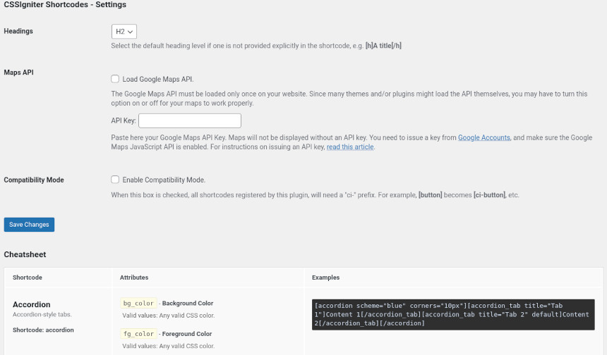
Here you can select the default heading output by the shortcode if none is specified, choose to load the Google Maps API and add your API key and toggle the compatibility mode in case you encounter any conflicts with other shortcodes.
Additionally you will find a handy cheatsheet with all the available shortcodes, their attributes and usage examples.
Using the shortcodes
To use the shortcodes edit any post or page and add a shortcode block, in the shortcode block paste in the shortcode of the item you wish to display and publish/update your post.
The shortcodes
Button
[button][/button]
Available attributes
- url – Where the button links. Any valid link. Default ‘#‘.
- target – Where the link should open. Any one of: ‘_blank‘, ‘_self‘, ‘_parent‘, ‘_top‘. Default empty.
- size – The size of the button. Any one of: ‘small‘, ‘medium‘, ‘large‘. Default ‘medium‘.
- scheme – Color scheme. Any predefined color scheme name.
- bg_color – The background color of the button. Any valid CSS color.
- fg_color – The foreground (text) color of the button. Any valid CSS color.
- border_color – The border color of the button. Any valid CSS color.
- border_width – The width of the border. Any valid CSS border-width: value.
- corners – The radius of the border’s corner. Any valid CSS border-radius: value.
- icon – A Font-Awesome icon name. E.g. ‘fa-download‘
- spin_icon – Turn icon spinning on. See spin_icon.
Examples
[button url="http://example.com"]A simple button[/button]
[button url="http://example.com" scheme="green" border_color="black" border_width="1px" icon="fa-shopping-cart" spin]A messed up button[/button]
Box
[box][/box]
Available attributes
- scheme – Color scheme. Any predefined color scheme name.
- bg_color – The background color of the box. Any valid CSS color.
- fg_color – The foreground (text) color of the box. Any valid CSS color.
- border_color – The border color of the box. Any valid CSS color.
- border_width – The width of the border. Any valid CSS border-width: value.
- corners – The radius of the border’s corner. Any valid CSS border-radius: value.
- icon – A Font-Awesome icon name. E.g. ‘fa-download‘
- spin_icon – Turn icon spinning on. See spin_icon.
Examples
[box scheme="red" icon="fa-ban"]My error box[/box]
[box border_color="pink" border_width="2px" corners="8px 16px"]My strange box[/box]
Grid
[row][/row], [column][/column], [col][/col]
With these shortcodes you can create a grid system within your posts or pages which will allow you to display your content in columns. The shortcode uses a twelve grid layout so the maximum sum of columns in a single row can’t be more than twelve. Start by creating the [row][/row] shortcode which is the container for your columns, much like a row in a spreadsheet contains the cells from each column. Then proceed by adding the [col][/col] or [column][/column], each [col][/col] shortcode will have a number which will represent how much of the available width the particular column will take up, for example if you have [col desktop=”6″][/col] this column will take up 6 columns from the total 12, so half the available width. You are now left with 6 more columns which you can either use up in one or more [col][/col] shortcodes.
row – Available attributes
- none
column, col – Available attributes
- desktop – Number of columns for the medium breakpoint ‘md‘.
- tablet – Number of columns for the small breakpoint ‘sm‘.
- mobile – Number of columns for the extra small breakpoint ‘xs‘. Default ‘12‘
- class – Additional classes for the generated wrapper. Useful for applying styles and/or targeting in custom styles.
- id – An optional HTML id value for the generated wrapper. Useful for targeting in custom styles.
Examples
[row][column desktop="6"]First column[/column][column desktop="6"]Second column[/column][/row]
[row][col desktop="6"]Column A[/col][col desktop="6"]Column B[/col][/row]
[row][col desktop="6"][_row][_col desktop="4"]Col A1[/_col][_col desktop="8"]Col A2[/_col][/_row][/col][col desktop="8"][_row][_col desktop="4"]Col B1[/_col][_col desktop="6"]Col B2[/_col][/_row][/col][/row]
Headings
[h][/h], [h1][/h1], [h2][/h2], [h3][/h3], [h4][/h4], [h5][/h5], [h6][/h6]
With the h shortcode, you can create styled headings for you content. The shortcodes h1-h6 are just shorthand aliases to h with the level attribute already set.
Available attributes
- level – The heading level. A number between 1-6. Default ‘2‘ but can be changed through the plugin’s options.
- scheme – Color scheme. Any predefined color scheme name.
- bg_color – The background color of the heading. Any valid CSS color.
- fg_color – The foreground (text) color of the heading. Any valid CSS color.
- border_color – The border color of the heading. Any valid CSS color.
- border_width – The width of the border. Any valid CSS border-width: value.
- corners – The radius of the border’s corner. Any valid CSS border-radius: value.
- icon – A Font-Awesome icon name. E.g. ‘fa-download‘
- spin_icon – Turn icon spinning on. See spin_icon.
- padding – Add some padding in order to make the heading box larger. Any valid CSS padding: value.
Examples
[h level="3" scheme="red"]My Heading[/h]
[h2 icon="fa-gear" spin bg_color="#45a78f"]Bigger Heading[/h2]
List
[list][/list]
You can replace those boring default HTML bullets by any icon you like. Just create a normal unordered (ul) list from within the WordPress editor, and wrap it in a [list][/list] shortcode.
Available attributes
- scheme – Color scheme. Only affects the icon. Any predefined color scheme name.
- color – The color of the icon. Any valid CSS color.
- icon – A Font-Awesome icon name. E.g. ‘fa-download‘
Examples
[list]<ul><li>Item 1</li><li>Item 2</li></ul>[/list]
[list scheme="brown" icon="fa-check" color="rgba(0, 100, 255, 0.5)"]<ul><li>Item 1</li><li>Item 2</li></ul>[/list]
Blockquote
[quote][/quote]
Available attributes
- title – The citation text, i.e. who said what you’re quoting.
- scheme – Color scheme. Any predefined color scheme name.
- bg_color – The background color of the blockquote. Any valid CSS color.
- fg_color – The foreground (text) color of the blockquote. Any valid CSS color.
- border_color – The border color of the blockquote. Any valid CSS color.
- border_width – The width of the border. Any valid CSS border-width: value.
- corners – The radius of the border’s corner. Any valid CSS border-radius: value.
- icon – A Font-Awesome icon name. Default ‘fa-quote-left‘.
Examples
[quote scheme="red" icon="fa-quote-right" title="Who said it"]What he/she said.[/quote]
Separator shortcodes
[separator /], [hr /]
Both shortcodes separator and hr, are just aliases of each other and behave exactly the same.
Available attributes
- type – The type / styling of the separator. Any one value of: solid, dotted, dashed, double, groove, ridge, inset, outset. Default ‘solid‘.
- scheme – Color scheme. Any predefined color scheme name.
- color – The color of the separator. Any valid CSS color.
- height – The height of the separator (bottom border). Any valid CSS border-width: value.
- width – The width of the separator. Any valid CSS unit of length.
- center – Centered separator. Any one value of: true, on. Furthermore, a ‘center‘ value can be placed by itself as a shorthand, without the need for the attribute name.
Examples
[separator scheme="red" type="dashed" width="50%" center /]
[hr color="#00ff00" type="dotted" width="200px" /]
Tooltip
[tooltip][/tooltip]
Available attributes
- tip – The content that appears as the tootip. Required.
- position – The position of the tooltip relative to the hover-able text. Any one value of: top, bottom, left, right. If empty, the tooltip appears over the hover-able text.
- always – Always show the tooltip. Any one value of: on. Furthermore, a ‘alwayson‘ value can be placed by itself as a shorthand, without the need for the attribute name.
- color – The color scheme of the tooltip. Any one value of: dark, light. Default ‘dark‘. Furthermore, a ‘light‘ value can be placed by itself as a shorthand, without the need for the attribute name.
Examples
Do you know what a [tooltip tip="Central Processing Unit" position="top" alwayson light]CPU[/tooltip] is?
Map
[map /] , [googlemap /]
Available attributes
- lat – The latitude of a place in the map. Any decimal value between -90 to 90. Required.
- lon – The longitude of a place in the map. Any decimal value between -180 to 180. Required.
- zoom – Zoom level of the map. Any integer value between 0-21. Default ‘8‘.
- title – The text appearing when hovering over the map marker.
- text – The text appearing when the map marker gets clicked.
Examples
[map lat="40.7828649" lon="-73.9653549" zoom="16" title="Central Park" text="Lower Manhattan" /]
Important information regarding map shortcode usage
The maps API is off by default on new installations, to enable it go to Settings > CSSIgniter Shortcodes and check the Load Google Maps API box. Additionally you will need maps API key as it is mandatory for the map embed to work. More info about this here.
Slider
[slider][/slider] , [slide][/slide]
To create a slider wrap one or more [slide][/slide] shortcodes into a [slider][/slider] shortcode. The slide’s content will be placed in the slide shortcode, like this [slide] Slider content here [/slide].
slider – Available attributes
- scheme – Color scheme. Any predefined color scheme name.
- bg_color – The background color of the slider’s content. Any valid CSS color.
- fg_color – The foreground (text) color of the slider’s content. Any valid CSS color.
- border_color – The border color of the slider. Any valid CSS color.
- border_width – The width of the slider’s border. Any valid CSS border-width: value.
- corners – The radius of the slider’s border corners. Any valid CSS border-radius: value. Note: If you provide a single CSS unit value, it will only be applied to the to top-left and top-right corners of each tab. This is on purpose, to get the best result with minimal typing. If you need to affect all corners of the tabs, you’ll need to provide four values, e.g. corners=”10px 10px 10px 10px”
Examples
[slider scheme="blue" corners="10px"][slide]Content 1[/slide][slide]Content 2[/slide][/slider]
[slider scheme="blue" corners="10px"][slide]Content 1[/slide][slide]Content 2[/slide][/slider]
Tabs
[tabs][/tabs] , [tab][/tab]
In order to create a set of tabs, you need to wrap one or more [tab][/tab] shortcodes into a [tabs][/tabs] shortcode.
tabs – Available attributes
- scheme – Color scheme. Any predefined color scheme name.
- bg_color – The background color of the tabs’ content. Any valid CSS color.
- fg_color – The foreground (text) color of the tabs’ content. Any valid CSS color.
- tab_bg_color – The background color of the inactive tabs. Any valid CSS color.
- tab_fg_color – The foreground (text) color of the inactive tabs. Any valid CSS color.
- active_bg_color – The background color of the active tab. Any valid CSS color.
- active_fg_color – The foreground (text) color of the active tab. Any valid CSS color.
- border_color – The border color of the tab group. Any valid CSS color.
- border_width – The width of the tab group’s border. Any valid CSS border-width: value.
- corners – The radius of the tabs’ border corners. Any valid CSS border-radius: value. Note: If you provide a single CSS unit value, it will only be applied to the to top-left and top-right corners of each tab. This is on purpose, to get the best result with minimal typing. If you need to affect all corners of the tabs, you’ll need to provide four values, e.g. corners=”10px 10px 10px 10px”
tab – Available attributes
- title – The text that appears on the tab. Required.
Examples
[tabs scheme="orange" active_bg_color="fuchsia"][tab title="Tab 1"]Content 1[/tab][tab title="Tab 2"]Content 2[/tab][/tabs]
[tabs scheme="orange" active_bg_color="fuchsia"][tab title="Tab 1"]Content 1[/tab][tab title="Tab 2"]Content 2[/tab][/tabs]
Accordions
[accordion][/accordion], [accordion_tab][/accordion_tab]
Accordions’ syntax and attributes are exactly the same like the tabs shortcode. Only the actual names of the shortcode change. That way, you can easily swap from tabs to accordions and back, without touching any of the attributes.
accordion – Available attributes
- scheme – Color scheme. Any predefined color scheme name.
- bg_color – The background color of the accordion tabs’ content. Any valid CSS color.
- fg_color – The foreground (text) color of the accordion tabs’ content. Any valid CSS color.
- tab_bg_color – The background color of the inactive accordion tabs. Any valid CSS color.
- tab_fg_color – The foreground (text) color of the inactive accordion tabs. Any valid CSS color.
- active_bg_color – The background color of the active accordion tab. Any valid CSS color.
- active_fg_color – The foreground (text) color of the accordion active tab. Any valid CSS color.
- border_color – The border color of the accordion. Any valid CSS color.
- border_width – The width of the accordion’s border. Any valid CSS border-width: value.
- corners – The radius of the accordion tabs’ border corners. Any valid CSS border-radius: value. Note: If you provide a single CSS unit value, it will only be applied to the to top-left and top-right corners of each accordion tab. This is on purpose, to get the best result with minimal typing. If you need to affect all corners of the accordion tabs, you’ll need to provide four values, e.g. corners=”10px 10px 10px 10px”
accordion_tab – Available attributes
- title – The text that appears on the accordion tab. Required.
Examples
[accordion scheme="blue" corners="10px"][accordion_tab title="Tab 1"]Content 1[/accordion_tab][accordion_tab title="Tab 2" default]Content 2[/accordion_tab][/accordion]
[accordion scheme="blue" corners="10px"][accordion_tab title="Tab 1"]Content 1[/accordion_tab][accordion_tab title="Tab 2" default]Content 2[/accordion_tab][/accordion]
Common attributes
Predefined color schemes.
Any shortcode that accepts an attribute named ‘scheme‘ can accept any one of the following values: blue, red, yellow, orange, purple, pink, brown, green, grey, white, black.
color
All attributes in every shortcode that accept a CSS color value, usually named ‘something_color’ can accept any of these color formats:
- Hexadecimal: #000000 to #ffffff upper-case or lower-case. Shorthand notation is not allowed, i.e. #000 to #fff
- rgb(): rgb($r, $g, $b) – Where $r $g and $b is a number 0-255 or a percentage 0%-100%
- rgba(): rgba($r, $g, $b, $a) – As above, and $a between 0-1.
- hsl(): hsl($h, $s, $l) – Where $h 0-360, $s and $l 0%-100%.
- hsla(): hsla($h, $s, $l, $a) – As above, and $a between 0-1 (decimal values allowed).
- Any one of the following keywords: transparent, initial, inherit, black, silver, gray, white, maroon, red, purple, fuchsia, green, lime, olive, yellow, navy, blue, teal, aqua
Please note that common names between the predefined colors above and the color schemes, doesn’t necessarily translate to the same color values.
spin_icon
Where a spin_icon attribute is available, valid values are: ‘true‘, ‘spin‘.
Furthermore, a ‘spin‘ value can be placed by itself as a shorthand, without the need for the attribute name.
border_width
Shortcodes that have a border_width property, can accept any valid CSS shorthand border-width value:
- One to four CSS units of length.
- Any one of the following keywords: thin, medium, thick, initial, inherit
corners
Shortcodes that have a corners property, can accept any valid CSS shorthand border-radius value:
- One to four CSS units of length, optionally followed by a forward slash ‘/‘ and one to four CSS units of length.
- Any one of the following keywords: initial, inherit
padding
Shortcodes that have a padding property, can accept any valid CSS shorthand padding value:
- One to four CSS units of length.
Length Units
Any property that requires a CSS unit of length accepts a number immediately followed by one of the following units: px, %, em, rem, ex, ch, vh, vw, vmin, vmax, mm, cm, in, pt, pc
Decimal numbers expressed in pixels (px) may or may not work depending on each browser’s handling, they are however accepted by the plugin.
Compatibility Mode
It’s quite common for users to have installed more than one shortcodes plugins, or for themes to provide their own shortcodes. When this happens, chances are that some shortcodes overlap, and more often than not, you end up having shortcodes that you can’t be sure where are they getting their styles and markup from.
Just go into the plugin’s settings panel, check the Compatibility Mode checkbox and Save Changes. You’ve just future-proofed your posts! All shortcodes now require a prefix of ‘ci-‘ minimizing the risk of collision with other shortcode providers. For example, instead of [button]Hello[/button] you should now write [ci-button]Hello[/ci-button]