Documentation for Elements Plus
- Installation
- Enabling your Elements
- Elements
- Label Plus!
- Dual Button Plus!
- Button Plus!
- FlipClock Plus!
- Gallery Plus!
- Image Hover Effects Plus!
- Call to Action Plus!
- Google Maps Plus!
- Youtube Slideshow Plus!
- AudioIgniter Plus!
- Preloader Plus!
- Instagram Plus!
- Elements Plus! Tooltip
- Scheduled Visibility!
- Icon Plus!
- Image Comparison Plus!
- Search Plus!
- Inline SVG
- Instagram Filters Plus!
- Sticky Videos Plus!
- Tables Plus!
- Tilt Effect Plus!
- Hotspots Plus!
- Contact Form 7
- WPForms Element
Installation
To install the plugin simply navigate to Plugins > Add New in your WordPress dashboard and search for Elements Plus!

Next click the Install Now button and wait for the plugin to be installed. Once the plugin is installed you can click the Activate button.

That’s it. The plugin is installed and activated.
Make sure you have Already installed and activated Elementor plugin.
Enabling your Elements
Navigate to Elementor→Elements Plus! and enable or disable your new custom elements.
Notice:
- Make sure if you are using Google Maps Plus! to generate a Google Maps API key like described here and paste it in your Google Maps API key field.
- Instagram Plus needs WP Instagram Widget plugin installed and and activated first.
- AudioIgniter Plus needs AudioIgniter plugin installed and activated.
Elements
While editing a post /page or custom post type with Elementor you will notice a new section called Elements Plus in which you can find your new toolset.
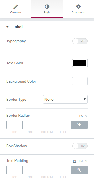
Label Plus!
With Label Plus you can create a simple label tag with custom alignment and an icon.
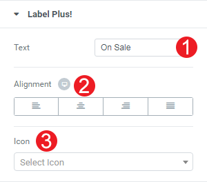
- Add your custom text.
- Select an alignment.
- Change the icon to your preference.
Under the Style tab you can control the appearance of your label like you would do in any Elementor’s element.
Dual Button Plus!
Dual Button allows you to create a set of two buttons.
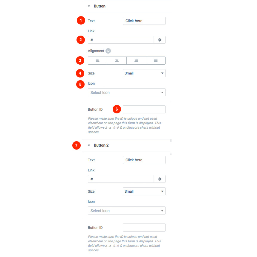
For each button you can
- Add a label for your button
- Add a link that your button will point to
- Select the buttons alignment
- Change the buttons style
- Add an icon for the button
- Add a button ID
- Add different values for the second button
You can style both of them using the default Elementor options under the Style tab.
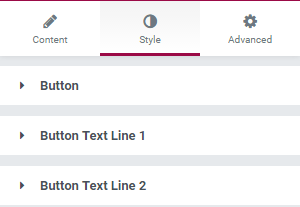
Button Plus!
With Button Plus you can create a simple button with multiple lines and control its style and behaviour.

- You can select the type of your button.
- Select the first and second text line.
- Add a link
- Control whether you want to open in a new window and all a nofollow rel.
- Change the alignment.
- Control the button size.
Under the Style tab you can control the appearance of the button itself and your button text.
FlipClock Plus!
This widget will allow you to create a slick countdown flip clock.

- Select when the flip clock will timeout
- Text that will appear when the countdown is over
- Show labels before the flip clock
- Select how many elements you need for your countdown
- Toggle seconds. This option will appear only when days are visible
- Change the Alignment of the widget
Gallery Plus!
With Gallery Plus you can easily add a beautiful gallery with your images and customize it.
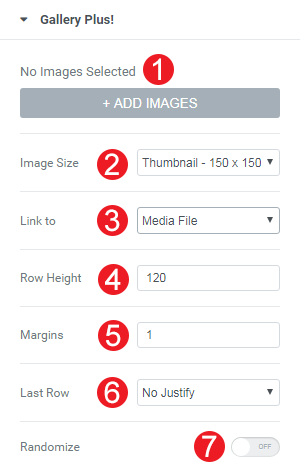
- Select your images by clicking on ADD IMAGES button.
- Select the image size for your images.
- Control whether you want to link to a media file, an attachment page or nowhere.
- Change the row height between the images.
- Change image margins.
- Control the looks of the last row
- Randomize the order of your images.
In your Style tab you can control your image and image caption appearance.

Image Hover Effects Plus!
Create complex hover effects for your images.

- Select the first Image
- Select the Second image
- Select the Hover effect
Call to Action Plus!
With Call to Action Plus you can create awesome hero and call to action section with your content.
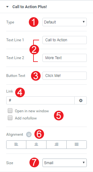
- Select your button type.
- Select your text for the first and second line.
- Add your button text.
- Change the button link.
- Control whether you want to open in a new window and all a nofollow rel.
- Change the Alignment.
- Change the button Size.
In your Style Tab
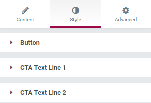
You can control your Button, CTA Text Line 1 and CTA Text Line 2 appearance.
Google Maps Plus!
With Google Maps Plus you can add a Google Map anywhere you wish and style it according to your preference.

- Add coordinates.
- Change the Zoom Level.
- Change the Height of the map.
- Upload a custom marker icon.
- Add custom text to the map’s infobox.
- Select one of the preloaded custom map styles.
- Paste a style of your choosing from SnazzyMaps.
- Prevent scrolling on the map.
Youtube Slideshow Plus!
With Youtube Slideshow Plus! you can add a cool video slider everywhere.
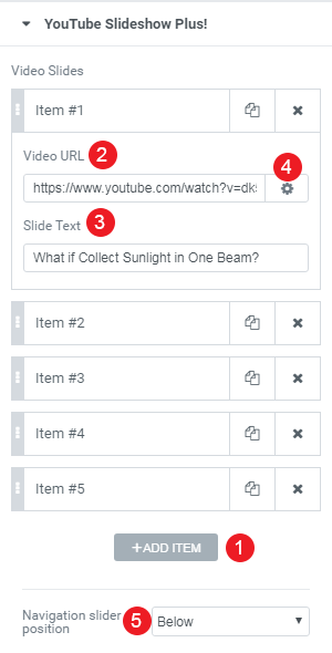
- Add a new Video Item.
- Select a Video URL.
- Add some text for your item.
- Change the link options.

- Change navigation slider position.
AudioIgniter Plus!
Now you can use our Free AudioIgniter Player as an Elementor Module. AudioIgniter lets you create music playlists and embed them in your WordPress posts, pages or custom post types. By using the standard WordPress media upload functionality, you can create new audio playlists in minutes. You can use AudioIgniter to stream your radio show too!
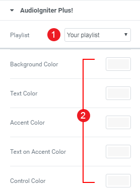
- Select your playlist.
- Change the Colors of your AudioIgniter player.
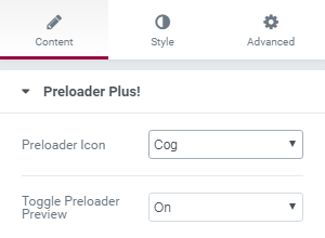
Preloader Plus!
Adding a preloader in your pages will never be easier. First add the preloaded element inside your page.
Select from the Content tab your favorite animated icon and toggle the preview for your preloader element.
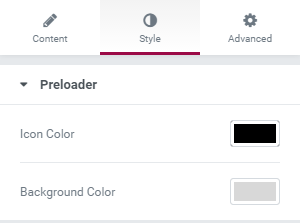
You can easily change the Icon color and page background from the Style Tab.
Instagram Plus!
Display the most recent images from an Instagram feed. You will need to have WP Instagram Widget Plugin installed and activated first.
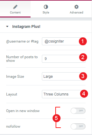
- Add your Instagram username.
- Choose the number of Instagram Photos.
- Select image size.
- Change the Column Layout.
- Select the link behavior.

You can also change the Style of your Instagram Module, by selecting the Widget Background Color and the padding between images.
Elements Plus! Tooltip
When enabling this module, in you selected element under the Content Tab you will get a new tooltip section. Here you can enable the custom tooltip and change its settings!
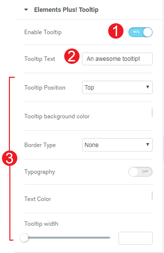
- You can enable or disable tooltip for the selected element.
- You can change the Tooltip text
- You can change various tooltip settings like colors, typography etc.
Scheduled Visibility!
Enabling this setting will add a new section for all your Elementor’s Modules under the Advanced Tab. This will allow you to render or not an element based on a date trigger!
Add any element you wish, let’s say a simple heading element in your Elementor canvas. Then select it and navigate to the Advanced tab

There you will find this Scheduled visibility options
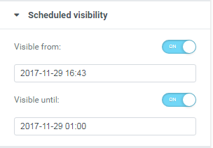
We can then select the date that our Heading Element (or any element) will show, and the date it will hide! You can use these triggers one by one or both.
Icon Plus!
An icon element similar to the one bundled with Elementor, with custom icon sets. After enabling Icons Plus module you can add our custom icon in your content.
You can select the icon and change various settings on the icon behaviour from the widget’s content tab.
- Change the default style of the icon.
- Select the icon you want.
- Select the URL you want the icon to point to.
- Select the Icon Alignment
You can also change the default color, size and rotation, as well as the hover animation and color of your icon, from the Style tab
- Change the primary color of the icon.
- Select its Size.
- Select its Rotation
- Change the hover primary color
- Select an animation when hovered.
Image Comparison Plus!
This module will allow you to position two images next to each other with a comparison handle between them.
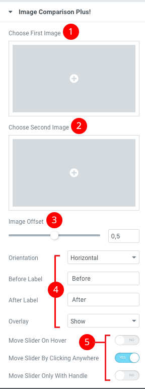
- Choose the first Image.
- Choose the second Image.
- Control the image offset.
- Change the various aspects of the comparison module.
- Control the slider handle behaviour
Search Plus!
Search Plus is an AJAX Powered search box with an autocomplete feature. It supports posts, pages and any custom post type you might need to support. When adding the widget you will get this screen under the Content Tab. Here you can:
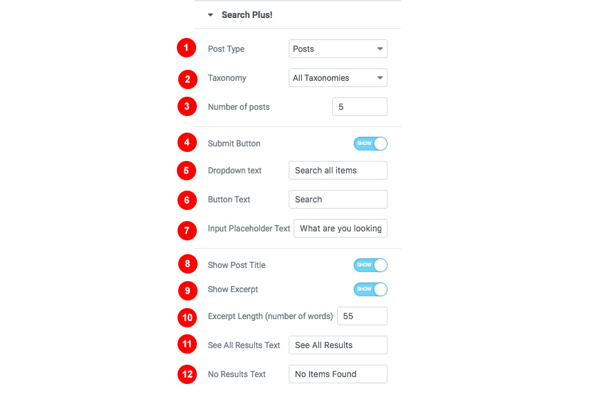
- Select a post type or page you need to fetch search results
- Select a specific taxonomy
- Select the max number of posts the search widget will render
- Add a submit button that will lead to your main search results page
- Add a dropdown text
- Add a button text
- Add a placeholder text
- Show the post title in results
- Show the excerpt in results
- Change the excerpt length (in words)
- Change the “See all results” text
- Add a message when no results are found
You can style Search Plus plugin from the Widget’s style tab. There you will find options to change any aspect of your Search widget and results
In detail you can:
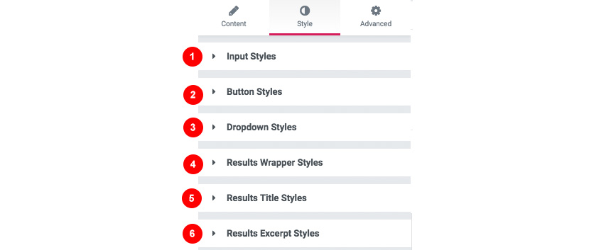
- Change Input styles and typography
- Change Button styles and typography
- Change the Dropdown styles
- Change the results wrapper styles
- Change the results title styles
- Change the excerpt style in your results
Inline SVG
Inline SVG will help you render your SVG inline and change its basic colors. In the content tab you can
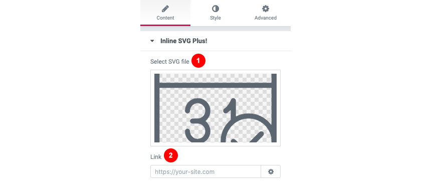
- Select your SVG
- Add a link for your SVG to point to
Now heading to the Style tab you can
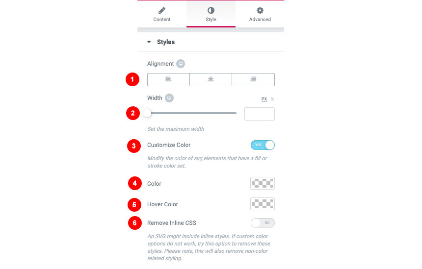
- Change the Alignment of your SVG icon
- Change the width
- Select if you wish to customize the color
- Select a Color
- Select a hover color
- Remove any unwanted CSS that might come from the SVG
Instagram Filters Plus!
This tool will help you style your image using Instagram Filters. This module will appear in every Elementor Image widget 
Sticky Videos Plus!
Select a video from Youtube or Vimeo and keep it sticky when your visitor scrolls down.
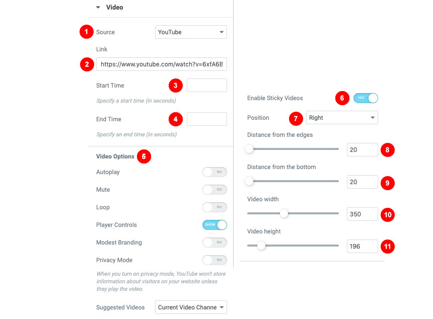
You can select all the basic information for your Video
- Select the source platform the video is hosted
- Select the full video URL
- Select the start time
- Select the end time
- Change your video options
- Enable Sticky Video
- Change the video position
- Change the distance from the edge (right or left) depending on the video position
- Change the distance from the bottom
- Change the sticky video width
- Change the sticky video height
Tables Plus!
This is a simple module that will help you create complex and responsive tables
Under the Content tab, you can select whether you want your table to behave responsively on mobile devices and adjust your table header and body.

For your table header, you can

- Add a new head column
- Select the header text
- Change the Column span
- Change the row span
- Modify the alignment of the content
While in your table body you can add as many items as your table heading
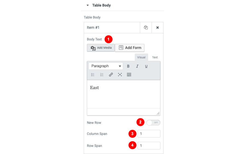
- Change the item body text
- Add a new row inside the content
- Select the column span
- Select the row span
Adjusting the table color and style is relatively easy. In Elementor’s Style tab you can change the heading styles

- Change the text alignment
- Change the text color
- Control the typography and fonts
- Change the background color
Same goes for the basic body style

- Change the text alignment
- Change the main text color
- Control the typography of the body content
- Add a primary background-color
- Add a secondary background color for altering rows
In general, you can

- Change the cell padding
- Add a border type
- Select the border width
- Select the border color
Tilt Effect Plus!
Tilt Effect is an advanced effect tool for your images. In each Elementor Image module, you will find under the Advanced tab

- Enable the title effect for the image
- Change the direction of the effect
- Select the tilt rotation
- Change the X-Axis of the tilt
- Change the Y-Axis of the tilt
- Change the Perspective
- Zoom in on hover
- Change the enter/exit transition speed
- Disable the effect in an axis
- Enable device orientation detection
Hotspots Plus!
Hotspot Plus will help you add mark points over an image with a custom text and styling. In the Content tab, you can

- Select the image you want to place your marks
- Select the image size
- Add your items
For each item you can

- Select the type of your mark
- Select the content
- Change the hotspot position on X-Axis
- Change the hotspot position on Y-Axis
- Show or hide the tooltip
You can also under the Style tab of the module to change the basic colors of your hotspots and their tooltips

- Select the hotspots colors
- Change the typography and font options of your spots
- Change their background color
- Change their size
You can also control the styles of the spot tooltip (if used)

- You can change the tooltip width
- Arrange the background color
- Alter the text color
Contact Form 7
Style your Contact Forms 7 forms using this module. You will need to have Contact Form 7 installed first in order for this module to work.
First, you will need to select the Contact Form you want to adjust from the content section of the element.

Then you can change for each part of this element

- Change Colors for the Form labels
- Change all colors of list items labels
- Change colors and typography for the form inputs
- Change colors and typography textarea looks
- Change all button colors
- Make form responsive
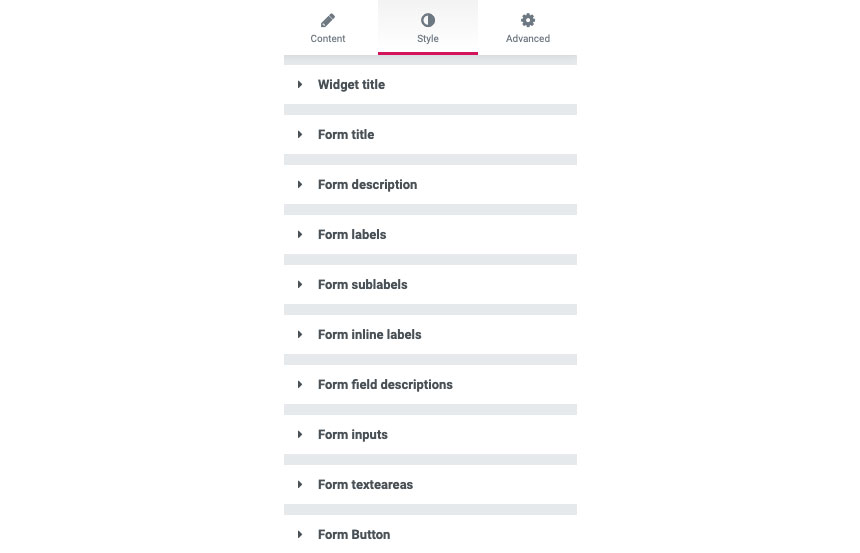
WPForms Element
Use and style every single elements of your WPForms forms! For this element you will need to have WPForms (lite or pro) plugin enabled
Here you can need to

- Change the widget title
- Select your’ already made WPForm you need to style
- Display its title
- Display its description
After selecting your form you can select how you need to style your main form elements and fonts from the style tab.