Styling the WP Instagram Widget
Recently we posted an article listing our favorite Instagram plugins. We mentioned WP Instagram Widget as being our go-to solution when we need to display a feed on our demos. We like the plugin due to its simplicity and easy of use. However these do come at a price. The widget does not look pretty from the get-go.
Let’s say we start by adding a widget in Twenty Sixteen‘s sidebar:
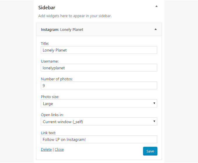
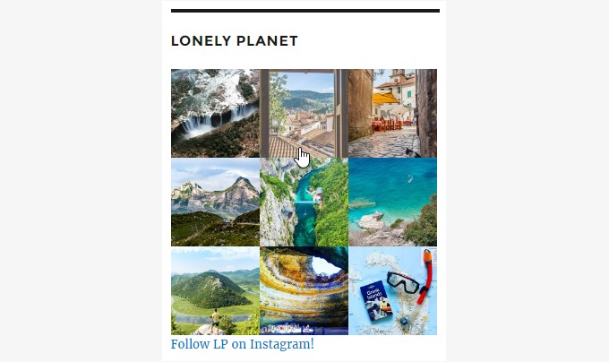
As an example we’ve added a feed from Lonely Planet’s Instagram. We’ve set the title, username and link text, that’s it. Here’s what you will see when you visit the site
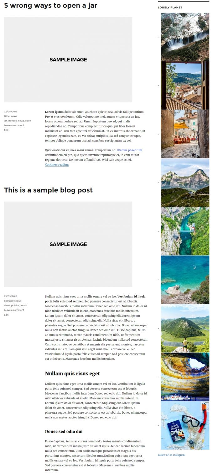
Not what you’d call pretty, right? The plugin comes with no styling of its own, which is great if you are a theme developer because it allows you to style it yourself to match your theme’s layout. Not so great for users though. Don’t worry, we can fix this!
What we need is some custom CSS to help us get to a more visually pleasing layout. If you are using a child theme you can place the styles at the bottom of your child theme’s style.css. Alternatively you can use a plugin to help you add custom styles. Jetpack has a built in custom CSS editor. Don’t want to use Jetpack? No problem, the plugin directory offers plenty of choice when it comes to custom CSS plugins.
Now that we have a place to put our styles in it’s time to style things. The widget has two main CSS classes .null-instagram-feed which is the main widget’s class and .instagram-pics which is the class applied to the image list (ul element).
First we need to remove these annoying dots next to each image, that is the default list styling. To do that we need this style:
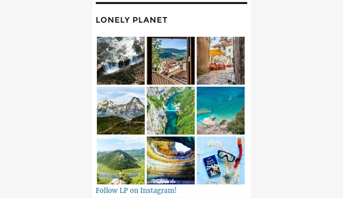
Now that this is taken care of we can create a columned layout for our images. Shall we say three columns? Use the style below:
Save and have a look at the front page.
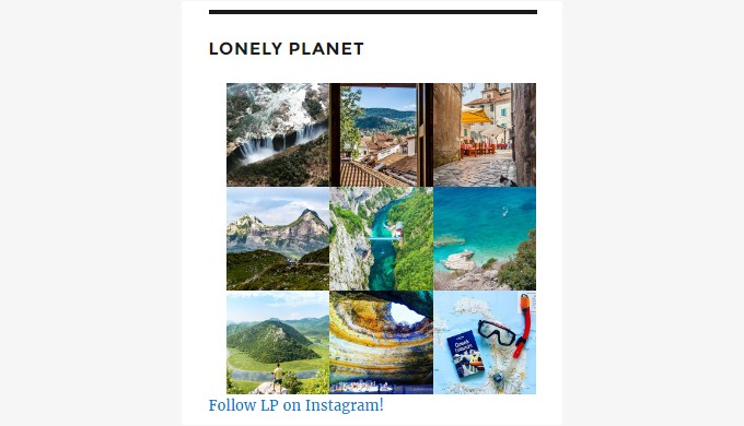
It has improved greatly, right? As you might have noticed, the images are a bit offset to the right, this is because Twenty Sixteen applies some margin to ul elements in widgets. We can remove that margin by modifying the .instagram-pics style above to this:
These minor glitches are bound to happen due to default theme styling. Mostly they are pretty easy to deal with using your browser’s developer tools to find the proper style to apply.
Now that this is out of the way, let’s say you want to apply some sort of hover effect so the user can clearly see which image they’re hovering over. To do that we will change the opacity of the hovered element with this style:
Done, let’s check it out!
Greatly improved! The margin is gone and now when you hover over an image it becomes slightly lighter than the rest.
Perhaps you’d like to add a bit of padding between your images so they don’t touch each other. In this case modify the .instagram-pics li style above to:
Et voila!
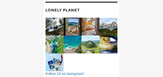
Don’t want padding but prefer a four column layout? Then use this style instead:
Easy right?
Almost there. The “follow” link looks a bit too close to the images, right? We can fix it. Just paste this in.
Much better!
Finally let’s say you want to modify the follow link’s main & hover colors. These styles are for you!
Final Words
Good job! With about 15 lines of CSS we have gone from an ugly list of images to a great columned layout with hover effects! Feel free to expand on the modifications above to get your desired layout. Happy styling!
10 responses to “Styling the WP Instagram Widget”
How do you achieve the carousel layout on the bottom of https://www.cssigniter.com/demo2/?theme=paperbag?
It’s the same WordPress plugin but we hook Slick Carousel on top of it http://kenwheeler.github.io/slick/ :)
Great tips, I fixed my own feed thanks to them
This is great – just sorted my page out in 5 minutes. Thanks for posting.
Just tried this with the Foodie Pro theme and everything except removing the small arrows worked. I copy pasted everything you put here. What could be the problem? :(
Hello.
The problem is caused by additional styling applied by the theme. You can contact the theme’s author and ask them to help you remove the arrows from the widget.
Hi! The title of the pictures appears in front of them, so the pictures cannot be seen because of the text! How can I hide the text/titles?
Thanks!
Hello.
Is there a link where we can see the issue?
Thank you.
How do you get it to look like the demo page-https://www.cssigniter.com/demo2/?theme=olsenlight
Hello Amanda.
The WP Instagram Widget plugin was disabled from the WordPress plugin directory and can’t be used at the moment. We’re currently looking for a suitable alternative to restore this functionality to our themes.
Thank you.